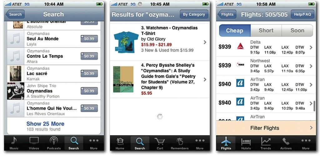
Content is the key ingredient in so many user experiences. So how does it change when it comes to planning a mobile user experience? Should you rewrite your content for each platform or do you need a different strategy to make the most of your content on all platforms? Handling content on mobile doesn’t need to be a chore but it does take planning.

Author/Copyright holder: Peter Morville. Copyright terms and licence: CC BY 2.0
In general terms the way you design information architecture (IA) for the mobile environment is very similar to the way that you design the IA for the desktop. The approach you use is near identical in fact but there are some important things to bear in mind when you do so:
Deliver what’s important on the mobile platform – that means you should focus on what’s important to the user when they’re using a smartphone. That doesn’t mean that your users will necessarily be using your app when they’re on the move or on the street – you need to research the way that they will use the app. That, in turn, lets you focus on the content that’s of value to the user and cut down the volume of data that you present on mobile.
Content should be focused on mobile – that’s smaller, simpler and easier to handle content than on the desktop. The limit of screen real estate makes large volumes of content more confusing on mobile than on a larger monitor.
Navigation should be simple – that means limiting the number of menu options and keeping things focused on what’s important to the user.
Information Architecture Design for Mobile
The process then follows a simple process:
Consider Click Investment
You want to build your information architecture hierarchy so that the minimum number of clicks is used to reach the most popular content. Less popular content can be farther away but not too far away. If people abandon a desktop website in seconds because of poor loading times – it seems likely that they would abandon a mobile website if they’re forced to wait and load multiple screens to get to the content they most value.
You can reduce levels of frustration with click investment by ensuring that you communicate the process clearly throughout the task. That means setting user expectations as to what will happen after each click before they make it.

Keep it Simple Stupid (KISS)
This comes up a lot in design and there’s no exception when creating information architecture for mobile. The simpler things are – the fewer issues with the overall experience.
So limit user choice; if your user research shows there are areas of your content that aren’t valued by mobile users – eliminate that content. You can always offer it via a desktop experience on mobile for the occasional user that really wants that content. The simpler your IA – the less chance that the user becomes frustrated with it.
Then plan your app’s IA – use a simple drill-down structure and nest content into clear, easy to understand and well-defined categories. Make sure that you understand the path from top-level information to sub-levels.
We’ve got some tips for this:
Keep categories to a minimum – again the simpler things are, the better the UX on mobile. That doesn’t mean abandon useful data but do think about the fact that people get lost more often the farther they drill down for information. 5 levels is enough on the desktop, with mobile you almost certainly want to aim for less.
Keep content and categories together – no empty pages, no empty links. If a user clicks on a navigation item, it must deliver some relevant content too.
Keep links to a sensible number too – don’t overwhelm the user with dozens of links. Ideally, keep the number of links displayed to fewer than 10.
Prioritize by popularity – “deck placement” is vital to controlling the simplicity of the experience. The more popular something is within the app or site; the more vital it is that you make it easy to get to. However, this can have an impact on the success of new features or content; as it will be placed lower in the deck and become harder to find. You may need to strike a careful balance between the two.
Label navigation items clearly and concisely – this applies to links as well as menu options; this is very important on phones with very small screens.
Think About Input Devices
Not all smartphones are touch screens. You need to ensure that you maintain the “tap worthiness” of navigation items (minimum 30 pixels) whilst still providing quick methods for non-touch screen users to get to data (0 to 9 as shortcut keys will be better than 1 to 10 as they match the numeric keys on the phone).

Author/Copyright holder: Asim18. Copyright terms and licence: CC BY 3.0
Provide Clear Navigational Cues
Navigation on mobile is more complicated than it is for desktop. Make your “breadcrumbs” explicit – if you use a back button, put a label on it to tell the user where it takes them. Make sure you have a home page icon that is clear and distinct and will take the person back to the beginning of their interaction.
The Take Away
Information architecture design for mobile doesn’t differ dramatically from information architecture design for the desktop. It’s important to research what’s useful on the mobile platform to your users and to try to keep things as simple and manageable as possible. This is true for both the IA and the navigation which directs the user through the IA.
References & Where to Learn More:
You can find this excellent guide to information architecture in general: The Ultimate Guide to Information Architecture.
We’ve treated navigation and IA as interchangeable in this article. However, strictly speaking, they aren’t. The Nielsen Norman Group explains why not.
Usability First explores information architecture in a succinct way.
Hero Image: Author/Copyright holder: murdocke23. Copyright terms and licence: CC BY-NC-SA 2.0


