19. Visual Aesthetics

599 shares
Download PDF

Visual aesthetics, as discussed in this chapter, refers to the beauty or the pleasing appearance of things. We discuss the importance of visual aesthetics in the context of interactive systems and products, present how it has been studied in the field of Human-Computer Interaction (HCI), and suggest directions for future work in this field.

19.1 Introduction

To scholars and practitioners in the field of HCI at the early 1990’s, the idea that aesthetics matter in information technology sounded heretic. Two decades later, in the early 2010s, this thought has conquered a solid place in both academia and industry. While experimentation with computers’ ability to generate visual art dates back to the 1960’s (Nake, 2005), systematic research on visual aesthetics of interactive systems can only be traced to the mid-1990’s (Kurosu and Kashimura, 1995; Tractinsky, 1997). Since then, a steady stream of studies has explored various aspects of this area. The timeline of this research has roughly corresponded to even more dramatic developments in the information technology industry. Since the later 1990’s, a strong shift towards visual aesthetics has swarmed the industry. The increased interest in aesthetics among the industrial and academic communities reflects the maturation of the HCI field and the overcoming of many of its growing pains as a discipline that struggles with unreliable technology on the one hand and with the need to satisfy users’ basic requirements on the other hand. Additionally, broader societal processes emphasizing design and style emerged at about the same time (Gibney and Luscombe, 2000; Postrel, 2002), further reinforcing shifts towards aesthetics of products in general (Bloch, 2011) and specifically of interactive systems. A more detailed account of this process is provided in Tractinsky (2004) and Tractinsky (2006).

Udsen and Jørgensen (2005) identified several approaches to the study of aesthetics in HCI. “Visual aesthetics”, as described in this chapter, correspond roughly to the approach which Udsen and Jørgensen identified as “Functionalist”. To be specific, and to distinguish the subject of this chapter from other similar terms, I use the term “aesthetics” in its fairly ordinary and common sense as reflected in dictionary definitions such as “an artistically beautiful or pleasing appearance” (The American Heritage Dictionary of the English Language), or as “a pleasing appearance or effect: Beauty” (Merriam-Webster’s Collegiate Dictionary). The term “visual” indicates concentration on the visual sense, which is the central human sense, occupying “almost half the brain” (Ware, 2008, ix). Thus, this chapter is not about various other phenomena studied under the “aesthetics” heading, such as literary aesthetics, abstract forms of aesthetic experiences or criteria (e.g., the elegance of mathematical proofs), or reactions to object qualities that do not immediately and primarily stem from its visual attributes.

In addition, a few other characteristics that describe research in the field can be listed. These characteristics describe how researchers in the field approach their subject matter. First, the approach of researchers in visual aesthetics reveals a bias towards positive effects of visual design, an issue to which I will return later in this chapter. Hence, research in this area commonly studies the beautiful and pleasing appearance of artifacts, or designed objects that are based on computing technology, rather than the effects of their ugly and displeasing counterparts. Second, at a Dagstuhl workshop on visual aesthetics in HCI, held in 2008, a majority of the participants adopted an interactionist approach to the study of visual aesthetics, noting that the aesthetic experience consists of people’s reactions to objects as opposed to aesthetics that are inherent in the object per se (Hassenzahl et al., 2008). These reactions include both individual idiosyncrasies and tastes, but also considerable agreement between individuals and experts, to a point where they may be considered “quasi-objective” (Hoyer and Stokburger-Sauer, 2011). Third, while the Dagstuhl workshop mentioned above failed to reach a consensus over the time frame that appears relevant to visual aesthetic reactions, my own position is that it can encompass the entire range from very quick, visceral reactions to very long, contemplative evaluations. Fourth, the processes involved in designing and evaluating visual aesthetics are both affective and cognitive. Finally, research in the field of visual aesthetics is primarily empirical and is characteristically descriptive (i.e., “what is considered beautiful”) rather than normative (i.e., what should be considered “beautiful”) (Hassenzahl, 2004b). This important distinction stresses its roots in applied research and differentiates the field from artistic or philosophical writing on the subject.

The objective of this chapter is to survey the field of visual aesthetics in HCI. We start by delineating the importance of visual aesthetics to HCI from three perspectives. We then present a research framework that serves us in reviewing key findings in the field. These aspects include issues such as what makes systems look aesthetic, what are the effects of visually aesthetic systems, and what mechanisms are involved in people’s judgment of aesthetics in the context of interactive systems. We also discuss methodological aspects and challenges for further research.

19.1.1 The importance of visual aesthetics in HCI

The importance of visual aesthetics to the field of HCI can be argued from various perspectives. Here I present three such perspectives - the design perspective, the psychological perspective, and the practical perspective. Although these perspectives are not meant to be exhaustive, I believe that, taken together they cover the lion share of arguments for the inclusion of visual aesthetics as a major aspect of HCI practice, research and education (Tractinsky and Hassenzahl, 2005). While these are distinctive perspectives, they may overlap at certain points. Finally, to some it may seem somewhat redundant to submit these arguments, as they have gained considerable acceptance in the HCI community in recent years. Still, I believe that it is important to present them in an organized fashion to clarify my point of view and to provide people in the community a set of arguments that can be used to make a case for visual aesthetics before other audiences (e.g., software and hardware engineers, product managers, etc.).

19.1.2 The Design Perspective

Despite being one of the youngest design disciplines, the development of interactive technology has quickly become one of the most salient design activities. The mutual relevance of HCI and Design has long been recognized (e.g., Winograd, 1996), but what are the implications of this to the research, practice and education in HCI? Here, I would like to point out two such implications. The first implication is the recognition that aesthetics constitutes an important and integral part of any design discipline. The importance of aesthetics increases as the interface between the artifact and the affected people (e.g., in terms of visual saliency, length of interaction or co-habitation) becomes more comprehensive. The second implication is that visual aesthetics is often related to other design aspects. Thus, not only should we not worry about trading off aesthetic and other qualities of interactive systems; we should embrace aesthetics as a dimension that augments other aspects of the design and the overall interactive experience.

19.1.2.1 The Vitruvian design principles

Vitruvius (1st century BC) is probably the first person to lay forth systematic and elaborated principles of design. It is not surprising that architecture was the subject of his elaborated writings, being the most salient and complex design discipline, which has affected human life ubiquitously. In addition to the fact that information technology and interactive systems have now become just as ubiquitous, it is not difficult to see that there is much in common for architecture and information technology (e.g., Brooks, 1975; Hooper, 1986; Lee, 1991; Kim et al., 2002; Visser, 2009). It is reflected by the term “information architecture,” used by professionals to designate the process of creating information-based environments and systems. The similarities between these two disciplines can be illustrated by considering Vitruvius’s three core principles of sound architectural work. Firmitas, which is the strength and durability of the building; utilitas - the utility of the building, its usefulness and its suitability for the needs of its intended inhabitants and users; and venustas - the building’s beauty. In architecture, the Vitruvian principles have been influential since their rediscovery in the 15th century (Johnson, 1994; Kruft, 1994). Today, for example, they serve as a basis for the Design Quality Indicator, developed by the Construction Industry Council in the U.K. to evaluate the design quality of buildings (Whyte et al, 2003).

It is straightforward for the various computing and IT disciplines to recognize firmitas as the core principle of their research and practice. The need for robust, reliable and dependable software, hardware, systems and products has occupied the field since its inception. We might say that, just as firmitas serves as a prerequisite for designing structure, so do we consider it a precondition for any IT system or product.

Whereas there is little disagreement about the importance of firmitas principle, the computing community was originally much less enthused about the utilitas principle. In the context of IT, this principle deals with designing to meet individual and organizational needs and goals, with emphasis on the efficiency and the effectiveness of the interaction between people and artifacts. In fact, the HCI community can take much of the credit for incorporating the utilitas principle into mainstream practices in the computing industry (cf. Tractinsky, 2006). The field of HCI has its roots in attempts to study and design systems and product that will allow people to use them efficiently (Card et al, 1983). The notion of usability, for example, which has served as a centerpiece of the HCI community has permeated not only other parts of the IT industry, but have gained almost universal recognition and support for the values of human-centered design. One of the most widely referenced models on people’s relationships with information technology - the technology acceptance model (TAM) - suggests that a system which is easy to use and provides more useful features is more likely to be adopted by its intended users (Davis, 1989).

With firmitas and utilitas in place, the computing community in general, and the area of HCI in particular, are still missing a key Vitruvian principle. For years, beauty and delight were considered by the HCI community as gratuity, often to be avoided. The emergence of beautiful interactive products during the first decade of the 21st century , which led to commercial success and to academic research (e.g., Kim et al., 2002; Liu, 2003; Tractinsky, 2004), has demonstrated quite convincingly, that as in other design disciplines, the third Vitruvian leg, venustas, should be fully embraced as cornerstone of designing interactive technology (see also, Fishwick, 2006).

Italian translation from 1521 of De Architectura Libri Decem (The Ten Books on Architecture) by Marcus Vitruvius Pollio. Preserved in the Smithsonian Museum of American History

Author/Copyright holder: Courtesy of Mark Pellegrini. Copyright terms and licence: CC-Att-SA-2 (Creative Commons Attribution-ShareAlike 2.0 Unported).

Figure 19.1
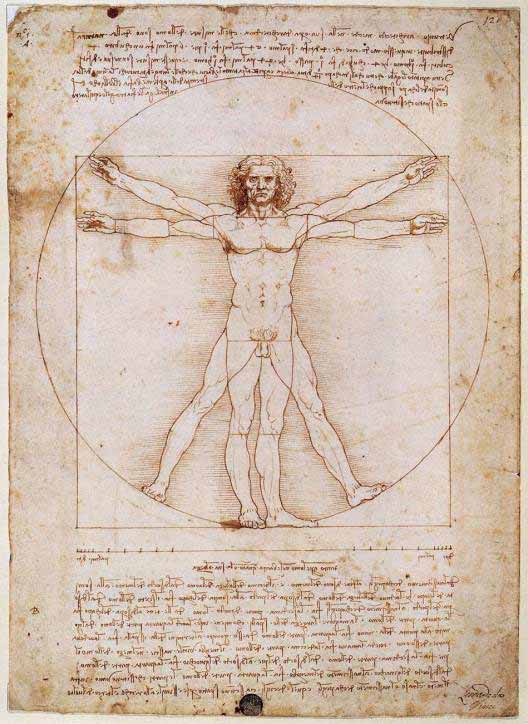
The Vitruvian Man drawing was created by Leonardo da Vinci circa 1487 based on the work of Vitruvius. By empirically measuring and calculating the proportions of the human body, Vitruvius may also be

Copyright terms and licence: pd (Public Domain (information that is common property and contains no original authorship)).

Figure 19.2: The Vitruvian Man drawing was created by Leonardo da Vinci circa 1487 based on the work of Vitruvius. By empirically measuring and calculating the proportions of the human body, Vitruvius may also be considered the first student of ergonomics.

19.1.2.2 Aesthetics and other design principles overlap

HCI and usability experts used to warn against putting too much emphasis on aesthetics (e.g., Norman, 1988; Nielsen, 1993). Their warnings seem to reflect a concern about the ability of these two design aspects to coexist. Beauty was a hurdle on the road to good design. If designers emphasize aesthetics they by default sacrifice usability. This viewpoint has been changing gradually, thanks in part to a stream of research findings that suggest that at least in terms of perceived design attributes, aesthetics and usability can be viewed as positively correlated (Tractinsky et al., 2000; Lavie and Tractinsky, 2004, Cawthon and Moere, 2007; Sonderegger and Sauer, 2010). Moreover, a closer look at usability guidelines suggests that there is no inherent conflict between usability and aesthetic principles. Guidelines for usable computer applications rely heavily on Gestalt laws of perception in recommending, for example, orderly displays, keeping elements aligned, grouping elements that belong together, clearly separating them from other elements, etc.

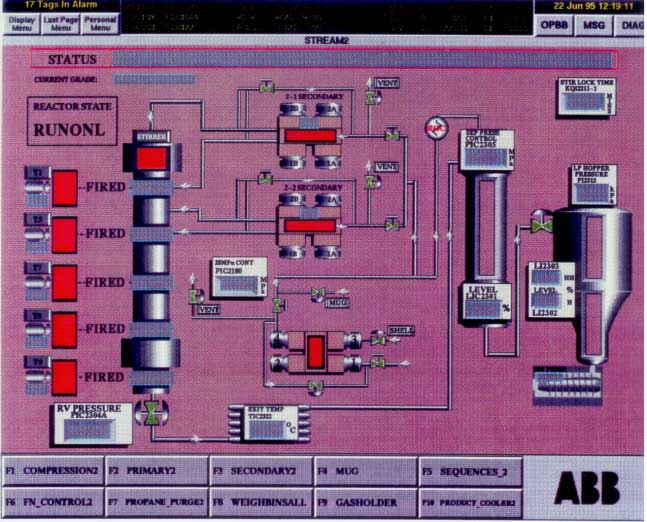
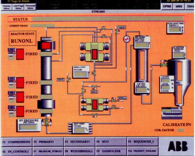
Of course, these principles were applied as well to explain and promote the theory and practice of art and design, suggesting that they affect aesthetic impressions (Arnheim, 1966). One of my favorite demonstrations of this point is the following screens which appeared in a study by Parush et al (1998). Participants in that study were asked to evaluate an interface quality of two screens (Figure 3). The participants rated the quality of the left screen as better than the quality of the right screen. But which design quality were they referring to? Usability? Visual aesthetics? Time and again, when I pose this question during class or in invited lectures, the distribution of answers remain almost the same: They are evenly distributed between “usability,” “aesthetics” and “both”!
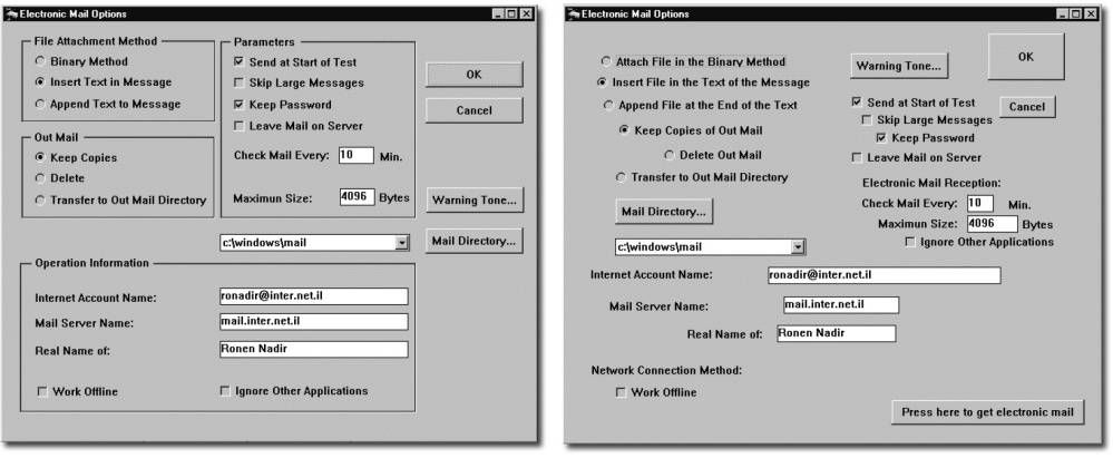
Two screens from Parush et al (1998). The left screen represents good design. The right screen represents bad design.

Author/Copyright holder: Parush et al. Copyright terms and licence: All Rights Reserved. Reproduced with permission. See section "Exceptions" in the copyright terms below.

Figure 19.3: Two screens from Parush et al (1998). The left screen represents good design. The right screen represents bad design.

This example illustrates the findings of another study (Lavie and Tractinsky, 2004) in which web pages were characterized along two perceived dimensions. We used the terms “classical” aesthetics to denote the dimension that communicated a sense of order and good proportions. This subdimension was highly correlated with usability. The other dimension represented originality and creativity aspects of the design and was accordingly labeled “expressive” aesthetics. Not surprisingly, perceived website usability was highly correlated with classical aesthetics but only moderately with expressive aesthetics. Thus, it is important to realize that (a) people can distinguish among different aesthetic aspects of interactive systems, and that (b) at least some aspects enhance, rather than negate, usability.

19.1.3 The Psychological Perspective

In the early days of the HCI discipline, researchers and practitioners emphasized task-related criteria, such as ease of use and efficiency as the ultimate goals of interactive design. Aesthetics was considered gratuitous at best or even harmful (e.g., Norman, 1988). However, as interactive technology became so ingrained in everyday life, touching on almost all aspects of it, it became apparent that this position should be reevaluated (Norman, 2002, Hassenzahl, 2007). To a large extent, the emergence of visual aesthetic research in HCI had its roots in the “positive psychology” movement (Seligman and Csikszentmihalyi, 2000) that called for a shift towards dealing with human strengths and well-being instead of with weaknesses and their remedies. This sentiment was enthusiastically embraced in the field of HCI in the context of studying the user experience (Hassenzahl and Tractinsky, 2006; Law and Schaik, 2010)

This section provides three arguments, from a psychological perspective, for the importance of aesthetic design. The basic idea is that aesthetic design positively influences both emotional and cognitive processes (Norman, 2004; Leder et al., 2004). This, in turn improves people’s experience with the technology, their appraisal of it and their attitudes towards it (e.g., Hartmann et al., 2007, 2008; Thuring and Mahlke, 2007). In this chapter we first discuss the emotional and motivational aspects: aesthetics pleases us and improve our well-being. We then discuss cognitive processes by which visual stimuli are easily recognized and thus are essential to subsequent evaluation of products and environments.

19.1.3.1 Aesthetics satisfies basic human needs and is a source of pleasure

Early HCI writings appear to belittle the need for aesthetic design. Such a perspective may have been motivated mainly by the need to promote the more pressing values of usable design. Still, given our knowledge about human nature, this position was not sustainable in the long run. It is argued that the value of visual aesthetics stems from its contribution to pleasure and well-being (e.g., Santayana, 1896; Postrel, 2002), and from its role as a basic human need (Maslow, 1954), perhaps due to evolutionary processes (Dutton, 2008).
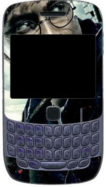
Aesthetics as an extension of the Self: Harry Potter skin for a Blackberry smartphone

Author/Copyright holder: Ninety9mall. Copyright terms and licence: All Rights Reserved. Used without permission under the Fair Use Doctrine (as permission could not be obtained). See the "Exceptions" section (and subsection "allRightsReserved-UsedWithoutPermission") on the page copyright notice.

Figure 19.4: Aesthetics as an extension of the Self: Harry Potter skin for a Blackberry smartphone

Visual aesthetics may temporarily take a side seat to other design aspects when other needs are more pressing; some people may be less sensitive or less in a need for aesthetic environments (Bloch et al., 2003); and aesthetic tastes, reactions to aesthetic stimuli vary between people (Santayana, 1896; Hoyer and Stokburger-Sauer, 2011). Still the universality of visual arts across cultures and the pleasures induced by it are cited by evolutionary psychologists as evidence for the fundamental role of aesthetics in the psyche of modern Homo sapience (Dutton, 2008). Aesthetic experiences are associated with affective responses and reflective thought (Leder et al., 2004). Research using functional magnetic resonance imaging (fMRI) found further neurophysiologic support for this association in the context of product packaging (Reimann et al., 2010). Whereas task-related criteria are often based on extrinsic motivation, aesthetics, through pleasure and engagement, primarily contributes to intrinsic motivation. Thus, there is little reason to believe that the need for aesthetics disappears in front of the computer. Visually pleasing design enriches our experiences with interactive systems just like they do with any other environment (Hassenzahl, 2007). There is empirical evidence that aesthetic design of interactive technology increases users’ pleasure and engagement (e.g., Thuring and Mahlke, 2007; Porat and Tractinsky, 2012; Angeli et al., 2006). Consequently, we expect pleasurable interactions to make us happier and thus to improve our well-being (Lyubomirsky et al., 2005). Furthermore, they may make us more tolerable of other design imperfections (Norman, 2004) and improve our task performance under certain conditions (Moshagen et al., 2009).

19.1.3.2 Aesthetics as an extension of the Self

Belk (1988) argues that “it seems an inescapable fact of modern life that we learn, define, and remind ourselves who we are by our possessions” (p. 160) This process of self-extension by possessions is manifested in the realm of HCI in the ways that people modify their computer desktops, screen savers, their websites, and various standard applications. These forms of idiosyncratic attachments (Kleine et al., 1995) are served well by the flexibility and plasticity of IT. The appearance of modern software applications can be personalized to suit users’ tastes. This trend, though on a smaller scale, can be found in hardware - e.g., in the abundance of various cell phone covers, charms and other ornaments. Software skins can be downloaded, for free or pay, for most popular applications. Indeed, studies have shown that the major factor influencing users’ selection of skins was the aesthetic aspect of its design (Tractinsky and Lavie, 2002; Tractinsky and Zmiri, 2006). The proliferation of such features could be explained in large part by individuals’ desire to express themselves, and to be seen in specific ways by others (Hassenzahl, 2003) and as part of an ongoing process of identity formation, through which people “express who they are and communicate affiliation with others” (Venkatesh and Meamber, 2008, p. 51). These are manifestations not only of who those individuals are, their past and present, and their affiliations (Kleine et al., 1995) but also of the social context within which so many interactive products are used today (Turkle, 2005).

Aesthetics as an extension of the Self: Harry Potter skin for the Windows 7 operating system

Copyright terms and licence: All Rights Reserved. Used without permission under the Fair Use Doctrine (as permission could not be obtained). See the "Exceptions" section (and subsection "allRightsReserved-UsedWithoutPermission") on the page copyright notice.

Figure 19.5: Aesthetics as an extension of the Self: Harry Potter skin for the Windows 7 operating system

Aesthetics as an extension of the Self: Harry Potter skin for the Google Chrome browser

Copyright terms and licence: All Rights Reserved. Used without permission under the Fair Use Doctrine (as permission could not be obtained). See the "Exceptions" section (and subsection "allRightsReserved-UsedWithoutPermission") on the page copyright notice.

Figure 19.6: Aesthetics as an extension of the Self: Harry Potter skin for the Google Chrome browser

19.1.3.3 Aesthetic impressions are fast, enduring and consequential

Whereas the previous arguments discuss psychological needs for aesthetic environments and motivation to possess, buy and use aesthetic products, the current argument is based on the consequences of aesthetic stimuli. Those consequences are based on the idea that aesthetic impressions can be very fast. Studies of brain activity suggests that aesthetic impressions form within 300ms to 600ms (Höfel and Jacobsen, 2007). Research on people’s impressions of web pages demonstrated that reliable and consistent aesthetic judgments are formed with exposure of less than 500 milliseconds (Lindgaard et al., 2006; Tractinsky et al., 2006). These very fast impressions are the first opportunity we have to form an attitude towards an object (e.g., an interactive system), whose other qualities are usually concealed until later time when opportunities to evaluate them arise (e.g., when trying to accomplish a task with the system). Those initial attitudes are likely to form at a relatively subconscious level and therefore may be relatively uniform across people, relative to more elaborated evaluations (Kumara and Gargb, 2010).

The primacy of first impression on attitudes is well documented in social science research. Its most salient manifestation is expressed by the “what is beautiful is good” stereotype (Dion et al., 1972), which suggests that a person’s physical appearance affects how others view the person’s hidden qualities (e.g., personality traits). Such preferences for aesthetic appearance may be the result of evolutionary adaptation (Rhodes, 2006). Research has documented numerous contexts in which people with good looks enjoy preferential treatment in the labor market (Hamermesh and Biddle, 1994), in credit markets (Ravina, 2008), and even in the classroom (Hamermesh and Parker, 2003).

We also know that people try to actively improve how they appear to others in order to gain benefits or to avoid sanctions (Jones, 1990). Such attempts can be found, for example, in how people try to improve information about things under their responsibility (e.g., at work) by presenting the information in more attractive formats (Tractinsky and Meyer, 1999). Such aesthetic improvements may pay off: research suggests that under ordinary conditions, aesthetic financial reports increase both novice and professional investors’ valuation of a firm (Townsend and Shu, 2010). Similarly, the way things appear may influence our attitudes towards them. By “things” we may refer to natural settings and objects such as landscapes (Porteous, 1996; Carlson, 2000) or to various sorts of designed environments (Gilboa and Rafaeli, 2003) and artifacts (Rafaeli and Vilnai-Yavetz, 2004). For example, Reimann et al (2010) found that products with aesthetic packages are chosen over less expensive products with well-known brands in standardized packages.

Thus, it should come as no surprise that the visual aesthetics of interactive systems, both hardware and software, may affect our evaluation of other system attributes. Hence, the suggestion that “beautiful is usable” that is, beautiful systems are considered by users to be more usable (Tractinsky et al., 2000).

19.1.4 The Practical Perspective

Finally, I would like to suggest that even if you are not convinced that aesthetics is a pillar of good design or that aesthetics fulfill psychological needs and influence attitudes and decision making, its practical significance is hard to deny. There is ample daily life evidence that illustrate this point. Here, I would like to suggest two aspects of this perspective. The first describes the importance of aesthetics as a differentiating factor between similar products. The second argument suggests that aesthetics and information technology are already profoundly intertwined in current socio-technical processes. Thus, not only is it unwise to ignore aesthetics in information technology, we are in fact required to pay more attention to it, to further study its relationships with other relevant aspects of the HCI field, and to improve its integration in the design of interactive systems.

19.1.4.1 Aesthetics as a differentiating factor

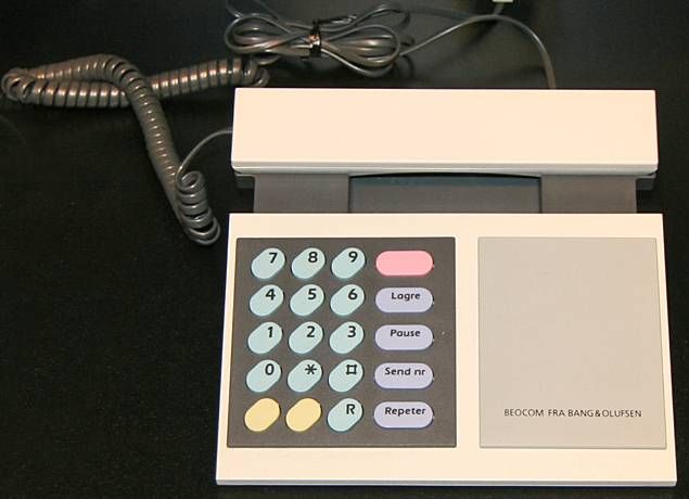
The weight of the IT industry has shifted over the last fifty years from emphasizing organizational number crunching to supporting organizational and personal decision making and productivity to being fully integrated in consumer and entertainment products. The list of successive companies that dominated the IT industry during this time frame - IBM, Microsoft and Apple - tells the story succinctly. The accelerated process of consumer-centeredness and commoditization of interactive technologies, partially described already byNorman (1998), increases the importance of aesthetics as a differentiating factor between competing products increases. The digital watch industry served as a classic example of such a process during the 1970’s and 1980’s, as functionality and performance met very high standards of accuracy and reliability. In that industry, much of the differentiation between brands and models is now based on aesthetic creativity or imitations of aesthetic exemplars. Today we are surrounded by similarly high-performance interactive consumer products - such as smart phones and tablet computers. These products are more oriented towards enhancing the user experience, and much of the battle involves attempts to catch the consumer’s eye and heart with appearance and design-based symbolic value. Thus, aesthetic design is gaining acceptance as a differentiating strategy or tactic (Simonson and Schmitt, 1997; Luchs and Swan, 2011; Reimann et al., 2011) in various markets.
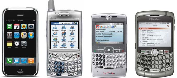
The first version of the iPhone, released in 2007 (left) compared to its contemporaries. The iPhone is a good example of how a phone manufacturer uses visual aesthetics as a differentiating factor - i

Author/Copyright holder: Courtesy of Marco Arment. Copyright terms and licence: CC-Att-SA-3 (Creative Commons Attribution-ShareAlike 3.0)

Figure 19.7: The first version of the iPhone, released in 2007 (left) compared to its contemporaries. The iPhone is a good example of how a phone manufacturer uses visual aesthetics as a differentiating factor - in everything from the actual phone to its packaging

The hugely popular Western Electric Model 2500 (12 button Touch-Tone) telephone, manufactured in 1980.
Copyright terms and licence: pd (Public Domain (information that is common property and contains no original authorship)).

Figure 19.8.A: The hugely popular Western Electric Model 2500 (12 button Touch-Tone) telephone, manufactured in 1980.

The BeoCom 1000 corded analogue telephone used visual aesthetics to differentiate itself from and compete against popular telephones like the Western Electric Model 2500.

Copyright terms and licence: pd (Public Domain (information that is common property and contains no original authorship)).

Figure 19.8.B: The BeoCom 1000 corded analogue telephone used visual aesthetics to differentiate itself from and compete against popular telephones like the Western Electric Model 2500.

19.1.4.2 Aesthetics is pervasive

There is a long tradition of relationship between aesthetics and technology (Petroski, 1992; Norman, 2004), which became more pronounced during the rapid technological developments of the 20th century. Advanced technologies helped in producing aesthetic forms that could not have been made before (at least not on a mass scale), and aesthetic concepts were borrowed from one technological field (e.g., aircraft design) into another (e.g., locomotive design or a structure of an airport terminal) with the aid of new design, manufacturing or building technologies. Today, it is common for design trends to appear at the same time in multiple industries (Gladwell, 2000). In the age of information technology, such relationships become more symbiotic than ever. One of the unique characteristics of information technology is that it is particularly friendly to aesthetic applications (Postrel, 2002). Relative to traditional methods it supports effortless creation, manipulation, and transmission of aesthetic materials. Consider, for example, the photography market’s shift from film-based cameras to digital cameras within merely a decade. Today, images and photos, major elements of visual aesthetics comprise about 2/3 of the volume of web pages transmitted through the internet (Rabbat, 2010). Digital technology and applications enable designers in various industries many more design options, and much more time to explore all of those options in order to create more appealing products. Perhaps even more importantly, these technologies offer ordinary people tools that help creating and communicating aesthetics on a revolutionary scale. The interlacing of aesthetics and information technology thus creates an aesthetic cycle in which constant supply of visually aesthetic stimuli increases people’s aesthetic sensitivity, which in turn motivates people to seek aesthetics everywhere, including in interactive products (Postrel, 2002).

19.1.4.3 A note on the moral aspect of practical considerations

Lest our position be misconstrued to mean that advocating aesthetic design implies that practical concerns should prevail over all other considerations, it is important to note that the reality depicted above also carries a moral dimension. Aesthetic and ethic considerations in design need not contradict (Liu, 2003). Aesthetic design implies that the designer or the organization respects their audience, is sensitive to people’s needs and desires and puts thought and effort into the design of the product and the environment. For example, Ulrich’s (Ulrich 1984) seminal study on hospital patients recovering after cholecystectomy found that patients in rooms with window view of natural settings recovered faster and needed fewer potent analgesics relative to patients in rooms with windows facing a brick building wall. A quarter of a century later, Postrel (2008) laments the disregards for aesthetic design in today’s health care institutions. In turn, feeling respected and appreciated, people will be more inclined to take care of an aesthetic and well maintained environment (Saito, 2008). In short, aesthetic design works for the betterment of our lives.

19.2 Research on visual aesthetics in HCI

Research on and around the various aspects of visual aesthetics in HCI can be roughly divided into four main categories that deal with various aspects of the aesthetic process:

  1. Antecedents of the aesthetic evaluation, that is, what makes people engage in aesthetic evaluations, and perhaps more importantly, what causes variations in aesthetic evaluations;

  2. The aesthetic evaluation itself and the psychological processes that are involved in it;

  3. Outcomes or consequences of aesthetic evaluations;

  4. Moderating variables, or intervening factors that influence how the antecedence operate on the aesthetic evaluations and how the evaluations affect the outcomes.

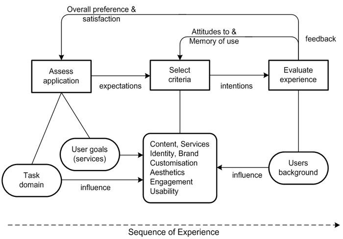
These categories can be seen as part of the schematic process described in Figure 8. I will elaborate on each of these elements below and present empirical studies that have handled these issues.
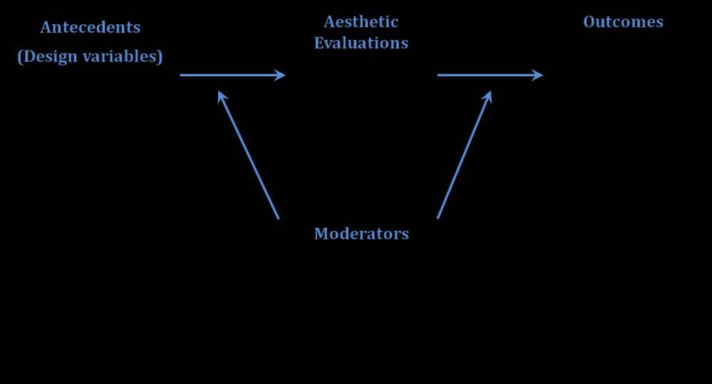
A general framework for the study of visual aesthetics in HCI. Some relevant research issues for each category are included

Author/Copyright holder: Unknown (pending investigation). Copyright terms and licence: Unknown (pending investigation). See section "Exceptions" in the copyright terms below.

Figure 19.9: A general framework for the study of visual aesthetics in HCI. Some relevant research issues for each category are included

19.2.1 Antecedents of visual aesthetics

What makes an interactive system look more or less aesthetic? What makes one system look aesthetic in a particular way and another system look aesthetic in a different way? These are questions of the utmost practical importance. If we could only decipher the aesthetic code! Fortunately, the quest for the Holy Grail of visual aesthetics is beyond our reach for at least the foreseeable future, so there is plenty of room for experimentation, new approaches and ample research. In studying this category, we naturally look first at design guidelines and insights. However, the very broad scope of design possibilities, the creative nature of design work, and the almost unbounded relationships between design elements make it extremely difficult to isolate specific design aspects which may be considered aesthetic or which may influence aesthetic perceptions one way or another. It is probably possible to categorize aesthetic design guidelines from the very broad and abstract (e.g., “form follows function”) to the very specific (e.g., “use colours with different hues between background and menu bar” (Kim et al., 2003), with mid-range guidelines in between (e.g., “visual layout should be symmetrical” (Sutcliffe, 2002). They can be expressed in terms of object properties or in terms of motivational and emotional mediators (e.g., Berlyne’s (Berlyne 1971) collative variables).

At the beginning of this section, we posed two different questions. The first question -- what makes a system look more or less aesthetic -- has probably been more central to aesthetic and design research over the years. Park et al. (2005) have collected and listed 11 visual attributes that can potentially answer this question. Other, more high-level responses to this question include contrasting attributes such as novelty and typicality (Veryzer and Hutchinson, 1998; Hekkert et al., 2010) and the related idea of processing fluency (Reber et al., 2004). Hekkert et al.’s results suggest that a balanced dose of typicality and novelty increase aesthetic evaluations (see also Kumara and Gargb, 2010, Tractinsky et al., 2011a). Similarly, van Schaik and Ling (2011) suggest that design qualities, which they term pragmatic and hedonic, affect perceptions of overall beauty.

Some researchers argue for the prospect of identifying formal, objective, attributes that determine aesthetic judgment, and which will ultimately lead to automatic composition or checks of displays such as web pages (e.g., Ngo et al., 2003). This approach has been criticized on the grounds that aesthetic laws engrained in the object are “universalist” (Krippendorff, 2005) would not survive individual, cultural and context differences (Martindale et al., 1990; Krippendorff, 2005). Similarly, Csikszentmihalyi (1991) argues that formal aspects only rarely make objects valuable to their owners. He speculates that people do not perceive formal attributes such as order or disorder in design according to mathematical principles. Still, despite the apparent subjective and context-dependent nature of aesthetic processes, studies have continued the quest for basic and formal principles of aesthetic properties of interactive systems. Such principles can be expressed as computational models aimed at achieving optimal design spaces. For example, Bauerly and Liu (2006) suggest that in basic images, symmetry and balance affect aesthetic appeal ratings. However, they also found that the strong relationship found between symmetry and aesthetic appeal diminished when tested with more realistic (i.e., context-dependent) web pages. Other approaches to predicting aesthetic evaluations have been proposed in the context of photographs. For example, the Aquine project (Datta et al., 2006, Datta et al., 2008) proposes to combine various algorithmic approaches to classifying photographs according to various visual properties.

However, as mentioned above, the problem of finding universal visual aesthetic guidelines and laws is further exacerbated in the field of HCI because of the variety of applications and products and the uniqueness of so many use contexts. In addition, the dynamic nature of contemporary society and fashion-like approach to the design of many interactive devices and applications make aesthetics a moving and often unpredictable target (Korman-Golander, 2011).

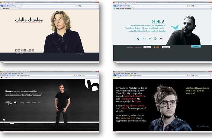
Website design fashion changes continuously. The popularity of the “Web 2.0” design trend peaked around 2007 and has been on the decline since then (Korman-Golander, 2011)
Author/Copyright holder: Gili Korman Golander. Copyright terms and licence: All Rights Reserved. Reproduced with permission. See section "Exceptions" in the copyright terms below.

Figure 19.10: Website design fashion changes continuously. The popularity of the “Web 2.0” design trend peaked around 2007 and has been on the decline since then (Korman-Golander, 2011)

The “One-Page Layout” website design trend became popular in 2008 (Korman-Golander, 2011)

Author/Copyright holder: Gili Korman Golander. Copyright terms and licence: All Rights Reserved. Reproduced with permission. See section "Exceptions" in the copyright terms below.

Figure 19.11: The “One-Page Layout” website design trend became popular in 2008 (Korman-Golander, 2011)

These constraints lead us to the second question. Here, researchers have tried to break down the aesthetic stimuli to sub-dimensions which may be more or less suitable for various contexts or to individual tastes. Such dimensions often emerged out of subjective evaluations of aesthetic stimuli. For example, Park et al. (2004) identified thirteen aesthetic dimensions of web pages. A more parsimonious approach to dimensionality was taken by Lavie and Tractinsky (2004), who identified two perceived dimensions of visual aesthetic, “classical” and “expressive,” in the context of website design. Classical aesthetics corresponds to traditional views of aesthetic - symmetrical, clean and organized design. The expressive dimension relates to the designer’s creativity and originality. One of the important aspects of that study was the demonstration that these aesthetic dimensions are correlated as expected with various interaction outcomes such as perceived usability, pleasing interaction and perception of service quality. Similarly, Moshagen and Thielsch (2010) have suggested four aesthetic dimensions: Simplicity, diversity, colorfulness and craftsmanship. The first two dimensions were highly correlated with Lavie and Tractinsky’s classical and expressive aesthetics, respectively. All four dimensions were associated with appeal. Commensurate with Lavie and Tractinsky’s results, all dimensions were positively, but differentially correlated with various outcome measures.

19.2.2 Perceiving and evaluating visual aesthetics

This category deals with one of the most basic questions in the field of visual aesthetics: How people process and evaluate visual stimuli in aesthetic terms? Detailed accounts of such processes are likely not specific to HCI, and thus have been and probably will be left to researchers in more basic research fields. Findings from such research are presented below to inform the readers about developments in this field. One of the most influential accounts of aesthetic processes was articulated by Norman (2004), who suggested that aesthetic perceptions and evaluations can be explained by considering cognitive and emotional processes at three different levels, which he termed visceral, behavioral and reflective. Visceral reactions to stimuli in the environment (including aesthetic stimuli) have developed to a large extent through evolutionary mechanisms, are performed very rapidly at almost instinct level, with little or no cognitive processing (Ortony et al., 2005). Thus, reactions at this level are quite automatic. The other two levels are characterized by increasingly more elaborated and distinct motivational, emotional and cognitive structures and processes, as well as by slower reactions to stimuli, tendency towards more optimal (as opposed to satisficing) responses and greater individual variability (Ortony et al., 2005).

Studies of aesthetic reaction have been performed on all levels (e.g., Csikszentmihalyi 1991; Leder et al., 2004; Winkielman et al., 2006; Jacobsen, 2010). Low level research is characterized by processes that last a few tenths of a second. At this level, research suggests that the evaluative aesthetic judgment involves a two-step process of an early impression formation and a later evaluative categorization process (Höfel and Jacobsen, 2007). Another finding at this level argues for a positive effect of prototypicality on aesthetic evaluations through the ease (fluency) of information processing (Winkielman et al., 2006). In the field of HCI, several studies have examined aesthetic evaluations after very short exposure to web pages. One of the differences between the basic research and HCI research at this level is that the latter usually involves more ecologically representative (i.e., “real”) stimuli. Lindgaard and colleagues (Lindgaard et al., 2011) suggest that stable aesthetic evaluations can be formed even after being exposed to a design for only 50 milliseconds. While some research questions the robustness of these findings, other research supports the notion that we do not need more than half a second to form first, and stable, aesthetic impressions of the web page (Lindgaard et al., 2006; Tractinsky et al., 2006)

Research on aesthetic processing at higher levels involves more elaborated considerations. In general, Leder et al. (2004) have proposed a model of aesthetic appreciation and aesthetic judgment. The model includes various categories of aesthetic processing, including “automatic” and “deliberate” stages and cognitive and emotional reactions. Although studying higher-level processes of aesthetic evaluations may be of interest to the HCI community, research thus far has concentrated more on the role of aesthetic processing as a mediator between design stimuli and outcome variables such as user engagement and trust (e.g., Hartmann et al., 2008, Lindgaard et al., 2011). Similarly, Thuring and Mahlke (2007) propose a model which integrates the effects of perceived system qualities, including visual aesthetics, on emotions and on appraisal of the system. Research on more long-term, reflective aesthetic evaluation is even scarcer. An example for such research in a general context is Csikszentmihalyi’s (Csikszentmihalyi 1991) study on household objects. Recently studies on aesthetic aspects of interactive systems began to adopt a more time-dependent approach (Schaik and Ling, 2008) and to employ longitudinal methods (e.g., Karapanos et al., 2010).

19.2.3 Outcome Variables

This section deals with what is probably the most practical question in relation to visual aesthetics in HCI: What are the effects of aesthetic perceptions and evaluations on HCI-related variables? Whereas the question of how aesthetic evaluations are formed is relatively general, the consequences of these evaluations can be highly domain-specific. Indeed, research in HCI primarily views the value of visual aesthetics, whether explicitly or implicitly, not as an end in itself but rather as a mediating force between (1) characteristics of the designed system or product, and (2a) other perceived attributes of the product or (2b) behavioral consequences of aesthetic evaluations. Early studies (Kurasu and Kashimura, 1995, Tractinsky, 1997) offered intriguing findings regarding positive association between visual aesthetics and a focal HCI variable - usability. Despite the lack of clear indication about cause and effect, these studies hinted at what subsequent studies explored more directly: that people’s perceptions of a system’s beauty may impact perceptions of other system attributes, such as ease of use (Heijden, 2003; Cyr et al., 2006), overall satisfaction (Tractinsky et al., 2000; Lindgaard and Dudek, 2003; Cyr, 2008), preferences (Schmidt and Liu, 2009; Lee and Koubek, 2010) and even performance (Quinn and Tran, 2010, Sonderegger and Sauer, 2010).

While early research appeared to accept intuitively the premise that aesthetic evaluations are fast enough to precede evaluations of other related variables, later research has demonstrated that this is indeed the case (Lindgaard et al., 2006, Lindgaard et al. 2011; Tractinsky et al., 2006; see also Section 2.2 above). These findings have further motivated the exploration of potential consequences of aesthetic design, a research area which have probably been the busiest of the four categories outlined in our framework. The range of variables covered by these studies includes evaluations of other system attributes, overall evaluations of the system, attitudes towards organizations represented by the system, and satisfaction from the interaction. Studies have also begun exploring the role of affect and emotions in mediating how perceived aesthetics influence those outcomes. Below I survey several studies that examined visual aesthetics’ effects on various variables. The studies represent a partial and probably arbitrary list.

Affect and emotions are oft-cited corollaries of visual aesthetics. The effects of attractive and appealing design on emotions were demonstrated in various studies, including Thuring and Mahlke (2007) in the domain of portable music players, Porat and Tractinsky (2012) and Cai and Xu (2011) in the domain of online shopping. The importance of aesthetics’ effects on emotions is twofold. First, as mentioned earlier, positive affect contributes to positive experience and well-being, and as such is an end in itself. Second, emotions have a role in affecting subsequent information processing, appraisal of other system attributes, and forming attitudes towards the system (Sun and Zhang, 2006).

Trustworthiness was a variable that was studied early as an outcome of visual design in the domain of online banking (Kim and Moon, 1998). In other studies on website design, Cyr et al. (2010) found that web-site color appeal is a significant determinant of website trust, and Lindgaard et al. (2011) also found strong correlations between visual appeal and trust in websites. A related variable to trust- reputation of an academic department - was correlated with aesthetics in a study of websites (Hartmann et al., 2007).

The effects of visual appeal on perceived usability was examined in several studies. Lee and Koubek (2010) found high positive correlations between usability and aesthetics before and after use. Like Tractinsky et al. (2000), they found that the effect of perceived aesthetics on perceived usability was stronger than the effect of objective performance on usability. Similar findings were obtained by Sauer and Sonderegger (2009). In another study, Sonderegger and Sauer (2010) found that participants using cell phones with high visual appeal rated them as more usable than participants using the unappealing devices. In a study of mobile phones, Quinn and Tran (2010) found that attractiveness accounted for as much variance in the SUS scores as effectiveness and efficiency. On the other hand, various studies found weaker or no such associations between visual aesthetics and usability (e.g., Lindgaard and Dudek, 2003, study 2; Hassenzahl, 2004a, Hassenzahl 2010; Thuring and Mahlke, 2007). The mixed findings suggest that the presumed association between perceptions of aesthetics and usability may not be universal. We elaborate on this point when we discuss the next category.

Visual aesthetics are considered a major force influencing perceptions of product character (Hassenzahl, 2003; Krippendorff, 2005) or brand personality (Park et al., 2005). It doesn’t come as a surprise, then, that in a study on product choice, most participants mentioned aesthetic and symbolic roles most often as affecting product choice (Creusen and Schoormans, 2005). Still in online environments, Mandel and Johnson (2002) found hat color and image-based priming influenced online consumers’ product choice. And Schmitt and Liu (2009) found that users are willing to sacrifice loading speed for a more aesthetically appealing webpage.

Following Norman’s (Norman 2004) claim that “attractive things work better,” perhaps the most intriguing question regarding the outcomes of visual aesthetic is whether it influences not only users’ perceptions and evaluations of the system, but also their Performance. Recent studies have started looking for empirical evidence regarding this question (e.g., Moshagen et al., 2009). In a study of 11 data visualization techniques, Cawthon and Moere (2007) found positive relation between aesthetic data visualizations and performance of data retrieval tasks. Sonderegger and Sauer (2010) and Quinn and Tran (2010) similarly found more effective task performance when using attractive versus unattractive mobile phones. Van Schaik and Ling (2009), however, did not find relation between perceptions of classical and expressive aesthetics and performance measures.

Finally, it is important to note that visual aesthetics is considered a prominent antecedent of the concept of “User Experience” (Hassenzahl and Tractinsky, 2006; Sutcliffe, 2009; Law and Schaik, 2010). In a recent survey of the user experience (UX) literature, Bargas-Avila and Hornbaek (2011) found that emotions, enjoyment and aesthetics are the most frequently assessed dimensions of UX. Considering that aesthetics is also an antecedent of the other two dimensions, it appears that its role in influencing the UX is large indeed. To a large extent, it is related to almost all the ideas expressed in this chapter.

19.2.4 Moderating Variables

Linkages between perceived beauty and various outcomes or between design attributes and aesthetic perceptions, even if backed up by solid research evidence, common sense, or philosophical arguments, should not be considered universal or deterministic (Sutcliffe, 2010). First, as mentioned in the previous subsection, against studies that empirically found associations between aesthetic evaluations and evaluations of other perceived system attributes, such as usability, there are studies that found weaker or no such associations, indicating that at least under certain circumstances they do not hold. Second, in social settings, where research on the “beautiful is good” phenomenon accumulated evidence earlier and for much longer than in our field, findings suggest that the associations between attractiveness and perceptions of other human attributes are not unqualified (Eagly et al., 1991). Third, for all we know about socio-technical phenomena, it makes little sense that such deterministic relationships exist in a complex reality that involves individual, social and technological forces. Thus, adopting a contingent approach to the study of visual aesthetics would probably be more productive in describing if and how aesthetic evaluations mediate between various antecedents and consequences.

The challenge is then, to identify and examine how various factors serve to alter or moderate the aesthetic process. In Tractinsky (2006) I have provided a partial list of such potential moderators. The list included the type of system used (a typology that can span multiple dimensions such as consumer product vs. a computer application; small vs. large display; personal vs. public; hedonic vs. utilitarian, etc.), the use context (e.g., work vs. entertainment), cultural differences (national, sub-cultural, idiological), and so on. Individual differences constitute an interesting group of potential moderators, because people vary greatly in their sensitivity to aesthetic stimuli and in their aesthetic preferences (e.g., Bloch et al., 2003; Hoyer and Stokburger-Sauer, 2011). Jacobsen (2004) study found consistent intra-individual aesthetic judgments but strong inter-individual differences in beauty judgments. In addition, the group model of aesthetic judgment misrepresented about half of the study’s participants. Pandir and Knight (2006) also found disagreement on aesthetic preferences in a study of different websites.

Contextual factors, such as domain and type of task are mentioned by Norman (2004) as important considerations for the type of aesthetic design required for users’ performance and satisfaction. He argues that in certain domains (e.g., control rooms) attractive design may not necessarily be desired. Ben-Bassat et al (2006) found that people weighed more usability over aesthetic factors when faced with a performance-oriented task, and Van Schaik and Ling (2008) demonstrated that attractiveness ratings were affected by providing context for the evaluation task. In online shopping environments Cai and Xu (2011) found that the effect of expressive aesthetics on shopping enjoyment was stronger when shopping for hedonic products compared to utilitarian products.

Individual factors may also affect how anteceding variables (e.g., objective design attributes) are perceived differently by people with different aesthetic tastes (Hoyer and Stokburger-Sauer, 2011). In the domain of web-site design, Park et al., (2004) found that variability in user tastes is associated with aesthetic fidelity (i.e., the degree to which users felt the target impressions intended by designers). Individual differences were also found to affect the relative importance of aesthetics in people’s preference of web-sites (Hartmann et al., 2008).

Attributes of the choice process were found to moderate the relation between aesthetic evaluation and product choice, especially when users are required to trade-off aesthetic for other system qualities. For example, Ben-Bassat et al (2006) found that system preference or choice were affected by aesthetics under ordinary conditions (e.g., questionnaires) but not when the participants had to bid for a system with which they will perform competitive tasks. Diefenbach and Hassenzahl (2007) showed that under a beauty-usability trade-off, although people may prefer more beautiful products to more usable ones, they choose the more usable product if they cannot justify choosing the more beautiful one.

Cross cultural studies have shown that national and professional cultures affect various relationships between aesthetic evaluations, their antecedents and their consequences. Several studies have demonstrated this moderating effect in the context of websites. For example, Cyr (2008) found effects of visual design on trust in China but not in Canada or Germany, and Cyr et al (2010) found different reactions to web-site color appeal in Canada, Germany and Japan. Hartmann et al (2007) found that the aesthetic evaluations and the importance of aesthetics are contingent on users’ background (design vs. technical; Western vs. Asian).

The contingent nature of the aesthetic process is exemplified by Moshagen et al’s finding that high visual aesthetics improved performance under poor usability but had no effect under high usability. Consequently, they quoted Liu’s (Liu 2003) principle that “. . . ergo-aesthetic design does not imply that workplace or product designers should only use designs that are pleasing or attractive. On the contrary, ergo-aesthetic design advocates the careful and proper selection of aesthetic levels of design to fit the needs and characteristics of the intended use” (p. 1298).

19.3 Future Directions

The review above presented the results of empirical studies that examined antecedents and effects of visual aesthetics in HCI and various contingencies that moderate the relationship along this aesthetic process. In this section I would like to discuss several methodological issues and suggestions for future research in this area.

19.3.1 Methodological Issues

The review of research in the field uncovered several methodological issues that may also be involved in masking effects along the aesthetic process. One such aspect concerns evaluations that are more nuanced than overall aesthetic evaluations, which are quite common in the studies surveyed in this chapter. Studies that look for evaluations of aesthetic sub dimensions (e.g., Kim et al., 2003; Lavie and Tractinsky, 2004; Moshagen and Thielsch, 2010) can potentially yield richer accounts of the influence of design on aesthetic processes and on subsequent evaluations of the interactive system, attitudes towards it and interactions with it.

A related issue deals with the measurement of visual aesthetics evaluations or judgment. In the field of HCI, aesthetic evaluations were measured by a single item and by multiple-item scales. For example, Kurosu and Kashimura (1995) Tractinsky (1997), Schenkman and Jonsson (2000), Hassenzahl and Monk (2010), and Sonderegger and Sauer (2010) have used a single item asking about the beauty of the various applications and interactive products. Others, such as Schenkman and Jonsson (2000), Van der Heijden (2003) ,Moshagen et al., (2009) employed multiple-item scales to measure attractiveness. While multiple item scales are generally regarded as more reliable measures, single item scales have some practical advantages. In general, the main advantage if that single items make questionnaires shorter, reducing participants’ fatigue and tendency to skip some of the items. In particular, the use of single items in the study of aesthetics allows quicker responses to stimuli in studies that focus on swift aesthetic responses (Lindgaard et al., 2006; Lindgaard et al., 2011; Tractinsky et al., 2006). The tension between scientific directives and practical constraints may not be as severe as it first appears. Studies suggest that when dealing with a concrete object (e.g., the application or product to be evaluated) and a concrete attribute of the object then single item measures are as valid as multiple-item scales (Gardner et al., 1998; Bergkvist and Rossiter, 2007). While the scientific community may have a hard time defining what is meant by the concepts of “aesthetics” or “beauty” - perhaps due to the multiple disciplines that deal with these concepts and which attach different meanings to them, my experience is that ordinary people’s intuitive interpretation of the terms correspond closely to the dictionary definition provided above, which guides research on visual beauty in HCI. This point may be worth further research for corroboration, but if correct, future scientific and practical studies would be able to safely use single item measures of visual aesthetics.

Research on visual aesthetics in HCI has employed a mix of experimental and correlational designs. Because some of the most interesting aspects of visual aesthetics research involve questions of cause and effect, experimental studies would appear to provide the most conclusive evidence. It is straightforward to study basic and relatively simple design effects (e.g., symmetry using basic patterns) on aesthetic perceptions using experimental designs (Bauerly and Liu, 2006; Winkielman et al., 2006). However, it becomes increasingly more difficult if we want to study the effects of aesthetic design using more complex and ecologically valid stimuli, like those used in correlational studies (e.g., Lindgaard et al., 2006; Hassenzahl and Monk, 2010). Thus, employing experimental designs using elaborated and realistic stimuli is a major challenge. Ideally, to test causal effects studies would manipulate design attributes independently of each other to separate aesthetic perceptions from perceptions of other system attributes. In practice, however, this is very difficult to accomplish due to the a priori association of these attributes (Moshagen et al., 2009). One frequent consequence of attempting to achieve this independent aesthetic manipulation is that it creates a relatively small variance in the manipulated stimuli (otherwise, strong aesthetic manipulations might also cause differences in other experimental factors). The danger is that small variance and the lack of strong aesthetic condition would in turn weaken the effects of visual aesthetics. Another challenge in manipulating or selecting aesthetic stimuli in experimental designs relate to whether the degree of aesthetic stimuli is defined “on average” (e.g., by a pilot study or manipulation check) or is defined separately for each individually (e.g., in a procedure described by Tractinsky et al., 2000). The advantage of the latter approach is improved probability that individuals who are assigned to various aesthetic groups in the experiment indeed perceived the stimulus in a way that corresponds to their group (as opposed to a stimulus that may belong to that group on average, but which doesn’t match the participant’s aesthetic taste). This would increase the effect size of the aesthetic manipulation. On the other hand, such a procedure usually requires pre-experimental exposure to a set of potential aesthetic stimuli. This process may later interact with the experiment (e.g., by creating expectations towards the experiment), and may create undesirable noise.

19.3.2 Future Research

This chapter has reaffirmed that visual aesthetics is associated with a range of HCI-related variables. However, it is also apparent that our understanding of the contingent nature of the processes that surround visual aesthetics is still limited. Thus, further exploring these contingencies (i.e., the conditions under which perceptions of visual aesthetics or its effects change due to contextual factors) appears to be more beneficial to the advancement of knowledge in the field than attempting to confirm direct relationships along the visual aesthetics process chain.

Most studies to date have concentrated on people’s first reactions to visual aesthetics or to short term impact of aesthetic design. Studies are also characterized by providing participants a limited set of aesthetic stimuli to choose from. The problem with such sets is that they do not necessarily include designs that are viewed by the participants as beautiful. In addition, such studies rarely represent reflective aesthetic value to individual participants. Such stimuli may be adequate for creating short term impressions, but they are hardly adequate for assessing contemplative evaluations and longer term evolvement of aesthetic processes. Thus, to expand the picture of visual aesthetics in HCI, future research should emphasize more reflective evaluation and contemplation of designed products and environments.

Another research topic that has yet to receive attention is the (dis)connect between designers and users. In other design disciplines, studies have found significant differences in aesthetic evaluation between laypeople and designers (e.g., Nasar, 1997 and Gifford et al, 2000, in the field of architecture). In HCI such differences were found by Korman-Golander (2011) between designers and software engineering students in assessments of web-site design trends. Similarly, Inbar et al. (2007) and Bateman et al. (2010) found that the minimalist design recommendations for charts made by Tufte’s (1983) influential critique of “chartjunk” practices do not resonate with people’s actual preference of chart types. To date, I am aware of only a few studies (e.g., Park et al. (2004) and Bateman et al, 2010) that have tried to tease out the sources of those differences, and to offer methods that would help bridge the gap between designers and other members of the development team and between the development team and intended users.

In his seminal work on the extended self, Belk (1988) listed various product categories in which there is significant image congruity between a brand or a product category and self images of owners. The list does not include IT products, but there are good reasons to expect that such congruity holds, for example, in the choice of personal computing, smart phones, media players, software, etc. We may then explore what role visual aesthetics plays in motivating people to choose those interactive media.

In discussing our early work on the relationships between aesthetic and perceived attributes of the system we called on researchers “to shed more light on the cognitive and/or affective processes that lead users to associate interface aesthetics with other system attributes” (Tractinsky et al., 2000, p. 140). Several studies have recently taken on this challenge. For example, Hassenzahl and Monk (2010) suggest that perceived aesthetics affects users’ evaluation of the system’s goodness, which in turn influences evaluations of the system’s usability. Similarly, Lindgaard et al. (2011) suggest that the initial attraction generated by a system’s aesthetics forms “a general attitude” of aesthetic, which is later refined through further use of the system and reflection based on high level emotional and cognitive processing. However, it seems that there is ample room for continuous research on the mechanisms that underlie these relationships. In particular, studies about the interplay of emotional and cognitive factors (Sun and Zhang, 2006; Thuring and Mahlke, 2007) at the three levels of processing (Norman, 2004) are sorely needed.

Studies of visual aesthetics in HCI have for the most part concentrated on the relatively stable properties of the user interface design. Thus, studies have used website screenshots, interactive products’ hardware design, or general aesthetic features of systems. Little attention was paid to dynamic aspects of visual aesthetics. With the increased embedding of dynamic visualizations , video clips and various animations in interactive systems we need to have a better grasp of their aesthetic qualities (Chen, 2005). Some initial steps in this direction can be found in a study of perceived aesthetic dimensions of animations, done in the context of in-car presentation of eco-driving information (Tractinsky et al., 2011b)

Finally, much of the variability in people’s assessment of visual design and the effects of visual design can be attributed to individual and cultural factors. These factors may include differences in sensitivity to visual aesthetics, different weighing of visual aesthetics when appraising systems and products, and different notions of what is considered beautiful. Such studies could explore why and how people personalize interactive systems and products (e.g., Tractinsky and Lavie, 2002, Tractinsky and Zmiri, 2006); why some people prefer ornamented charts or web pages while others prefer minimalist styles (e.g., Inbar et al, 2007; Bateman et al., 2010); why reactions to website color treatments differ among different cultures (Cyr et al., 2010); and whether people belonging to different trend and fashion adoption groups prefer different website designs (Korman-Golander 2011).

19.4 Conclusion

Interest in visual aesthetics in HCI has grown considerably over the last 15 years. From a short conference paper that reported correlations between perceived aesthetics and apparent usability (Korosu and Kashimura, 1995) to a rich field of inquiry. It is possible that the interest in the field was motivated by provocative titles such as “What is beautiful is usable” (Tractinsky et al., 2000) and “Attractive things work better” (Norman, 2004). It is more likely, however, that it corresponded to technological and societal changes that have swept our lives over that time and reshaped the field of human-computer interaction.

19.5 References

Angeli, Antonella De, Sutcliffe, Alistair G. and Hartmann, Jan (2006): Interaction, usability and aesthetics: what influences users' preferences?. In: Proceedings of DIS06: Designing Interactive Systems: Processes, Practices, Methods, & Techniques 2006. pp. 271-280

Arnheim, Rudolf (1966): Order and complexity in landscape design. In: Arnheim, Rudolf (ed.). "Toward a Psychology of Art". University of California Press

Bargas-Avila, Javier A. and Hornbæk, Kasper (2011): Old wine in new bottles or novel challenges: a critical analysis of empirical studies of user experience. In: Proceedings of ACM CHI 2011 Conference on Human Factors in Computing Systems 2011. pp. 2689-2698

Bateman, Scott, Mandryk, Regan L., Gutwin, Carl, Genest, Aaron, McDine, David and Brooks, Christopher (2010): Useful junk?: the effects of visual embellishment on comprehension and memorability of charts. In: Proceedings of ACM CHI 2010 Conference on Human Factors in Computing Systems 2010. pp. 2573-2582

Bauerly, Michael and Liu, Yili (2006): Computational modeling and experimental investigation of effects of compositional elements on interface and design aesthetics. In International Journal of Human-Computer Studies, 64 (8) pp. 670-682

Belk, Russell W. (1988): Possessions and the Extended Self. In Journal of Consumer Research, 15 (2) pp. 139-168

Ben-Bassat, Tamar, Meyer, Joachim and Tractinsky, Noam (2006): Economic and subjective measures of the perceived value of aesthetics and usability. In ACM Transactions on Computer-Human Interaction, 13 (2) pp. 210-234

Bergkvist, Lars and Rossiter, John R (2007): The Predictive Validity of Multiple-Item Versus Single-Item Measures of the Same Constructs. In Journal of Marketing Research, 44 (2) pp. 175-184

Berlyne, D. E. (1971): Aesthetics and psychobiology. Appleton-Century-Crofts

Bloch, Peter H. (2011): Product Design and Marketing: Reflections After Fifteen Years. In Design, 28 (3) pp. 378-380

Bloch, Peter H., Brunel, F. F. and Arnold, T. J. (2003): Individual Differences in the Centrality of Visual Product Aesthetics: Concept and Measurement. In Journal of Consumer Research, 29 (4) pp. 551-565

Brooks, Fred (1975): The Mythical Man-Month: Essays on Software Engineering. Addison-Wesley Publishing

Cai, Shun and Xu, Yunjie (Calvin) (2011): Designing Not Just for Pleasure: Effects of Web Site Aesthetics on Consumer Shopping Value. In International Journal of Electronic Commerce, 15 (4) p. 159–187

Card, Stuart K., Moran, Thomas P. and Newell, Allen (1983): The Psychology of Human-Computer Interaction.Hillsdale, NJ, Lawrence Erlbaum Associates

Carlson, Allen (2000): Aesthetics and the Environment: The Appreciation of Nature, Art and Architecture.Routledge

Cawthon, Nick and Moere, Andrew Vande (2007): The Effect of Aesthetic on the Usability of Data Visualization. In:Proceedings of the 11th International Conference Information Visualization 2007. pp. 637-648

Chen, Chaomei (2005): Top 10 unsolved information visualization problems. In IEEE Computer Graphics and Applications, 25 (4) pp. 12-16

Creusen, Marielle E. H. and Schoormans, Jan P. L. (2005): The Different Roles of Product Appearance in Consumer Choice. In Journal of Product Innovation Management, 22 (1) pp. 63-81

Csikszentmihalyi, Mihaly (1991): Design and Order in Everyday Life. In Design Issues, 8 (1) pp. 26-34

Cyr, Dianne (2008): Modeling Web Site Design Across Cultures: Relationships to Trust, Satisfaction, and E-Loyalty. In Journal of Management Information Systems, 24 (4) pp. 47-72

Cyr, Dianne, Head, Milena M. and Ivanov, Alex (2006): Design aesthetics leading to m-loyalty in mobile commerce. In Information & Management, 43 (8) pp. 950-963

Cyr, Dianne, Kindra, Gurprit S. and Dash, Satyabhusan (2008): Web site design, trust, satisfaction and e-loyalty: the Indian experience. In Online Information Review, 32 (6) pp. 773-790

Cyr, Dianne, Head, Milena and Larios, Hector (2010): Colour appeal in website design within and across cultures: A multi-method evaluation. In International Journal of Human-Computer Studies, 68 (1) pp. 1-21

Datta, Ritendra, Li, Jia and Wang, J. Z. (2008): Algorithmic inferencing of aesthetics and emotion in natural images: An exposition. In: Image Processing, 2008. ICIP 2008. 15th IEEE International Conference on 2008. pp. 105-108

Datta, Ritendra, Joshi, D., Li, J. and Wang, James Z. (2006): Studying aesthetics in photographic images using a computational approach. In Distribution, 3953 pp. 288-301

Davis, Fred D. (1989): Perceived Usefulness, Perceived Ease of Use, and User Acceptance of Information Technology. In MIS Quarterly, 13 (3) pp. 319-340

Dion, Karen, Berscheid, Ellen and Walster, Elaine (1972): What is beautiful is good. In Journal of Personality and Social Psychology, 24 (3) pp. 285-290

Dutton, Denis (2008): The Art Instinct: Beauty, Pleasure, and Human Evolution. Bloomsbury Press

Eagly, Alice H., Ashmore, Richard D., Makhijani, Mona G. and Longo, Laura C. (1991): What is beautiful is good, but..: A meta-analytic review of research on the physical attractiveness stereotype. In Psychological Bulletin, 110 (1) pp. 109-128

Fishwick, Paul A. (ed.) (2006): Aesthetic Computing. The MIT Press

Forlizzi, Jodi (2008): The product ecology: Understanding social product use and supporting design culture. InInternational Journal of Design, 2 (1) pp. 11-20

Gardner, D. G., Cummings, L. L., Dunham, R. B. and Pierce, J. L. (1998): Single-Item Versus Multiple-Item Measurement Scales: An Empirical Comparison. In Educational and Psychological Measurement, 58 (6) pp. 898-915

Gifford, Robert, Hine, Donald W, Muller-Clemm, Werner, Reynolds, D'arcy J. and Shaw, Kelly T. (2000): Decoding Modern Architecture: A Lens Model Approach for Understanding the Aesthetic Differences of Architects and Laypersons. In Environment And Behavior, 32 (2) pp. 163-187

Gladwell, Malcolm (2000): The Tipping Point: How Little Things Can Make a Big Difference. Back Bay Books

Hamermesh, Daniel S. and Biddle, Jeff E. (1994): Beauty and the Labor Market. In American Economic Review, 84 (5) pp. 1174-1194

Hamermesh, Daniel S. and Parker, Amy M. (2003): Beauty in the Classroom: Professors' Pulchritude and Putative Pedagogical Productivity. In National Bureau of Economic Research Working Paper Series, 9853 (4) pp. 369-376

Hartmann, Jan, Sutcliffe, Alistair G. and Angeli, Antonella De (2008): Towards a theory of user judgment of aesthetics and user interface quality. In ACM Transactions on Computer-Human Interaction, 15 (4) p. 15

Hartmann, Jan, Sutcliffe, Alistair G. and Angeli, Antonella De (2007): Investigating attractiveness in web user interfaces. In: Proceedings of ACM CHI 2007 Conference on Human Factors in Computing Systems 2007. pp. 387-396

Hassenzahl, Marc (2007): Aesthetics in interactive products: Correlates and consequences of beauty. In: Schifferstein, Hendrik N. J. and Hekkert, Paul (eds.). "Product Experience". Elsevier Science

Hassenzahl, Marc (2003): The Thing and I: Understanding the Relationship Between User and Product. In: Blythe, Mark.A., Overbeeke, Kees, Monk, Andrew F. and Wright, Peter C. (eds.). "Funology: From Usability to Enjoyment". Springerpp. 31-42

Hassenzahl, Marc (2004b): Beautiful Objects as an Extension of the Self: A Reply. In Human-Computer Interaction, 19 (4) pp. 377-386

Hassenzahl, Marc (2004a): The Interplay of Beauty, Goodness, and Usability in Interactive Products. In Human-Computer Interaction, 19 (4) pp. 319-349

Hassenzahl, Marc and Monk, Andrew (2010): The Inference of Perceived Usability From Beauty. In Human Computer Interaction, 25 (3) pp. 235-260

Hassenzahl, Marc and Tractinsky, Noam (2006): User experience - a research agenda. In Behaviour and Information Technology, 25 (2) pp. 91-97

Heijden, Hans van der (2003): Factors influencing the usage of websites: the case of a generic portal in The Netherlands. In Information and Management, 40 (6) pp. 541-549

Hekkert, Paul, Snelders, Dirk and Wieringen, Piet C. W. (2010): "Most advanced, yet acceptable": Typicality and novelty as joint predictors of aesthetic preference in industrial design. In British Journal of Psychology, 94 (1) pp. 111-124

Hooper, Kristina (1986): Architectural design: an analogy. In: Norman, Donald A. and Draper, Stephen W. (eds.). "User Centered System Design: New Perspectives on Human-Computer Interaction". Hillsdale, NJ: Lawrence Erlbaum Associates

Hoyer, Wayne and Stokburger-Sauer, Nicola (2011): The role of aesthetic taste in consumer behavior. In Journal of the Academy of Marketing Science,

Höfela, Lea and Jacobsena, Thomas (2007): Electrophysiological Indices of Processing Symmetry and Aesthetics: A Result of Judgment Categorization or Judgment Report?. In Journal of Psychophysiology, 21 (1) pp. 9-21

Inbar, Ohad, Tractinsky, Noam and Meyer, Joachim (2007): Minimalism in information visualization: attitudes towards maximizing the data-ink ratio. In: Brinkman, Willem-Paul, Ham, Dong-Han and Wong, B. L. William (eds.) ECCE 2007 - Proceedings of the 14th European Conference on Cognitive Ergonomics August 28-31, 2007, London, UK. pp. 185-188

Jacobsen, Thomas (2004): Individual and group modelling of aesthetic judgment strategies. In British journal of psychology London England 1953, 95 (0) pp. 41-56

Jacobsen, Thomas (2010): Beauty and the brain: culture, history and individual differences in aesthetic appreciation. In Journal of Anatomy, 216 (2) pp. 184-191

Johnson, Paul-Alan (1994): The Theory of Architecture: Concepts, Themes & Practices. Van Nostrand Reinhold

Jones, Edward Ellsworth (1990): Interpersonal Perception. W H Freeman and Co (Sd)

Jr., Frank Gibney and Luscombe, Belinda (2008). The Redesigning Of America. Retrieved 1 December 2011 from Times.com: http://www.time.com/time/magazine/article/0,9171,9...

Karapanos, Evangelos, Zimmerman, John, Forlizzi, Jodi and Martens, Jean-Bernard (2010): Measuring the dynamics of remembered experience over time. In Interacting with Computers, 22 (5) pp. 328-335

Kim, Jinwoo and Moon, Jae Yun (1998): Designing Towards Emotional Usability in Customer Interfaces -- Trustworthiness of Cyber-Banking System Interfaces. In Interacting with Computers, 10 (1) pp. 1-29

Kim, Jinwoo, Lee, Jungwon, Han, Kwanghee and Lee, Moonkyu (2002): Businesses as Buildings: Metrics for the Architectural Quality of Internet Businesses. In Information Systems Research, 13 (3) pp. 239-254

Kim, Jinwoo, Lee, Jooeun and Choi, Dongseong (2003): Designing emotionally evocative homepages: an empirical study of the quantitative relations between design factors and emotional dimensions. In International Journal of Human-Computer Studies, 59 (6) pp. 899-940

Kleine, Susan Schultz, Kleine, Robert E. and Allen, Chris T. (1995): How Is a Possession "Me" or "Not Me"? Characterizing Types and an Antecedent of Material Possession Attachment. In Journal of Consumer Research, 22 (3) pp. 327-43

Korman-Golander, Gili (2011). Aspects of Fashion/Trends in Web Design, M.Sc. Thesis. Ben-Gurion Univerity of the Negev http://aranne5.lib.ad.bgu.ac.il/others/KormanGolanderGili.pdf

Krippendorff, Klaus (2005): The Semantic Turn: A New Foundation for Design. CRC Press

Kruft, Hanno-Walter (1994): A History of Architectural Theory: From Vitruvius to the Present. Zwemmer

Kumara, Minu and Gargb, Nitika (2010): Aesthetic principles and cognitive emotion appraisals: How much of the beauty lies in the eye of the beholder?. In Journal of Consumer Psychology, 20 (4) pp. 485-494

Kurosu, Masaaki and Kashimura, Kaori (1995): Apparent usability vs. inherent usability: experimental analysis on the determinants of the apparent usability. In: CHI 95 Conference Companion 1995 1995. pp. 292-293

Lavie, Talia and Tractinsky, Noam (2004): Assessing dimensions of perceived visual aesthetics of web sites. InInternational Journal of Human-Computer Studies, 60 (3) pp. 269-298

Law, Effie L.-C. and Schaik, Paul Van (2010): Modelling user experience -- An agenda for research and practice. InInteracting with Computers, 22 (5) pp. 313-322

Leder, Helmut, Belke, Benno, Oeberst, Andries and Augustin, Dorothee (2004): A model of aesthetic appreciation and aesthetic judgments. In British Journal of Psychology, 95 (0) pp. 489-508

Lee, Allen S. (1991): Architecture as a reference discipline for MIS. In: Nissen, H. E., Klein, H. K. and Hirschheim, R. (eds.). "Information Systems Research: Contemporary Approaches & Emergent Traditions". North Hollandp. 573–592.

Lee, Sangwon and Koubek, Richard J. (2010): Understanding user preferences based on usability and aesthetics before and after actual use. In Interacting with Computers, 22 (6) pp. 530-543

Lindgaard, Gitte and Dudek, Cathy (2003): What is this evasive beast we call user satisfaction?. In Interacting with Computers, 15 (3) pp. 429-452

Lindgaard, Gitte, Dudek, Cathy, Sen, Devjani, Sumegi, Livia and Noonan, Patrick (2011): An exploration of relations between visual appeal, trustworthiness and perceived usability of homepages. In ACM Transactions on Computer-Human Interaction (TOCHI), 18 (1)

Lindgaard, Gitte, Fernandes, Gary, Dudek, Cathy and Brown, J. (2006): Attention web designers: You have 50 milliseconds to make a good first impression. In Behaviour and Information Technology, 25 (2) pp. 115-126

Liu, Yili (2003): Engineering aesthetics and aesthetic ergonomics: theoretical foundations and a dual-process research methodology. In Ergonomics, 46 (13) pp. 1273-1292

Luchs, Michael and Swan, K. Scott (2011): Perspective: The Emergence of Product Design as a Field of Marketing Inquiry. In Journal of Product Innovation Management, 28 (3) pp. 327-345

Lyubomirsky, Sonja, King, Laura and Diener, Ed (2005): The benefits of frequent positive affect: does happiness lead to success?. In Psychological Bulletin, 131 (6)

Mandel, Naomi and Johnson, E. J. (2002): When Web Pages Influence Choice: Effects of Visual Primes on Experts and Novices. In Journal of Consumer Research, 29 (2) pp. 235-245

Martindale, Colin, Moore, Kathleen and Borkum, Jonathan (1990): Aesthetic Preference: Anomalous Findings for Berlyne's Psychobiological Theory. In The American Journal of Psychology, 103 (1)

Maslow, Abraham H. (1954): Motivation and Personality. HarperCollins Publishers

Maslow, Abraham Harold (1987): Motivation and Personality. HarperCollins Publishers

Moshagen, Morten and Thielsch, Meinald T. (2010): Facets of visual aesthetics. In International Journal of Human-Computer Studies, 68 (10) pp. 689-709

Moshagen, Morten, Musch, Jochen and Göritz, Anja S (2009): A blessing, not a curse: experimental evidence for beneficial effects of visual aesthetics on performance. In Ergonomics, 52 (10) pp. 1311-1320

Nake, Frieder (2005): Computer art: a personal recollection. In Proceedings of the 5th conference on Creativity cognition,

Nasar, Jack L. (1997): The Evaluative Image of the City. Sage Publications, Inc

Ngo, David Chek Ling, Teo, Lian Seng and Byrne, John G. (2003): Modelling interface aesthetics. In Information Sciences, 152 pp. 25-46

Nielsen, Jakob (1993): Usability Engineering. Boston, MA, Morgan Kaufmann

Norman, Donald A. (1988): The Psychology of Everyday Things. New York, Basic Books

Norman, Donald A. (1998): The Invisible Computer: Why Good Products Can Fail, the Personal Computer Is So Complex and Information Appliances Are the Solution. MIT Press

Norman, Donald A. (2004): Emotional Design: Why We Love (Or Hate) Everyday Things. Basic Books

Ortony, Andrew, Norman, Donald A. and Revelle, William (2005): The role of affect and proto-affect in effective functioning. In: Fellous, Jean-Marc and Arbib, Michael A. (eds.). "Who Needs Emotions?: The Brain Meets the Robot (Series in Affective Science)". Oxford University Press

Pandir, Muzeyyen and Knight, John (2006): Homepage aesthetics: The search for preference factors and the challenges of subjectivity. In Interacting with Computers, 18 (6) pp. 1351-1370

Park, Su-e, Choi, Dongsung and Kim, Jinwoo (2004): Critical factors for the aesthetic fidelity of web pages: empirical studies with professional web designers and users. In Interacting with Computers, 16 (2) pp. 351-37

Park, Su-e, Choi, Dongsung and Kim, Jinwoo (2005): Visualizing E-Brand Personality: Exploratory Studies on Visual Attributes and E-Brand Personalities in Korea. In International Journal of Human-Computer Interaction, 19 (1) pp. 7-34

Parush, Avraham, Nadir, Ronen and Shtub, Avraham (1998): Evaluating the Layout of Graphical User Interface Screens: Validation of a Numerical Computerized Model. In International Journal of Human-Computer Interaction, 10 (4) pp. 343-360

Porteous, J. Douglas (1996): Environmental Aesthetics: Ideas, Politics and Planning. Routledge

Postrel, Virginia (2002): The Substance of Style: How the Rise of Aesthetic Value Is Remaking Commerce, Culture, and Consciousness. HarperCollins

Postrel, Virginia (2008). The Art of Healing - Magazine - The Atlantic. Retrieved 1 January 2011 from

Postrel, Virginia (2003): The Substance of Style: How the Rise of Aesthetic Value Is Remaking Commerce, Culture, and Consciousness. HarperCollins

Quinn, Jeffrey M. and Tran, Tuan Q. (2010): Attractive phones don't have to work better: independent effects of attractiveness, effectiveness, and efficiency on perceived usability. In: Proceedings of ACM CHI 2010 Conference on Human Factors in Computing Systems 2010. pp. 353-362

Rafaeli, Anat and Vilnai-Yavetz, Iris (2004): Emotion as a Connection of Physical Artifacts and Organizations. InOrganization Science, 15 (6) pp. 671-686

Ravina, Enrichetta (2008). Love & Loans: The Effect of Beauty and Personal Characteristics in Credit Markets. Columbia Business School

Reber, Rolf, Schwarz, Norbert and Winkielman, Piotr (2004): Processing fluency and aesthetic pleasure: is beauty in the perceiver's processing experience?. In Personality and social psychology review an official journal of the Society for Personality and Social Psychology Inc, 8 (4) pp. 364-382

Reimann, M., Zaichkowsky, J., Neuhaus, C., Bender, T. and Weber, B. (2010): Aesthetic package design: A behavioral, neural, and psychological investigation. In Journal of Consumer Psychology, 20 (4) pp. 431-441

Rhodes, Gillian (2006): The evolutionary psychology of facial beauty. In Annual Review of Psychology, 57 (1) pp. 199-226

Santayana, George (1955): The Sense of Beauty: Being the Outline of Aesthetic Theory. Dover Publications

Sauer, Juergen and Sonderegger, Andreas (2009): The influence of prototype fidelity and aesthetics of design in usability tests: effects on user behaviour, subjective evaluation and emotion. In Applied Ergonomics, 40 (4)

Schaik, Paul Van and Ling, Jonathan (2009): The role of context in perceptions of the aesthetics of web pages over time. In International Journal of Human-Computer Studies, 67 (1) pp. 79-89

Schaik, Paul Van and Ling, Jonathan (2011): An integrated model of interaction experience for information retrieval in a Web-based encyclopaedia. In Interacting with Computers, 23 (1) pp. 18-32

Schenkman, Bo N. and Jonsson, Fredrik U. (2000): Aesthetics and preferences of web pages. In Behaviour & Information Technology, 19 (5) pp. 367-377

Seligman, Martin E. P. and Csikszentmihalyi, Mihaly (2000): Positive Psychology: An Introduction. [Article]. InAmerican Psychologist, 55 (1) pp. 5-14

Shaked, Gilboa, and Rafael, Anat (2003): Store environment, emotions and approach behaviour: applying environmental aesthetics to retailing. In The International Review of Retail, Distribution and Consumer Research, 13 (2) pp. 195-211

Simonson, Alex and Schmitt, Bernd H. (1997): Marketing Aesthetics: The Strategic Management of Brands, Identity and Image. Free Press

Sonderegger, Andreas and Sauer, Juergen (2010): The influence of design aesthetics in usability testing: effects on user performance and perceived usability. In Applied Ergonomics, 41 (3) pp. 403-410

Sun, Heshan and Zhang, Ping (2006): The role of affect in Information systems research. In: Zhang, Ping andGalletta, Dennis (eds.). "Human-Computer Interaction and Management Information Systems: Foundations (Advances in Management Information Systems)". M.E. Sharpe

Sutcliffe, Aiistair (2009): Designing for User Engagement: Aesthetic and Attractive User Interfaces. In Synthesis Lectures on HumanCentered Informatics, 2 (1) pp. 1-55

Sutcliffe, Alistair G. (2002): Assessing the Reliability of Heuristic Evaluation for Website Attractiveness and Usability. In: HICSS 2002 2002. p. 137

The Chromium Blog (2009). WebP, a new image format for the Web. Retrieved 1 December 2011 from The Chromium Blog: http://blog.chromium.org/2010/09/webp-new-image-fo...

Thuring, Manfred and Mahlke, Sascha (2007): Usability, aesthetics and emotions in human-technology interaction. In International Journal of Psychology, 42 (4) pp. 253-264

Townsend, Claudia and Shu, Suzanne B. (2010): When and how aesthetics influences financial decisions. In Journal of Consumer Psychology, 20 (4) pp. 452-458

Tractinsky, Noam (1997): Aesthetics and apparent usability: empirically assessing cultural and methodological issues. In: Proceedings of the SIGCHI conference on Human factors in computing systems 1997. pp. 115-122

Tractinsky, Noam (2004): Toward the study of aesthetics in information technology. In: Proceedings of the 25th International Conference on Information Systems December 12-15, 2004, Washington, DC, USA. pp. 771-780

Tractinsky, Noam (2006): Aesthetics in Information Technology: Motivation and Future Research Directions. In:Zhang, Ping and Galletta, Dennis (eds.). "Human-Computer Interaction and Management Information Systems: Foundations (Advances in Management Information Systems)". M.E. Sharpe

Tractinsky, Noam and Hassenzahl, Marc (2005): Arguing for Aesthetics in Human-Computer Interaction. In i-com Zeitschrift für interaktive und kooperative Medien, 4 (3) p. 66–68

Tractinsky, Noam and Meyer, Joachim (1999): Junkchart or Goldgraph? Effects of Presentation Objectives and Content Desirability on Information Presentation. In MIS Quarterly, 23 pp. 397-420

Tractinsky, Noam and Zmiri, Dror (2006): Exploring Attributes of Skins as Potential Antecedents of Emotion in HCI. In: Fishwick, Paul A. (ed.). "Aesthetic Computing". The MIT Press

Tractinsky, Noam, Katz, A. S. and Ikar, D. (2000): What is Beautiful is Usable. In Interacting with Computers, 13 (2) pp. 127-145

Tractinsky, Noam, Inbar, Ohad, Tsimhoni, Omer and Seder, Thomas (2011): Slow down, you move too fast: Examining animation aesthetics to promote eco-driving. In: 3rd International Conference on Automotive User Interfaces and Interactive Vehicular Applications AutomotiveUI 2011 November 30th-December 2nd, 2011, Salzburg, Austria.

Tractinsky, Noam, Cokhavi, Avivit, Kirschenbaum, Moti and Sharfi, Tal (2006): Evaluating the consistency of immediate aesthetic perceptions of web pages. In International Journal of Human-Computer Studies, 64 (11) pp. 1071-1083

Tractinsky, Noam, Abdu, Rotem, Forlizzi, Jodi and Seder, Thomas (2011a): Towards personalisation of the driver environment: investigating responses to instrument cluster design. In International Journal of Vehicle Design, 55 (2) pp. 208-236

Tufte, Edward R. (1992): The Visual Display of Quantitative Information. Graphics Press

Turkle, Sherry (2005): The Second Self: Computers and the Human Spirit - Twentieth Anniversary Edition. The MIT Press

Udsen, Lars Erik and Jørgensen, Anker Helms (2005): The aesthetic turn: unravelling recent aesthetic approaches to human-computer interaction. In Digital Creativity, 16 (4) pp. 205-216

Ulrich, R. S. (1984): View through a window may influence recovery from surgery. In Science, 224 (4647) pp. 420-421

Venkatesh, Alladi and Meamber, Laurie (2008): The aesthetics of consumption and the consumer as an aesthetic subject. In Consumption Markets Culture, 11 (1) pp. 45-70

Veryzer, Robert W. and Hutchinson, J Wesley (1998): The Influence of Unity and Prototypicality on Aesthetic Responses to New Product Designs. In Journal of Consumer Research, 24 (4) pp. 374-385

Visser, Willemien (2009): Design: one, but in different forms. In Design Studies, 30 (3) pp. 187-223

Ware, Colin (2008): Visual Thinking: for Design. Morgan Kaufmann

Whyte, Jennifer, Gann, D. and Salter, A. (2003): Design quality indicator as a tool for thinking. In Building Research Information, 31 (5) pp. 318-333

Winkielman, Piotr, Halberstadt, Jamin, Fazendeiro, Tedra and Catty, Steve (2006): Prototypes are attractive because they are easy on the mind. In Psychological Science, 17 (9) pp. 799-806

Winograd, Terry (1996): Bringing Design to Software. ACM Press

19.5 Commentary by Jeffrey Bardzell

The Mathemagician: “You couldn’t have tea for two without the two, could you?”

King Azaz: “You couldn’t have tea for two without the tea, could you?”
-- The Phantom Tollbooth
 

The thesis of my commentary is that Noam Tractinsky’s chapter on Visual Aesthetics reflects and champions only a portion of work on aesthetics that has influenced HCI, that he has (hopefully unintentionally) marginalized alternative approaches, and that a more balanced picture needs to be offered. To defend this thesis, my commentary will do the following:

  • Demonstrate through close reading that Tractinsky’s chapter offers a philosophical theory of aesthetics and also denies that it does so as part of a rhetorical strategy to avoid engaging with aesthetic theory
  • Propose three arguments motivating visual aesthetics in interaction design
  • Critically evaluate Tractinsky’s (what I will call) “aesthetic processing theory for HCI” in light of these three arguments
  • Explore rival aesthetic theories from the humanities
  • Introduce HCI research and design that leverages these rival theories and evaluate them in light of these three arguments
  • Argue that we need a more balanced and comprehensive view than the one Tractinsky offers if the interaction design community is to address all three arguments motivating visual aesthetics and interaction design

The most substantial criticism of Tractinsky’s article that I will make is that his account of aesthetics in general and visual aesthetics in HCI in particular is extremely limited, rather than comprehensive as he promises, and it excludes both major aesthetic ideas and also major aesthetic contributions to interaction design. Such a marginalization therefore offers, in my view, a distorted account of his putative topic—visual aesthetics in HCI—and might encourage readers to miss opportunities to work towards a goal that all of us have in common: a desire to make interaction more aesthetic.

While my commentary takes a critical position with regard to Tractinsky’s essay, I want to stress up front both that Tractinsky’s research, as well the work of those within his tradition (including nearly all my fellow commenters on this chapter), has had enormous positive influence over the years in HCI, that I myself both teach and use such work, and that I broadly agree with Tractinsky’s prescriptions for the future of such research. My purpose is not to attack what clearly is a rigorous, useful, and influential research approach; rather, it is to critique its positioning and its limits and to explore alternative formulations that complement and strengthen, but do not replace, its place in HCI.

At the end of the day, we are successful if we have helped designers make interactions that are more aesthetic, not if we win academic turf wars.

19.5.1 An anti-theory theory and its consequences

Tractinsky opens his chapter by defining and scoping his operational understanding of “visual aesthetics” by separately defining “visual” and “aesthetics”:

I use the term “aesthetics” in its fairly ordinary and common sense as reflected in dictionary definitions such as “an artistically beautiful or pleasing appearance” (The American Heritage Dictionary of the English Language), or as “a pleasing appearance or effect: Beauty” (Merriam-Webster’s Collegiate Dictionary). The term “visual” indicates concentration on the visual sense, which is the central human sense, occupying “almost half the brain” (Ware, 2008, ix). Thus, this chapter is not about various other phenomena studied under the “aesthetics” heading, such as literary aesthetics, abstract forms of aesthetic experiences or criteria.... or reactions to object qualities that do not immediately and primarily stem from its visual attributes
-- Section 19.1
 

By using two standard dictionary definitions and by bracketing aside the “various other phenomena studied under the ‘aesthetics’ heading,” Tractinsky categorically disengages with millennia of aesthetic thinking in philosophy, art history, literature, architecture, and film. Yet by referencing brain sciences in his definition of the visual, he indicates his willingness to engage with scientific scholarship. Thus, Tractinsky has signaled his intention—one that he will carry out throughout the article—to be scholarly about the empirical science of aesthetics and strategically unscholarly about philosophy of aesthetics. The latter is not an accusation from me but rather how he describes himself:

While the scientific community may have a hard time defining what is meant by the concepts of “aesthetics” or “beauty”—perhaps due to the multiple disciplines that deal with these concepts and which attach different meanings to them, my experience is that ordinary people’s intuitive interpretation of the terms correspond closely to the dictionary definition [sic] provided above, which guides research on visual beauty in HCI.
-- Section 19.3.1
 

Here we have the strong claim that interdisciplinary attempts at defining aesthetics confuse the scientific community, and that the way forward is deceptively simple: to base aesthetic research in HCI on what he calls “ordinary people’s intuitive interpretation of the terms,” which are reflected in the dictionary definitions and to disregard all that multidisciplinary handwringing. With that established, research is “primarily empirical and ... characteristically descriptive (i.e., ‘what is considered beautiful’) rather than normative (i.e., what should be considered ‘beautiful’)” Section 19.1. Here, Tractinsky is again positioning himself and other researchers outside of aesthetic debates: his job is simply to discover what is already out there in the world and not to take positions on (which would place him inside) aesthetic debates.

Thus, Tractinsky’s success with his “ordinary language” definition of aesthetics hinges whether the view of aesthetics that he presents reasonably reflects people’s ordinary views of aesthetics. If it does, then his categorical rejection of millennia of humanist scholarship on aesthetics seems reasonable, since it does not appear to provide anything useful for his research project and may even harm it through multiple and confusing technical definitions. Moreover, if he does hold to an ordinary definition of aesthetics, then he can justifiably argue that he is outside of aesthetic debates and simply discovering what’s already there (which is what he means when he talks about being “descriptive” and not “normative”).

But if Tractinsky’s work turns out not to be based on ordinary views of aesthetics, then he has set up two problems for himself: first, he is vulnerable to the criticism that his approach lacks scholarly rigor because he seems simply to have chickened out of engaging with the conceptual difficulty that most of the rest of us find intrinsic to aesthetic reasoning; and second, he loses this right to claim that he is merely descriptive and not normative, and therefore that his proposed science of aesthetics effectively becomes another candidate philosophical view of aesthetics, and hence subject to the very sort of philosophical critique that he seeks to circumvent by avoiding theory in the first place.

I argue that it is easy to see that the notions of aesthetics that Tractinsky cites with approval over the course of the article neither match the brief and nearly vacuous dictionary definitions he quotes, nor does the view of aesthetics that he promotes reflect the common, non-scholarly, intuitive views of aesthetics held by ordinary people. Therefore, I argue that what “guides research on visual beauty in HCI” is not a simple idea intuitively shared by most people, but rather is a sophisticated, technical, and robustly academic theory, that this theory inevitably has normative dimensions to it (and, incidentally, it’s hard for me to understand how anything that has “implications for design” is not intrinsically normative), and therefore deserves critical scrutiny in order to be used rationally. In short, I argue that Tractinsky introduces an aesthetic dogma that is cloaked in supposedly descriptive empirical science; as a field, we need to disentangle the two so that we don’t throw out the baby with the bathwater.

19.5.2 Tractinsky's extra-ordinary language definition of aesthetics

In the course of the article, Tractinsky cites with approval a diverse (and unabashedly scholarly) array of aesthetics concepts that anyone would be hard-pressed to claim are part of what he calls “ordinary people’s intuitive interpretation of the terms” and certainly won’t be found in collegiate dictionaries under “aesthetics.” These include the following:

  • The three Vitruvian principles of architecture (firmitas, utilitas, venustas) are offered as an ancient means of articulating different dimensions of design value, which establishes an analytic understanding of design value comprising a structural relationship among strength, durability, and structure; usefulness and suitability; and beauty (Section 19.1.2.1).
  • Gestalt psychology of perception is used to explain why usability and beauty are harmonious, rather than conflicting values (Section 19.1.2.2).
  • Tractinsky’s own influential use of “classical” versus “expressive” aesthetic dimensions is offered as a further means of exploring relationships among usability and beauty (Section 19.1.2.2).
  • Psychological understandings of aesthetics, too numerous to mention here in full, are offered, including the idea that “the value of visual aesthetics” comes from “pleasure and wellbeing,” “basic human need,” and “perhaps ... evolutionary processes” (Section 19.1.3.1), that “aesthetic experience” is a combination of “affective responses and reflective thought” (Section 19.1.3.1), that aesthetics has something to do with the psychology of the self (Section 19.1.3.2), and that “aesthetic stimuli” cause “very fast” “aesthetic impressions” (Section 19.1.3.3), and above all that aesthetics can be modeled as using an information processing metaphor (Section 19.2).
  • Design understandings of aesthetics are summarized as respecting audience, being sensitive to needs and desires, and designing with effort and care (Section 19.1.4.3).
  • Norman’s division of “aesthetic perceptions and evaluations” across “visceral, behavioral, reflective” ... “levels” ... “of processing” is summarized and championed several times (e.g., Section 19.2.2).

There is no space here to evaluate these different concepts (each of which brings with it insights and difficulties), and Tractinsky is certainly justified in outlining them as influential and important aesthetic ideas that have been explored in psychology, design, and more recently HCI. But in embracing all of these ideas, Tractinsky has outlined a philosophical infrastructure for an academic theory of aesthetics and departed from a commonsense or dictionary notion of the aesthetic. I believe I can reasonably assert that none of the ideas in the list above are part of “ordinary people’s intuitive interpretation of the terms” and I can also reasonably assert that all of these ideas are foundational to Tractinsky’s research project. Therefore, his anti-theory stance is invalid: he has constructed for himself a theoretical apparatus constituted by a set of technical and interlocking ideas, and he is not relying on a simple dictionary definition as he claims.

And it is building from this apparatus that Tractinsky offers a particular academic theory of aesthetics in Section 19.2, where he outlines a flow model for what he calls “the aesthetic process.” According to this model, design variables (including “low-level” attributes such as use of color and symmetry and “high level” attributes such as novelty, typicality, and fluency) lead to (cause?) aesthetic valuations (such as visceral, behavioral, and reflective ones, following Norman) and in turn aesthetic valuations lead to (cause?) outcomes (such as affects and emotions, brand trust, perceived usability, perceived product character). Each of these relationships is modified by the type of system used, cultural inputs, domain, type of task, and aesthetic tastes. In this model, Tractinsky intermingles traditional aesthetic categories (e.g., symmetry, form, composition, balance of typicality and novelty, diversity, craftsmanship, expressivity) and the language of experimental psychology (e.g., the information processing metaphor, variables, moderators, input/output, performance, motivation).

This is a very sophisticated theory, and at this point I would like revisit Tractinsky’s foundational claims:

  1. The two dictionary definitions (which both assert that beauty is that which is pleasing) accurately reflect ordinary people’s intuitive understandings of aesthetics and these are that which “guides research on visual beauty in HCI”
  2. And therefore:
    1. No academic theory of beauty beyond a dictionary definition is needed to pursue this research and
    2. Empirical science on visual aesthetics for HCI is descriptive and not normative because it stays out of multidisciplinary aesthetic debates

But merely summarizing Tractinsky shows that what he has offered here is far more than the dictionary definition and adds up to an information processing theory of aesthetics in which design inputs yield evaluation outputs, and evaluation outputs become inputs for outcomes outputs. According to this theory, the process itself has “moderators” including use context, system attributes, culture, and individual differences as inputs. This is substantially more specific and more guiding than his dictionary definition (“a pleasing appearance or effect: Beauty”), a phrase that is vague to the point of meaninglessness and is obviously insufficient to guide the empirical research of aesthetics in HCI!

I have, I believe, established that in spite of what he claims, Tractinsky operates with a much more sophisticated aesthetic philosophy than a dictionary definition, but I have not commented on how his theory relates to ordinary people’s intuitive understandings. But I think some very simple reflection can disabuse us of that pretention as well. For example, I teach a course called Interaction Culture to HCI students within a School of Informatics and Computing. In the opening minutes of the first day of that class, before I even introduce myself or give students the syllabus, I show the first few minutes of an art film that has achieved some popular success. This year, I showed the first 5-6 minutes of Run Lola Run, a 1998 German action film with a philosophical subtext. The opening of the film includes 3D computer graphics, 2D cartoon animation, 2.5 post-production compositing (e.g., titles), live motion acting, heavy image manipulation, and an intense techno beat; in addition to the bewildering visual assault there is also a short but mysteriously philosophical verbal script whose relationship to the images is not obvious. After showing this introduction once, I ask students to simply talk out loud about their reactions to it. Some describe how it made them feel—excited, anxious, curious. Others talk about symbols that constitute the work as an artifact—how the heavy use of clock imagery and the metronomic beat of the techno soundtrack reinforced each other. Others offer suggestions about what the director may have intended or was trying to say or do, how this fits in the German cinematic tradition, etc. Still others talk about what was happening when the film was made (the 1990s in Germany or popular culture in general). Are these not ordinary, common, and intuitive aesthetic reactions? Such interpretative strategies—and not aesthetic processing theory—are taught to us as children in schools and at home and come almost naturally to us as adults. My sense is that if one really wants to understand what ordinary people intuitively do, all one needs to do is watch ordinary people intuitively encounter beautiful things. Tractinsky goes far beyond that in his research, and rightly so, but it is disingenuous to claim that he neither needs nor uses any disciplined academic theory of aesthetics.

Figure 19.1: A sequence from the credits of Run Lola Run

So Tractinsky’s aesthetic processing theory is not intuitive or common. Nor is it an empirically discovered fact in the world. That theory is thus a philosophical theory of aesthetics, or, in the language of logical positivism (which I personally reject but am not certain that Tractinsky does), a dogma. Aesthetic processing is a theory of aesthetic response constructed out of the methodological and conceptual apparatus of information processing psychology and adapted using aesthetic vocabulary from both the sciences and the arts. For example, Tractinsky’s own seminal distinction between “classical” and “expressive” aesthetics are both derived from the history and philosophy of art, the former attributable to philosophers such as Hutcheson, Bell, and Beardsley and the latter attributable to philosophers such as Langer and Collingwood. (Both concepts have also been developed and critiqued for over a century, and the conceptual difficulties of each are well known among analytic philosophers of art, if not the HCI community.)

19.5.3 The aesthetic processing theory and its discontents

My argument thus far has been largely philosophical, seeking to show that the conceptual edifice on which Tractinsky builds his aesthetic processing theory is flawed inasmuch as it claims to be a-theoretical when it clearly is not.

However, the real point of all this is much more practical: I want to show that the theoretical blindness built into Tractinsky’s philosophy of visual aesthetics has important consequences for HCI that need to be dealt with. Two of them are as follows:

  • The a-theoretic position exempts itself from critical scrutiny, since it denies the existence of its own theoretical constructedness and normative commitments, presenting itself innocently as mere empirical data; such data, this position implies, can be scientifically but not philosophically interrogated.
  • The a-theoretic position is used to marginalize Tractinsky’s rivals—basically, anyone with a humanist or openly theoretical orientation to aesthetics who seeks to contribute to HCI; significantly, all such research, and in spite of the fact that some of it has been extremely influential in the field, has been all but completely ignored in Tractinsky’s essay (and those of the other commentators).

Of the two, the second is a more serious shortcoming, especially given that Tractinsky claims that “The objective of this paper is to survey the field of visual aesthetics in HCI,” when in fact it surveys only a favored subset of that field. I will address both of these practical consequences in what follows.

19.5.4 What do we want from visual aesthetics in HCI?

Scientific research is expensive, and one way or another the public pays for it, and so any scientific agenda should deliver some sort of public good. What is the social value of aesthetic research in HCI? Let us follow Tractinsky’s example by beginning with the dictionaries:

an artistically beautiful or pleasing appearance” (The American Heritage Dictionary of the English Language), or as “a pleasing appearance or effect: Beauty
 

These definitions are not terribly helpful. The only public good I can imagine deriving from them is that this research will make interacting with digital systems more “pleasing.” But surely this is a weak argument: just as my insurance company won’t pay for voluntary cosmetic surgery to make me look more pleasing, I can’t imagine policymakers in this era of austerity investing in scientific research to make user interfaces more “pleasing.”  

Tractinsky himself offers numerous and much better arguments in the course of his essay. He notes that aesthetics has long been integrated within design disciplines whose professional and socioeconomic success is beyond dispute and whose theories and methods can be leveraged in HCI and interaction design. He notes that Gestalt psychology has shown that aesthetic criteria are linked with other design values, including usefulness and suitability, his most powerful argument to the HCI community, which historically has had a orientation towards the useful. He adds that aesthetics satisfies human needs (not merely superficial desires), contributes to wellness, and seems to be linked to the formation and experience of the self, making the argument that aesthetics is good for people’s lives. He also notes that aesthetics helps otherwise similar products differentiate themselves, thus contributing economic value (which, in the case of Apple, has been substantial). I accept each of these (normative) arguments as stated and stress that he has here offered a number of social benefits that can emerge from this research, most of which are functional in nature: aesthetics supports usability, aesthetics satisfies needs, aesthetics contributes to the self, aesthetics contributes to economic prosperity.

If we turn to other philosophers of aesthetics besides Tractinsky (and I count him as one, whether or not he does), we can see many other arguments commonly made that would support the idea that this research contributes to the public good. Common claims in the aesthetic literature include the following statements about aesthetic response and/or aesthetic experience (synthesized from Bardzell, 2011):

  • Aesthetic experience is intellectually and emotionally rich and fulfilling, thus improving quality of everyday life. In HCI, McCarthy & Wright (2004) build on the aesthetics of philosopher John Dewey to propose a holistic view of good experience, so that experience designers have something to orient their work toward.
  • It can educate our perception and challenge and develop our cognitive abilities (e.g., reasoning, sense-making, learning) in worthwhile ways. An emphasis on active, rather than passive computer use has long been advocated in the work of HCI researcher Yvonne Rogers (2006), and while she doesn’t invoke the language of aesthetics, she clearly is thinking along comparable lines.
  • It contributes directly to human knowledge and understanding of the world. Researchers in critical design (Dunne & Raby, 2001) have used aesthetic designs to generate knowledge for and about interaction design.
  • It can be individually enlightening and ethically uplifting, e.g., by heightening one’s capacity for empathy. Critical design researchers have also argued that their methodologies contribute to these outcomes.

Going back to Plato, aesthetics has been implicated not only in pleasures but also its role in contributing to (or detracting from) an educated and responsible public, and this predisposition is amply reflected in the list above. As interactive technologies continue to replace older media forms in mediating how people interact with themselves, each other, and the world, making interaction aesthetic in these senses seems to be imperative, rather than optional. The cultivation through aesthetic engagement of ourselves as perceptive, imaginative, and insightful citizens (an epistemological position) would seem to depend increasingly on human-computer interaction.

I have briefly sketched 3 simple arguments justifying aesthetic interaction: a hedonic argument, a functionalist argument, and an epistemological argument. While I personally support all three, it seems the second (Tractinsky’s functionalist argument) and the third (aesthetic philosophers’ epistemological argument) could be the most compelling for policymakers as well as researchers and practitioners within the field of HCI and interaction design.

19.5.5 Critically assessing the aesthetic processing theory in HCI

Now that I have sketched out three primary arguments in favor of pursuing visual aesthetics in HCI, and I have earlier established that Tractinsky offers a theory of aesthetic processing as a means to do so, so we are finally in a position to evaluate the strengths and weaknesses of this aesthetic processing theory for HCI.

19.5.5.1 Strengths of the aesthetic processing theory for HCI

Tractinsky does much of my work for me here, since his article systematically summarizes the achievements of this tradition, and by and large I accept his account of that at face value; as I said in my introduction, I use aesthetic processing research in both my own research and teaching. I’ll add a few points here for emphasis.

I begin with the point that although aesthetic philosophy, literary theory, and art history (etc.) have anticipated and expounded on many of the concepts used in aesthetic processing theory, nothing that the humanities tradition has done anticipated the exciting and specific findings about how quickly judgments and evaluations are made, how such judgments are causally linked to closely related phenomena (e.g., affect, human needs), and how all of the above influence behavior. If one accepts Norman’s three-part distinction between visceral, behavioral, and reflective aesthetic perception and evaluation (and I do not, but that’s beside the point here), it is clear that the aesthetic processing approach has offered unparalleled insight into the visceral processing—a fact that is not lost on marketers as well as designers. Some of the questions that this research is well positioned to answer include user perceptions of a system’s usability and beauty, behavioral consequences of aesthetic valuations, attitudes (such as trust) towards organizations represented in systems, brand personality, and perceived system performance.

Aesthetic processing research provides new discoveries about the very mechanisms of aesthetic perception and experience, and their implications go beyond HCI and should influence anyone interested in visual aesthetics in the humanities and sciences. In their critique of McCarthy & Wright for failing to clarify much specifically about the content of experience, Hassenzahl, Diefenbach, & Göritz (who in my view operate in a similar paradigm with Tractinsky) argue that this sort of approach can reveal much about how experience is constructed from perceptions, motivations, affect, and judgments and thereby offer useful implications for designers (Hassenzahl, Diefenbach, & Göritz, 2010); they are right about the strength of their approach compared to McCarthy & Wright’s, though I believe McCarthy & Wright also offer complementary strengths that Hassenzahl, Diefenbach, & Göritz  do not acknowledge. Anyway, aesthetic processing approaches to aesthetics have revealed much about the nature of fast aesthetic judgments of interactive systems, have done so with useful implications for design, and have offered compelling evidence to support their findings.

Another benefit of this approach is that Tractinsky’s work in the 1990s decisively undermined prevailing attitudes (especially the high-profile urgings of Norman and Nielsen at the time) that viewed the aesthetic as inherently in conflict with the usable. Tractinsky helped change the field by offering evidence that usability and aesthetics were not, in fact, in conflict. In so doing, he helped create space for others of us interested in aesthetic interaction, not by making a nice argument about aesthetics, e.g., using Dewey or Heidegger to argue for a more robust aesthetic sensibility, but by proving the prevailing wisdom wrong on its own terms: experimental science. I am hardly a fan of scientism for its own sake, but the ability of this paradigm of research to leverage science to contribute to the scholarship of aesthetics (and aesthetic philosophers and literary theorists are beginning to read cognitive science on aesthetics), and specifically to advocate successfully for more work on aesthetics in HCI, is an enduring achievement.

Of the three arguments I offered supporting research on visual aesthetics in HCI (hedonic, functionalist, and epistemological), a strength of this tradition is that it speaks to the first two in powerful ways.

19.5.5.2 Weaknesses of the aesthetic processing theory for HCI

As with any synoptic theory of aesthetics, the aesthetic processing model as presented has a number of practical weaknesses.

The first weakness stems from the fact that the aesthetic processing model differs in important ways from our common experience of the aesthetic: as I have argued, it is too steeped in information processing theory to fit with an ordinary person’s experience. One aspect of that is the reductive approach that aesthetic processing theory relies on. Its level of analysis is often faster than what humans are consciously aware of: for example, the finding that broad aesthetic judgments are made within x number of milliseconds may have application for professional designers, but it certainly sits outside of an ordinary person’s experience. Likewise, the reduction of holistically experienced phenomena (e.g., emotion) into constituent, measurable parts is also alien to the common aesthetic experience. Finally, many of the example interfaces shown in these studies are frankly ugly (see Figure 19.3 in the main chapter, and Figures 19.1A-B in Lindgaard’s comment for typical examples), and the reason for this, I believe, is that the researchers’ intellectual goal tends to be something like “given that we have to design, e.g., a Windows email dialog box, what choices will make it be perceived as more rather than less beautiful?” rather than “how do we design a beautiful interaction?” It is a strength of aesthetic processing theory that it is able to answer the first question, but it is a weakness of the approach that it can’t put Humpty Dumpty back together again, that is, that once complex wholes are reduced into parts, the process can’t be reversed. Pragmatically, this research is not typically used to promote beautiful interactions, but rather more beautiful (than they otherwise would have been) interactions.

Second, the aesthetic processing model is also comparatively weak at ethical and socio-cultural considerations. I agree with the ancient Greeks in seeing ethics and aesthetics as so deeply intertwined as to be inseparable, but in doing so, one must move the aesthetic from the realm of the perceptual and into the hermeneutic. Tractinsky writes, “this chapter is not about ... our reactions to object qualities that do not immediately and primarily stem from its visual attributes” (Section 19.1), so he seems to be excluding attributes that influence how we perceive the visual in the first place. In the Strengths section, I mentioned some of the specific contributions of empirical approaches based on the aesthetic processing theory: user perceptions of a system’s usability and beauty, behavioral consequences of aesthetic valuations, attitudes (such as trust) towards organizations represented in systems, brand personality, and perceived system performance. Not only do none of these have a strong ethical dimension to them, but worse, armed with the findings of this research, marketers and designers are in a better position to manipulate users, because so much of this research provides practical guidance on how viscerally to influence perceptions, behaviors, and affects through design choices.

Aesthetic philosophers have long taken to task theories that, like this, focus tightly on the perception of objective visual qualities precisely because of concerns about manipulation. For example, analytic philosopher Mary Devereaux (1998) investigates this issue in Riefenstahl’s Triumph of the Will, a Nazi propaganda film that was made with such stunning cinematic vision and craftsmanship that it won awards across Europe in the late 1930s and continues to influence the language of cinema today. If we limit ourselves to “objects or qualities” that “immediately and primarily stem from its visual attributes” we have little mechanism for dealing with the seductive evil of Riefenstahl’s film; on the aesthetic processing theory, such a film is beautiful. Now, Triumph of the Will is an extreme case, but it calls into question the hermeneutic effects of moral sensibility within of aesthetic sensemaking and reflection. Consider a 2007 video game produced and distributed by Hezbollah called Special Force 2, a first-person shooter in which the player’s goal is to shoot and kill as many Israeli soldiers as possible: ethics and aesthetics will converge in human-computer interaction in diverse and socially important ways.

Figure 19.2 A-B-C: The pageantry of the Nuremberg rally was partly constructed in order to be visually pleasing on film.

An example pertaining to the social context of aesthetic response is Duchamp’s Fountain, which is an otherwise ordinary urinal that the artist signed (under a nom de plume) and put on display in a museum, making it “art.” There is nothing visually interesting about this urinal: if it is art, it is only so on account of its having been placed in an art museum, on a pedestal as a work of art, by someone recognized by his community as an artist. All of the aesthetic processing involved in this case is at best loosely connected with visual stimuli in the sense that Tractinsky uses the term. In his Commentary to this chapter, Marc Hassenzahl touches on this issue, noting that “beauty” is socially constructed rather than individually processed, though I note that Hassenzahl’s idea has already been developed and debated for decades in philosophical aesthetics, yielding Arthur Danto’s influential notion of “artworld” and three versions of Georgie Dickie’s “institutional theory of art.” One risk of the a-theoretical position outlined by Tractinsky is that it runs the risk of reinventing wheels.

Duchamp's 'Fountain' deliberately challenged traditional aesthetic notions of beauty and artistic achievement.
Figure 19.3: Duchamp's 'Fountain' deliberately challenged traditional aesthetic notions of beauty and artistic achievement.

A third weakness is the lack of medium specificity in Tractinsky’s account. An important topic in many aesthetic fields is an effort to discover and/or articulate what a given medium is uniquely good at presenting for aesthetic attention: what can film do that painting cannot, or vice-versa? The aesthetic processing model applies equally to all visual forms, painting, (visual) HCI, film, sculpture, etc. But given that we are in HCI and interaction design, it would seem that interactive, rather than visual, aesthetics would be the target. This concern is raised by Jinwoo Kim is his Commentary to this chapter. This weakness can presumably be explained by the fact that the aesthetic processing model, by virtue of being a processing model, is fundamentally about the cognitive (i.e., processes internal to an individual body and its cognitive processing) and thus has less to say about the visual artifact itself, except inasmuch as it is perceived and rendered available to consciousness.

The final weakness I will mention is that the aesthetic processing theory struggles to deal with the notion of skilled or expert interpretation, e.g., the idea that a critic or a designer has a more robust or better understanding than a layperson—a claim that both critics and designers make, justifiably in my view, because such an understanding is the foundation of their professions and what they are trained for. Tractinsky himself acknowledges this problem in Section 19.3.2 when he calls for more work regarding “the disconnect between designers and users,” but he does not acknowledge the design research (e.g., Schön, 1983; Buchanan, 1995; Cross, 2007) or HCI research (e.g., Lowgren & Stolterman, 2004; Greenberg & Buxton, 2008; Bardzell, 2009; Bardzell, 2011) that has already explored this issue. Lacking a solid account of how legitimate subjective expert judgments are formed, exacerbated by a rejection of the normative aesthetics that they imply, the aesthetic processing account leaves little epistemological space for designers of aesthetic interactions to be anything other than ordinary people armed with empirical data—a characterization that is far from the self-perceptions of most designers and is all but senseless when applied to artists.

In short, the weaknesses of the aesthetic processing account is that it sheds little insight on the third argument in favor of visual aesthetics for HCI I described above: the epistemological one, which focuses on how aesthetic encounters have the long term effect of cultivating our capacities for imaginative perception, insight, critical thought, and empathy.

19.5.5.3 Critical evaluation summary

As I have stressed throughout this essay, the aesthetic processing theory has made contributions to HCI research and, I would argue, aesthetics research more generally. Its analysis of visceral perception and evaluation coupled with its ability to demonstrate subtle causal relations among diverse factors at the very heart of aesthetic perception are peerless as far as I know in any discipline. As Tractinsky notes, there is still much to do here, and as someone committed to aesthetic interaction and aesthetic life in general, I enthusiastically support the continuation of that agenda.

At the same time, as my list of weaknesses hopefully showed, there are major gaps the aesthetic processing theory’s coverage of the whole domain of aesthetics, and these matter. Its reductionism, struggles with ethics and social context, lack of medium specificity, and problems with subjective experts and normative criteria are not merely incidental gaps that just haven’t been filled in yet, but rather reflect intrinsic confounds in the theory itself. The existence of gaps and confounds is hardly a reason to reject a theory, since I can’t think of a theory that doesn’t have both.

But it is a good reason to be more epistemologically open-minded than Tractinsky portrays himself to be and to acknowledge as fellow travelers researchers who work on alternative formulations of aesthetics. Specifically, this encyclopedia chapter aiming to survey the whole field of visual aesthetic for HCI should acknowledge the history and philosophy of aesthetics as pursued throughout the humanities for millennia rather than replace them with vacuous dictionary entries, and also acknowledge work in HCI that builds on these traditions. The inclusion of such contributions would also enrich the prescriptions for the future of aesthetic research in HCI.

19.5.6 Aesthetics, according to the rest of the world

It has been a professional mystery to me, since moving to HCI from my doctoral work in comparative literature and philosophy, why so much of the work on aesthetics in HCI and design is so emphatically cut off from the rest of the aesthetic world. Indeed, reading this research, one might not even know that there is a massive domain of inquiry into aesthetics beyond aesthetic processing and other experimental traditions. Though I repeatedly stress that I find value in aesthetic processing, it is also worth pointing out to readers that aesthetic processing occupies the marginal position academically. If one consults the Wikipedia entry on aesthetics, or searches on the term “aesthetics” at Amazon or Google Scholar, what I am saying will become abundantly clear. Less than 10% of the Wikipedia article could even remotely be considered along the lines of what Tractinsky describes. Oxford’s 4-volume Encyclopedia of Aesthetics was edited by a philosopher (Michael Kelly) and is overwhelmingly not about aesthetic processing theory. Dozens of similar high profile examples in between these two extremes can be found.

I speculate that this self-imposed exile from millennia of interdisciplinary aesthetic thinking reflects a scientific habit that emerged in the Renaissance and came into its own in the Enlightenment and again in the Logical Postivism of the 1920s through 50s, which seeks to reject tradition as dogmatic and confused and seek instead to start anew, using rigorous science and empirically discovered facts to re-investigate phenomena that traditional culture muddled with its dogmas and pet theories. Yet the presence of traditional aesthetic concepts, categories, and systems of relations in aesthetic processing theory reveals the problem. If one uses vocabulary like “classical,” “expressive,” “aesthetic,” “experience,” and “judgment,” one is always already operating from inside the very tradition that is being rejected. And seeking to remove this vocabulary from aesthetic processing won’t work—it can’t be aesthetic processing unless some of this vocabulary is incorporated (and it always is).

So my argument instead is to accept the legitimacy of aesthetic processing but to end its self-imposed exile from the rest of aesthetics. (Humanists would benefit from a little empirical rigor as well—my argument cuts both ways.) What’s needed, then, is to reintroduce the rest of the aesthetic world and juxtapose it to Tractinsky’s essay, so that a fuller picture begins to emerge.

19.5.6.1 The aesthetic disciplines

As Tractinsky correctly argues, aesthetics is fundamental to human life and wellness. Not surprisingly, something so important to being human is going to get a lot of attention in human thought. One way to introduce it, then, is to focus primarily on contemporary aesthetic thought and the disciplines in which it unfolds. The following brief introduction is meant to sketch out what some of these disciplines are and the sorts of issues that people within them try to deal with. I also include a handful of introductory readings as starting points for those interested.

19.5.6.1.1 Analytic philosophical aesthetics

Analytic aesthetics takes as its problem the careful evaluation of aesthetic systems of thought or dogmas. By way of self-disclosure, the analytic tradition has been most influential on my own understanding of aesthetics, and my approach to critiquing Tractinsky’s essay is inspired by it. An analytic approach is typically strong at evaluating arguments about aesthetics, frequently (and frustratingly) demonstrating the irrationality of both everyday and sophisticated aesthetic positions. Nearly all of the core concepts of aesthetics (e.g., expression, pleasure, beauty, artworld, realism, experience, style, emotion, form, metaphor, representation, creativity, fiction) and aesthetic mediums (dance, poetry, film, theatre, painting, sculpture, etc.) are analyzed with logical rigor and definitional clarity in this discipline; it remains a mystery to me why analytic aesthetics isn’t more influential in HCI than it currently is. Introductory works include Dickie’s Introduction to Aesthetics: An Analytic Approach (1997), Eldridge’s An Introduction to the Philosophy of Art (2003), and Levinson’s Oxford Handbook of Aesthetics (2003), and for HCI readers I also recommend the first third of Carroll’s Beyond Aesthetics (2001), because it speaks directly to major aesthetic issues in HCI today (including and especially formalist theories like Tractinsky’s and experience theories like McCarthy & Wright’s).

19.5.6.1.2 Art history and theory

Aesthetics has historically been linked to reasoning about art. The art history and theory tradition is exceptionally strong at close analyses of art works, their experienced effects, the conditions of their creation, and the historical, national, cultural, and social contexts of their production and use. Beyond the innumerable large, full-color textbook histories of movements and traditions, I also recommend Julian Bell’s What is Painting? (1999), Gayford & Wright’s The Grove Book of Art Writing (1998), and any of the volumes in MIT Press’ Documents of Contemporary Art series edited by Blazwick to get a feel for how art historians and artists think about art and aesthetics.

19.5.6.1.3 Film aesthetics

Studies of film are of interest to interaction designers for several reasons. Film was the “new media” of the twentieth century, and one can see in the development of film and the social and intellectual reactions to it over time parallels to digital and interactive media and reactions today. As a dynamic, visual, and screen-based medium, film is also arguably closer to digital interaction than other cultural forms (such as novels or paintings). Finally, because film was so spectacularly implicated in the horrors of the twentieth century (Nazism in particular), film theorists and critics have intermingled aesthetic and ethical considerations in insightful ways that have similarly deep implications for HCI. Good starting points for interaction designers include Murch’s In the Blink of an Eye (2001, also cited by Hassenzahl in his Commentary to this chapter), Braudy and Cohen’s comprehensive Film Theory and Criticism (2004), and Monaco’s visually exemplified introduction to film theory, How to Read a Film (2000).

19.5.6.1.4 Literary theory

Literary theory has almost become synonymous with postmodernism and so-called “Grand Theory” (e.g., Deconstructionism, Psychoanalysis, Feminism, Marxism) and their excesses. One of the strengths (and problems!) with this tradition was its development of what has been called a “hermeneutics of suspicion,” that is, the development of an interpretive habit that rejects traditional notions of authorial intention and aesthetic pleasure, and replaces them with analyses that claim to expose the secret machinations of the selfish subconscious, the false consciousness-creating ideologies of capitalism, and/or the repressive effects of patriarchy. Less acknowledged is that a backlash against Grand Theory within literary studies began in the late 1980s, and careful/close readings of literary texts has been making something of a comeback. I recommend as starting points Barry’s Beginning Theory (2002), Tyson’s Critical Theory Today (2006), and The Cambridge History of Literary Criticism, volumes VIII (Seldon, 2005) and IX (Knellwolf and Norris, 2007) in particular.

19.5.6.1.5 Visual cultural studies

Visual cultural studies offers a cultural studies take on “both “high” and “low” forms of visual culture, including painting, product design, fashion, comic books, and advertising. These approaches are often interdisciplinary in their mix of critical interpretation, historical analysis, and sociological analysis and tend to remain well grounded on the visual artifacts and sociohistorical data, avoiding some of the dizzying flight of postmodernist “speculation to the death” (Baudrillard’s phrase) characteristic of work in some of the other fields. The best introduction to this work I have seen is Barnard’s Approaches to Understanding Visual Culture (2001); also interesting are design histories, such as Marcus’ Masters of Modern Design: A Critical Assessment (2005).

19.5.6.2 Cultural aesthetics and the human quality of life agenda

As I have spent much of my adult life reading about aesthetics from the fields listed above, I have my own (perhaps idiosyncratic) sense of the achievements of aesthetic thinking. I point out from the outset that these frequently comes in the form of theory—the kind of thing that Tranctinsky wants to rule out. But these theories are not, at least in the hands of the stronger writers, muddled and speculative dogmas; rather they are new concepts or new systems of concepts that empower us to perceive the experiential and socio-cultural significances of cultural works in much more diverse, nuanced, and personally fulfilling ways. These theoretical innovations are legitimated in at least two ways I can think of. First, they have to empower us to see and feel the sociocultural significance and experiential meanings of a work more robustly than we can without them. Second, they have to withstand, at least partly, the often brutal scrutiny of analytic philosophy, as described above.

I will briefly sketch some of the issues and related concept systems that have been developed to help us think more deeply about them—and to cultivate our appreciation for the aesthetic.

Whereas aesthetic processing theory formulates art as a "stimulus” that causes a “response” in our eyes and affective apparatus that in turn causes behavioral dispositions, other aesthetic theories position aesthetic encounters as the primary means by which an intelligent person works through a “learning-like process” to understand in an authentic and personal way “what it is like to live in the distinctive way of someone else,” helping overcome the barriers to “coping with others” and also to overcome the “impoverishment of the sensitivity on which moral competence often depends” (Miller, 1998, p50). Here, Miller links aesthetic perceptiveness (which, incidentally, is a concept at the very core of Baumgarten’s definition of the word “aesthetics” when he invented the term in the 18th century) to an empathic and holistic comprehension of the distinctive style of another’s life to moral competence. I can’t in this space to justice to Miller’s full reasoning, but his account is incredibly insightful and yet also participates elegantly in my own intuitive understanding of aesthetic experience. When I read Murakami’s Wind-Up Bird Chronicle or watch Claire Denis’ 35 Shots of Rum, I don’t merely enjoy the carefully crafted prose or sumptuous cinematography: I also feel like I am learning, expanding my horizons, growing in some way as a person. In short, Miller’s account helps clarify what I already know: that aesthetic experience can be good for me.

But it is not always good for me. I spoke earlier of the “hermeneutics of suspicion,” the interpretative strategy that with a dollop of paranoia investigates how aesthetic responses can be false pleasures. By false pleasure, I refer to pleasures that are harmful to us in ways that we fail to perceive or understand while we are enjoying them. Visually seducing desperate and fearful citizens to seek the paternal embrace of Nazism is a false pleasure, offering an ideological myth that stimulates the very fear it promises to assuage in place of actually providing a socially just system of government that would accomplish such security. Feminist film theorist Laura Mulvey 1975 showed in a seminal analysis how, in the hands of nearly exclusively male directors, cinema’s camera imposes on viewers a heterosexual male gaze, that the camera visually inspects and finds scopophilic pleasures in female actors’ bodies in ways that it does not for male actors, having diverse consequences for male and female film viewers.

Both of the preceding paragraphs have linked aesthetic experience with personal growth and the emergence of an intelligent and moral identity or the perversion of them. The following quote is from Richard Shusterman, an aesthetic philosopher who has influenced a considerable amount of HCI research to the point that Shusterman has been invited (and accepted) to be a featured speaker at CHI 2012. In the quote, Shusterman introduces his aesthetic vision:

my prime goals here are reconstructive [i.e., normative] rather than historical: (1) to revive Baumgarten’s idea of aesthetics as a life-improving cognitive discipline that extends far beyond questions of beauty and fine arts and that involves both theory and practical exercise; (2) to end the neglect of the body that Baumgarten disastrously introduced into aesthetics (a neglect intensified by the great idealist tradition in nineteenth-century aesthetics; and (3) to propose an enlarged, somatically centered field, somaesthetics, that can contribute significantly to many crucial philosophical concerns, thus enabling philosophy to more successfully redeem its original role as an art of living.
-- Shusterman 2000; pp266-7, emphasis added
 

Similarly, in the words of artist Nicolas Bourriaud:

we are quite happy to create modus vivendi that make possible fairer social relations, more dense ways of life, and multiple, fruitful combinations of existence.... art no longer tries to represent utopias; it is trying to construct concrete spaces
-- Bourriaud 2006; pp 166-7
 

My purpose in citing these quotes is not to assert that this is better or more important that the research ambitions of aesthetic processing theory, but simply to stress that this sort of agenda (a) is legitimately aesthetic HCI (including visually aesthetic HCI), because its aesthetic credentials are unassailable and it has influenced diverse HCI researchers (e.g., Schiphorst, 2009, 2011; Ferreira & Höök, 2009; Bardzell, 2011 among others), and (b) also can contribute to the same goals that aesthetic processing theorists themselves advocate: aesthetic interactions.

Aesthetic philosophers have also developed an extensive vocabulary to investigate artistic expression, including the development and articulation of sophisticated and intensely personal emotional insights (e.g., Collingwood, 1938) and the nature of creativity. Expression is important for HCI and interaction design, because unlike novels or paintings, interactions are made out of user expressions as much as designer choices. The aesthetic processing theory’s focus on visceral perception/response rather than expression, reductiveness rather than holism, and lack of medium-specificity make it difficult (though not necessarily impossible) for this theoretical approach to offer a strong account of self-expression. Jinwoo Kim, in his Commentary to this chapter, suggests that it would be good to explore YouTube creativity and the “social formation process of visual aesthetics,” and he is right. And, indeed, there is already HCI research on this that, again, is not acknowledged anywhere else in this chapter: Bardzell, 2007; Blythe & Cairns, 2009; Blythe & Cairns, 2010; Luther & Bruckman, 2008. I submit that this research agenda is strengthened, not confused, by a more holistic use of theory.

19.5.6.3 Cultural aesthetics in HCI

As I have already suggested, Tractinsky’s reference list notwithstanding, aesthetic theories from the humanities have influenced HCI and interaction design in significant and worthwhile ways. I briefly introduce a number of them below in the hopes of offering Encyclopedia of Human-Computer Interaction readers a more comprehensive and balanced set of references than they would have gotten had my Commentary not existed. I cannot here comprehensively cover all of the relevant work, but I do at least want to introduce four major themes of non-aesthetic processing approaches to aesthetics in HCI, themes that in many cases include seminal work.

The first research theme includes medium-specific theories of interactive aesthetics. As noted earlier, aesthetic processing does not explicitly distinguish between visual interaction and any other visual medium; it also scopes out non-visual digital interactions. Jonas Löwgren in (Löwgren, 2006, 2009) constructs an analytic vocabulary specifically for interaction, focusing on the notion of a interaction quality, which is a holistically understood description that intentionally blurs the boundaries between artifact descriptions and phenomenologically felt reactions. Examples include pliability, rhythm, dramaturgical structure, and fluency. In Bolter & Gromala (2006), the authors explore the ways that interactive technologies foreground and transform our understandings of transparency and reflectivity. In their analysis, these aesthetic qualities are also linked to dominant epistemologies in computer science. Lim et al. (2007) develop a concept of an interaction gestalt, leveraging both aesthetic processing (including Tractinsky) and pragmatist aesthetics (including Dewey and Shusterman) to articulate a set of attributes of an interaction gestalt, which include connectivity, continuity, movement, orderliness, pace, and time-depth among others. Common to all three medium-specific theories of interactive aesthetics are holistic understandings, explorations of design qualities, and efforts to link together interaction attributes with experience and understanding as they are consciously present to us.

The second research theme involves design and research methodologies surrounding aesthetic interaction. As interaction designers have gone from improving the performance of text editors to designing everyday technologies that are increasingly expected to be technologically robust, usable, sustainable, aesthetic, and socially just, design becomes an infinitely more complex problem. Standing in for empirical data about everything is an expert ability to read culture and to situate designs in appropriate and appealing ways within it (Kuutti, 2009). Supporting this ability to critically “read” design is a rising interest in the professional practice of criticism, an interest first introduced in HCI by Bertselsen & Pold (2004), and developed in my own work on interaction criticism (Bardzell & Bardzell, 2008; Bardzell 2009; and Bardzell, 2011). Also drawing on the arts and critical theory, but leveraging it in a different direction, is critical design, as developed in Dunne (2006), Dunne & Raby (2001), and Gaver et al. (2004). Critical designers develop provocative designs to challenge users by staging dilemmas that “force a decision onto the user, revealing how limited choices are usually hard-wired into products for us” (Dunne & Raby, 2001, pp45-46). Yet another approach, inspired by early twentieth-century literary theory, is defamiliarization, which seeks to find ways to enable designers to see beyond their own everyday assumptions by defamiliarizing themselves with and from them (Bell, Blythe, & Sengers, 2005).

A third research theme involves specific aesthetic design domains that touch upon HCI. In an anthology, a number of prominent HCI researchers from different intellectual traditions contributed a notion of funology as a new normative goal for HCI besides usability (Blythe et al., 2003). Another rising domain of aesthetic HCI interest is research on craft and DIY, which gets at a number of aesthetic issues, including creativity, the pleasures of things well made and making things well, and the relations among our pastimes, our heritage, and ourselves (e.g., Goodman & Rosner, 2011; Buechley et al., 2009; Bardzell, Rosner, & Bardzell, 2012). Responding to the explosion of non-WIMP-based user interfaces has been a rising interest in embodied interaction, and much of this work has also had an aesthetic dimension. Bardzell & Bardzell (2011) studied the designers and design processes of digitally enabled sex toys to understand designing for the confluence of sensual pleasure, intimate experience, social activism, and consumer electronics. HCI researchers have connected the performing arts, dance in particular, with interaction design research practices (Schiphorst, 2011) and user experience design and aesthetic response research (Latulipe, Carroll, & Lottridge, 2011).

High-end designer vibrators, such as the Better Than Chocolate Music Edition are aesthetic consumer electronics.
Figure 19.4: High-end designer vibrators, such as the Better Than Chocolate Music Edition are aesthetic consumer electronics.

The final, and arguably most important, of all the themes I briefly sketch here is aesthetic experience. Aesthetic experience is a major topic in nearly all domains that identify themselves as “aesthetic,” from recent analytic philosophy to the ancient Greeks, and from cognitive science to postmodern literary theory. Because it has been so tightly linked with user experience (UX) design—which remains the most common job title of my program’s graduates—this one is of signal importance. The seminal work in this area is McCarthy & Wright’s Technology as Experience, a book that constructs a theory of technology-mediated experience by combining American pragmatist philosopher John Dewey’s theories of aesthetic experience in his seminal book Art as Experience with Russian literary theorist Mikhael Bakhtin’s concept of dialogism. Their resulting theory has had extraordinary impact in our field not because (as Hassenzahl, Diefenbach, & Göritz complain) it seeks to tell us what the content of an experience is, but because the book has raised the imaginative perceptiveness, the insight, and the interpretative sensibility of thousands of UX designers (including all of my students)—a true achievement within the aesthetic HCI agenda.  Others have used similar theory. In her recent My Life as Night Elf Priest, cultural anthropologist and HCI luminary Bonnie Nardi (2010) simultaneously constructs a theory of aesthetic experience and interpretively analyzes World of Warcraft play as an aesthetic experience. Her work helps interaction designers understand more analytically why World of Warcraft has been the smash hit that it has been, even as she contributes to the theory of aesthetic interaction experience. Finally, I want to point to Boehner, Sengers, & Warner’s (2008) “Interfaces with the ineffable: Meeting aesthetic experience on its own terms,” which among other contributions systematically explores the relationships between cognitive science and critical aesthetic conceptual systems. Though they position themselves as partisans on the critical side of that divide, and construct the two theoretical orientations as divided, nonetheless they can also be read subversively to explore opportunities to bridge that divide—which is increasingly what I think we should be doing.

19.5.7 A constructive conclusion

Given the unmistakeably increasing role of interaction in our everyday lives, mediating virtually every aspect of life, from work to the bedroom, interaction design simply must be aesthetic, just as our buildings must not only keep out rain but also be beautiful places to inhabit and our clothing must not only keep us warm but also help us express who we are or want to be. HCI is not mainly about high-performing text editors and aircraft controller interfaces any more. Whoever is seeking ways to make interaction more aesthetic I consider a fellow traveler.

We can’t have tea for two without the two or the tea.

19.5.8 Acknowledgements

I’d like to acknowledge several scholars for helping me formulate the thoughts I have developed in this Commentary. I’d like to begin by thanking Noam Tractinsky, whose article prompted the strong feelings that all but compelled me to work out the ideas in this essay. While this article took on, at times, a critical tone, scholarly dialogue is the means by which knowledge advances are made, and my own thinking is clearer and (in my view) more beautiful than it would have been without his work on aesthetics in HCI. Methodologically, beyond acknowledging analytic philosophy in general, I’d like to reference Gilbert Cockton’s careful critique of Gould & Lewis (2008) as an intellectual and rhetorical model for my analysis here. I’d also like to acknowledge Boehner et al.’s (2005) critique of the information processing model of affect in this, as that was the paper that introduced me to HCI's own "hermeneutics of suspicion" regarding the hidden operations of information processing theory in our research. Finally, I’d like to thank Mads Soegaard for convincing me to turn an emailed rant into a constructive commentary—and for his patience while I put it together.

19.5.9 References

  • Bardzell, J. Creativity in amateur multimedia: popular culture, critical theory, and HCI. Human Technology 3 (1) (2007), 12-33.
  • Bardzell, J. Interaction criticism and aesthetics. Proc. of CHI’09. ACM Press (2009), 2357-2366.
  • Bardzell, J. Interaction criticism: An introduction to the practice. Interacting with Computers 23 (6), 2011, 604–621.
  • Bardzell, J. & Bardzell, S. Interaction criticism: a proposal and framework for a new discipline of HCI. In CHI '08 Extended Abstracts. ACM, New York, NY, 2463-2472.
  • Bardzell, J., Bardzell, S. “Pleasure is your birthright”: Digitally enabled designer sex toys as a case of third- wave HCI. Proc. of CHI’10, ACM Press (2011), 257- 266.
  • Bardzell, S., Rosner, D., & Bardzell, J. Crafting Quality in Design: Integrity, Creativity, and Public Sensibility. Proc. of DIS'2012, ACM Press (2012, accepted).
  • Barnard, M. (2001). Approaches to Understanding Visual Culture. New York: Palgrave Macmillan.
  • Barry, P. Beginning Theory: An Introduction to Literary and Cultural Theory. Manchester, UK: University of Manchester Press, 2002.
  • Bell, G., Blythe, M., & Sengers, P. Making by Making Strange: Defamiliarization and the Design of Domestic Technologies. ACM Transactions on Computer-Human Interaction, Vol. 12, No. 2, June 2005, 149–173.
  • Bertelsen, Olav W.  & Pold, S. Criticism as an approach to interface aesthetics. In Proceedings of the third Nordic conference on Human-computer interaction (NordiCHI '04). ACM, New York, NY, 23-32.
  • Blazwick, I. Series Editor. Documents of Contemporary Art. Whitechapel Gallery and The MIT Press.
  • Blythe, M., Overbeeke, K., Monk, A., & Wright, P. Funology: From Usability to Enjoyment. Dordrecht: Kluwer Academic Publishers, 2003.
  • Blythe, Mark & Cairns, P. 2009. Critical methods and user generated content: the iPhone on YouTube. In Proceedings of the 27th international conference on Human factors in computing systems (CHI '09). ACM, New York, NY.
  • Blythe, M. & Cairns, P. 2010. Tenori-on stage: YouTube as performance space. In Proceedings of the 6th Nordic Conference on Human-Computer Interaction: Extending Boundaries (NordiCHI '10). ACM, New York, NY, USA, 72-81.
  • Boehner, K., DePaula, R., Dourish, P., and Sengers, P. Affect: From information to interaction. AARHUS’05, ACM Press (2005), 59-67.
  • Boehner, K., Sengers, P., & Warner, S. Interfaces with the ineffable: Meeting aesthetic experience on its own terms. ACM Transactions on Computer-Human Interaction 15, 3, Article 12 (December 2008), 29 pages.
  • Bolter, J. & Gromala, D. Transparency and reflectivity: Digital art and the aesthetic of interface design. In Fishwick, ed., Aesthetic Computing. Cambridge: The MIT Press, 2006, 369-82.
  • Bourriaud, N. Relational aesthetics. In Bishop, C., ed., Participation. Cambridge, MA: The MIT Press, 2006, 160-171.
  • Braudy, L. & Cohen, M. Film Theory and Criticism. Sixth edition. Oxford: Oxford University Press, 2004.
  • Buchanan, R. Rhetoric, humanism, and design. Chicago: The University of Chicago Press, 1995, 23-66.
  • Buechley, L., Rosner, D., Paulos, E., & Williams, A. 2009. DIY for CHI: methods, communities, and values of reuse and customization. In Proceedings of the 27th international conference extended abstracts on Human factors in computing systems (CHI EA '09). ACM, New York, NY, USA, 4823-4826.
  • Carroll, N. Beyond Aesthetics: Philosophical Essays. Cambridge: Cambridge University Press, 2004.
  • Collingwood, R. G. The Principles of Art. Oxford: Oxford University Press, 1938.
  • Cockton, G. 2008. Revisiting usability's three key principles. In CHI '08 extended abstracts on Human factors in computing systems (CHI EA '08). ACM, New York, NY, USA, 2473-2484.
  • Cross, N. Designerly Ways of Knowing. Basel: Birkhauser, 2007.
  • Devereaux, M. Beauty and evil: The case of Leni Reifenstahl’s Triumph of the Will. In Levinson, J., ed., Aesthetics and Ethics: Essays at the Intersection. Cambridge, UK: Cambridge University Press, 1998, 227-256.
  • Dickie, G. Introduction to Aesthetics: An Analytic Approach. Oxford: Oxford University Press, 1997.
  • Dunne, A. (2006). Hertzian Tales: Electronic Products, Aesthetic Experience, and Critical Design. Cambridge, MA: MIT Press.
  • Dunne, A., and Raby. F. Design Noir:The Secret Life of Electronic Objects. Birkhäuser, Basel, Switzerland, 2001.
  • Eldridge, R., 2003. An Introduction to the Philosophy of Art. Cambridge University Press, Cambridge, UK.
  • Ferreira & Höök Body Orientations Around Mobiles CHI 2009
  • Gaver, W., Bowers, J., Boucher, A., Pennington, S., Schmidt, A., Steed, A., Villars, N., Walker, B. The drift table: designing for ludic engagement. Extended Abstracts of CHI, ACM Press (2004).
  • Gayford, M., & Wright, K. (eds). The Grove Book of Art Writing: Brilliant Writing on Art from Pliny the Elder to Damien Hirst. New York: Grove Press, 1998.
  • Goodman, E. and D. K. Rosner. (2011) From Garments to Gardens: Negotiating Material Relationships Online and ‘By Hand.’ In Proc. of CHI'11.
  • Greenberg, S. & Buxton, B. (2008). Usability considered harmful (some of the time). Proc of CHI ACM.
  • Hassenzahl, M., Diefenbach, & Göritz, A. Needs, affect, and interactive products – Facets of user experience. Interacting with Computers 22 (2010) 353–362
  • Knellwolf, C. & Norris, C. (eds). The Cambridge History of Literary Criticism: Volume IX Twentieth-Century Historical, Philosophical and Psychological Perspectives, Cambridge: Cambridge University Press, 2001.
  • Kuutti, K. HCI and design: uncomfortable bedfellows? In Binder, Lowgren & Malmborg (eds.) (Re)searching the Digital Bauhaus. London: Springer, 2009, 43-59.
  • Latulipe, Celine, Carroll, E., A., & Lottridge, D. 2011. Love, hate, arousal and engagement: exploring audience responses to performing arts. In Proceedings of the 2011 annual conference on Human factors in computing systems (CHI '11). ACM, New York, NY, USA, 1845-1854.
  • Levinson, J. The Oxford Handbook of Aesthetics. Oxford: Oxford University Press: 2003.
  • Lim, Youn-kyung, Stolterman, E., Jung, H-K., & Donaldson, J. 2007. Interaction gestalt and the design of aesthetic interactions. In Proceedings of the 2007 conference on Designing pleasurable products and interfaces (DPPI '07). ACM, New York, NY, USA, 239-254.
  • Löwgren, J. Articulating the use qualities of digital designs. In Fishwick, ed., Aesthetic Computing. Cambridge: The MIT Press, 2006, 383-404.
  • Löwgren, J. (2009). Towards an articulation of interaction aesthetics. The New Review of Hypermedia and Multimedia 15(2), 129-146.
  • Löwgren, J. & Stolterman, E. 2004 Thoughtful Interaction Design. MIT Press.
  • Luther, Kurt and Bruckman, A. 2008. Leadership in online creative collaboration. In Proceedings of the 2008 ACM conference on Computer supported cooperative work (CSCW '08). ACM, New York, NY, USA, 343-352.
  • Marcus, G.H. Masters of Modern Design: A Critical Assessment. New York: Monacelli Press, 2005.
  • McCarthy, J. and Wright, P. Technology as Experience. The MIT Press, MA, USA, 2004.
  • Miller, R. Three versions of objectivity: Aesthetic, moral, and scientific. In Levinson, J., ed., Aesthetics and Ethics: Essays at the Intersection. Cambridge, UK: Cambridge University Press, 1998, 26-58.
  • Monaco, J. How to Read a Film: Movies, Media, Multimedia. Third edition. Oxford: Oxford University Press, 2000.
  • Mulvey, L. Visual pleasure and narrative cinema. Screen 16(3), 1975.
  • Murch, W. In the Blink of an Eye: A Perspective on Film Editing. Second edition. Los Angeles: Silman-James Press, 2001.
  • Nardi, B. My Life as a Night Elf Priest: An Anthropological Account of World of Warcraft. University of Michigan Press, Ann Arbor, 2010.
  • Rogers, Y. (2006) Moving on from Weiser’s vision of calm computing: Engaging ubicomp experiences. Ubicomp 2006, LNCS 4206, pp 404-421
  • Schiphorst. T. 2011. Self-evidence: applying somatic connoisseurship to experience design. In Proceedings of the 2011 annual conference extended abstracts on Human factors in computing systems (CHI EA '11). ACM, New York, NY, USA, 145-160.
  • Schiphorst. Thecla 2009. soft(n): toward a somaesthetics of touch. In Proceedings of the 27th international conference extended abstracts on Human factors in computing systems (CHI EA '09). ACM, New York, NY, USA, 2427-2438.
  • Schön, D. A. The reflective practitioner: How professionals think in action. Basic books, 1983.
  • Seldon, R. The Cambridge History of Literary Criticism: Volume VIII From Formalism to Poststructuralism. Cambridge: Cambridge University Press, 2005.
  • Shusterman, R. Pragmatist Aesthetics: Living Beauty, Rethinking Art. 2000. Rowman & Littlefield.
  • Tyson, L. Critical Theory Today: A User-Friendly Guide. Second edition. New York: Routledge University Press, 2006.

19.6 Commentary by Gitte Lindgaard

19.6.1 Context, processes, and measurements of visual aesthetics in HCI: A commentary to Tractinsky's chapter on visual aesthetics

In his chapter, Tractinsky provides a thorough review of the aesthetics-related literature in the Human-Computer Interaction arena and beyond and it is a pleasure to read. It is especially nice to see just how far HCI research into visual aesthetics has come in 15 short years! Tractinsky reminds us of the origin of the concept of aesthetics and gives a very nice summary of relevant research from the perspectives of design and psychology as well as looking at practical issues of designed devices. In addition, Tractinsky also shares his views on where to go from here, outlining several strands of potential future research. I agree with most of Tractinsky offers in his essay, so I decided to extend some of the proposed directions. Specifically, I discuss the importance of context, people’s expectations, and appropriateness with respect to visual aesthetics in an attempt to show that evaluation of aesthetics may occasionally be influenced by unrelated variables. The section following that discussion is a bold, tongue-in-cheek suggestion that it may be time for HCI researchers as well as product designers to consider the concepts of affect and cognition as an integrated whole, in addition to existing models and paradigms. I refer briefly to Barnard’s Interacting Cognitive Subsystems (ICS) framework to underscore that the idea is not new. I provide research findings challenging the claim that the mere exposure effect is based entirely on affect. In the third section, I highlight some issues with one of Lavie and Tractinsky’s (2004) aesthetics scales, the ‘classical aesthetics’ scale. Finally, I offer a conclusion.

19.6.2 The importance of context, expectations, and appropriateness of visual aesthetics

My thesis in this section is that context matters, even when we are interacting through a computer screen (Bødker, 1990), and even when our focus is on visual aesthetics. Computer games aiming to entertain and keep users engaged need vibrant colors, action-oriented settings, creative challenges and nifty surprises. Yet all of these attributes would be highly inappropriate for interactive technology designed, for example, to support the management of large-scale terrorist attacks involving mass casualties. Along similar lines, Web sites designed to facilitate the management of one’s bank accounts should use graphics and color sparingly so as to look ‘formal’ and thus appear ‘professional’ (Lindgaard, Dudek & Fraser, 2012) and trustworthy (Kim & Moon, 1998). People don’t go to the bank to be entertained or to hang out for extended periods of time. Yet, when looking for a gift for a special friend, the very same people who want banks to look formal expect lots of color and plenty of pictures displaying nicely presented products, perhaps even some playful animations. They enjoy spending time browsing an online gift shop that meets those expectations.

Over time, as experience with a particular website genre accumulates, our expectations of the look and contents of that genre develop into increasingly refined mental models (Johnson-Laird, 1983) or schemata (Bartlett, 1932), sometimes also referred to as look-up tables. These internal representations function as cognitive shortcuts by enabling us very quickly to determine how well a given exemplar of that genre meets our expectations. We tend to prefer the familiar, prototypical exemplars (Martindale, 1984; Winkielman, et al., 2006), mainly because they facilitate recognition and therefore demand a minimum of cognitive processing (Whitfield, 2000). To the extent that a particular website meets our expectation, we are likely to perceive it as an appropriate representative of its genre. To the extent that our expectations are not met, however, the site is likely to be deemed inappropriate even if it is well designed, very usable, and visually very appealing. In one of our recent experiments, we primed participants to expect to judge the visual appeal and appropriateness of a set of online banking sites or online gift shops even though they were all shown examples of both genres. The findings revealed that participants assigned to the gift shop condition rated visual appeal significantly higher than participants assigned to the banking condition (Lindgaard et al., 2012), and they were also significantly less tolerant of incongruent stimuli (Whittlesea & Williams, 2001). Mental models guiding expectations would thus seem to underlie the concept of appropriateness which, in turn, was shown to be capable of affecting perceptions of visual appeal. Although some HCI researchers have begun to investigate variables that may mediate perceptions and guide judgments of other variables (e.g. de Angeli et al., 2006; Moshagen & Thielsch, 2010; Hassenzahl & Monk, 2010; van Schaik & Ling, 2011), this research is in its infancy.

An interactive aesthetic experience is supposed to make us feel happy (Csikszentmihalyi, 1990), but as HCI researchers and designers we also need to understand what visual aesthetics means and what aesthetic experiences entail in a variety of situations. To date, nearly all visual-aesthetics related HCI research, including our own, has involved consumer goods or web sites. That is, research has focused on situations in which users decide themselves which products to buy and which websites to visit. Yet, it is equally relevant to consider aesthetics in the context of work where the choice of, and interaction with, technology is typically mandatory. In his research, Martindale (1990) found that meaningfulness was the most important predictor of preference. Meaningfulness may, however, on occasion lead to rejection of very appealing designs that, to the untrained eye, would be considered visually aesthetic and hence important for human well-being. For example, the images in Figure 1 below are borrowed from a high-pressure petro-chemical plant-management system. The plant produces many types of plastic from purified, highly compressed gas injected under high pressure into reactor vessels operating at 200°+ C. The gas is mixed with chemical catalysts in a process that eventually outputs tiny plastic pellets forming the raw material for other products. Each of the four systems in the factory was represented by the very pretty, realistic 3-D graphical representation and by a different background screen color as shown in Figure 1. All four systems were accessible from the computer terminals, and the various parts of each system were directly accessible from those colorful front pages by clicking on the relevant component.

Figure 19.1 A-B: Screens representing two different systems in a high-pressure petro-chemical factory. The first image has 5 pumps and 4 secondary compressors; the second image has 4 pumps and 2 secondary compressors (all with red borders)

Observations over several months of the highly experienced teams running the factory, however, showed that they did not use those screens to access the finer details of the systems. They noted only the number of pumps or the number of secondary compressors to ensure they were entering the intended system. When asked about the purpose of the different background colors, they maintained they ‘hadn’t noticed’, and that to them, the background colors ‘all looked pretty much the same’. To inspect components of a system, they used menus that relied on the terminology to which they were accustomed, or they reverted to the prototypical monochrome system diagram shown in Figure 2. The impressive graphic design efforts were, in other words, perceived to be unnecessary, indeed inappropriate, for that safety-critical environment.

The paper diagram to which the experts reverted
Figure 19.2: The paper diagram to which the experts reverted

The above example highlights an important “(dis)connect” between designers and users, as Tractinsky so aptly puts it. Yet, in order visually to please a particular audience, images need not be ‘pretty’ in the conventional sense of everyone agreeing that they are ‘good looking’. Images that may look very busy, even cluttered and thus not aesthetically pleasing to a lay audience, may be very pleasing and satisfying to work with for the target audience. The image in Figure 3 shows a screen that enables epidemiologists and infection control personnel effectively to monitor infectious disease outbreaks by tracing the people with whom affected patients may have been in contact since their exposure to the disease. This capability can thus also help to predict how the disease will spread unless preventative measures are taken such as isolating whole hospitals, even cities, in a timely fashion. To people whose work does not involve such issues, the screen may seem too bland and too busy; the target audience nevertheless finds it both visually appealing and useful.

An epidemiologist's view of a screen allowing access to certain details about affected patients
Figure 19.3: An epidemiologist's view of a screen allowing access to certain details about affected patients

Both the above examples draw attention to the need to understand the meaning of visual aesthetics, its value to target users beyond the first impression, and the role it plays in different contexts. The issue is clearly more complex than merely deciding whether to impute or ignore visual aesthetics in the design of interactive technology as some researchers have speculated (Norman, 2004). To disentangle the roles of expectations and appropriateness in connection with visual aesthetics, we need longitudinal studies of ongoing interactive technology usage with self-chosen consumer products (Karapanos et al., 2009) as well as with mandatory systems in work places, targeting experts as well as new users.

19.6.3 Cognitive and affective processes

Hundreds of studies have confirmed the so-called mere exposure effect attributed to the work of Zajonc (1980; Bornstein 1989; 1992). It is found in experiments using a very brief stimulus exposure time, between one and 50 ms (Bornstein, 1989; 1992) in a variety of contexts including web pages (Lindgaard et al., 2006; 2011). The accumulated evidence suggests that it is based on affect and that it occurs in the absence of cognitive processes (Zajonc, 1980; 2001). According to Zajonc, “careful experiments have ruled out explanations of this phenomenon based on ease of recognition, and increased perceptual fluency, or subjective familiarity” (2001, p. 225). Zajonc further argues that, “if cognitive processes are not involved in a behavior... affective influences, which are necessarily less diverse than cognitive influences, will dominate the behavior, yielding a more homogeneous array of reactions” (2001, p. 227). Using a novel light-emitting diode (LED) tachistoscope, very recent research, however, has demonstrated that people are capable of recognizing and verbally identifying pictures of animals presented randomly for 1 or 10ms with mean levels of accuracy reaching approximately 90% (Thurgood et al., 2011). In one condition, the animal pictures were presented against a plain white background; in the other, they were shown in their natural environments. There was no difference in the number of animals correctly identified at 1 and 10ms exposure times in the plain condition, but more animals were correctly identified at 10 ms than at 1 ms exposure time in the natural-settings condition. The paradigm did not involve backward masking, the purpose of which is to cancel further processing of the target stimulus after its offset (Breitemeier & Ogmen, 2000; Verleger et al., 2004).

The proposed explanatory models of masking assume that the mask overrides the stimulus in the visual sensory buffer, replacing it with a representation of the mask. Rieger and his colleagues (2005) provided empirical support for this in a study in which they integrated psychophysical and physiological data and employed conditions with and without a mask. Using stimuli comprising complex images of natural scenes, their results showed that viewers had access to the stimulus beyond the target exposure time. Therefore, when no mask is used, it would appear that the iconic trace of the target stimulus remains in the visual buffer where it decays approximately one second after the stimulus offset (Averbach & Sperling, 1961; Kovacs et al. 1995; Sperling, 1960).

Due to the absence of masking, it is highly likely that Thurgood et al.’s (2011) results were affected, at least to some degree, by prolonged processing of the stimuli. However, contrary to previous findings involving the mere exposure effect, some cognition evidently did take place. As participants’ responses were recorded manually, response times could unfortunately not be measured. Yet, Thurgood et al.’s research strongly suggests that we need to revisit our definitions of affect and cognition. If the two are as closely intertwined as these researchers’ findings suggest, one may even speculate that the time has come to wean ourselves from the Cartesian dualism that has served science very well for several Centuries, but that demands us strictly to separate feeling from thinking. I believe it is time for us to start thinking about a more holistic view of human information processing that includes affect as well as cognition. Interestingly, Barnard’s (1985) theoretical framework of Interacting Cognitive Subsystems (ICS) allows such smooth integration of affective and cognitive information (Barnard & Teasdale, 1991) that I have in mind. The central ICS concept is that different types of information are received, stored and processed by a set of nine functionally independent sub-systems whose function is to process sensory information, interpret it and prepare the organism to respond to events external to it (Humphrey, 1992). Because ICS is a framework rather than a theory, it makes no specific predictions about the exact representations used (Scott et al., 2001). ‘Knowledge’ is regarded as the consequence of several sub-systems functioning in a chain, whereby one passes the information to the next or to the outside world. A more complete explanation of ICS is given in Lindgaard and Whitfield (2004). I wholeheartedly agree with Tractinsky when he says that “the challenge is to identify and examine how various factors serve to alter or moderate the aesthetic process”.

19.6.4 Measurements of visual aesthetics

Appraisals of visual aesthetics are typically obtained via rating scales (Hassenzahl, 2004; Lavie & Tractinsky, 2004; Moshagen & Thielsch, 2010, concurrent or retrospective verbal protocols (Ericsson & Simon, 1993; Taylor & Dionne, 2000), and/or psychophysiological measures (Jacobsen & Höfel, 2007a; 2007b; Tuch et al., 2009). Studies relying on rating scales feature most prominently in the HCI literature, and several of these have been found to correlate well with one another (see e.g. van Schaik & Ling, 2011; Moshagen & Thielsch, 2010), suggesting that they are tapping into the same concept. In his chapter, Tractinsky draws attention to the problematic issue of competing concepts that are not mutually exclusive, and which therefore causes confusion among researchers, students, and evaluators alike. The confusion concerns a conceptual overlap between Lavie and Tractinsky’s (2004) ‘classical’ aesthetics scale and traditional usability.

Taking first a step back from visual aesthetics, ‘Good design principles’ have existed in the HCI literature since the 1980s (e.g. Smith & Mosier, 1985; Galitz, 1987; Ravden & Johnson, 1989), but most have their roots in human perception as discussed by the early gestalt psychologists (Koffka, 1915, cited in Köhler, 1967). Good design includes the so-called ‘CRAP’ Principles (Contrast, Repetition, Alignment, Proximity). Good contrast makes it easy for the eyes to distinguish between foreground and background. For example, the highly simplified white stick people in Figure 4 below stand out perfectly against the black background. Repetition refers to the use of a consistent visual system. For example, the same-size icons in Figure 4 denoting different kinds of sports all rely on a very simple visual language displaying drawings of one or two people shown in a frontal or a side view. The principle of alignment dictating a minimum number of alignment points is captured nicely in Tractinsky’s Figure 19.3 of the two screens borrowed from Parush’s (1998) study showing one very orderly screen that adheres to the alignment principle, and one very disorderly screen that does not. Likewise, proximity is also captured in the orderly screen in which items that belong together conceptually are placed together physically, with each group framed, and given a title that clearly distinguishes one the others. That is not the case in the disorderly screen in which individual items are more or less randomly placed.

The principle of repetition via simplified drawings of people acting out a particular sport
Figure 19.4: The principle of repetition via simplified drawings of people acting out a particular sport

These four basic design principles are largely adhered to in interactive computing systems regardless of whether an application is intended for serious or for more playful purposes, unless it specifically aims to confuse or surprise users, for example, in an interactive treasure hunt. The principles are also captured in four of the five the items in Lavie and Tractinsky’s (2004) classical aesthetics scale. Thus, a pleasant, clear, and clean user interface design is well organized and orderly, much like Parush et al.’s (1098) good example. The role of symmetry, although recommended by some researchers (Sutcliffe, 2001; Bauerly & Liu, 2006), is a little unclear. For example, none of the icons in Figure 4 are horizontally or vertically symmetrical, but they are clear and clean, and they do reflect harmony. The final item in the classical aesthetics scale is ‘aesthetics’, which is somewhat curious in a scale intended to measure that very concept. In addition to being pleasant to look at, an orderly user interface design would also be easy to use and navigate. Those items, together with another item called ‘clear design’ feature in the additional scale intended to measure ‘usability’.

It should be appreciated that Lavie and Tractinsky’s two aesthetics scales were published nearly a decade ago and that they, together with Hassenzahl’s (2004) scales, marked the first serious attempt in the HCI community to measure aesthetics such that concerns for visual aesthetics could be readily distinguished from traditional performance-based usability. The aesthetics-related scales have provided an excellent start allowing HCI researchers to delve more deeply into these complex concepts; they have served us well since their publication and have contributed to much fruitful research. Our next step now should be to conduct research aiming to resolve the unfortunate confusion about the conceptual overlaps between aesthetics, especially classical aesthetics, and usability.

19.6.5 Conclusion

Research into visual aesthetics has grown to become a very exciting, complex, and hence very challenging field in HCI. So many doors have been opened, many more topics are yet to be explored, and we have barely begun to identify some of the relevant concepts, let alone stray down some of those blind alleys that every new field of research inevitably will encounter. Thank you Noam, for reminding us of some of those directions we need to take, and thank you for summarizing the relevant literature for us.

19.6.6 References

  • Averbach, E., & Sperling, G. 1961. Short term storage of information in vision. In C. Cherry (Ed.), Information Theory, (196-211). Butterworth, London.
  • Barnard, P. J. (1985). Interacting cognitive subsystems: Modelling working memory, phenomena within architecture, in A. Miyake and P. Shah (eds), Models of working memory: Mechanisms of active maintenance and executive control, Cambridge University Press, Cambridge, 197—258.
  • Barnard, P. J. & Teasdale, J. D. (1991), Interacting cognitive subsystems: a systematic approach to cognitive-affective interaction and change, Cognition and Memory, 5, 1—39.
  • Bartlett, E.F. (1932). Remembering, Cambridge University Press, Cambridge, UK.
  • Bauerly, M. & Liu, Y. (2006).  Computational modeling and experimental investigation of effects of compositional elements on interface and design aesthetics, International Journal of Human-Computer Studies, 64 (8) pp. 670-682
  • Bornstein, R.F. (1989). Exposure and affect: Overview and meta-analysis of research, 1968-1987, Psychological Bulletin, 106(2), 266-289.
  • Bornstein, R.F. (1992). Subliminal Mere Exposure Effects, In R. F. Bornstein & T. S.Pittman (eds), Perception Without Awareness: Cognitive, Clinical, and Social Perspectives, The Guilford Press, New York, 191-210.
  • Bødker, S. (1990). Through the interface: A human activity approach to user interface design, Lawrence Erlbaum Associates, Mahwah, NY.
  • Breitemeier, B.G. & Ogmen, H. (2000). Recent models and findings in visual backward masking: a comparison, review, and update, Perception and psychophysics, 62 (8), 1572-1595.
  • Csikszentmihalyi, Mihaly (1990). Flow: The Psychology of Optimal Experience. Harper & Row, New York, NY.
  • DE ANGELI, A., SUTCLIFFE, A. AND HARTMANN, J. 2006. Interaction, usability and aeshtetics: What influences users’ preferences?, Proceedings DIS, 271-280.
  • Ericsson, K. A., & Simon, H. A. (1993). Protocol analysis: Verbal reports as data (Rev. ed.). MIT Press, Cambridge, MA.
  • HASSENZAHL, M, 2004. The interplay of beauty, goodness, and usability in interactive products, Human-Computer interaction, 19, 4, 319-349.
  • Galitz, W. (1987).
  • Hassenzahl, M. & Mohk, A. (2010). The inference of perceived usability from beauty, Human-Computer Interaction, 25(3), 235-260.
  • Humphrey, N. K. 1992, A History of the Mind (London: Chatto and Windus).
  • JACOBSON, T. AND HÖFEL, L. 2007a. Electrophysiological indices of processing aesthetics: Spontaneous or intentional processes, International journal of psychophysiology, 65, 20-31.
  • JACOBSON, T. AND HÖFEL, L. 2007b.Electrophysiological indices of processing symmetry and aesthetics: A result of judgment categorization or judgment report?, Journal of psychophysiology, 21 (1), 9-21.
  • Johnson-Laird, P. (1983). Mental models, Harvard University Press, Cambridge, MA.
  • Köhler, W. (1967). Gestalt Psychology, Psychological Research, 1, XVIII-XXX
  • KOVACS, G., VOGELS, R. AND ORBAN, G.A. 1995. Cortical correlate of backward masking, Proceedings of the national academy of sciences U.S.A., 92, 5587-5591.
  • Karapanos, E., Zimmerman, J., Forlizzi, J., & Martens, J. B. (2009). User experience over time: an initial framework CHI2009 (pp. 729-738): ACM.
  • Kim, J. & Moon, J.Y. (1998). Designing towards emotional usability in customer interface trustworthiness of cyber-banking system interfaces, Interacting with Computers, 10, 1-29.
  • Klein, G. (1997). An overview of naturalistic decision making applications, in X. Zambok & G. Klein, Naturalistic decision making, Lawrence Erlbaum & Associates,
  • Lavie, T. & Tractinsky, N. (2004). Assessing dimensions of perceived visual aesthetics of web sites, International Journal of Human-Computer Studies, 60, 269-298.
  • Lindgaard, G. & Whitfield, A. (2004). Integrating aesthetics within an evolutionary and psychological framework, Theoretical Issues in Ergonomics Science, 5 (1), 73-90.
  • Lindgaard, G., Fernandes, G., Dudek, C. & Brown, J. (2006). Attention web designers: You have 50 milliseconds to make a good first impression!, Behaviour & Information Technology. 25, 115-126 (awarded best paper for 2006, 25th. Anniversary of BIT).
  • Lindgaard, G., Dudek, C., Sen, D., Sumegi, L. & Noonan, P. (2011). An exploration of relations between visual appeal, trustrworthiness and perceived usability of homepages, TOpics in Human-Computer Interaction (TOCHI), 18(1), 1-30.
  • Martindale, C., Moore, K. & Borkum, J. (1990). Aesthetic preference: Anomalous findings for Berlyne’s psychobiological theory, The American journal of psychology, 103(1), 53-80.
  • Lindgaard, G., dudek, C. & Fraser, L. (2012). Exploring the role of mental models on judgments of visual appeal and appropriateness of web pages, submitted to International Journal of Human-Computer Studies (February, 2012).
  • Martindale, C. (1984). The pleasures of thought: A theory of cognitive hedonics, Journal of mind and behavior, 5, 49-80.
  • Moshagen, M. & Thielsch, M.T. (2010). Facets of visual aesthetics, International journal of human-computer studies, 68,689-709.
  • Norman, D.A. (2004). Emotional design: Why we love (or hate) everyday things, Basic Books, New York, NY.
  • Ravden & Johnson
  • RIEGER, J.W., BRAUN, C., BÜLTHOFF, H.H. AND GEGENFURTNER, K.R. 2005. The dynamics of visual pattern masking in natural scene processing: A magnetoencephalography study, Journal of vision, 5, 275-286.
  • Roth, S.P., Schmutz, P., Pauwels, S.L., Bargas-Avila, J.A. & Opwis, K. (2010). Mental models for web objects: Where do users expect to find the most frequent objects in online shops, news portals, and company web pages?, Interacting with Computers, 22, 140-152.
  • Scott, S. K., Barnard, P. J. and May, J. 2001, Specifying executive representations and processes in number generation tasks, The Quarterly Journal of Experimental Psychology, 544, 641—664.
  • Smith & Mosier (1985)
  • SPERLING, G. 1960. The information available in brief visual presentations. Psychological Monographs: General and Applied, 74(11), 1-30.
  • SUTCLIFFE, A. 2001 Heuristic evaluation of website attractiveness and usability, Lecture Notes in Computer Science (LNCS) 2220, 183-198.
  • Taylor, K.L. & Dionne, J.-P. (2000). Accessing Problem-Solving Strategy Knowledge: The Complementary Use of Concurrent Verbal Protocols and Retrospective Debriefing, Journal of educational psychology, 92(3), 413-425.
  • Thurgood, C., Whitfield, T. W. A., & Patterson, J. (2011). Towards a visual recognition threshold: New instrument shows humans identify animals with only 1 ms of visual exposure. Vision Research, 51(17), 1966-1971.
  • Tuch, A.N., Bargas-Avila, J.A., Opwis, K. & Wilhelm, F.H. (2009). Visual complexity of websites: Effects on users’ experience, physiology, performance, and memory, International Journal of Human-Computer Studies, 67, 703-715.
  • van Schaik, P. and Ling, J. (2011). An integrated model of interaction experience for information retrieval in a Web-based encyclopaedia, Interacting with Computers, 23 (1), pp.18-32.
  • VERLEGER, R., JASKOWSKI, P., AYDEMIR, A., VAN DE LUBBE, R.H.J. AND Groen, M. 2004. Qualitative differences between conscious and non-conscious processing? On inverse priming induced by masked arrows, Journal of experimental psychology: General, 133, 494-515.
  • Whitfield, T. W. A. (2000). Beyond prototypicality: towards a Categorical-Motivation model of aesthetics, Empirical Studies of the Arts, 18, 1—11.
  • Whittlesea, B.W.A. & Williams, L.D. (2001). The discrepancy-attribution hypothesis: II. Expectation, uncertainty, surprise, and feelings of familiarity, Journal of experimental psychology: Learning, memory, and cognition, 27(1), 14-33.
  • Williams, R. (2008). The non-designer’s design book, Peachpit Press, Berkeley, CA. 3rd edn.
  • Winkielman, P., Halberstadt, J., Fazendeiro, T. & Gatty, S. (2006). Prototypes are attractive because they are easy on the mind, Psychological science, 17(9),799-806.
  • Zajonc, R., 1980. Feeling and Thinking: Preferences need no Inferences, American Psychologist, 35 (2), 151-175.
  • Zajonc, R.B. 2001. Mere exposure: A gateway to the subliminal, Current directions in psychological science, 10 (6), 224-228.

19.7 Commentary by Marc Hassenzahl

19.7.1 Everything can be beautiful

"Beauty is an important ingredient of our daily lives. We admire and praise the beauty of nature, architecture, music, other people — an ugly colour or an awkward form easily repels us. Given its pervasiveness, the lack of research addressing aesthetics in Human-Computer Interaction (HCI) is striking".

Not long ago, I started a book chapter on beauty and HCI with these words (Hassenzahl, 2008). And I believe both parts still to be true. Beauty still matters and HCI still keeps struggling with the concept. The alleged reasons for this are manifold. One can despise beauty because of its notorious elusiveness or fight about whether beauty can be reduced to some numbers on scales or not — as David Frohlich (2004) put it: "It didn’t seem to me to be the kind of thing that could be measured so easily with a seven-point bipolar scale and a pencil". Not to mention the legions of philosophers who already devoted whole lives to understanding the transcendental nature of beauty.

Noam Tractinsky is not easily deterred by this. He boldly summarizes what we know about beauty in HCI, which seems to be substantial enough. We know, for example, something about the processes underlying judgments of beauty. When "looking at" an object the percept is emotionally processed. This leads to a positive or negative response — an involuntary, effortless and fast process. Attributed to the visual Gestalt of an object, the response becomes its beauty. We can more or less reflect and elaborate upon this initial response and we can even revise it.

But more importantly any judgment of beauty has consequences. Through its immediacy, beauty becomes the starting point for inferring other attributes, such as how practical or captivating an object is — even when actual hands-on experience is missing (van Schaik, Hassenzahl, & Ling, in press). "What is beautiful is ..." is a powerful process, and trying to understand when and how people infer quality through a network of beliefs and rules is exciting. An even more striking phenomenon is the ambivalent nature of beauty in the consumers' eye. Sarah Diefenbach calls it the "Beauty Dilemma" (e.g., Diefenbach & Hassenzahl, 2011). In fact, we all seem to know how much we enjoy beauty. According to Maslow (1954) beauty might even be a fundamental need (which I do not necessarily agree with) and Raymond Loewy — "the man who streamlined the sales curve" — endowed us with the insight that "between two products equal in price, function and quality, the one with the most attractive exterior will win." Nevertheless, Sarah finds a deeply ingrained suspicion towards beauty in products. Choosing a primarily beautiful over a primarily usable product is difficult, because it needs to be justified. We want beauty, but we are desperately looking for any "functional alibi" easing the load of justifying our desire. That is why Apple users insist that their gadgets are not only beautiful but also more usable. It is a proper justification for indulging in beauty. There are other envisioned consequences of beauty even that “attractive things work better”, and knowing those seems important for any discipline concerned with making things. We cannot switch off peoples' perception and evaluation of the things in their environment, thus, we cannot not address beauty (or ugliness, respectively) when designing. We better know of the consequences of ignoring beauty.

Coming back to the beginning of my comment: Why are we struggling with beauty, given that we already know so much? Close-up beauty seems only half as elusive as it appeared at the outset and the many interesting and important consequences make research into beauty valuable. In a comment to one of my papers on beauty, Kees Overbeeke and Stephan Wensveen (2004) stated: "For product designers Hassenzahl’s work is of interest [...] if it can be used in actual design work. How will it contribute to new product development?" Now substitute "Hassenzahl's work" with "research on aesthetics" and you see the problem. Knowing the processes of how to derive a judgment of beauty or the consequences once it was derived tells us nothing about how to make something beautiful. To learn more about how to make beautiful things, I consulted the "antecedents section" of Noam's paper, but it leaves me empty-handed. I trust in Paul Hekkert's (Hekkert, Snelders, & van Wieringen, 2003) advice to balance typicality and novelty — but what exactly is typicality and novelty then, doesn't this just only shift the problem? — and I mistrust the potential helpfulness of advice such as "colour use should be balanced and low saturation pastel colours should be used for backgrounds ..." (Sutcliffe, 2009). I hate pastels — most of the time.

"If we could only decipher the aesthetic code!" Noam exclaims — ironically maybe — but to me it reveals the basic problem. In fact, there is nothing to decipher, we simply make beauty. Given the swiftness of the judgmental processes, many academic quickly invoke innate mechanisms shaped by evolution as explanation for beauty. That's how the argument goes: We respond favourably to symmetry, because it signals health (i.e., reproductive success). And somehow we fail to recognize that a TV set or a car has only a weak relation to reproduction — we still like it better when it is symmetric — maybe. Evolutionary explanations are hard to rebut, but actually I don't think we need them. Let's think of the judgmental process underlying beauty as a short-hand. It is one of those magically fast, automatic System 1 processes that spare our lazy System 2 the deliberate thinking (Kahneman, 2011). Without such short-hands or "heuristics", we would be catatonic most of the time — locked into endless choice processes.

But even when we think of judgments of beauty as a short-hand, the crucial question remains: Why do we react, in a split-second, to one object positively, but negatively to the other? It’s not exactly an original observation, but I suspect this to be first of all a matter of familiarity (e.g., "mere exposure", Zajonc, 1980). For car interiors, Carbon and Leder (2005), for example, showed that highly innovative designs were not judged to be beautiful at first. However, repeated unobtrusive exposure (over 30 minutes) quickly increased beauty. The other important aspect is authority. It is not an immediately perceivable inherent quality that distinguishes a design classic from any other object. It is the very fact that accepted authorities announce it to be a design classic— through exhibiting, reviewing, and giving away precious awards — which counts.

Without familiarity or authority guiding us through unfamiliar masterpieces we have a hard time to perceive beauty. A good example is the one of the street musician playing his violin for 43 minutes on a Friday morning at L'Enfant Plaza, Washington, without attracting much attention. Hardly anybody stopped; the youngish man collected $32. The musician, however, was Joshua Bell, the violin a $3.5 million handcrafted Stradivari from 1713, and the music masterpieces by Bach, Schubert, Ponce and Massenet. The same people that passed Bell in the metro without a second look may pay $100 for an admission ticket to listen to him in a concert hall.

Video 1: Joshua Bell, an American Grammy Award-winning violinist plays his $3,5 million Stradivari violin and earns $32 in 43 minutes.

Video 2: Joshua Bell playing his violin at the White House Evening of Classical Music on November 4, 2009.

In the Washington Post article about the metro experiment, Mark Leithauser, senior curator at the National Gallery, makes it clear: "Let's say I took one of our more abstract masterpieces, say an Ellsworth Kelly, and removed it from its frame, marched it down the 52 steps that people walk up to get to the National Gallery, and brought it into a restaurant. It's a $5 million painting. And it's one of those restaurants where there are pieces of original art for sale, by some industrious kids from the Corcoran School, and I hang that Kelly on the wall with a price tag of $150. No one is going to notice it. An art curator might look up and say: 'Hey, that looks a little like an Ellsworth Kelly. Please pass the salt.'" One may attribute this to context; I think it is about authority.

Ellsworth Kelly Small Oak, 1964, National Gallery, Washington, Not on View
Figure 19.1: Ellsworth Kelly Small Oak, 1964, National Gallery, Washington, Not on View

To make something beautiful is thus not about curves versus rectangles, saturation, hue, symmetry, proportions or any other hidden "aesthetic code." To make something beautiful is about deciding what to want, to make it, to expose people to it, and to claim with authority that this is beautiful. In this respect beauty is more or less constructed socially. For design this is freedom and burden at the same time. While we can make everything beautiful — even streamlined toasters — we become more and more aware of the responsibility this implies. It was us and not any evolutionary aesthetic code, who established the wasp waist, subjecting women to cracked and deformed ribs, weakened abdominal muscles, and deformed and dislocated internal organs. Was Rubens just depicting the beauty ideal of his time or was he actually setting it to voluptuous, stout, and luxuriant? Is it some hard-wired evolutionary preference or us, who decided to create a beauty ideal in cars that look as if they run on chummy pedestrians rather than on gasoline? Because everything can be beautiful, we need to think careful about what we make beautiful, how we set our ideals. This is the true challenge of beauty in HCI and any other design discipline.

References

  • Carbon, C.-C., & Leder, H. (2005). The Repeated Evaluation Technique (RET). A method to capture dynamic effects of innovativeness and attractiveness. Applied Cognitive Psychology, 19(5), 587-601. doi:10.1002/acp.1098
  • Diefenbach, S., & Hassenzahl, M. (2011). The Dilemma of the Hedonic - appreciated, but hard to justify. Interacting with Computers, 23(5), 461-472. doi:10.1016/j.intcom.2011.07.002
  • Frohlich, D. (2004). Beauty as a Design Prize. Human-Computer Interaction, 19(4), 359-366. Taylor & Francis. doi:10.1207/s15327051hci1904_4
  • Hassenzahl, M. (2008). Aesthetics in interactive products: Correlates and consequences of beauty. Product experience (pp. 287-303). Retrieved from http://issuu.com/hassenzahl/docs/beauty-exp-hassenzah-lit-fin
  • Hekkert, P., Snelders, D., & van Wieringen, P. C. W. (2003). “Most advanced, yet acceptable”: typicality and novelty as joint predictors of aesthetic preference in industrial design. British journal of psychology (London, England : 1953), 94(Pt 1), 111-24. doi:10.1348/000712603762842147
  • Kahneman, D. (2011). Thinking Fast & Slow (p. 512). Allen Lane. Retrieved from http://www.amazon.com/Thinking-Fast-Slow-Daniel-Kahneman/dp/1846146062
  • Maslow, A. H. (1954). Motivation and Personality. (A. H. Maslow, Ed.)New York (Vol. 19, p. 411). Harper. Retrieved from http://scholar.google.com/scholar?hl=en&btnG=Search&q=intitle:Motivation+and+Personality#0
  • Overbeeke, K., & Wensveen, S. (2004). Beauty in Use. Human-Computer Interaction, 19(4), 367-369. Taylor & Francis. doi:10.1207/s15327051hci1904_5
  • Sutcliffe, A. (2009). Designing for User Engagement: Aesthetic and Attractive User Interfaces. Synthesis Lectures on Human-Centered Informatics, 2(1), 1-55. doi:10.2200/S00210ED1V01Y200910HCI005
  • Zajonc, R. B. (1980). Feeling and thinking: Preferences need no inferences. American Psychologist, 35(2), 151-175. doi:10.1037/0003-066X.35.2.151
  • van Schaik, P., Hassenzahl, M., & Ling, J. (n.d.). Modeling user-experience from an inference perspective. Transactions of Computer-Human Interaction.

19.8 Commentary by Antonella De Angeli

Antonella's commentary is coming very soon - please check back in a few days!

19.9 Commentary by Dianne Cyr

Noam Tractinsky uses aesthetics to refer to an artistically or pleasing appearance or effect. There is a focus on the visual and the attributes that encroach on our hedonic or affective sensibilities. As an art collector for many years, a new abstract acquisition will move me in certain ways - based on the colors, balance and overall flow of the work. But as with visual aesthetics or visual design in HCI, it is often difficult to explain why. While it may no longer be heretical to consider design or visual aesthetics as central user elements in HCI, in-depth understanding of these areas remains elusive — especially from a theoretical perspective.

Tractinsky’s contributions to the field of design are substantial, and he has provided an impetus through his research to better understand the design perspective and what is pleasing to the user. His article utilizes three lenses— the design perspective, the psychological perspective, and the practical perspective — all of which have implications for the ongoing development of theory that informs practice. Building from this work, I propose there are three areas that merit additional attention by HCI researchers and practitioners as we move forward in the field, and it is these areas which I address below. That is: (1) the need to theoretically ground the principles of visual aesthetics in experimentally driven research; (2) the expansion of methodologies to gain new perspectives on visual aesthetics and design, and (3) new directions for research that emphasize individual and cultural factors. These are all topics mentioned in this chapter.

19.9.1 Developing Theoretical Models for Design Aesthetics

In 2007 Shirley Gregor and David Jones wrote an article in the Journal of the Association for Information Systems titled “The Anatomy of a Design Theory”.  The crux of the paper is that insufficient attention has been focused on the specification of design theory in terms of identifying purpose and scope; constructs to be tested; principles of form and function that define the structure, organization, and functioning of the design product or design method; and principles of implementation, among others. While great strides have been made in these areas in recent years — there is room for improvement to carefully identify and test principles of design aesthetics, and the subsequent impact on the user. Perhaps this is, as Tractinsky points out, because aesthetics and other design principles are intertwined and the specifics of design as tested are not sufficiently delineated. As is also mentioned in this chapter, terms such as “aesthetics” or “beauty” are ill defined, originating in diverse disciplines in which different meanings of the terms prevail. The psychological perspective further exacerbates the development of theory since it is difficult to determine precisely why a user responds to design elements. Along these lines, what exactly is pleasure? How is it different from enjoyment or satisfaction? Although some studies are aiming to disentangle these various constructs as reactions to design, in the realm of affect and emotion there is much work yet to be done. Developing or adopting theoretical frameworks that underpin such emotive or affective responses is essential to the development of design theory that can be tested over time in diverse contexts. For instance, in our paper in which we examined human images in website design (Cyr et al. 2009) images were examined as they contributed to user’s perceived social presence of the website. The theory of visual rhetoric was used as the theoretical context for user experience and provided understanding for why emotive responses occur. In other work it is likewise important to carefully outline theory, apply it to user experience, and to build new understandings that add rigor to the discipline.

19.9.2 Methodologies through which to Interpret Visual Design

Related to the preceding, it is generally acknowledged that methodologies are best used when they are suited to the research problem, and are aimed to elicit depth and precision. In this regard, Tractinsky aptly profiles various methods for how user responses to visual aesthetics or visual design are gauged. He notes that typically visual design is measured using surveys with single or multiple item scales. However as measurement techniques expand, there is opportunity to delve into new methods that more deeply and comprehensively attend to what users are experiencing.  More specifically, Tractinsky refers to the study using fMRI for testing reactions to product packaging (i.e. Reimann et al., 2010), and there is merit to pursue these alternative methodologies as they inform the HCI and design communities. For instance, in our work we examined human images in website design (Cyr et al. 2009) as well as user reactions to the use of different colors (Cyr et al. 2010) on websites  using eye-tracking equipment that measures exactly where and for how long users look at elements of design. Coupled with interviews to determine why users look where they do, these methods offer a systematic analysis of elements of visual design. Most recently, a paper published in the top IS journal MISQ by Angelika Dimoka and her colleagues (forthcoming) has charted a research agenda for the use of neurophysiological tools in IS research. The use of methodologies such as eye-tracking and fMRI are part of an evolving research agenda, and are well applicable to visual aesthetics, and the cognitive and affective outcomes for users related to their reactions to visual design principles. In this regard, Soussan Djamasbi (2011) has examined online viewing and aesthetic preferences using an eye-tracking device.  These methodologies offer precise insights into why users respond as they do - that serves to develop or elaborate design theory.

19.9.3 New Directions for Research

Tractinsky points out important areas for future exploration. I particularly think there is need for additional investigations into how to better serve practitioners through HCI research. Recently a representative of the practitioner community responsible for the production of superior interfaces wrote to me lamenting the need for better design information based on systematic study. Her questions included: why method A is better than method B when running a user evaluation study; how to effectively turn interview data into design criteria for interface development; or how to best determine prototypes that are able to elicit viable evaluation data. This disconnect between designers and users is also outlined by Tractinsky and deserves attention generally, and more specifically in the area of aesthetics and design. Other important areas for investigation outlined in the chapter relate to individual and cultural factors, and as already noted, design differences have been found across cultures for images and color preferences (Cyr et al. 2010; 2011). In a study in which visual design was modeled to trust for Canadians, Germans, and Chinese — only for Chinese users did visual design result in trust (Cyr, 2008). This finding signals diverse reactions to aesthetic elements of websites across different countries. Since work in this area is very sparse, more research is required. The impact of design aesthetics in mobile commerce is also worthy of future investigations. Further, visual design aesthetics significantly impacts perceived usefulness, ease of use, and enjoyment of mobile services (Cyr at al. 2006), representing a novel area for upcoming research in the realm of mobility. Finally, research agendas might explore differences in aesthetics and subsequent reactions to design between men and women. Studies on website design, including visual design, has uncovered significant differences between male and female produced websites (Moss et al. 2006), and related to perceived social presence (i.e. warmth and sociability) of a website as experienced by men versus women (Cyr et al. 2007). While one might expect perceptual differences between men and women to aesthetic stimuli to be well documented, in fact little research resides in this area. In sum, collectively these topics will not only inform and expand theory for aesthetic and visual design, but will provide valuable data for practitioners as well.

19.9.4 References

  • Cyr, D., Head, M., and Larios, H. (2010). Colour Appeal in Website Design within and across Cultures: A Multi-method Evaluation. International Journal of Human Computer Studies, 68(1-2), 1-21.
  • Cyr, D., Head, M., Larios, H. and Pan, B. (2009). Exploring Human Images in Website Design: A Multi-Method Approach. MIS Quarterly, 33(3), 539-566.
  • Cyr, D. (2008). Modeling Website Design across Cultures: Relationships to Trust, Satisfaction and E-loyalty. Journal of Management Information Systems, 24(4), 47-72.
  • Cyr, D., Hassanein, K., Head, M. and Ivanov, A. (2007). The Role of Social Presence in Establishing Loyalty in e-Service Environments. Interacting with Computers. Special Issue on “Moving Face-to-Face Communication to Web-based Communication”, 19(1), 43-56.
  • Cyr, D., Head, M., and Ivanov, A. (2006). Design Aesthetics Leading to M-loyalty in Mobile Commerce. Information and Management, 43(8), 950-963.
  • Cyr, D., and Bonanni, C. (2005). Gender and Website Design in E-Business. International Journal of Electronic Business, 3(6), 565-582.
  • Dimoka, A., Banker, R.D., Benbasat, I., Davis, F.D., Dennis, A.R., Gefen, D., Gupta, A., Ischebeck, A., Kenning, P., Pavlou, P.A., Müller-Putz, G., Riedl, R., vom Brocke, J., and Weber, B.  (forthcoming). On the Use of Neurophysiological Tools in IS Research: Developing a Research Agenda for NeuroIS. MIS Quarterly.
  • Djamasbi, S., Siegel, M., Skorinko, J., and Tullis, T. (2011). Online Viewing and Aesthetic Preferences of Generation Y and Baby Boomers: Testing User Website Experience through Eye Tracking, International Journal of Electronic Commerce, 15(4), 121-158.
  • Gregor, S. and Jones, D. (2007). The Anatomy of a Design Theory. Journal of the Association for Information Systems, 8(5), 312-335.
  • Moss, G., Gunn, R., and Heller, J. (2006). Some Men Like it Black, Some Women Like it Pink: Consumer Implications of Differences in Male and Female Website Design. Journal of Consumer Behavior, 5, 328-341.
  • Reimann, M., Zaichkowsky, J., Neuhaus, C., Bender, T. and Weber, B. (2010.) Aesthetic Package Design: A Behavioral, Neural, and Psychological investigation. Journal of Consumer Psychology, 20(4), 431-441.

19.10 Commentary by Alistair G. Sutcliffe

Noam Tractinsky has played a key role in placing visual aesthetics on the research agenda of Human Computer Interaction. His 1997 CHI paper launched the phrase ‘what is beautiful is usable’ to demonstrate that usability was not the only important quality of interactive products, and established aesthetics on the HCI research agenda. As Noam acknowledges, ‘what is beautiful is usable’ is an adaptation of the beauty in judgement bias well known in psychology, where we attribute more favourable qualities to people we judge to be more handsome or beautiful. However, understanding just how visual aesthetics affects our judgement of products, and how product features influence visual aesthetics, has proven to be a complex and still poorly understood story.

In his chapter Noam examines visual aesthetics from the three perspectives of design, psychology, and pragmatics or practical considerations. Getting designers to define just what constitutes an aesthetic design is a task akin to herding cats; discussion leads to multiple views, perspectives and disagreement. While there have been some attempts to encapsulate good principles of aesthetic design (e.g. Kristof & Satran 1995, Lidwell et al., 2002), design is a highly creative activity which can never be formally analysed, so aesthetic design continues to expand into new frontiers. In his chapter Noam tries to restrict himself to visual aesthetics rather than reviewing the wider area of user experience (UX) which involves other product qualities such as interactive features, customisation and adaptation, as well as content and services. Limiting discussion to visual aesthetics may keep a chapter within page limits, but it is difficult to draw the line between visual aesthetics and user experience; for example, is our reaction to an interactive animated character determined by its appearance (visual aesthetics), how it interacts or a combination of both? In my own work, with Antonella de Angeli, we have been trying to tease apart a multi-faceted view of product quality judgement of which visual aesthetic is but one component (De Angeli et al., 2006; Hartman et al., 2007, 2008).

From the psychology perspective, Noam laid the foundations for quantitative measurement of visual aesthetics with his classic and expressive aesthetic scales (Lavie & Tractinsky, 2004), later expanded with symbolic and pleasure scales. I have used these questionnaires many times to explore the beauty and usability debate, showing that the initial ‘what is beautiful is usable’ was a bit of a simplification. In fact the ‘halo’ effect, where favourable judgement on one quality (aesthetics) will spill over into another (usability), is highly context-dependent and users’ judgement on the same product will change dramatically according to the task and between users (Sutcliffe, 2009; Hartmann et al., 2007, 2008). Overall judgement about product quality appears to be a complex interaction between several qualities: content/services, visual aesthetics, interaction, customisation, and product identity/brand. Furthermore, as Noam notes, judgement of aesthetics changes over time, from initial almost subliminal impressions, first demonstrated by Gitte Lindgaard, to more reflective and cognitive assessment of quality. This may explain why getting a consensus about a design from designers is a lost cause: not only is beauty in the eye of the beholder, it also changes over time.

I use the term ‘user engagement’ to cover not only visual aesthetics but also interactive qualities of products which can range from simple menu-link navigation on websites to 3D graphical worlds with interactive avatars (virtual people) and flying through navigation as found in SecondLife, World of Warcraft and a host of games applications. While visual aesthetics is important at first sight, interactivity and functionality soon become much more important, as users’ judgement changes within a session and over successive encounters (Hartman et al., 2008; Sutcliffe, 2009). The essence of user engagement is illustrated in Figure 19.1.

Model of user engagement, showing the interplay between judgement criteria and the user-domain context
Figure 19.1: Model of user engagement, showing the interplay between judgement criteria and the user-domain context

Not only do the criteria influencing user judgement change over time, but they also depend on the product domain. Our preliminary theory predicts that as users experience progresses with more interactive sessions the criteria which are important for judgement change. On first sight aesthetics is important but then interaction and engagement takes over,  however in the longer run utility (content and services) become dominant. Usability must be good enough so it doesn’t annoy the user but not perfect- people will forgive small problems. The application domain also biases the criteria. For games, interactivity and flow are paramount, but would you want to do your online banking in SecondLife? Well, maybe some of you would. Discovering where the general laws of user quality judgement and preferences lie will keep myself, Noam and many others occupied for many years to come.

The psychology and pragmatic perspectives may have a closer relationship than is immediately apparent. Noam reviews Marc Hassenzahl’s work in his chapter, describing the hedonic (pleasure/aesthetic) and pragmatic (usability/utility) constructs which Marc has shown to be remarkably consistent over a range of products and users (Hassenzahl, 2004, 2010). Since hedonic and pragmatic constructs are related to simpler concepts of goodness and beauty, maybe we judge products by these two simple constructs; or, as Noam and I believe, the picture is more complex with components such as classic and expressive aesthetics, user engagement, service quality, etc., competing to compose the final impression of satisfaction, emotional reaction or preference. All of us believe judgement is context-dependent, but there is disagreement about where the boundary of general psychology and the influence of context lies. Noam failed to mention in his chapter the contextual school of user experience, headed by John McCarthy and Peter Wright (McCarthy & Wright, 2004, 2010), who hold the view that all user experience can only be understood by investigating the ‘dialogue’ or co-experience between the user, product and context, aided by interpretivist theory and a qualitative, epistemological approach. The contextualists, and indeed many designers, would argue that visual aesthetics is a pragmatic endeavour which can only be analysed in context and created through experience. I think Noam disagrees with this view and will continue, as will I, to unpack the psychology of visual aesthetics and user experience, and may one day even relate our measures to design principles and features. However, I suspect we will never catch up with the designers; the motor of creative aesthetics runs faster than the process of scientific research.

19.10.1 References

  • De Angeli, A., Sutcliffe, A.G. & Hartmann, J. (2006). Interaction, usability and aesthetics: What influences users’ preferences? Proceedings: Conference on Designing Interactive Systems, DIS-06, pp. 271-280. New York: ACM Press.
  • Hartmann, J., Sutcliffe, A.G., & De Angeli, A. (2007). Investigating attractiveness in web user interfaces. Proceedings: CHI-07, San Jose. New York: ACM Press.
  • Hartmann, J., Sutcliffe, A.G., and De Angeli, A. (2008). Towards a theory of user judgement of aesthetics and user interface quality. ACM Transactions on Computer-Human Interaction, 15(4).
  • Hassenzahl, M. (2004). The interplay of beauty, goodness and usability in interactive products. Human-Computer Interaction, 19, 319-349.
  • Hassenzahl, M. (2010). Experience design: Technology for all the right reasons. In Carroll, J.M. (Ed.) Synthesis lectures on human centered informatics. San Rafael CA: Morgan Claypool.
  • Kristof, R. & Satran, A. (1995). Interactivity by design: Creating and communicating with new media. Mountain View CA: Adobe Press.
  • Lavie, T. & Tractinsky, N. (2004). Assessing dimensions of perceived visual aesthetics of web sites. International Journal of Human-Computer Studies, 60, 269-298.
  • Lidwell, W., Holden K. & Butler, J. (2003). Universal principles of design. Gloucester MA: Rockport.
  • McCarthy, J. & Wright, P. (2005). Technology as experience. Cambridge MA: MIT Press.
  • McCarthy, J. & Wright, P. (2010). Experience centred design: Designers, users and communities in dialogue. In Carroll, J.M. (Ed.) Synthesis lectures on human centered informatics. San Rafael CA: Morgan Claypool.
  • Sutcliffe, A.G. (2009). Designing for user engagement: aesthetic and attractive user interfaces. In Carroll, J.M. (Ed.) Synthesis lectures on human centered informatics. San Rafael CA: Morgan Claypool.

19.11 Commentary by Jinwoo Kim

"Do we have to study this stuff? This is so ... obvious..."

This is a comment that I got from my graduate student about ten years ago. At that time, a few groundbreaking research outputs were released such as (Kurosu and Kashimura, 1995) and (Tractinsky et al., 2000). As a half-cooked cognitive engineer with a strong inclination to empirical validation, I was fascinated with these papers, and I decided to use them as discussion material for my graduate-level HCI class in which about one-third of the students were from the Korean design industry. However, to them, the fact that visual aesthetics were closely related to the overall quality of system use was so obvious that they did not feel any need for serious research. However, it is equally surprising to me that not much had been known about the importance, the antecedents and outcomes, and the moderating conditions of 'visual aesthetics' until these few groundbreaking studies. And I believe this is the core message of the article 'visual aesthetics' written by Noam Tractinsky.

The importance of visual aesthetics has also been found in one of our studies that applied the three Viturvian design principles (mentioned in Noam's article) on four different kinds of Internet businesses (Kim et al., 2002). We found that venustas (or visual aesthetics) had strong influences on user satisfaction and customer loyalty. An even more interesting finding was that visual aesthetics influenced user satisfaction even in intrinsically utilitarian domains such as online stock brokerages and search portals.

I would like to add two more reasons for why 'visual aesthetics' will become even more important in the future.

First, user experience (UX) will get more attention in the future. UX is defined as "a person's perceptions and responses that result from the use or anticipated use of a product, system or service (ISO 9241-210)." One of the main characteristics of UX, in comparison to usability, is that it is more subjective and holistic. In relation, visual aesthetics has been found to strongly affect subjective and holistic experience (Park et al., 2005). Corroborating evidence for this prediction comes from the broader participation of design communities in the HCI field as UX becomes more important.  For example, a recent annual meeting of the Korean HCI society attracted more than 1,500 participants where more than one-third of papers at the conference came from designers who were interested in UX.

Second, as information technologies (such as smart phones and tablet computers) become more ubiquitous, the quality of life, not just use quality, has been greatly influenced. One of our studies (Choi et al. 2007) investigated the impact of use experience upon the overall quality of life. The results indicate that several life domains such as cultural and leisure as well as financial and educational domains are greatly affected by the visual characteristics of mobile technologies. Visual aesthetics will hence have greater impact on our quality of life as information technologies are utilized more pervasively. 

In order to meet the growing importance of visual aesthetics, I would like to add three more future research directions.

First, most prior studies in visual aesthetics focused on individual user experience such as a single person using a web page or mp3 players to evaluate visual aesthetics felt only by him/her. However, as social computing is used more pervasively, more people are using products and services together. For example, people use YouTube and leave their comments on the visual aesthetics of video content.  As a matter of fact, comments and opinions on visual aesthetics are more frequently observed than those on usefulness or usability. However, not much has been known about how people express their visual aesthetics to the public and how other people are affected by comments and opinions on visual aesthetics. Future studies should investigate the social formation process of visual aesthetics.

Second, most prior studies in visual aesthetics have investigated the consumption process of visual aesthetics, but not much research has been conducted on the creation process of visual aesthetics by ordinary users. However, a recent phenomenon reveals average users who create artifacts that focus on visual aesthetic properties. For example, visual aesthetics are main focus of T-shirts at Threadless.com and appliances at Quirky.com. However, most research in user creation focused on the utilitarian and economic perspectives by expert users, and not many studies have been conducted on the creation process of visual aesthetics by ordinary users. Future studies on the creation process of lay users will contribute not only to visual aesthetics research but to user innovation research as well. These studies also provide greater practical implications for facilitating the creation process of visually appealing outputs by lay users.

Third, current interests in service design may prompt an interesting question on visual aesthetics for non-visual artifacts. Most prior studies on visual aesthetics have focused on some tangible and visible artifacts such mobile phone skins or ATM machines. However, we observe that people frequently mention the visual aesthetic aspects of services such as shopping or searching. As was mentioned in Noam's article, not much attention was paid to dynamic aspects of visual aesthetics. How do people experience visual aesthetics for intangible services and dynamic contents? Do they feel visual aesthetics from the visual components of the services or are they affected by some neurological stimuli that mediate between non-visible aspects of services and visual aesthetics? These are the questions that might provide additional explanations on visual aesthetic processes.

In summary, visual aesthetics will be more important as IT products and services become ubiquitous and holistic. Noam's framework on the antecedents, evaluation process, moderators and outcomes of visual aesthetics in HCI will provide valuable starting points for us to understand more deeply the intuitively obvious but poorly investigated visual aesthetics.

19.11.1 References

  • Choi, H., Lee, M., Im, K., and Kim, J. (2007). Contribution to Quality of Life: A New Outcome Variable for Mobile Data Service, Journal of the Association for Information Systems, 8 (12), 598-618.
  • Kim, Jinwoo, Lee, Jungwon, Han, Kwanghee and Lee, Moonkyu (2002): Businesses as Buildings: Metrics for the Architectural Quality of Internet Businesses. In Information Systems Research, 13 (3) pp. 239-254
  • Kurosu, Masaaki and Kashimura, Kaori (1995): Apparent usability vs. inherent usability: experimental analysis on the determinants of the apparent usability. In: CHI 95 Conference Companion 1995 1995. pp. 292-293.
  • Park, Su-e, Choi, Dongsung and Kim, Jinwoo (2005): Visualizing E-Brand Personality: Exploratory Studies on Visual Attributes and E-Brand Personalities in Korea. In International Journal of Human-Computer Interaction, 19 (1) pp. 7-34.
  • Tractinsky, Noam, Katz, A. S. and Ikar, D. (2000): What is Beautiful is Usable. In Interacting with Computers, 13 (2) pp. 127-145.

19.12 Commentary by Masaaki Kurosu

19.12.1 Aesthetics and Beauty

First, I would like to use the word "beauty" instead of "aesthetics" unlike Tractinsky for the reason that the former is a quality characteristics of the object while the latter is a philosophical consideration on the beauty. And the latter is rooted in Western culture since Greek era (more specifically since Bavmgarten in 1750) and is thus specific to Western culture, while the concept of beauty is universal although its connotation and denotation varies so much depending on time and culture.

In Japan, for example, craftsman who made unglazed earthenware and drew patterns on its surface in ancient times must have some intension for the beauty and, possibly, for some religious significance.

The generation and development of Chinese character meaning the beauty
Figure 19.1: The generation and development of Chinese character meaning the beauty

The conceptualization of beauty in Japan was influenced by China at the time of import of Chinese characters at 5-6th century. As is shown in Figure 19.1, the Chinese character meaning the beauty consists of the image of a sheep and a man, thus is describing some religious and ritual meaning. After obtaining the Chinese character, the concept of beauty could have been externalized in Japan and since then many beautiful Japanese arts and crafts have been made though not having the philosophical consideration on the nature of beautifulness but with the intension for the beauty.

In 1875, early in Meiji era when Japan stopped her national isolation and started to mass-import Western culture, Nishi translated the concept of "Aesthetica" of Bavmgarten and used the term "美學" that is still used now for translating the word "aesthetics". It was the starting point of aesthetics in Japan. In other words, Japanese had a concept of beauty for quite a long time but the concept of aesthetics for only 150 years.

19.12.2 Beauty and Art

In 1881, Fiedler, the originator of "Kunstwissenschaft", made the science of art to be separated from the aesthetics and regarded the substance of art independent from the beauty. There are so many examples of work of art that are not "beautiful" including "Les Masques et La Mort" by Ensor (1897), "Fountain" by Duchamp (1917), "Die Frauen der Revolution" by Kiefer (1987), etc.

Artworks that are not beautiful: "Les Masques et La Mort" by Ensor, J. (1897), "Fountain" by Duchamp, M. (1917) and "Die Frauen der Revolution" by
Figure 19.2: Artworks that are not beautiful: "Les Masques et La Mort" by Ensor, J. (1897), "Fountain" by Duchamp, M. (1917) and "Die Frauen der Revolution" by Kiefer, A. (1987)

In between the art and design, there is another example of advertisement by Benetton as shown in Figure 19.3.

Advertisement by Benetton (Photo: Oliviero Toscani)
Figure 19.3: Advertisement by Benetton (Photo: Oliviero Toscani)

Of course, there are many art works today that are beautiful, but it is also true that there exist other artists who want to present their work so that viewers will consider such serious themes as the meaning of life, the relationship between people and object, the peace and war, the human rights, etc.

19.12.3 Beauty and Design

Designing is a universal human activity that can be found anytime and anywhere. The key point that the design is different from the art is that there is a user for the design. In most cases, users are other people than designers and designed products will be merchandised. As a result, designers make efforts to let their output be attractive to users. And one of the key elements of this attractiveness is the beauty.

Judgment on the designed product is not much complex compared to the judgment on the work of art maybe because it is related more to the perceptual process than to the conceptual process, especially in terms of the beauty. Hence, as Tractinsky pointed out, the law of symmetry, the law of simplicity, the law of grid design, etc. can be applied and be perceived to increase the degree of beauty of designed product.

But a simple application of such laws of designing can generate difficult-to-use products as shown in Figure 19.4 and Figure 19.5.

Beautiful but difficult-to-use design (example 1) - A misuse of the law of symmetry
Figure 19.4: Beautiful but difficult-to-use design (example 1) - A misuse of the law of symmetry

In Figure 19.4, the UI layout of the laptop is shown where the touch pad is placed at the center of the body by applying the law of symmetry. The designer, thus, neglected the touch typing usability. As is well known, the touch typing for the fast text input requires four fingers of each hand to be placed on the home positions; "asdf" for the left hand and "jkl;" for the right hand. But if you try to place your hand on this keyboard, you will find that the palm of the right hand will be placed on the touch pad and unintended cursor movement will occur (lower left picture). And if you try to avoid unexpected touching to the pad, you will have to put your hands in an awkward manner (lower right picture). If the designer follows the law of usability (in general), the location of the touch pad should be displaced a bit to the left.

Beautiful but difficult-to-use design (example 2) - Overemphasizing the color design
Figure 19.5: Beautiful but difficult-to-use design (example 2) - Overemphasizing the color design

In Figure 19.5, a calculator is shown that looks beautiful regarding the color design. But as you can see in the lower right picture, the assignment of numbers and symbols are quite difficult to see because of the low contrast between the figure and the ground. For the designer, I guess, numbers and symbols with high contrast to the background were just the visual noise. Thus s/he might have violated the law of usability (in general).

19.12.4 Beauty, Quality Characteristics and Meaning in Design

As was pointed out by Tractinsky, the visual judgment on beauty is very fast, thus plays an important role in drawing the attention of customers. And the visual beauty is dominated by rather simple and traditional rules. But too much emphasis on the beauty will lead to a difficult-to-use designs as was discussed in the previous section. Hence the usability or the pragmatic aspects is important at the same level as the pleasure or the hedonic attributes as Jordan (1999) and Hassenzahl (2003) pointed out.

Designers and marketing people have a tendency to put more emphasis on the attractiveness of the product, thus tend to focus on the beauty, pleasure and hedonic aspects. But it is only a one-sided approach. We should remember that the consumer will become the user after the purchase of the product and will start using it. Unlike designers and marketing people, usability professionals, ergonomics specialists and engineers tend to put a bit too much emphasis on the phase of the user and focus on the usability and functionality. Although this is another type of approach, two types of stakeholders will have to cooperate in a well-balanced manner based on the understanding of the result of Kurosu and Kashimura (1995) that the apparent usability will not cover the inherent usability.

Three Dimensions of Design
Figure 19.6: Three Dimensions of Design

Figure 19.6 summarizes this discussion in terms of the cooperative design between two disciplined stakeholders. Furthermore, this table shows the importance of the meaningfulness as was proposed by Kurosu (2012) in addition to the subjective quality characteristics (beauty, pleasure or hedonic attributes) and the objective quality characteristics (usability, functionality, performance, reliability, safety, maintenability, etc.)

The meaningfulness in the third row of this table means to design what people really needs. A typical example appeared in the Japanese market recently: a television set equipped with the ionized air emitting function that will allow users to watch the program in a good physical environment was released. Is this what people needed? Should these functions be united together?

Even if a product is attractively designed and have an acceptable level of objective quality, that product will be useless if it doesn't have a meaning. This is the reason why Kurosu added the meaningfulness to the subjective quality and the objective quality.

It should be admitted that the beauty as one of the key subjective quality characteristics is quite important. But taking a good balance among these three dimensions should not be forgotten.

19.12.5 References

  • Bavmgarten, A.G. (1750) "Aesthetica"
  • http://books.google.co.jp/books?id=iPVNLFAGznQC&printsec=frontcover&hl=ja&source=gbs_ge_summary_r&cad=0#v=onepage&q&f=false
  • Fiedler, K.A. (1881) "Moderner Naturalismus und künstlerische Wahrheit"
  • Hassenzahl, M. (2003) "The Thing and I: Understanding the Relationship Between User and Product" in Blythe, M., Overbeeke, C., Monk, A.F., and Wright, P.C. (eds.) "Funology: From Usability to Enjoyment" Kluwer, pp.31-42
  • Jordan, P.W. (1999) "Pleasure with Products: Human Factors for Body, Mind and Soul" in Green, W.S. and Jordan, P.W. (eds.) "Human Factors in Product Design" Taylor & Francis
  • Kurosu, M. (2012). Three Dimensions of Artifact Design — Meaningfulness, QualityTraits and Kansei (in Japanese). Human Interface Symposium 2012
  • Kurosu, M. and Kashimura, K. (1995): Apparent usability vs. inherent usability: experimental analysis on the determinants of the apparent usability. In: CHI 95 Conference Companion 1995 1995. pp. 292-293
  • Nishi, A. (1875) "[image]" (in Japanese)
  • Tractinsky, N. (1997): Aesthetics and apparent usability: empirically assessing cultural and methodological issues. In: Proceedings of the SIGCHI conference on Human factors in computing systems 1997. pp. 115-122
599 shares
Download PDF

Open Access—Link to us!

We believe in Open Access and the democratization of knowledge. Unfortunately, world-class educational materials such as this page are normally hidden behind paywalls or in expensive textbooks.

If you want this to change, , link to us, or join us to help us democratize design knowledge!

Share Knowledge, Get Respect!

Share on:

or copy link

Cite according to academic standards

Simply copy and paste the text below into your bibliographic reference list, onto your blog, or anywhere else. You can also just hyperlink to this book chapter.

Tractinsky, N. (2014, January 1). Visual Aesthetics. Interaction Design Foundation - IxDF.

New to UX Design? We're Giving You a Free eBook!

The Basics of User Experience Design

Download our free ebook “The Basics of User Experience Design” to learn about core concepts of UX design.

In 9 chapters, we’ll cover: conducting user interviews, design thinking, interaction design, mobile UX design, usability, UX research, and many more!

A valid email address is required.
314,782 designers enjoy our newsletter—sure you don’t want to receive it?

Download Premium UX Design Literature

Enjoy unlimited downloads of our literature. Our online textbooks are written by 100+ leading designers, bestselling authors and Ivy League professors.

Bringing Numbers to Life
The Encyclopedia of Human-Computer Interaction
Gamification at Work: Designing Engaging Business Software
The Social Design of Technical Systems: Building Technologies for Communities

New to UX Design? We're Giving You a Free eBook!

The Basics of User Experience Design

Download our free ebook “The Basics of User Experience Design” to learn about core concepts of UX design.

In 9 chapters, we’ll cover: conducting user interviews, design thinking, interaction design, mobile UX design, usability, UX research, and many more!

A valid email address is required.
314,782 designers enjoy our newsletter—sure you don’t want to receive it?