Now let’s see a topic about keeping our users’ lives easy. “Isn’t that the theme of most articles here?” you may ask. Well, this one is especially geared towards users. Understanding Hick’s law means you can design so that more users will visit and stay on your website.
Delivering a good user experience requires that first you find out the functionalities that will answer their needs; second, you need to guide them to the specific functions they need most. If users end up stuck in the decision-making process of “what next?”, they may become confused, frustrated, or leave your website.
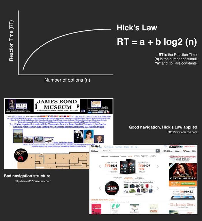
Hick’s Law is a simple idea that says that the more choices you present your users with, the longer it will take them to reach a decision. It’s common sense, but often neglected in the rush to cram too much functionality into a site or application. As a designer, you will use Hick’s Law to examine how many functions you should offer at any part of your website and how this will affect your users’ overall approach to decision making.
What Is Hick’s Law?
Hick’s Law (or the Hick-Hyman Law) is named after a British and an American psychologist team of William Edmund Hick and Ray Hyman. In 1952, this pair set out to examine the relationship between the number of stimuli present and an individual’s reaction time to any given stimulus. As you would expect, the more stimuli to choose from, the longer it takes the user to make a decision on which one to interact with. Users bombarded with choices have to take time to interpret and decide, giving them work they don’t want.
The formula for Hick’s Law is defined as follows:
RT = a + b log2 (n)
Where “RT” is the reaction time, “(n)” is the number of stimuli present, and “a” and “b” are arbitrary measurable constants that depend on the task that is to be carried out and the conditions under which it will be carried out. “A” could be finding the right present online for your mother-in-law; “B” could be an onscreen chat with your mother-in-law in which she reminds you it’s her birthday tomorrow.
Generally, the application of Hick’s Law is simple – reduce the number of stimuli and get a faster decision-making process — but there are exceptions to the rule. For example, a user may already have made a decision before seeing the stimuli. In that instance, the time it takes for him/her to act is likely to be less than if he/she had not already determined a course of action.
The Implementation of Hick’s Law
You can find applications of Hick’s Law everywhere, not just in web and app design. Hick’s Law determined the number of controls on your microwave or your washing machine. A design principle known as “K.I.S.S.” (“Keep It Short and Simple”) became recognized in the 1960s for its effectiveness in this regard. Echoing Hick’s Law, K.I.S.S. states that simplicity is the key for a system to work in the best way. First embraced by the U.S. Navy, the principle of “K.I.S.S.” was in general use in many industries by the 1970s. In some environments, K.I.S.S. gets translated as “Keep It Simple Stupid”.

Author/Copyright holder: Schnäggli. Copyright terms and licence: CC BY-SA 3.0
Hick’s Law surrounds us. When you go to a high-end restaurant, often whoever has written the menu has used Hick’s Law to give you the “right” number of choices. By not getting bogged down in a decision-making process, you’re more likely to savor you meal out with the important company joining you. Look at the menu above: what a daunting job to choose a pizza!
Of course, designers don’t use Hick’s Law in isolation in design. We always combine it with other design principles to make it work effectively. We often have to make compromises with Hick’s Law, too – sometimes there is no avoiding complexity. This is why a DSLR camera has many more controls and options than a camera on a smartphone. The objective of Hick’s Law is to try and simplify the decision-making process, not eliminate that process entirely.
In web and app design, as with other types of product design, we often have several functions and choices to present to the user. Here, we have to take the time to think about how we’ll introduce those.
The landing page is the first glimpse your user will have of your site. That’s a make-it-or-break-it chance to create an impression using Hick’s Law. So, it’s particularly important to minimize choices here. Are you promoting a product or a service? If you’re selling aquariums, what’s your best-selling model? Introduce your company and highlight the model on the landing page, organizing text carefully. Most importantly, draw the user’s eye with a well-placed image (remember those sweet spots). They’ll see that before they start reading. Make the option you most want them to select stand out.
Separating the essential material from the secondary, less-likely-to-be-selected options is vital. On one hand, we may know which, say, aquarium will jump out at most users, and which are the more specialized ones that only expert fish-keepers might want. However, because we have more familiarity with such functions and choices, we run the risk of forgetting that our users won’t have this. They’re arriving at the website or examining the product with a fresh perspective. So, understanding this difference, we must stand back and see what we will offer the users to get them to decide their next move. Good designers try to employ Hick’s Law to respect their users’ time and to ensure a high-quality user experience.
To employ Hick’s Law effectively in the design of interactive products, you can consider the following:
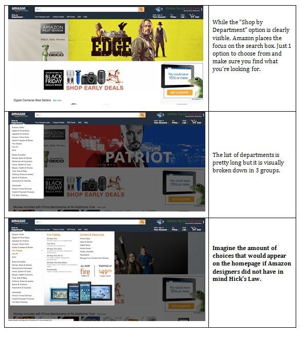
Categorizing Choice - You can see Hick’s Law in action in the navigation of almost any website. If your menus offered direct access to every link within your site, you could quickly overwhelm the visitor. If Amazon’s menus did that, it could take several hours to scroll through a menu! Suddenly, searching for a last-minute birthday present or replacing a printer cartridge becomes a “stressfest”!
Happily, designers group menu items into high-level categories instead. These slowly expand as the users select options; the new categories then take users where they want to go. Do you recall Amazon screenshots just above? There’s a compromise between offering all functionality and Hick’s Law, which pressures the designer to keep things as simple as possible.
With highly complex sites, the use of Hick’s Law requires further implementations of choice. As designers, we notice how we can scatter navigation items throughout the design in small, discrete clusters. These help narrow down huge volumes of information without overloading the user.
The card-sorting method is great to find out about the categories that make more sense to your users. You can use card-sorting to define the groupings of the functionalities and also the labels for these categories. You should do this early on in your project, before starting any sketching or wireframe.
As you move on in the design process, you can use eye-tracking to have a heat map of your site. This can help you work out where future design changes might benefit from further applying Hick’s Law. Heat maps display areas of a site that users look at most, showing problem areas quickly, too.
Obscuring Complexity - If you have a complex process, you can use Hick’s Law to rationalize only presenting specific parts of that process at any one time on the screen. Instead of throwing the entirety of your payment process up in a long, complex form, you can break it down into prompting users to register their e-mail and create a password. Then, you can give them another screen with shopping cart details, then another which collects delivery information and so on.
By reducing the number of options on screen, the payment process becomes more user friendly, and it’s more likely that the user will reach the end of the process than abandon the cart.
Hints from analytics
Once your app or website is launched, it is also important to keep an eye on how Hick’s law might be affecting your users’ experience. Here are some variables that you can use to analyse it:
Time on Site - There is a sweet spot for most websites when it comes to time spent on site. Too little time and the user has likely left without purchasing or registering. Too much time and they may get caught up in information consumption and again fail to make a purchase or register. Just enough time and the majority of users who will make a purchase and register will do so.
Once a site is live, you can start to gauge where that sweet spot is and utilize Hick’s Law either to increase or decrease the average amount of time spent on site.
While simplifying decision making can extend the time spent on site, it might also reduce it. If the decision making is so simple that users make little progress towards their objectives each time they make a decision, they‘ll be as likely to leave as users who find a decision-making process impossibly confusing because they’ve seen too many options at once.
Page Views - Hick’s Law can also affect the number of page views that each user carries out. If the navigation menu is too complex, the number of page views is likely to be lower than if users were offered a navigation menu that better met their needs.
Of course, page views are only important if the users are achieving their objectives while on site. It would be easy to construct a very deep menu system of binary choices that required 10 or more clicks to get to the desired information. Unfortunately, were you to design that, you’d almost certainly find that users would abandon the site long before getting to the information they needed. This approach might deliver more page views at first, but it is unlikely to deliver the results required from your design, either.
The Take Away
Hick’s Law (or the Hick-Hyman Law) states that the more stimuli (or choices) users face, the longer it will take them to make a decision. For designers of all types, this presents a challenge, making it imperative to offer the most useful set of options to avoid frustrating the user. This can be vital for safety. The U.S. Navy was quick to recognize the importance of the “Keep It Simple and Straightforward” (“K.I.S.S.”) principle, which reflects Hick’s Law.
As web designers, we have an important choice to make before presenting users with the choices we hope they will select on our sites. We have to use Hick’s Law in conjunction with other design principles, especially on the landing page to make the most-desired option/s stand out.
Sometimes, there’s no avoiding complexity, especially if we’re involved with presenting a huge amount of needed information about sophisticated products or intricate services. Using Hick’s Law can help us reduce that complexity by simplifying the decision-making process for our users.
To make our designs work, we need to remember that a) the user’s time is precious, and b) a user is not obligated to stay on our site. To enhance the user experience, we should consider the following:
Categorizing Choice – Enabling users to find items from higher categories, as if they were looking under sections in a library.
Obscuring Complexity – Breaking up long or complex processes into screens with fewer options.
Once your website or app is live, you can use variables such as “time on site” and “page views” to understand if Hick’s law has been applied correctly.
Overall, remember that Hick’s Law is a guideline you can adapt to your design. Always try to “flip” the perspective to see the choices you want to present from the outside. Avoid flooding with options, but bear in mind the balance between users’ time and comfort zones for handling options on a page. Guiding them to select between clear options that will get them somewhere quickly (such as a shopping cart) will take the work out of the user experience and reward you both.
As a user experience designer, you have a great ally in the card-sorting method. Keep in mind that you 1) first need to find out who are your users and what they need, 2) then define the functionalities your product and service will offer to meet these needs, and 3) use methods such as card sorting to build the right categorization and labels for these categories.
Where To Learn More
Gross, J. (2012). “Redefining Hick’s Law”. Smashing Magazine.
Abowd, G., Foley, J. et al. (2014). “Simple Models of Human Performance – Predictive Evaluation with Hick’s Law, Fitt’s Law, Power Law of Practice.” UI Design –Georgia Tech.
Hochheim, W.H. (2008). “Hick’s Law? Reaction Time in Combat? No!”. Practical Self-Defense / The Stay Alive Program.
McGough, O. (2014). “Juggling Jam – Applying Hick’s Law to Web Design”. (Private Blog).