It’s a funny thing that when we talk of UX work; we tend to talk of the successes of projects and how we can influence them. There’s rarely a mention of the flip side of UX work, the times that we have to take our ideas and extinguish them because they are doomed to failure.
The real business case for UX work is that it acts as a way to reduce risk. The better a product meets user needs, the more it will sell. And conversely a product that doesn’t meet user needs is, perhaps, one that is no longer required at all.
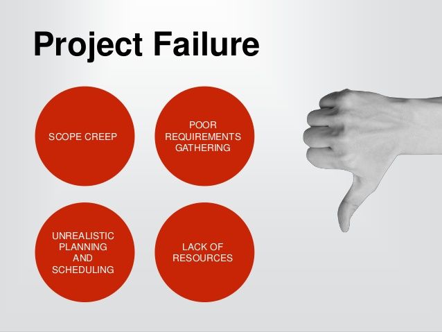
Pushing a failed product into production is expensive. It costs in development time. It cost in marketing time. It costs in research, etc. Sometimes it’s the UX team’s job to say; “It’s time to give up on this and do something else instead” in order to prevent costs from spiralling out of control. So here are 4 indicators that might mean it’s time for UX to call an end to a project:
You Haven’t Stopped to Work Out Who Will Use the Product
Sometimes great ideas take a life of their own. You sit down, you think of a problem and a wonderful solution to it and then you’re off designing the first iteration of the product. The trouble with this approach is that it assumes that the problem matters enough to a group of people that they will pay to have it solved.
In reality, this may not be the case. Just because a solution is elegant and incredibly technically clever; it doesn’t mean that anyone cares about, needs or wants that solution.
That’s what market research is for. It’s to find out who might use a solution. It’s to find out how many people might use the solution. To find out whether that is a single group of users or many different users each with different requirements for the solution. And so on…
If you can’t identify who will use a product, all development should be suspended until you can clearly define the users and have a reasonable degree of certainty that they will make the project economically viable.

Author/Copyright holder: philhearing. Copyright terms and licence: CC BY 2.0
When You Go Looking For The Users – They Aren’t There
This is a major warning sign that your product isn’t going to deliver rewards. If you start trying to recruit for your user research and find that a month later – you can’t find enough participants, it suggests that your users don’t exist in the volumes that are going to make your work commercially viable.
This may not always be true. There are highly specialist areas where a niche product can command such an incredible premium that it may still be commercially viable but those areas are few and far between. It’s also highly likely that if you were working in such a field – you’d be in contact with your potential users already.
If you can’t reach users to get them to test the product, how are you going to reach them when you want them to buy your product? Sales and marketing are going to follow the same basic processes you use to find prospects.

Author/Copyright holder: Unknown. Copyright terms and licence: Unknown.
Feedback From The Users is Completely Contradictory
You’re conducting your research when you notice that there’s a funny thing happening. For one feature set, half your users love the feature and half of them hate it. The same half that loved that feature hate another feature and the half that hated the last feature, love this one.
This tells you that you’re not dealing with a single user group. In fact, you’re dealing with two user groups each with very different objectives from a product.
If you cater to the first group, you’re going to lose the second group. If you cater to both groups – you may lose everyone.
You may find that this requires a decision to target one group of users (if they’re large enough a group to justify this). You may find that you need to split development to try and cater for each group separately. You may also find if the split makes both groups uneconomic to cater for that the product needs to stop development and you need to return to the drawing board.

Author/Copyright holder: Michael Wyszomierski. Copyright terms and licence: CC BY-NC 2.0
Users Can’t Articulate The Value in the Product
There’s a good reason that UX researchers want to get the users “hands on” with a product as early in the development process as possible. It’s so that they can see if the users can see how that product actually meets their needs.
You can argue that prototypes, wireframes, etc. are somewhat unsatisfactory in this respect and it’s possible that your users will only understand your genius when they hold the finished product… but it’s a bad argument. Sure, there are limitations to mock ups of products. But if a user can’t see any value in those mock ups it’s a massive red flag to say; “Hey! Wait a minute! Are we sure that this product is going to deliver the goods?”
You are supposed to be reducing the risk that a business faces. The longer you wait to get user feedback… the bigger the risk to the business. User research isn’t supposed to reveal absolute joy with every product. Sometimes it’s supposed to show that a product isn’t going to be viable – no matter how clever the idea seemed in the first instance. Don’t be afraid to say when you think a project would be better off scrapped.
Summary
It’s important to treat these as indicators of possible failure rather than gospel. The more of the warning signs you encounter, the more likely it is that you’re on the wrong track and heading in the wrong direction.
Sometimes, that will mean tweaking the product. Sometimes, it’s going to mean cancelling the product. As long as it leads to satisfied internal and external customers that’s just fine. It’s part of what UX design is really about.
Header Image: Author/Copyright holder: Slav Karaslavov. Copyright terms and licence: All rights reserved. Img Source
