When you think about user experience design (UX design) and what the ingredients for users to enjoy great experiences are—and so, what you need to think about presenting to them in innovative and delightful ways they can hit the ground running with—does it seem a little overwhelming sometimes? Does it ever feel like there are so many theories and principles and strands of ideas to work into the mix—to say nothing of all the creative problem-solving and tool use to factor in there, too—that the odds of great design are too great? Well, take heart, because coming now are the five elements that make up UX design, itself, and you’ll find you can get a faster track on a smoother design journey with these on board with you.
UX designers stand on several sets of foundations—fundamental principles with names that conjure powerful images. For example, we strive to be user-centered; we know to place usability and desirability as central parts of what we do; accessibility has—or should have—exalted status in our work. Yet there’s so much involved in design work that we may not have time to consider the philosophical dimensions of what we do. Aside from even the design aspects, there’s the hard graft of research, and then all that usability testing to work into the equation, too, so to try to name all the important principles might seem a task too hard.
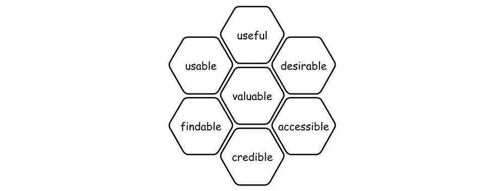
Imagine, though, if you could focus on just five elements instead—five elements of UX design that you could leverage to craft user experiences that not only attract but also retain users’ attention. The great news is that we’re not dangling some lines of wishful thinking to tempt or make you feel better—and, to be sure, Executive Design Leadership Coach, Author and Speaker, Jesse James Garrett’s model has the perfect package for you to make sure your website or app is empathetic, strategic, usable, inclusive, and validated!
The author of The Elements of User Experience: User-Centered Design for the Web and Beyond, Garrett emphasizes strategy, scope, structure, skeleton, and surface as critical components, and they’re the fundamental guides for UX professionals who create engaging websites, mobile sites, and applications to serve users well with. And Garrett’s elements serve as the foundation for developing solutions that aren’t just usable but desirable to boot—and, better still, they offer a clear strategy to meet user needs so your designs can emerge on point and ready to resonate (and delight).
Watch our video to get a firm idea what of the five elements of UX are, how they work, and how they can help your design projects:
Know Your Elements – Identify The Five Elements of UX Design Framework
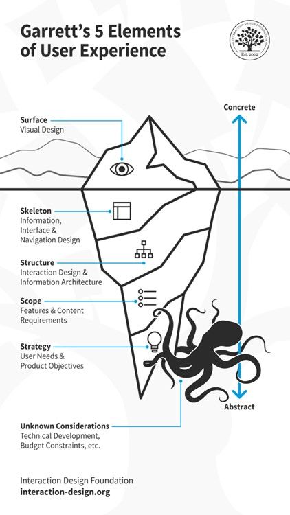
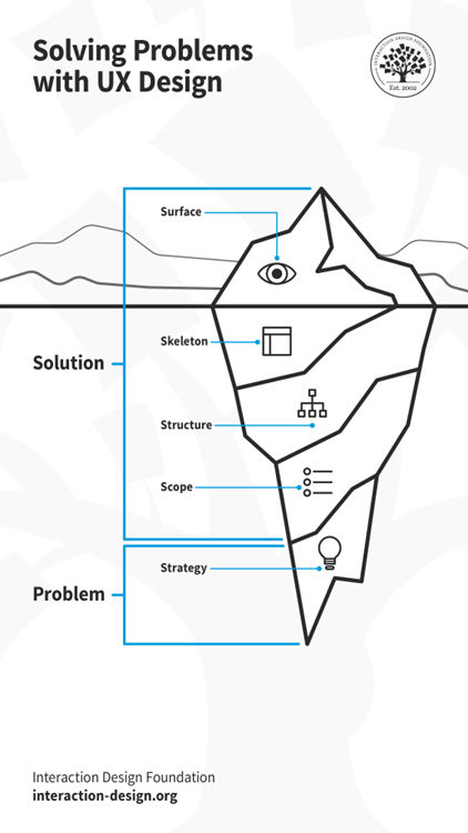
The 5 Elements of UX Design: Note the Unknown Considerations that can lurk beneath any project.
© Interaction Design Foundation, CC BY-SA 4.0
1. Strategy
For the first of the five elements of UX design—strategy—let’s go deep. Everything else rests on this part, and for this you’ve got to clearly define your product’s objectives. What’s more, you’ll want to align it with both client and stakeholder goals and then, plus, you’ll have to head to the other side of the “equation” to make sure it addresses user needs for real.
Strategy as a word can sometimes sound daunting, conjuring images of chess grandmasters and the like, but have no worries—the most important aspect of this stage is that you’re wearing a UX researcher’s hat. You’ll want to gather essential information to lay a solid foundation—or “runway” to take off from so you can soar high with what you prototype and design—and it’s through your research that you can focus on what users and your brand aim to achieve, and keep a sharp view of it as you move along in the design process.
Strategy isn’t just about setting goals—it’s about understanding the needs through user research as well, and not for nothing is there the dedicated role of a UX strategist to help brands due to the importance of strategy. In any case, it’s only when you’ve got this solid research information on board that you’ll be able to start determining what your design needs to include—and then, from there, you can move your way toward working on a product or service that will truly resonate with its users.
2. Scope
Now we go up one level in our “iceberg.” The scope of a UX project defines what your product will contain and how it’s going to function. Now, you’re on to detailed planning of functional specifications like features and content requirements, and they’re things that include images, maps, and text. At this level of the “iceberg,” you’re working to make good and sure that your product meets the expected standards and user requirements effectively, and it covers both what the product does and the information it provides users with.
For scope, you’ll need to make sure that every feature works well with others and every piece of content adds value for the user—all while keeping in mind that too much choice and too many options, for instance, will work against the experience because of analysis paralysis and indecision.
3. Structure
At the heart of user experience is how you as a designer structure the information users find in your design work. The structure element focuses on interaction design and information architecture—vital aspects of any digital solution, and they dictate how users interact with the product and how they navigate through it. One of the most vital aspects here—and of design in general—is that it’s got to be easy to understand, as in, intuitive so users can hit the ground running and get what they want to do done.
For this middle part of the “iceberg,” then, you’ll create conceptual models and site maps, important tools that’ll help you ensure you organize your product in a way that makes sense to the users and prioritizes important content in the most effective way for them.
4. Skeleton
This one might at first seem a little confusing to some people—since “structure” and “skeleton” can sound and seem so close—but it’s got its own layer in our “iceberg” and for good reason. The skeleton of a UX design refers to the design of wireframes and prototypes that outline the arrangement of interface elements—the visual planning area where you lay down the way the digital solution, for example, is going to appear.
This element is a crucial one, and it deals with how you place buttons, links, images, and text—all the aspects that need to work together so that all-important seamless experience happens for users in their various user scenarios and contexts. Most important of all is that you need to make sure that users can find what they need without unnecessary complexity—so it’s as simple and pure and efficient and appropriate as it can be for your users and your brand. The moment users stop to think about your design is the place where the spell of seamlessness breaks—they’ve got to be in it, interacting with the brand, not “on” it, as in, on a device where they’ve had to, for example, hesitate because they’re looking for a button. Skeleton is about making the interaction as intuitive as possible, about helping users to navigate through the product smoothly, and about setting up the platform for the next—and final—layer in our “berg.”
5. Surface
Finally, we’ve made it to the surface—and it’s time to take a breath, although there’s still a fair bit of design work left to do as you work out how to flesh out the skeleton in exactitude. The surface element deals with the sensory experience of the user, and it includes the visual design like layout, typography, color, and imagery—all the things that they’ll base their first impressions of your brand on, too.
This is where you—and your design team—decide how the product will appear to the users, and have good reasons for every aspect that makes it onto the screen because here’s where you need to strike that ideal balance. Your product has got to be functional, to be sure, but it also has to be aesthetically pleasing. The surface should guide users intuitively through the visual elements and cues embedded in the design, and everything that shows on it needs to pull its weight because this is the part that seals the deal on the conversion rate, and ensures an enhanced overall user experience happens into the bargain.
Know The Whys Behind These Elements in Design
From the start of your UX design process right through to the final user testing, design refinements, and—drumroll—launch, it’s best to keep it top of mind that when you bake the five elements into your design solution, you can enhance the entire user experience, boost user engagement, and elevate your brand’s reputation; and, without further ado, here’s why each UX design element is crucial:
1. Universal Design and User Inclusion
Get the principles of universal design on board your work and you’ll make sure that your product’s design considers the needs and requirements of all users, making it accessible and beneficial to a diverse audience. No matter who gets to your design solution, they’ll be able to use it with ease, enjoy it (or have zero frustration with it), and remember your brand as being one that looks out for them and their needs.
2. Form Follows Function
Get this principle baked into your designed product and you’ll have a better product for it—as this one’s about how the design of any element should first and foremost reflect its intended function. And in UX, this means designing with the end-user in mind, including a mindful consideration of what their user needs are going to be like in the various user contexts they’ll encounter your design in. So, you’ll need to make sure that each component of your interface serves a purpose and enhances the user experience—and anything that’s “pretty” without purpose, for instance, stays out.
3. Integrated Design Approach
Speaking of “pretty,” aesthetic, functional, and UX design must work in harmony to make things best for the user—and we can see this, for example, when we consider that while a button must be visually appealing (aesthetic) and trigger the correct action (functional), it should also fit seamlessly within the overall design framework to provide a cohesive user experience, all being “magic” ingredients of that superb UX you’re after and advocate for your users through.
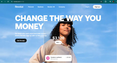
Revolut offers a simple yet personalized online banking experience through its mobile app. Their UX design meticulously caters to fintech users, integrating features that are both functional and aesthetically pleasing, ensuring every interaction is intuitive and satisfying.
© Revolut, Fair Use
4. Business and User Objectives
It’s a “must” to focus on foundational elements such as clear business objectives and user needs, and while it may seem “too obvious” to warrant another mention, it’s impossible to overstate how important it is. This alignment needs to be there from the get-go—not least because, after all, it’s what makes sure that the product consistently meets its intended goals throughout the design process. What’s more, it’s the balance where you’ll find it keeps the brand happy at the same time as it keeps the users delighted, and the metrics are the proof—success is measurable against predefined criteria.
5. Benefits of a Strong UX Foundation
A well-implemented UX strategy leads to increased customer satisfaction, fosters loyalty, and reduces user churn, which is that unfortunate rate at which users stop using a product (and so it’s something to minimize as far as possible). What’s more, though, a healthy UX strategic approach can even result in cost savings and better SEO rankings, all signaling as benefits that highlight why a user-centered approach to innovation in design is vital—and you’ll have a product that’s functional, that’s attractive, and that can endure in the marketplace for years to come.
Remember, every other part of your design needs to stem from a problem—a real problem the users have that you keep sight of throughout the design process.
© Interaction Design Foundation, CC BY-SA 4.0
How to Include these Five Elements into Your Work
After all the “iceberg” layers and reasons to be cheerful about them, you’re wondering how to get them baked into your work (not that you’d want to try baking an iceberg!). Well, there’s another reason to smile, aside from that bad joke—it’s a holistic approach to do that—something that’s key to creating designs that users love and engage with—and (even better news) it’s got steps to implement it with:
1. Do User Research and Get an Understanding
To begin, put yourself in the users’ shoes so you get to understand their needs and pain points in no uncertain terms. Conduct interviews, give them online surveys, and use other research methods to gather insights into these users’ needs, tendencies, and motivations—all the “living” data that you’ll need to get in to make something that can therefore cater to real people in their real-world situations. Use this data to create user personas and map out user journeys, and identify primary goals and potential challenges so you’ll have solid objectives and obstacles to chart for the road ahead.
2. Start to Design and Prototype
Or maybe that should be prototype and design so we don’t get the proverbial “cart before the horse,” but in truth it should begin with wireframing, so develop initial wireframes to plot out the layout and user flow. It’ll help you to visualize the basic structure—and test them when you “bounce” them off stakeholders and other early test users—before you move on to more detailed versions of a design you can test, like low-fidelity prototypes—and, then, create high-prototypes to test functionality and user flow at a finer level. In any case, allow for adjustments before any coding begins—pretty vital as once things get too high-fidelity, it’ll cost far more to change things. This stage should focus on interaction design, and you want to ensure that the interaction between the user and the product gets to be as pleasant as it is intuitive.
3. Focus on the Visuals and Information Architecture
Now it’s time to enhance the user experience—all that juicy surface stuff where you get to focus on visual design elements such as typography, space, layouts, and color and have fun getting them to come together in the perfect way. As you’re doing that, make sure you structure the information architecture well to make content easy to find and understand for users, and that includes organizing navigation elements like Account, Cart, Search, and Menu for top-level access.
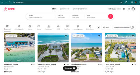
Airbnb bridges hosts and guests with stellar UX. Airbnb's website serves dual audiences: hosts and guests, with a design that meets both their needs effectively. The search functionality features prominently with a strong call-to-action, ensuring users can easily navigate and find what they're looking for, making the platform both navigable and stylish.
© Airbnb, Fair Use
4. Ensure Accessibility and Consistency
Make sure that your product is accessible to all users, and it’s a big deal—and a legal requirement in many countries—not least for users with disabilities but accessible design helps all users, anyway, when you think about considerate design features like adequate color contrast and subtitles for bright sunny days and loud environments, respectively. Then there’s consistent design, and it’s vital, too, to keep design and functionality consistent across various platforms and devices. Use responsive web design and consider principles like Fitt’s Law to optimize the ease of user interactions, and—major point to bear in mind—most users will be on mobile devices.
We can’t stress enough how important it is to design with accessibility in mind:
5. Test and Integrate Feedback
“The proof of the pudding is in the tasting,” as the saying goes, and if you test early and often you’ll enjoy the benefit of course-correction without much pain (as in, costs and other wasted resources). Conduct usability testing with tools like Crazy Egg and Hotjar to get accurate feedback in from real users, and this stage is vital (not that the other ones are less so, though)—it’s because it evaluates how successful your product is. Bear in mind that no one gets it all-boxes-ticked right and perfect on the first go, and sometimes your brand will want “good enough” rather than “perfect” to start with, anyway, in the form of a minimum viable product (MVP). So, that user feedback will prove helpful when you refine your design. And keep the users in the loop. Continuously engage them in an ongoing conversation to understand and focus on delivering user value.
Watch as CEO of Experience Dynamics, Frank Spillers explains important points about MVPs:
6. Remember the Unknown Considerations
As with many things in life in general, design can throw some curveballs—not least since it tends to be bound up with the way technical advancements and trends go. Or, more appropriately, these hidden things can sometimes rear their heads in the form of such “delights” as budget constraints, those technical developments, and the like. These can be hard to see, let alone predict—and it can take a deep dive to spot some issues that might otherwise derail your nice clean, minimalist UX design.
In our iceberg diagram, we’ve got a rather menacing-looking kraken lurking in the depths to mirror or analogize this (and we love friendly octopuses, by the way)—tentacles swaying, waiting to lash, seize, and snare some part of something important in your design process and work. So, be sure to stay fluid and flexible. Just remain prepared for the odd intrusion from some unforeseen problem, and keep afloat and on board with your user flows. When your design makes an impact—and maybe it’s best to leave the iceberg analogy on that note—you can enjoy some plain sailing ahead and neither you nor your users will end up stranded on floes!
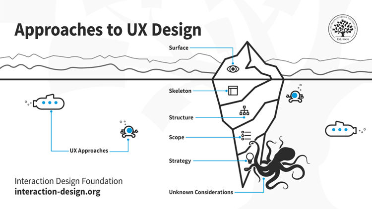
Remember, with the 5 elements of UX design framework, stay fluid and keep an eye on all sides of the design equation—and under it.
© Interaction Design Foundation, CC BY-SA 4.0
The Take Away
The five elements of UX (user experience) design are strategy, scope, structure, skeleton, and surface—and they’re both critical components and fundamental guides for designers to create engaging websites, mobile sites, and applications to serve users well with. It’s important to “bake” them in throughout the design process through the activities of user or UX research, wireframing and prototyping, and visual design and information architecture. It’s also vital to make sure the digital design solution is accessible to all users, has got the consistency factor running through it, and that you usability test and integrate the feedback as you iterate on the next version.
Throughout the whole process, from the opening stages to the final iterations, be sure to stay vigilant for the unknown considerations, which can lurk and rear their heads to get in the way without warning. Once you’ve got the five elements “baked” in, though, you’ll stand a far higher chance of seeing a successful design released into the marketplace, and so delighting your users, your brand, and (and why not!) yourself.
References and Where to Learn More
Take our course, User Experience: The Beginner’s Guide for a deep dive into the elements of UX design and more.
Check out The 5 elements of UX design explained by Cynthia Vinney for more insights.
Read Focusing on the 5 Elements of User Experience by Adam Deardurff for further tips and in-depth information.
Go to Elements of the User Experience | Why does it matter, and who should do it? by Vitaliy Podoba for further insights.