Welcome back! We’re continuing our series of awesome UX practices that began on Tuesday; if you missed the earlier parts – you can always go back and find them under the UX Daily section of the Interaction Design Foundation’s website. Today we’re picking up where we left off with user testing:
Determine the Test by The Questions You Want Answered

Author/Copyright holder: Mauro. Copyright terms and licence: CC BY-SA 2.0
You don’t select user testing tools by user preference, personal preference, etc. You pick them to answer specific questions. That means when you need to quantify (count) answers then you can split-test or A-B test your ideas. When you need more qualitative data then you use usability testing. It’s that simple really. Of course, you may be able to get a little of the other kind of data out of each form of testing but that’s not what they’re designed for.
Don’t Forget the Value of Analytics
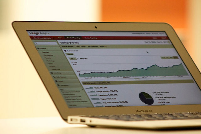
Author/Copyright holder: Our friends at www.bluefountainmedia.com. Copyright terms and licence: All rights reserved
Your users often give you a ton of data without you having to speak to them at all. Assuming you have Google Analytics (or similar) installed; they’ll be generating data constantly. Review that data as part of your research phase. Where do people quit the product? Where do they enter? Which routes through your product result in the best business results? Which give the worst results? These are all questions you can start to understand with analytics.
Start Your UI Design By Prioritizing User Needs
Before you jump into UI design; it’s always a good idea to have a clear picture of what you want each function or screen to do. The priority for each screen is the user’s priority of needs when you have multiple functions available; if you only have one – then that’s the priority. Think about what the user wants to achieve and how best to help them get there. Don’t spend too much time designing until this is clear in everyone’s minds.
Take Cues on UI Design from The World Around You
Wherever possible use the world around you to inspire layout, lighting and perspective. How do you store CDs at home? That’s likely to be the way that everyone does it. Is that useful to a computer user? No? Why? Because they sit side-by-side and it’s hard to see what each title is about. Where could you find a better display of CD covers? Your local record shop? And so on…
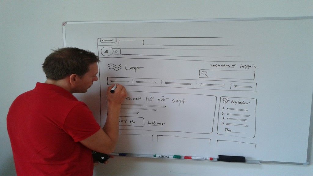
Sketch UI Designs Before the Digital Design
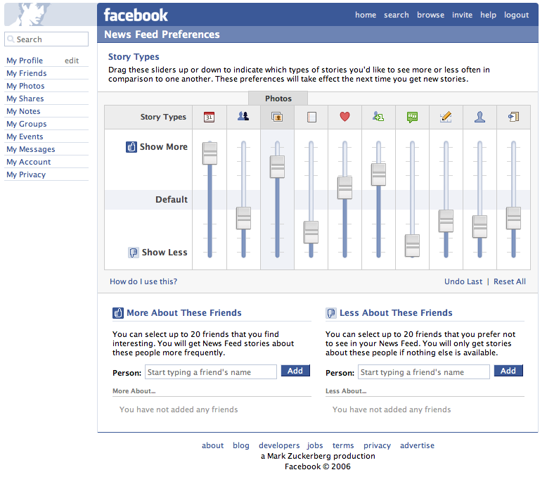
Author/Copyright holder: Jacob Bøtter. Copyright terms and licence: CC BY 2.0
Once again paper is cheap and easy to use. It also lets you quickly try out a bunch of ideas before you settle on the right one. It doesn’t really matter how pretty these designs are as long as they effectively communicate interactions and ideas. Get feedback on ideas before you do the hard work on a computer. It’s quicker and much less aggravating to fix things before you spend days or weeks on design.
Header Image: Author/Copyright holder: James Royal-Lawson. Copyright terms and licence: CC BY-SA 2.0
