There’s a wealth of information to be found about user experience but there are some areas that aren’t as well addressed as they, perhaps, should be. We’ve though of 5 ideas that you may not have considered in your UX design process:
When and Where Matters
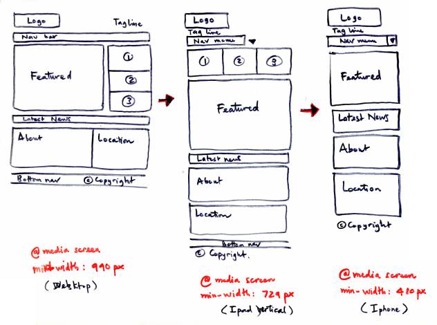
There’s a big difference from using a shiny new application on a desktop computer in an air-conditioned office from using the same application on a cheap smart phone, in a warm supermarket with two young children trailing you around.
Author/Copyright holder: mygraphicfriend.com. Copyright terms and licence: All rights reserved Img source
In the days of ultimate mobility; where and when your customers use your application or website can be critical to developing the right user experience. You need to look at responsive design at a minimum to ensure screen real estate is used well but there’s more to this than responsive design – think about key processes and how easy they are to conduct on a smaller screen. It can make all the difference to your user experience.
Help Create Bonds with Your Brand
Author/Copyright holder: MindTools.com. Copyright terms and licence: All rights reserved Img source
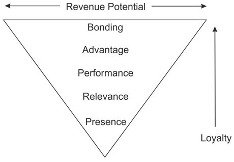
Brands are not about colour schemes or pretty logos. Those are elements of graphic design that are supposed to trigger a positive association with your brand. Your brand is who, as a company or entity, you are. You can help make it easy for people to understand your brand by making it clear what you do to users wherever they land on your site or in your application. If that message isn’t readily available; it’s likely that your users will go somewhere where it is crystal clear instead.
Go Feature Light
If you’re in a big startup with lots of cash; everyone will have awesome ideas for features. In fact, they may have so many ideas that you end up with a requirements document that resembles the Encyclopaedia Britannica.

Author/Copyright holder: James Case. Copyright terms and licence: CC BY 2.0
This is not the best way to start a project. Find out what your users really want to achieve (their Top 3-5 objectives is a good place to start) and deliver that. You can add features later – if your users actually want them. But it’s much easier to control the user experience of a simple application or website than a ridiculously complex one.
Make Access Easy
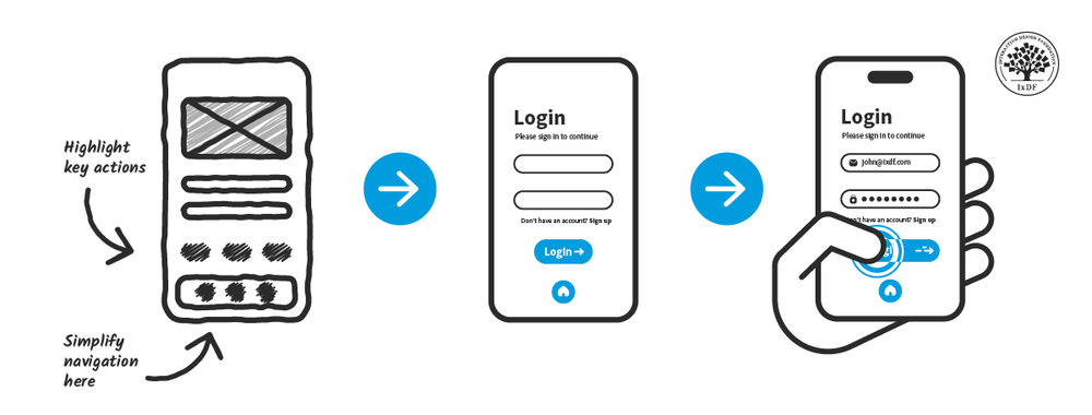
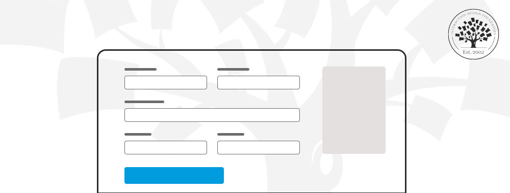
Want to send your users packing quickly? Make it hard for them to get into doing what they want to do. Don’t make login processes and registration processes so information heavy (and whatever you do don’t use CAPTCHAs) that they destroy the user experience before it even gets started. Constantly revisit your analytics and if people are bailing at the first hurdle – it’s time to change the process.
Customer Service Dictates UX
Author/Copyright holder: Gordon Ednie. Copyright terms and licence: CC BY 2.0
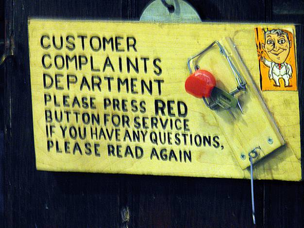
People want good service. It’s your customer care department’s job to deliver it. All the good work you have done is for nothing if your customer care is rude, ineffectual, time consuming, etc. learning to provide excellent CX (Customer Experience) will reflect directly in your user’s experiences too. Customer service is not an optional extra – it’s the bare minimum your users expect from you.
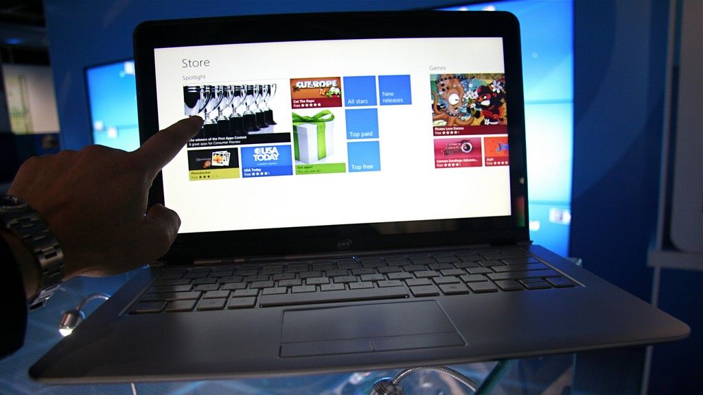
Header Image: Author/Copyright holder: Intel Free Press. Copyright terms and licence: CC BY 2.0
