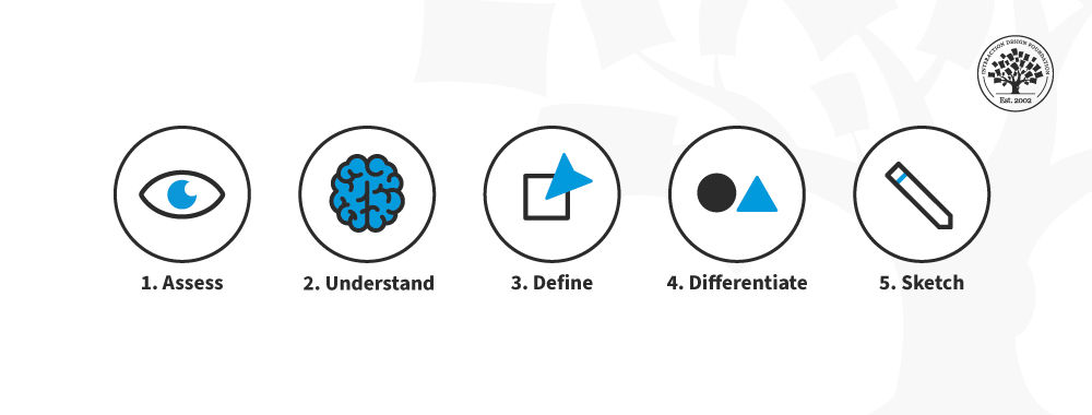
UX projects generate a bunch of documentation by nature. However, one thing many UX designers fall over on is generating good documentation. Documents need to fulfil some basic criteria in order to be genuinely useful and it’s worth taking some steps to generate better UX documentation – your clients will love you for it. We’ve got 5 simple questions that may help answer whether your documentation is up to scratch:
Is this document useful?
This question is more important and less obvious than it sounds. Before you spend any time putting words on paper; you need to spend some time thinking about what the purpose of the document is. Your UX documentation must move the project forward or enable decision making to move a project forward. You should be able to demonstrate how the document will do this before you write a single word.
How can the document achieve its purpose?
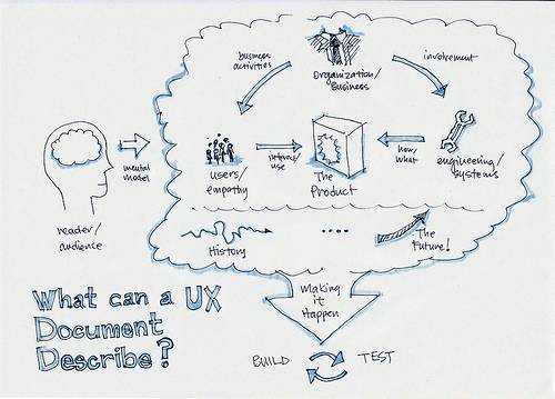
You need to take some time to think about how the document will be used. It needs to be fit for purpose, fit for the situation in which it will be used and to the audience itself. If you spend a little time thinking about how the document will be used you can normally define clearly what kind of format you will use for the document. A quick briefing for the development team which backs up a presentation is going to be a very different document to the one that you send to wrap the whole project up with the project sponsor.
How can the document be made easy to use?
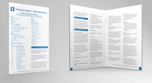
Usability is a key part of the UX designer’s skill set; it needs to be applied to the documents we create too. That means it needs to be in clear, simple, language with a well-defined structure that is immediately apparent. The reader should be able to easily digest the content and then take any action necessary. In the main, a document is a standalone item, if you need to explain any of the content in person – the document is not easy to use.
How should the document be presented?
If you’re working for a client or as part of an in-house team; what are the standards set for internal documentation? Is there a style guide you can use to guide the layout? If not, can you get some examples of documents they’ve used of similar nature before? Presentation requirements can vary hugely. And yes in some organizations failure to meet those requirements can end up with the document going straight into the bin.
How will the document be accessed?

You need to make sure that you follow any nomenclature requirements provided by the company or client. You will want to be certain that you submit files in the appropriate file types or risk conversion ruining the format. You want to make sure that it’s in a known location where it’s easy to find and easy to use.
Image Source:
Glue Think (link to image), Clker (link to image), Twc Digital (link to image), Blue Agility (link to image)


