There’s no doubt that of all the social networks the most beloved by the media is Twitter. The network’s format of quick, pithy opinions has led to dozens of collated articles in the news. It’s cheap and easy to find opinions on Twitter and, of course, whatever viewpoint you wish to represent – there’s always someone out there somewhere who feels strongly in the way that you’d like them to.
Yet, beneath the surface things aren’t all roses. Twitter’s share price has been in gradual decline since its IPO. While Facebook has made great progress in monetizing its platform – Twitter is still struggling. At the Q4 earnings in February, investors began asking some hard questions of the Twitter management team.
It turns out that Twitter’s problems may run deeper than first thought. The service has approximately 1 billion users which is certainly a healthy amount of market penetration. Though this pales in comparison to Facebook’s numbers.
What is more shocking is that only about 25% of Twitter’s users are active users. The definition of active user being “someone that logs on to the platform once a month”. That’s around 200 million active users. Compare that to Facebook’s more than 1 billion active users each month and you can start to see why Twitter’s shareholders aren’t exactly ecstatic.
In fact, if you examine the latest active usage statistics – you find that Twitter is lagging behind LinkedIn, WeChat, WhatsApp and even Google+ in terms of active users.
Sign ups for the platform are also dwindling. Where once the social network could expect to rapidly replace inactive users with active users – this is no longer the case. Worse, in the case of new sign ups Business Insider notes that 80% of these sign ups don’t end up as “active users”. That’s a higher percentage than the existing user base.
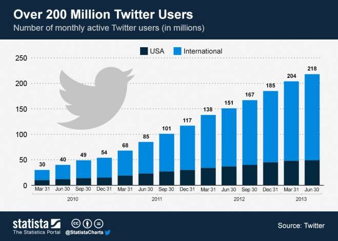
Author/Copyright holder: Statista. Copyright terms and licence: All rights reserved Img source
So What’s the Problem?
Twitter hasn’t been particularly forthcoming about the issues it faces as a platform, understandably – a company with declining share prices is hardly likely to air its issues and provoke further decline but it appears that the fundamental issues are user experience related.
The biggest selling point of Twitter, historically, has been its ability to provide up-to-the-minute information from a variety of sources. The trouble is that this can be overwhelming for a new user with no experience of the platform. It’s not like Facebook where you can quickly catch up with everything your friends have to stay; it’s hard enough to keep up with what’s going on at any given moment.
And it’s probably this single aspect of the Twitter experience that makes it so hard to retain users. Sure, there are 200 million or so people who like this – at least they like it enough to log in at least once a month; but it’s clear there are over 700 million people who don’t like it enough to log in at least once a month too.
The outgoing CEO, Dick Costolo, was pretty tight-lipped at the Q4 shareholder’s meeting over the problems users face when curating an interesting and engaging Twitter feed but from an external perspective and an unscientific show of hands when talking to those who tried and left Twitter – it seems pretty clear that this is the biggest barrier to entry for Twitter.
The short messaging format may make it the easiest network to become a contributor to but it also makes it the “noisiest” social network too. Twitter often delivers more content in 5 minutes than people’s Facebook networks deliver in a week.
So how can Twitter go about addressing this UX problem without alienating its core audience?

Author/Copyright holder: TechCrunch. Copyright terms and licence: CC BY 2.0
Enter Project Lightning
Twitter seems to have acknowledged the UX issue without specifically saying so. It has recently announced “Project Lightning”. It’s going to be part of Twitter’s mobile app and may be used on other websites and apps too. It will also be available to non-users of Twitter (possibly to attract new sign ups).
The idea is simple. If you want to follow the data stream from something like an event; it’s quite possible that the torrent of data generated is going to deter you from keeping an eye on Twitter. Hundreds of “We’re all at E3!” messages aren’t going to be something you want to read.
So project lightning’s solution is to use a set of Twitter editors to curate that stream to a more manageable and more valuable stream. Except the majority of the content won’t be tweets – it’s going to be video and photographic content.
Other sites will be able to embed these streams so that their users can follow them in real time (in much the same way that is possible to embed a YouTube video on your site today).
The project moves away from focusing on following people and to focusing on following events.
Is It Enough?
It’s good to see Twitter addressing a user experience problem and trying something new. Unfortunately, there are similar services from Snapchat and from Instagram. These newer networks are already winning the hearts and minds of the youth market and in the case of Instagram already have more active users than Twitter (and Snapchat is catching up fast with 200 million active users per month).
Snapchat has also surpassed Twitter in that it has already learned to monetize its live global stories feature. With a 10 second video earning $400,000 in revenue from the Live Stories stream. Snapchat has even go so far as to set up an ad-agency so that it can help advertisers deliver vertical video that can be used on the platform.
What Next?
It remains to be seen if Project Lightning is the first step in a bigger program of improvements or whether Twitter is currently waiting to see if it’s the whole solution to its woes. What we do know is that Twitter has some world class UX design talent in house and that the ailing social network shouldn’t be written off just yet. However, it’s clear that improvements need to come quickly before competitors take even more of the company’s market share.
Header Image: Author/Copyright holder: Unknown. Copyright terms and licence: Unknown. Img Source


