Case Study: How does Gmail use Grouping?

by William Hudson | | 8 min read
449 shares

To say that Google Mail (Gmail) is popular would be a considerable understatement. In 2021 it had 1.8 billion users worldwide. More than half of 18- to 20-year-olds use it. While the majority of users (75%) access Gmail through mobile devices, a considerable number of the more than 300 billion emails sent and received daily are handled by the Gmail website. It’s worth considering how it’s designed.

Show Hide video transcript
  1. 00:00:00 --> 00:00:34

    Let's see how Gmail uses various visual elements to help with grouping crucial elements. First of all, let's look at the whole Gmail window.  And you notice here, instantly there's large areas of different background color. So some sections of the screen have a white background,  but there are two big areas of gray background. One is the search box at the top. But the other is the message area.

  2. 00:00:34 --> 00:01:02

    So obviously within Gmail, why are you using Gmail? It's about email messages. And so the email messages as an area have been given a strong color coding in order that your eye  instantly knows that's separate from all of the other things around it. So that's one major difference. And background color's being used to give that functional separation  between the messages and the rest of the functionality of the page.  What I'm going to do now is I'll zoom into the left-hand side

  3. 00:01:02 --> 00:01:34

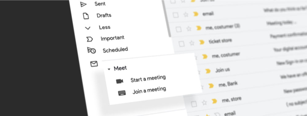
    where you have a number of elements. Some of it's about folders and tags; some of it's about messaging. So let's look at that left-hand side. So let's zoom into it. Here the page has got various elements. It's got buttons to compose new messages, but also it's got a list of folders or tags, depending on how you think about them. And also icons and names that have to do with starting a meeting and joining a meeting. Then below that about hangouts. Crucially, for these, it's spacing. These are functional groups,

  4. 00:01:34 --> 00:02:00

    but they're very clearly delineated partly through space.  Interestingly enough, I think maybe if that word "meet" had been a long word, they might have needed to add additional space in order to help it separate. It might be sufficient that it doesn't have an icon. But certainly it's fairly clear that there are functional differences.  However, partly that's done by spacing and by things that are similar,

  5. 00:02:00 --> 00:02:34

    that look similar. You can clearly see they follow each other. But in addition, I'd like to point out that the light gray lines, in addition, using lines both to separate those functional groups on the left-hand side, but also between each mail message, because they go all the way along in a table. And that's a common story. In one sense, those lines are unnecessary. You can see where one group ends – functional group ends – and the next starts. You can, because mostly the mail messages have a long enough subject line. 

  6. 00:02:34 --> 00:03:02

    You don't have a big gap. You can see the line of the mail message. But the gray line just helps. And particularly for any sort of perceptual problems or if you're just acting quickly and stressed, anything that can just help you. They've been done very light[ly], so they're not making a lot of visual intrusion. They're not noisy, but they also can help you along the way.  So here's a good example of ways you can be subtle 

  7. 00:03:02 --> 00:03:06

    about the use of grouping elements, but also very clear.

In this short clip, Alan Dix takes us through some of the grouping and ordering considerations for the main Gmail web page. Notice that while he occasionally refers to aesthetic alignment as nice to have, it is generally considered important to reduce visual complexity. So, while not strictly functional, it is more than just a nicety.

References and Where to Learn More

Christo Petrov, 52 Gmail Statistics To Show How Big It Is in 2021

Image

© Ingrid Figueredo and Interaction Design Foundation, CC BY-SA 3.0
Get Weekly Design Insights

Join 315,594 designers who get useful UX / UI Design tips from our newsletter.
A valid email address is required.
449 shares

Open Access—Link to us!

We believe in Open Access and the democratization of knowledge. Unfortunately, world-class educational materials such as this page are normally hidden behind paywalls or in expensive textbooks.

If you want this to change, , link to us, or join us to help us democratize design knowledge!

Share Knowledge, Get Respect!

Share on:

or copy link

Cite according to academic standards

Simply copy and paste the text below into your bibliographic reference list, onto your blog, or anywhere else. You can also just hyperlink to this article.

Hudson, W. (2022, June 6). Case Study: How does Gmail use Grouping?. Interaction Design Foundation - IxDF.

New to UX Design? We're Giving You a Free eBook!

The Basics of User Experience Design

Download our free ebook “The Basics of User Experience Design” to learn about core concepts of UX design.

In 9 chapters, we'll cover: conducting user interviews, design thinking, interaction design, mobile UX design, usability, UX research, and many more!

A valid email address is required.
315,594 designers enjoy our newsletter—sure you don't want to receive it?