Learn to design for the future, while balancing your design with your users’ present stage of skills and mindset. This is called the MAYA Principle and it’s the secret behind the industrial design of the Coca-Cola bottle, Shell Oil logo, and the Greyhound logo.
Why not learn from the best design experts with the most impressive track record? Raymond Loewy (1893-1986) is often referred to as the father of Industrial Design and his track record is indeed impressive. The Air Force One logo, the Coca-Cola bottle, the Shell Oil logo, the US Postal Service logo, the Greyhound logo are just some of his impressive designs which still exist today.
Today, Loewy can still teach us to design our products with just the right balance between the well-known present, on one hand, and a new and innovative future on the other hand. If we don’t hit the right balance, our users won’t embrace nor buy our products, Loewy emphasized.

Designs and drawings by Raymond Loewy who designed the Air Force One logo, the Coca-Cola bottle, the Shell Oil logo, the US Postal Service logo, and the Greyhound logo.
© Raymond Loewy, All Rights Reserved
The MAYA Principle
Loewy’s secret was essential to design for the future – but delivering the future gradually. He designed his famous logos, some of the most recognizable cars of the 40s, 50s, and 60s, refrigerators, and locomotives for his users’ present needs and skills while pushing the boundaries of design and technology beyond his users’ expectations. He called this approach the MAYA principle. Maya is an abbreviation for “Most Advanced. Yet Acceptable.” which means that Loewy sought to give his users the most advanced design, but not more advanced than what they were able to accept and embrace. Loewy believed that:
"The adult public's taste is not necessarily ready to accept the logical solutions to their requirements if the solution implies too vast a departure from what they have been conditioned into accepting as the norm."

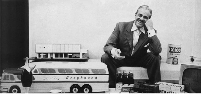
Raymond Loewy surrounded by some of his iconic designs.
© Raymond Loewy, All Rights Reserved

The early iPod is a good example of how Apple applied the MAYA principle. The iPod’s designers gradually pushed the product design further and further as the iPod gradually lost the extra buttons and got a more streamlined interface. It is very likely that this gradual development from the first iPod in 2001 was what made the iPhone acceptable to users when it was launched in 2007. By applying the MAYA principle, the designers at Apple provided the users with the most advanced design within the boundaries of their acceptance.
© Unknown
Apple and the MAYA Principle
The Newton tablet was an early personal digital assistant and the first tablet platform developed by Apple. Apple started developing the tablet in 1987. It was launched in 1993 and cancelled in 1998 as it was a financial disaster for Apple. There were several reasons that the Newton tablet did not become a success, but one of the main reasons could well be that the Newton tablet was introduced without users being familiar with a digital personal assistant.
A more recent example is Google Glass which has not become the success it was anticipated to become. Maybe it’s because the whole concept of wearing glasses that both record everything we do – while augmenting what we see with a layer of information – is simply too advanced for us. Maybe we need to take gradual steps before being ready to embrace this new technology. So the question is, how do we learn to strike the right balance between the most advanced design and our users’ ability to accept our product?

The lack of success for both Apple’s Newton tablet and Google Glass could be that they were too advanced for their users.
© Unknown
How You Can Apply the MAYA Principle in Your Everyday Design Work
Most of us have experienced the frustrating feeling of trying to explain and sell a great design solution and not get the buy-in from our management or clients. Maybe the design solution was too advanced? Or too much like the old design? Next time, you should consider using the MAYA principle to strike the right balance.
Advance your design gradually over time as the Apple designers did with their development of the iPod. Do not make a lot of major changes right away as you risk scaring off your users. You need to ask yourself what context your users are familiar with and which features has to be changed. When in doubt you should distinguish between: Nice to have and need to have.
Include familiar patterns in the visual design so users can orient themselves just like Apple’s designers gradually made the iPod more and more streamlined and eventually launched the ultra-streamlined iPhone.
Draw on your user’s present skills and mindset while presenting them with only a carefully chosen few major changes.
A golden rule is that if you have to explain your product design and if you need to include a manual or elaborate “help” features, your product is overly advanced or too complex to use. Your users should be able to understand and use your product instantly or at least with little training and explanation. Your users will lose confidence in the product and in themselves if they need to read a thick manual to understand it. We will explain how to find the right balance further down based on the theory of psychologist Lev Vygotsky.
The MAYA principle resonates with many design principles and heuristics such as the “Match between the system and the real world” from Jakob Nielsen’s list of heuristics (http://www.nngroup.com/articles/ten-usability-heur...).
The MAYA principle also resonates with the use of libraries and design patterns when designing interactions: By using standard libraries and design patterns, you can increase the level of familiarity that the users will have with your design. That can be helpful if you aim to push the boundaries in some aspects of your design, i.e. if you intentionally depart from the norm in some aspects of your design.
Psychological and Philosophical Perspectives by Vygotsky and Kierkegaard
“Most Acceptable, Yet Advanced” is not specific to design. It’s fundamental to how human beings learn new skills and insights.
Among educators, the Danish philosopher Søren Kierkegaard (1813-1855) is often quoted for emphasizing the fact that when you want to help someone learn a new skill (or product), you first need to find out about the person’s present skill level. You need to find out what’s acceptable to them before teaching them anything new and advanced. Otherwise your efforts (and your design of a new product) will not be worth anything. For instance, there is no reason to teach a child to spell the word “philosophical” if the child has not learned what an alphabet is and what it means. The first step is always to find out what is “acceptable” for the learner and user.

There's no need to teach a child to spell the word “philosophical” if the child has not learned what an alphabet is and what it means. The first step is always to find out what is “acceptable” for the learner and user.
© Letter School. All rights reserved
How advanced and innovative can you then make your new product or design? To answer that question, you can use the principle called the zone of proximal development (ZPD). The term was developed by the Soviet psychologist and founder of cultural-historical psychology, Lev Semyonovich Vygotsky (1896-1934). Vygotsky’s term zone of proximal development describes the range of skills that a child is in the process of learning.
Vygotsky stated that a child follows an adult's example and gradually develops the ability to do certain tasks without help. Vygotsky believed that the role of education is to give children experiences that are within their zones of proximal development, thereby encouraging and advancing their individual learning. We will tell you how you can use that in a design process, but first you need some more background on the ZPD.
The lower limit of the ZPD is the maximum level of skill which a child can acquire by working independently (the child’s actual developmental level). This can be compared to your users’ present level of skills and the skills they are (easily) able to learn by themselves. This would mean small changes in an existing product, or a new product with a strong similarity to existing products or interaction patterns.
The upper limit of the ZPD is the maximum level of skills that the child is able to reach with the assistance of a more capable instructor. Vygotsky emphasized that you can only help the child, i.e. your user, through gradual steps of evolving new skills and understandings. A first-grade teacher will, of course, know that a child will learn to spell even the most complex words in the future. But you don’t present the child with long complex words to begin with. You start gradually by presenting the child with the letter A, then the letter B, and so forth. You always have to aim for only the next reachable zone of development.
What you can learn from Vygotsky is that you have to distinguish between:
Your user’s lower limit of ZPD – i.e. what she can easily learn by herself, without your help, without a manual, or without an instructor’s help.
Your user’s upper limit of ZPD – i.e. what she can learn with the help of an instructor or manual.
When seeking the right balance you should remember that a child most often has to attend school. Your users don’t have to buy your product. Maybe some users are forced to use your products at work, but you should strongly consider if you design for the lower or upper limit of ZPD. Do you want your users to read manuals or to require instruction before being able to use your product, or do you want them to be able to easily teach themselves new functions?
The MAYA principle advocates for designing with the lower limit of ZPD in mind if you want your product to succeed. Most often, users will not spend their valuable time and money by learning how to use your new product if they can find a product which is easier to use. At the same time, users are often attracted to shiny new products with advanced features - designed with the future in mind. Finding the right balance could be the determining factor that will decide if your next product will become a success.
The Take Away
Loewy teaches us to design our products with just the right balance between the well-known present, on one hand, and a new and innovative future on the other hand. We should design for the future but at the same time we should strive to deliver the future gradually. This is fundamental if we want people to embrace and buy our products. He called this approach the MAYA principle. Maya is an abbreviation for “Most Advanced. Yet Acceptable.” which means that Loewy sought to give his users the most advanced design, but not more advanced than what they were able to accept and embrace.
References and Where to Learn More
Learn more about Raymond Loewy.
More information about L.S. Vygotsky.
