Have you ever wondered why there are so many terrible but sometimes nice-to-look-at websites out there? We think it’s because so many design clients don’t buy websites but rather they buy graphic designs instead. The sign off process for many projects is simply a question of handing the client a lovely Photoshop style mock up and getting them to say;“That’s lovely, build that.”
We think that you can overcome these problems by asking your designers to design for use rather than for sale. What that really means is that we think you should see a design working in browser before you sign off on it. Here’s why:
Photoshop’s Beauty Rarely Carries to the Browser
Author/Copyright holder: Unknown. Copyright terms and licence: Unknown. Img source
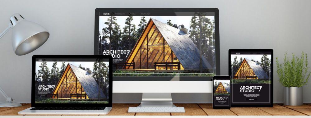
Browsers are fickle beasts. They don’t render images, fonts, text, etc. in exactly the same way and that lovely Photoshop layout may look like utter junk in a browser. Then of course in these days of responsive design; there’s the issue of how your site’s going to look when it’s crunched into an iPhone screen.
You Can’t Play with an Image
What if the feel of that beautiful site is a load of old rubbish? How will you tell from a lovely Photoshop image if that’s the case? If you build the mock up in a browser – you can then show the functionality not just the look.
Photoshop Work is Wasted Work
Why build stuff in Photoshop at all? It’s not like you’re going to get those years of your life back when you build the working website. Just go straight to building the website; it won’t be that much more time consuming than doing it in Photoshop and it will be much easier to see if things are working at a much earlier stage of design too.
Flying Solo is Silly

Author/Copyright holder: Melanie Holtsman. Copyright terms and licence: CC BY-NC 2.0
Most product creation exercises are all about the team work involved and yet, the Photoshop design tends to be done by one member of the team with one specific skill (graphic design). It’s a way to waste much of the creative talent in the design team. If all you do is build pretty pictures rather than websites… you lose much of the genius that you pay good wages to work for you.
But… Don’t Throw Photoshop Out Either
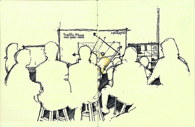
We think Photoshop’s an awesome starting place. It lets us quickly wireframe or sketch ideas without relying on other specialist packages. It also helps us compile things like style guides or extensions to an idea later on in the design process.
Author/Copyright holder: Timothy Terway. Copyright terms and licence: CC BY-NC-ND 2.0
It’s not that Photoshop sucks – it’s an incredibly versatile tool which is justly the most popular package of its kind in the world – it’s that it’s not the right tool for the design of a website. It’s the right tool to create graphics with and to support the design of a website.
Header Image: Author/Copyright holder: Adrian Jimenez. Copyright terms and licence: CC BY-ND 2.0
