Want to design your copy so that it improves the user experience? You’re not alone. So we’ve come up with a short list of tips that should help create more valuable copy on your website or in your application:
Use Labels

Author/Copyright holder: oddharmonic. Copyright terms and licence: CC BY-SA 2.0
If you want your users to know what you’re talking about – tell them. This is in fact one of the key rules of presenting data in real life too. Tell people what you are going to tell them, then tell them, and then come back and summarize what you told them. This helps retention of information and makes it much clearer as to whether people should stick around for you to do the telling.
In copy that means clear headlines and sub-headings. Make sure that these are clear and informative. It’s OK to be witty or clever too but not at the expense of clarity.
Make Your Links Valuable
We’ve done a whole article on why the words “click here” suck. A link should be informative; the text should tell a user what they will learn when they do hand out that all important click. The good news is that writing clear links will also improve your search engine optimization; Google looks at links and the descriptions and tries to see if they are related to the content of the landing page.

Author/Copyright holder: amattox mattox. Copyright terms and licence: CC BY-NC 2.0
So use names and descriptions in your links and don’t be vague about where they go. It should, as an added bonus, also improve your users’ trust in your website.
Look at Space in Your Design
Great graphic design can be undone by the copy that fills it. If you are selling a highly technical product and need to convey that information to your users than a gorgeous display with room for exactly 5 words of text – is worse than useless. The same goes for space for endless product descriptions when the product is too simple to need that kind of explanation. Could you write 300 words about a $5 wine glass? And even if you could; could you find anyone who would actually want to read those 300 words?

Author/Copyright holder: David Sillitoe. Copyright terms and licence: All rights reserved Img source
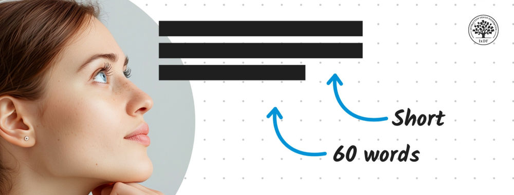
The space you allocate for text needs to be useful in the context of how that text will be used. Otherwise you won’t be able to give people what they need or you’ll have to bore them to death with long, ponderous descriptions.
Text Needs to Be Placed Appropriately
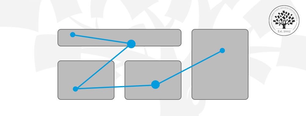
Look at the overall design and ask whether the text is in the right place? It’s all too easy to try and stuff everything you think a user might need on the home page but in practice that’s a great way to send users running for the hills. If you need lengthy product descriptions – create individual products pages with the space for it. If you want to write 5,000 word blog posts, that’s awesome, but make sure they integrate with the layout properly.
Designing with copy in mind takes no longer than ordinary design. It just means raising your awareness of your users’ needs before you put pen to paper.
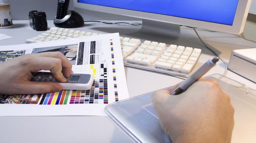
Header Image: Author/Copyright holder: Unknown. Copyright terms and licence: Unknown. Img Source
