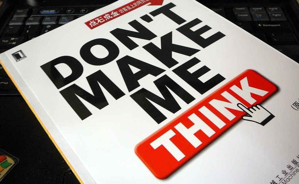
Don’t Make Me Think is the title of a book by the HCI and Usability engineer Steve Krug. It teaches UX designers how to deliver great user experiences in a very simple and accessible way. Since its release in the year 2000 it has become one of the defining texts in the industry and an invaluable guide to UX professionals around the world.
Don’t Make Me Think was written by Steve Krug to help people think like usability experts do. It was designed to be short, concise and very much to the point. The idea being that if it can be read in less than 2 hours and covers all the most important concepts of usability; it would be much easier to get people who don’t normally have responsibility for UX to get on board with the ideas and to promote them from within their organizations.

Author/Copyright holder: Austin Kleon. Copyright terms and licence: CC BY-NC-ND 2.0
This has made it one of the most popular books in the UX and usability field and to date it has sold nearly 500,000 copies and been published in 20 different languages!
Steve has also written a sequel; Rocket Surgery Made Easy is a practical guide to usability testing that can be used by just about anyone to examine their web site, software or app to see that their products are as usable as possible.
Key Ideas from Don’t Make Me Think
We strongly recommend that you read Steve’s book. It really is incredibly short and it will ensure that you get a strong grounding in usability without spending half your life studying the research that surrounds the area. As a way of introduction (or refreshment if you have already read the book), here are some key lessons in the book that are worth highlighting:
Usability Is…
Usability is simply the idea that a normal person should be able to use your products without finding the process frustrating or annoying. Usability is making sure things work well and are easy to use. Spoons, for example, are incredibly usable .

Author/Copyright holder: Scott Bauer. Copyright terms and licence: Public Domain
Self Explanatory is the Way Forward
Whenever a user opens an app or a web page they should be able to tell you at a glance what it’s for. It should be as obvious as can be what the purpose of things is.
Don’t Make Me (or Anyone) Think
If you make people think, you make them unhappy. Users don’t want to treat your site or app like some sort of cryptic crossword – they want to know what they should do immediately and then do it. The more you make people think, the more likely they are to go elsewhere to get the job done.
Time Wasting Sucks

Author/Copyright holder: PROangie werren. Copyright terms and licence: CC BY-ND 2.0
People go online to save time not to spend it. If you waste people’s time they move on. This should be obvious when you think about the fact that even page loading times are considered in Google ranks.
Let Me Go Back
As long as the back button works, mistakes don’t matter too much from a user’s perspective. The back button is the most used feature on the internet today. Make sure people can get back to where they started if they get lost.
People are Habitual
If something works well – people will tend to stick to using that. Even if there’s a better way to do something out there – it’s unlikely that they’ll go looking for it. That doesn’t mean that they won’t eventually have it called to their attention but if you make things usable; you make them sticky.
Get to the Point
Again with the time saving – people don’t look for pleasantries on the internet; they want to get to the point. Make sure your sites and apps do just that.
Some People Love Search
You need to have a search facility within your web app or site. There’s a certain group of users who have become search-dependent. If you don’t give them the option; they’ll go elsewhere.

Author/Copyright holder: Panagiotis Georgiou. Copyright terms and licence: CC BY-NC-ND 2.0
Don’t Change the Map
People remember the experience of interacting with websites and applications. They learn where to find what they want and how to do what they do. When you mess with the site map – you mess with their ability to recall these steps and make things confusing for returning users.
Show Them the Way to Go Home
The home button is the ultimate emergency exit for users. If they get really, really lost and even the back button isn’t helping – they need a single click to get them home. Make sure it’s obvious and immediate.
The Take Away
Don’t Make Me Think is all about simple ideas and simple ways to put them into practice. Of course, there’s more to usability than Steve’s brilliant guide can contain but all the major fundamentals for UX designers are there and they’re very easy to get at. Usability is one of the four main building blocks of UX (along with desirability, value and adoptability) and it’s vital to get to grips with it to build awesome apps and websites.
References & Where to Learn More
Course: Web Design for Usability.
Don’t Make Me Think by Steve Krug can be purchased at Amazon here (please note the Interaction Design Foundation is not an Amazon affiliate and does not receive any commission on purchases made)
Hero Image: Author/Copyright holder: keso s. Copyright terms and licence: CC BY-NC-ND 2.0


