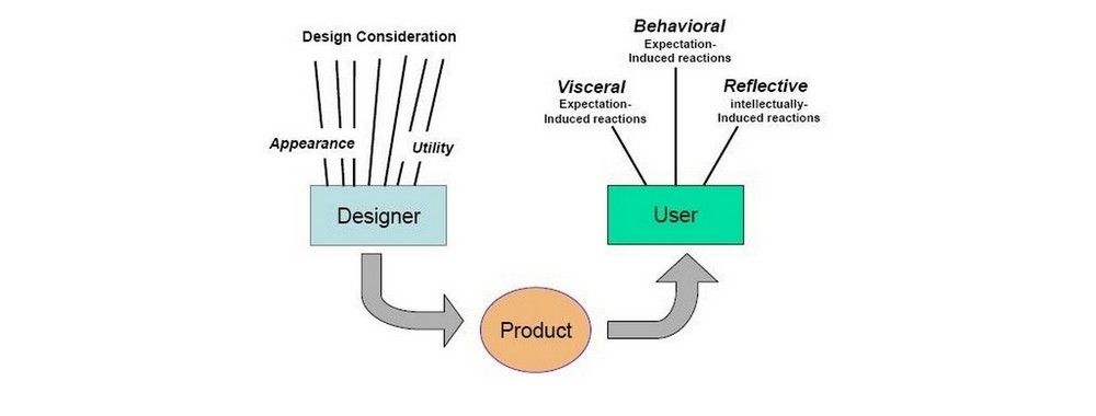
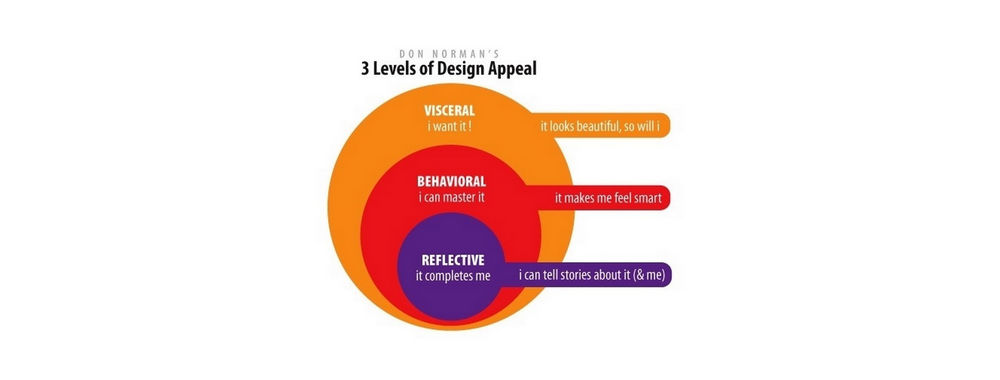
“If the product is something fundamental to life and well-being, then the proper response is to ignore continual shifts in popular sentiment and aim for long-lasting value. Yes, the product must be attractive. Yes, it should be pleasurable and fun. But it must also be effective, understandable, and appropriately priced. In other words, it must strive for balance among the three levels of design.”
— Don Norman (2005) in “Emotional Design: Why we love (or hate) everyday things"
As you are aware, the popular belief is that aesthetics have the potential to influence users at the visceral, behavioral and reflective levels of processing. Attractive things not only make us feel positive but also influence us in terms of how we interact and think about such things. Even slight changes to the visual appeal of products, situations, and even workplaces have been found to influence productivity. For example, a recent study conducted by psychology researcher Marlon Nieuwenhuis at Cardiff University and her colleagues (2014) found offices with plants (i.e. 'green' offices) reported employees were happier and showed higher rates of productivity than offices with a 'lean' design (i.e. stark offices with no greenery).
It would be nonchalant to simply say aesthetics make things better; taken as a whole, aesthetics encompasses a myriad of different considerations, and a misstep on any of these can make the design and user experience worse. The things we found attractive, stylish or appealing ten, fifteen, twenty, thirty years ago are, for the most part, are things we see from our current viewpoint as old-fashioned (although some things we appreciate as 'retro') and outdated. So, we are constantly dealing with changing attitudes of aesthetic appeal. This means aesthetics is something of a moving target, emphasizing the challenge facing us all as designers.
Aesthetics in an ever-changing world
So, how can we contend with changing attitudes and opinions of aesthetic appeal?
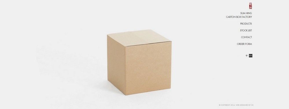
Firstly, concentrate on the product. Many of the answers should be found by focusing on what exactly you are designing. For example, a website selling clothes should convey this message instantly, which means the designers must limit the amount of distraction on arrival. Take a look at the Sum Hing Carton Box Factory website pictured above; the user is greeted by a single cardboard box. The navigation options are then placed along the right-hand side of the user interface. This arrangement informs the users of where they are and the potential navigation points. The aesthetic appeal lies in the minimalistic design.
Secondly, keep things simple. This is connected to the previous example; if the users have to search to find what they need, you have, to a degree, failed. What they need should be available and visible as and when they need it. If you manage to reduce the time it takes to identify the necessary element or object, the users/consumers can concentrate on the task at hand and improve their productivity as a result.
Thirdly, keep things functional, effective and transparent. While there is pressure to bend and weave so as to stay in time with the prevailing styles and fashions, functionality, effectiveness, and transparency are just as likely to attract users and consumers. Functionality refers to how the user interacts with the product. If there are significant difficulties, it does not matter how attractive your design is, the users are likely to feel frustrated. Effectiveness refers to how quickly the users are able to identify what they can do, how they can do it, where they can go, and the speed with which they are able to complete their tasks. Transparency is the honesty and openness of your product, branding, message(s), and so on. If the users feel like there is some hidden catch to using or buying your product, you will lose their trust. After all, if we do not feel comfortable or relaxed, anticipating some nasty surprise, how can we be expected to enjoy the user experience? The users should be able to focus their attention on the elements necessary for their task(s).
When products are poorly designed (i.e. affect the interactive experience) and are inefficient and dishonest, the aesthetic qualities of your product will be associated with these negative design characteristics. For example, an attractive banner advert might have aesthetic appeal, but through experience, the users know they are being seduced with little honesty and transparency.
Conclusion
This is by no means an edict or a sure-fire approach to achieving aesthetic appeal, especially if you are working in an industry based on the prevailing fashions of the time. However, thanks to your concentrating on functionality, appropriateness, simplicity, and transparency, the obstacles that often face users are lowered, allowing them to devote their attention to the important aspects of using and interacting with a particular product.
The Take Away
Aesthetics have the capacity to improve an overall user experience. When simple superficial changes are made to a product, setting or any other element in our environment, they can have a significant impact on our productivity and emotions. While attractive things have been found to influence our conscious and subconscious minds, aesthetics can negatively impact our thinking and behavior. In order to exploit the benefits of visual appeal, whilst reducing the potentially deleterious aspects of poor visual (or sensory) design, you must focus on a number of important considerations. What is the product? Who are your intended users? Is the design simple enough to ensure rapid identification of the elements necessary for a specific task? Are you being honest and transparent? Each new product presents a specific set of challenges; however, the principles of functionality, appropriateness, simplicity, and transparency help us make the correct superficial design decisions.
References & Where to Learn More
Hero Image: Copyright holder: the Author, copyright license and terms: Public Domain
Nieuwenhuis, M., Knight, C., Postmes, T., & Haslam, S. A. (2014). “The relative benefits of green versus lean office space: Three field experiments”. Journal of Experimental Psychology: Applied, 20(3), 199.
