Fitts's Law provides a model of human movement, established in 1954 by Paul Fitts, which can accurately predict the amount of time taken to move to and select a target. Although originally developed according to movement in the physical world, in human-computer interaction Fitts's Law is typically applied to movement through the graphical user interface using a cursor or other type of pointer. Fitts's Law has been formulated mathematically in a number of ways; however, its predictions are consistent across the many different mathematical representations.
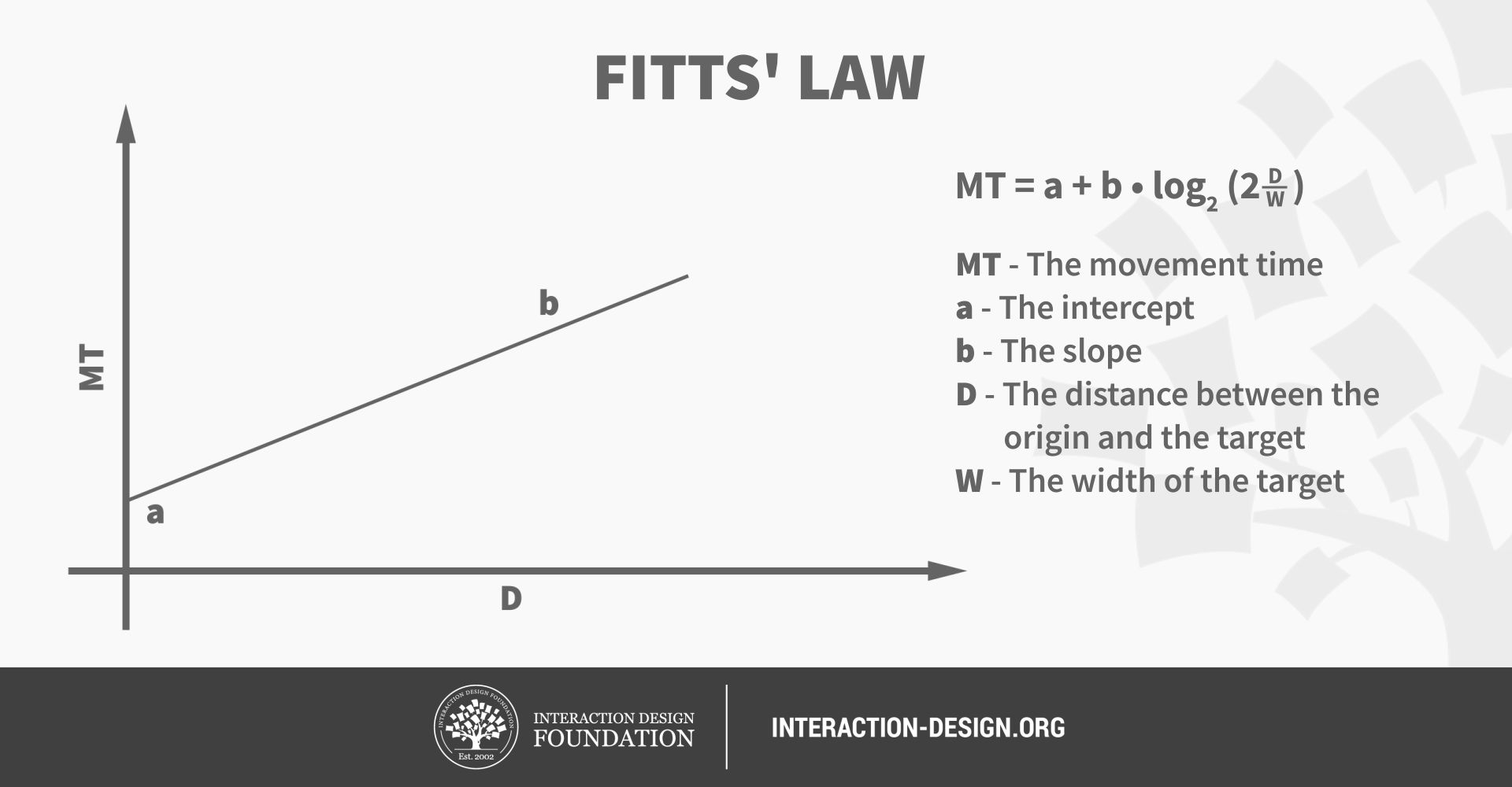
Put simply, Fitts' Law states: "...the time to acquire a target is a function of the distance to and size of the target". As the distance increases, movement takes longer and as the size decreases selection again takes longer. Whilst Paul Fitts established his law of movement before the advent of graphical user interfaces, the law is no less robust when applied to navigation through the virtual world.
Applying Fitts’s Law to User Interface Design
The size of a target and its distance from the user’s current position within the user interface affect user experience in a number of ways. Some of the major implications for user interface design and user experience in turn are considered below:

1. Command buttons and any other interactive element in the graphical user interface must be distinguished from other non-interactive elements by size. Whilst it may seem obvious, user interface design often ignores that the larger a button is the easier it is to click with a pointing device. As interactive objects decrease in size there is a smaller surface area, requiring a level of precision that increases selection times.
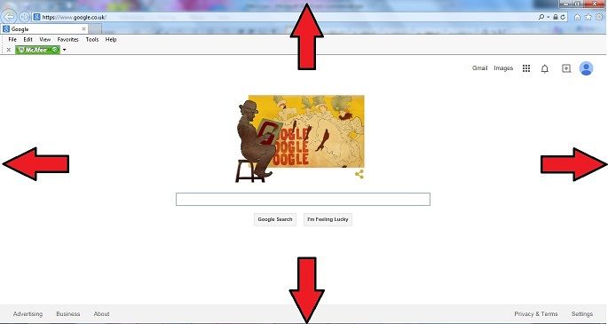
2. The outer edges and corners of the graphical user interface can be acquired with greater speed than anywhere else in the display, due to the pinning action of the screen. As the user is restricted in their movements the pointing device cannot move any further when they reach the outermost points of the screen; fixing the cursor at a point on the periphery of the display.
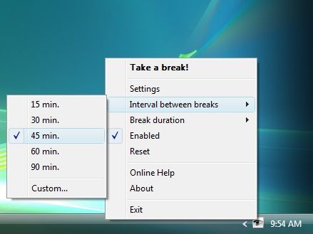
(Pop-up Menu)
3. Pop-up menus better support immediate selection of interactive elements than dropdown menus as the user does not have to move the cursor from its current position. Therefore, graphical designs that allow the user to interact without moving help to reduce the 'travel time'.

(pie menu)
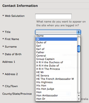
(Dropdown menu)
4. Selecting options within linear menus, whether vertical (e.g. dropdown menus) or horizontal (e.g. top-level navigation), takes longer than clicking options in pie menus - where choices are arranged in a circle. Travelling distance is the same for all options in pie menus, unlike linear menus where distance increases the further along or down the list of options the user goes. In addition, the size of target areas is large in the pie menu, with the wedge-shaped buttons affording a larger margin for error when moving the cursor.
5. Task bars impede movement through the interface as they require a more time-consuming level of precision than when options are placed on the outer limits of the screen. Although unconnected to Fitts's Law, multiple task bars can introduce a certain level of confusion or at the very least require the user to engage consciously with the screen arrangement to ensure appropriate selection.
A Simple Rule
The aim of user interface design should be to reduce the distance from one point to the next and make the target object large enough to enable prompt detection and selection of interactive elements without sacrificing accuracy. One particular aspect of this is ensuring that users are able to click anywhere on an interactive element to carry out the assigned action. For example, links, whether they are in the form of text, images or buttons (such as those seen in the ASOS screenshot below), should afford clicking on the whole region.
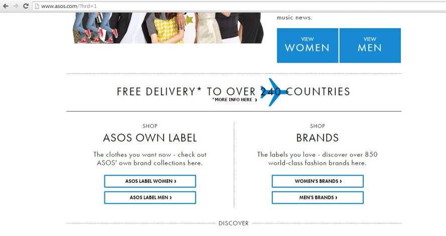
Unfortunately, in web design especially, users are often forced to position the cursor directly over a specific portion of a link in order to interact. It is important to design according to the users' expectations; they should be able to click anywhere within the clearly defined boundaries.
In Summary
Fitts's Law is applied to the design of interactive objects in graphical displays. As the size of an object increases the selection time goes down and as the distance between the user's starting point and the object decreases so to does the time taken to make the selection. Conversely, small objects, placed far away from the user's starting position take longest to select. Therefore, designers should aim to make objects as close to one another when they are used in the same sequence chain. They should also try to make the interactive elements of the screen as large as is sensible with the amount of space available. Small objects spread apart take the longest time to select; avoid this combination of design features as much as possible.
References & Where to Learn More
Course: UI Design Patterns for Successful Software:
https://www.interaction-design.org/courses/ui-design-patterns-for-successful-software
When You Shouldn’t Use Fitts’s Law To Measure User Experience Anastasios Karafillis (Smashing Magazine)
Human Factors and Fitts’ Law Ken Goldberg, IEOR and EECS (Slides)
Fitts’s Law
Image 1: Assured Dynamics
Image 2: Six Revisions
Image 3: Ar Mythra (WIki User)
Image 4: IE Screenshot
Image 5: Tatiana Azundris
Image 6: Velocity Partners
Image 7: Toshiba Satellite Taskbar
Image 8: ASOS.com


