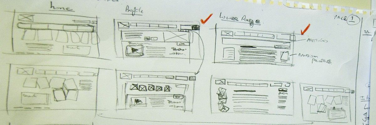
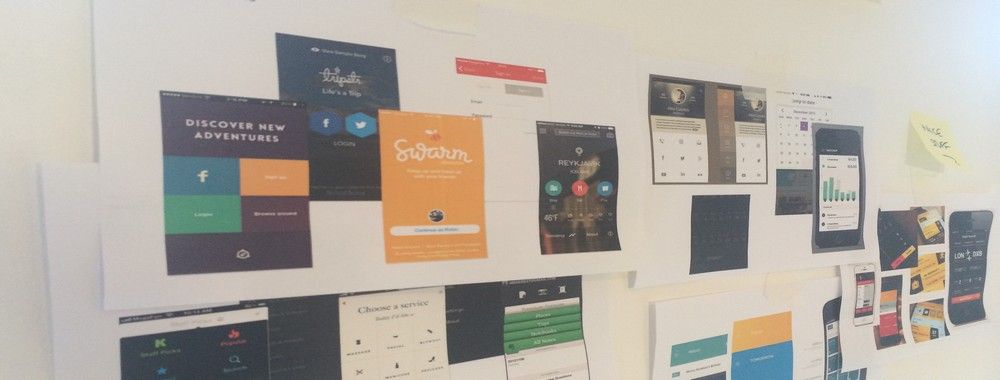
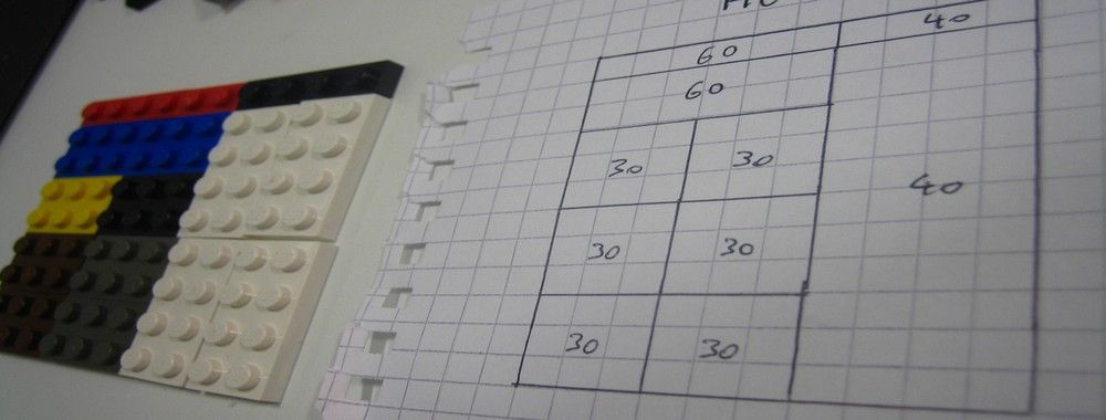
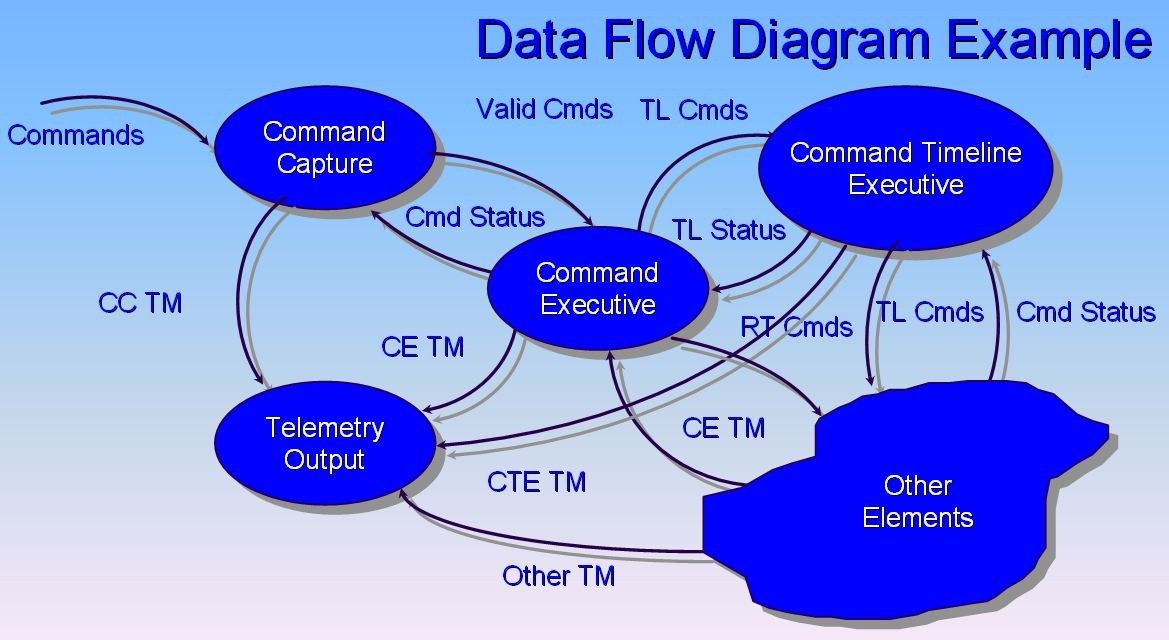
It can be really tempting to start a design project by leaping into the deep end and starting to sketch out pages and work on the information architecture of the final product. However, it’s almost certainly the wrong approach to take. To create great user experiences – designers must focus on the user’s needs and that means developing an understanding of how to create the best task flow for that user. The better you facilitate the user moving from start to finish on a particular process – the easier the product is to work with and the more likely that you are to deliver an awesome user experience.
Author/Copyright holder: John Azzolini. Copyright terms and licence: Public Domain.
Flow design doesn’t just have to examine user flows – it can also examine other types of flow. However, UX designers are generally going to be concerned with user flows.
How Do We Design for User Flow?
We begin with the user themselves. Instead of going through the technical specification documents and trying to base designs on that – we examine what the user’s objective (or objectives) are and what the business’s objective (or objectives) are.
So for example on a retail website this might include:
User wants to buy a new product
User wants to research alternative products
User wants to return a product
By mapping out all the possible objectives and comparing them to business objectives – it becomes easy to create user flows. Flows are simply the process steps from the user arriving on a website to completing their task or tasks.
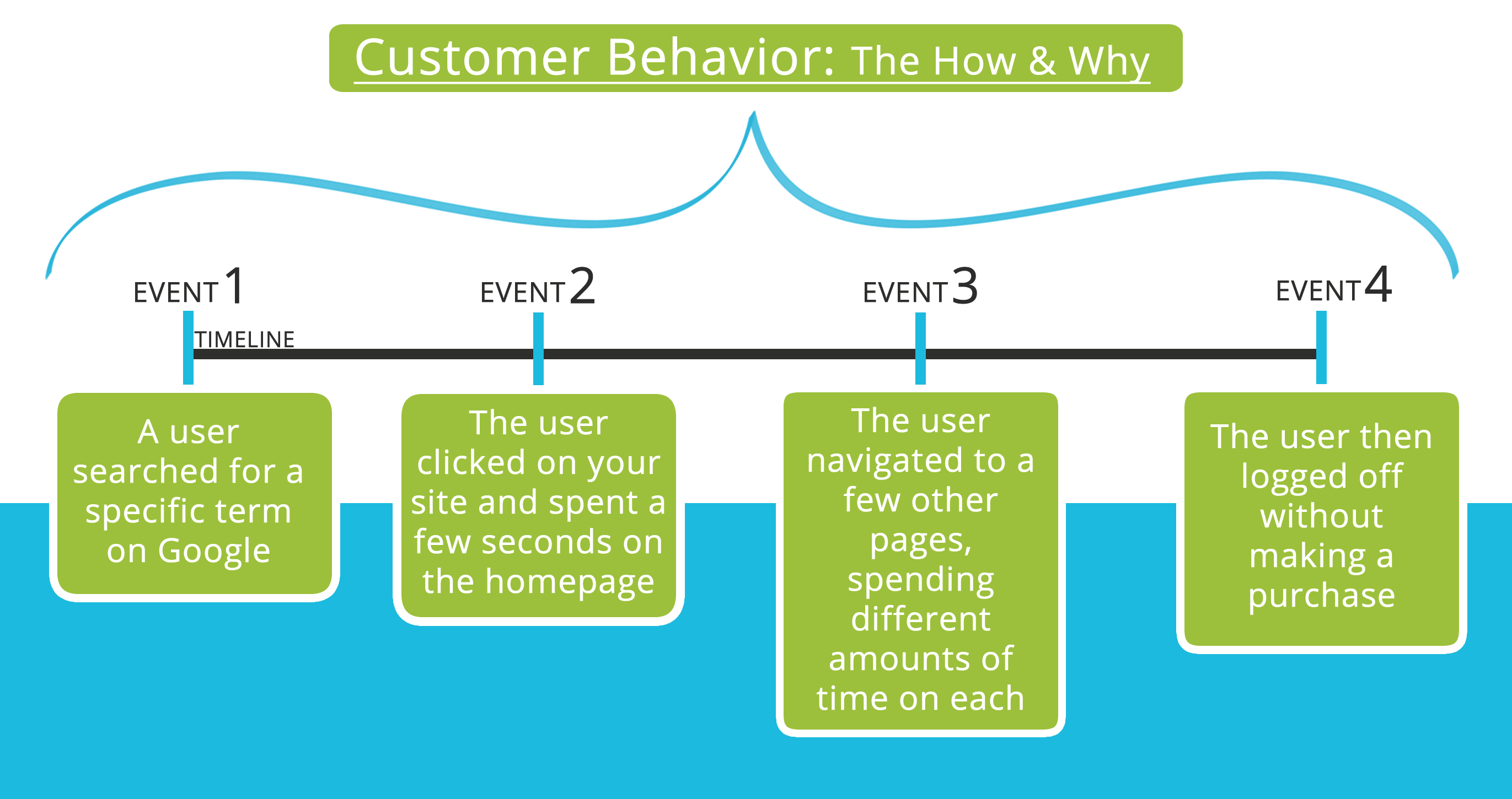
Once you know what users want to do – you might also want to look at where a user might arrive on your site and where they are coming from. A user who is responding to e-mail marketing will probably be delivered to a different place in the site to a user who finds you through organic search.
These define the entry points into task completion funnels (similar to marketing conversion funnels).
Author/Copyright holder: Photo.iep. Copyright terms and licence: CC BY 3.0
The classic conversion funnel is one that nearly everyone in marketing and product design is familiar with. It tracks the expectation of customers moving through a sales flow.
The Task Completion Funnel
Task completion funnels should be designed for flow from the point of entry to the funnel to the completion of the task.
This will normally involve:
Design of the point of entry (Banner Ad, Search Text, E-mail, etc.)
Design of the landing page (How will you welcome the visitor to the site and get them to begin the process for which they arrived?)
Design of the process itself
Considerations for Point of Entry
With each point of entry you may want to consider:
What user group or groups are we targeting with this point of entry?
Are they actively looking to get involved with our site or product or are they going to “stumble” across us?
Will they be looking to solve a problem and if so what?
How can we grab their attention and hold it for long enough for them to decide to click through to the site?
How can we best relate to the user involved? What messages might work well with these users? Can we articulate their pain points and a solution simply?
What are the best calls to action to use to get that click through?
Author/Copyright holder: Free Stock Images. Copyright terms and licence: CC BY 2.0
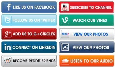
Not every call to action is “buy now!” These are all examples of call to action buttons that you will be familiar with already. Even if you don’t think of them that way when you see them.
Considerations for Landing Pages
For each landing page you will want to think about:
How can we create confidence for the user? What benefits should we highlight? How do we keep the reading burden low whilst still providing enough evidence to reassure the user?
How do we focus the content on a call to action?
How can we keep the cognitive friction for the user in this process to a minimum?
Considerations for Process Steps
As the processes which you will want to guide a user through may vary dramatically – it is harder to provide a concrete list of things to take into account. However, you should focus on:
How can we minimize steps in the process without over-complicating screens?
Can we get the process completed and then ask for more information afterwards? If so, how can incentivize that?
Once you have these flows mapped for each point of entry, landing page and process – you will discover there are large areas of overlap. At this point you can start to map each task completion funnel to each other – which will reduce the overall design burden and suggest a useful structure for information architecture within the finished product.
As Scott Belsky, the VP of Products and Community at Adobe says; “Rule of thumb for UX: More options, more problems.”
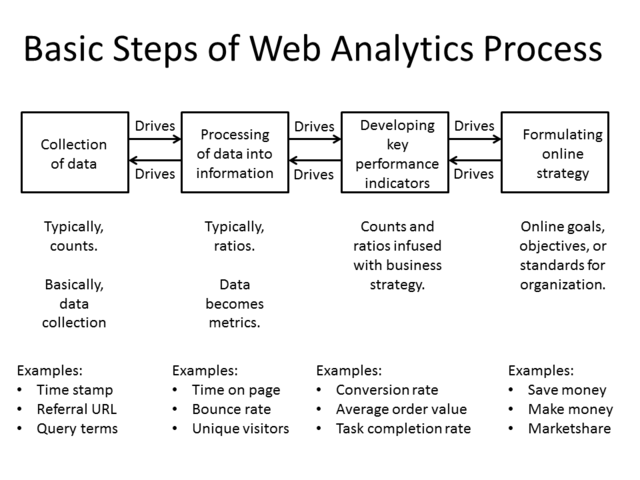
Author/Copyright holder: Gary Stevens of https://hostingcanada.org/. Copyright terms and licence: CC BY-SA 4,0
The simpler and clearer the process – the easier it is for a user to follow. Take the process above and think about how you could make it simpler for your organization?
The Take Away
Flow design makes designers focus on what users want to get out of interactions with a specific product. It ensures that user experience takes priority over graphic design or information architecture structuring and provides a solid framework to move the project forward when visual design and IA are required. Task completion funnels can be sketched on paper and used to explain user flows to other team members (such as developers) and are a clear and simple way of showing what the user wants.
User flows are the ultimate representation of user experience. When design works to user flows – it ensures that users get exactly what they came for.
References
This article looks at the difference between site flow and user flow and when to focus on each.
If you want to create smooth user flows this article has some useful tips too.
