One of the critical issues facing designers for mobile commerce websites is; what do I include to give people a good idea of what the site’s about but without overwhelming them completely? In this article we’ll take a look at what might help make for better home page UX in mobile commerce.
What Happens When Someone Visits a Mobile Website?

Author/Copyright holder: European Parliament. Copyright terms and licence: CC BY-NC-ND 2.0
In tests it’s been demonstrated that most people will have a look at the whole of the home page. That means they’re going to do some downward scrolling and then go back to the top before they do anything. That’s because most of us want to know what our choices are before we make any real decisions on what we’re going to do.
This is often true even when your user has come to your site for a specific purpose. E.g. they know what they’re going to do and the option to do that is clearly displayed when they land on the home page.
So How Can We Help Them Understand Their Choices?
Keep Visuals Simple
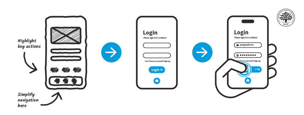
It’s OK when you’re using the massive real estate of a desktop or laptop screen to have a few messages that you want to show to your readers. On a mobile platform too many messages can become ridiculously confusing. Keep things simple on the home page; it’s better to have a couple of critical actions highlighted than an encyclopaedia’s worth.
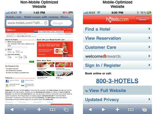
Author/Copyright holder: Small Box. Copyright terms and licence: All rights reserved Img source
You might want to consider shoving the most complex graphics down “below the fold”.
Make Choices Simple
It can be tempting to reduce the number of categories that you can browse on the home page. It fits with keeping things simple right? Not so much. It’s much easier for a user to get where they’re going if they can choose it from the home page. So make all your top-level categories available on the home page navigation if you can. Confuse people too much and they’ll leave. They have to be able to choose where they want to go easily.
Keep The Fold Obvious
If you have a particularly clever design team they may be able to perfectly align the fold with the bottom of the mobile screen. This sounds like an awesome idea (in theory it is – it looks great) but in fact it removes the suggestion of the fold from people’s minds. If they can’t see the fold; they won’t scroll down past it.
Your fold needs to show that there’s more data to come. You want to cut things off in a slightly messy way so that your users know that they can scroll down for more information.
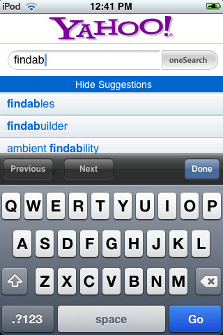
Give Me Search
Author/Copyright holder: Peter Morville. Copyright terms and licence: CC BY-NC 2.0
If worst-comes-to-worst and I need to go looking for something I can’t find on that home page – I need to be able to lay hands on your search facility. That means you need to give me a really clear place to search from. That’s a search field I can type stuff into and not a link to a separate search page.
Header Image: Author/Copyright holder: Text100. Copyright terms and licence: CC BY-NC-ND 2.0


