Affinity diagramming is almost too good to be true. Write on some sticky notes, arrange them, and…that’s it. But don’t let its simplicity fool you. With affinity diagrams in your toolbox, you’ll have the power to bridge the gap between research and results.
Affinity diagrams start as a collection of user observations in the form of affinity notes. They are typically written on adhesive notes or their digital equivalents, though you may also use printed cards or other formats. In this video, William Hudson, User Experience Strategist and Founder of Syntagm Ltd, introduces affinity notes and the methods you can use to obtain them.
ShowHide
video transcript
00:00:00 --> 00:00:30
The affinity diagramming process involves a number of components, the most basic of which is the set of affinity notes. These are the original user observations, and I say "original" but not literally; they actually are taken from user observations, but they're written in the first person, which we call "voice of the customer," and they're always in the first person and always in the voice of the customer.
00:00:30 --> 00:01:03
And of course, people don't normally always talk like that, so you'll find yourself having to, transcribe them, either in the field or, if you've taken recordings, you might transcribe them later. It's always a lot of people, it's tiring, you know, it's so even that gets exhausting. So I try to keep it like one hour max, one and a half, like a bigger shopping. We try to avoid that. We try to avoid days that we know it's gonna or hours that we know it's going to be
00:01:03 --> 00:01:30
like really packed. When I did take interview notes in the field, I did it on a small laptop, and I would deliberately write these in the appropriate format, so they would be in the first-person voice of the customer, and if I thought there was any chance that the interviewee might have meant something different, I'd read it out to them, and I'd say, "Is that a fair representation of what you've just said?" And they would usually agree. Occasionally, they'd say,
00:01:30 --> 00:02:03
"Well, no, it was more like something else." So, it's good to make sure that you actually check this data with your original interviewees. For the remote sessions, I did recordings and had that transcribed into text and then turned that into voice of the customer and then sent those files back to the interviewees just to ask them to have a run through and make sure that everything there was what they'd said, and they were happy with it. So, that just makes sure that we're still on the same page in terms of what user said and what we actually, wrote down.
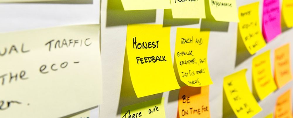
"Affinity notes" are the basic observations of what participants said or did that you write in the first person. The “voice of the customer” is the preferred term, though “the voice of the user” is equally relevant.
How to Build an Affinity Diagram Step by Step
Now that you understand how user research translates into affinity notes and how to write them, William provides a detailed explanation of the diagramming process:
ShowHide
video transcript
00:00:00 --> 00:00:34
The affinity diagramming process starts with the basic affinity notes that we obtain from user interviews and adds multiple layers of hierarchy effectively. Karen Holtzblatt suggests three. So, you and your colleagues go through all the observations, all the affinity notes, group things that you think are related for whatever reason together, and then you would put a blue note on top of those to indicate that those are connected
00:00:34 --> 00:01:00
and try to describe, again in the voice of the customer, what that affinity is, why those particular things are similar. On top of that, you might repeat the process with pink, and those, not surprisingly, group together the blue themes. And then finally, on top, you have a green layer. Now, the green layer may or may not be in the voice of the customer; by that stage, you're actually quite happy just to summarize. But at the pink and blue layers,
00:01:00 --> 00:01:30
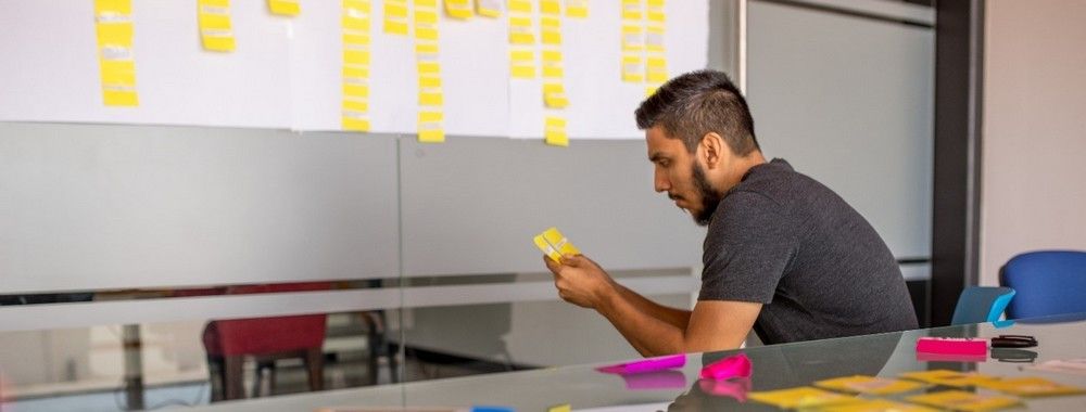
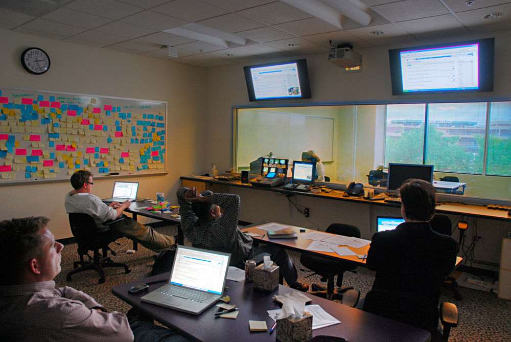
if you have both of those, it's not absolutely essential, it's important that you don't misrepresent the notes underneath. So, summarizing is generally not a good idea at the lower levels. We actually need to be, much more detailed in describing the notes underneath, as it were. If you're doing an affinity diagramming activity face to face, you'll be doing it in a large room, large enough to accommodate all the team members for the process. And those team members there,
00:01:30 --> 00:02:01
beyond your original project team, might include other stakeholders or managers in the organization, might include people from your marketing department, for example, but the people who can contribute and who are interested in what your users say and do and to help shape the direction that your product or service is going to take. So, you have this, this in theory, large room with a fairly large number of people in it, and you need to distribute now these observation notes that you took from your research and turn them into affinity notes
00:02:01 --> 00:02:30
by making them first person, and you shuffle those. It's important that you shuffle them because otherwise you could end up giving handfuls of the same participants to a very small number of people. People are asked to put the affinity notes either down on the table if you're doing it horizontally and they're just plain notes or up on the walls if you're using post-it notes or something similar. And then you start to organize them and reorganize them and label them.
00:02:30 --> 00:03:03
Now, the curious thing is the choice of colors. It turns out that you can buy packs of post-it notes from various manufacturers in these four colors: the yellow affinity notes and then pink, blue, and green. So, that's handy. I don't know whether that was behind Karen's original choice of colors for these things, but it's extremely convenient. You may end up doing this incrementally, so you might actually have several sessions. You would do that with new data when it arrives, and this is actually a recommended procedure, especially
00:03:03 --> 00:03:25
in new problem areas where you're not entirely sure what you're going to find out, but you might still have a lot of data. So, you have an initial session and then you add to it in a subsequent session. Obviously, it's quite a different process for doing it online, but this is the summary of how you do it when you're in a physical face-to-face situation.
In the affinity diagramming process:
Begin with the affinity notes and organize them into related groups.
Then label the groups and repeat the process at two or more levels, depending on the number of observations. This process creates a hierarchical structure.
All levels, except the top, maintain the voice of the customer. The top level can use more abstract topic descriptions, such as "Online Shopping."
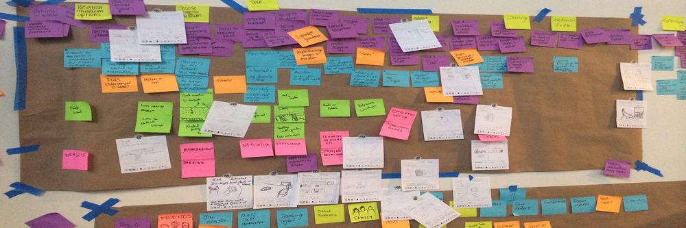
In affinity diagramming, participants traditionally arrange notes on a table or a vertical surface, such as a wall or a whiteboard, in a room large enough to comfortably accommodate all participants. At the end of the session, the group may take a photo of the diagram to capture the results.
However, digital tools now make it easier to create affinity diagrams online. The concept remains the same—you write your notes on virtual sticky notes and arrange them collaboratively via video calls or other online tools. While you lose the benefits of in-person collaboration, online sessions make it easier to revisit and amend your diagram. And if your team is scattered geographically, online sessions help overcome travel and time zone challenges.
Affinity Diagram Guide
This practical guide will help you stay on track during your affinity diagramming sessions. It summarizes the colors used in the hierarchies, provides useful metrics on the number of notes at each level, and includes step-by-step instructions for running your session.
Get your free template for “Get Started with Affinity Diagrams: A Step-by-Step Guide”
The Take Away
Affinity diagrams are highly effective for turning raw research into actionable insights, and the steps involved are simple:
You begin with affinity notes—original user observations in the first person, known as the "voice of the customer," which you typically transcribe on-site or from audio recordings of remote sessions.
Next, review the transcribed data with the original interviewees to ensure you have not changed the meaning.
To begin the diagramming process, group the yellow affinity notes according to their connections and place a blue note on top.
Next, arrange the blue notes into groups with a pink note on top, then arrange the pink notes with a green note on top. Write all notes in the voice of the customer, except the green notes, which use more abstract categories.
When you follow this process, your aim is to accurately represent user observations and group related themes using a hierarchical approach. Affinity diagramming is an engaging activity that immerses participants in user research. The effectiveness of the results lies in the decisions you make as a group.
To improve the chances that your design will engage an audience, we must focus on how it can stand out. To do that, we n
954 shares
5 years ago
Open Access—Link to us!
We believe in Open Access and the democratization of knowledge. Unfortunately, world-class educational materials such as this page are normally hidden behind paywalls or in expensive textbooks.