The internet has the power to improve the lives of people with disabilities. Sadly, many websites and applications don’t consider the disabled during the design process and this cuts off people from information and assistance that they might really benefit from. Designing for people with disabilities doesn’t have to be hard work – there are some simple steps to take that make websites and apps accessible to nearly everyone.
Designing for the Visually Impaired
Visual impairment can range from minor vision problems all the way through to blindness. There’s no “one size fits all” audience when catering for the visually impaired. That means you need to think “flexible” when providing solutions. Some people simply need the ability to amend the size of text easily or to change the contrast/colour balance settings. Others will be using software to read the pages to them. Still others will use software to translate sites into braille.
There are some straightforward tips for making things easy for the visually impaired:
Software translators can’t translate graphical content. That means it’s important to have some text to explain each of your graphics and that’s true for those graphics which are nothing but text too. It’s much harder to enlarge text delivered in graphic form than in standard written fonts.
Make sure you label your graphics with alt text (software uses this text to describe a graphic and its function to the reader).
Don’t restrict font sizes or make layouts rigid. It’s much easier for someone with partial sight to scale the page for their convenience if there are no restrictions.
Try to use descriptive titles for page headers – it takes much longer for a blind person to “scan” a page than it does for a sighted person.
Always use standard HTML – software can struggle badly with HTML that doesn’t follow a standard format.
Try not to use a text only alternative website – design should be universal and text only alternatives should be a last resort.

Author/Copyright holder: Unknown. Copyright terms and licence: Unknown Img source
Designing for the Hearing Impaired
It’s easy to forget that many websites present challenges for the hearing impaired too. One of the key reasons for this is that many deaf and hearing impaired people rely on sign language rather than reading a language for communication.
That means it’s always a good idea to keep language basic. Don’t use big words where small ones will do. You can always test the complexity of language using a Flesch-Kincaid test online. The good news is that this won’t just benefit the hearing impaired – it will benefit all your users. Accessibility of language can massively broaden the audience that can engage with your content.
You should also provide closed captions for audio and video wherever possible. If you can’t embed the captions on a video directly; you can provide a link to a transcript of the video. Try and keep this link as close to the video as possible to make it easy to locate.

Author/Copyright holder: Soichi Yokoyama. Copyright terms and licence: CC BY-NC-ND 2.0
Designing for the Physically (Mobility) Impaired
While many solutions can be implemented at the hardware level for those with movement problems; there are fixes that are useful at a software level too.
It’s important to understand that many operations we take for granted – like being able to hold Ctrl+Alt+Del at the same time are not easy for many people with physical disabilities. Providing alternatives that allow for a series of key pushes rather than a collection of simultaneous key pushes can be incredibly helpful for this audience.
Allowing for voice and other forms of control technology can also dramatically improve the accessibility of a site or application.
It can be very useful to provide links as large buttons rather than as hypertext for those with coordination issues or dexterity problems. Though, if you’ve followed our tip about allowing people to resize their text as they wish – this becomes less important.
Layout and navigation consistency matters for these folks too – don’t move things around and make it even harder to move around a site or application than it needs to be. Try to remember not everyone can use a mouse easily and click consistently.
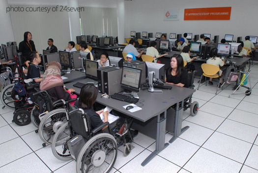
If you’re providing the computing facilities – try to make certain that they are easy to access in a wheelchair and that there’s plenty of space for the movement impaired to function in too.
Author/Copyright holder: 24seven. Copyright terms and licence: All rights reserved Img source
Designing for the Learning Impaired
It’s all too often forgotten that there are large numbers of people out there with cognitive disabilities. We recognize that given the huge range of abilities that it’s nearly impossible to cater for all learning impairments. However, there are some general techniques that can help open up your site to as wide an audience as possible without becoming overly burdensome on the design and development team.
The use of simple uniform screens (e.g. the ability to view only a single thing at any point in time) can help keep confusion to a minimum and keep someone’s attention focused on that idea. Keeping language simple will also help benefit the learning impaired. It’s also a good idea to try and keep on page distractions to a minimum – lots of moving graphics or overly complex navigation systems can frustrate and confuse some people with learning impairment.
Try to keep lists in small and ordered logical groups. This is especially true if they contain links to other parts of the website. Using audio, visual and text to illustrate the same point can help someone stay focused and retain information too.
It’s useful to have an easy, consistent way to return to the homepage so that if things become too much – the individual can easily start again.
Summary
It’s estimated that 19% of the world’s population suffers from some form of disability in their lives. That’s 1 in 5 of your potential user base. Catering for people with disabilities isn’t just a nice thing to do, it’s the right thing to do and it enables you to increase your customer base proportionately in return. The tips above should help you get moving in the right direction for these users.
Header Image: Author/Copyright holder: BBC. Copyright terms and licence: All rights reserved. Img


