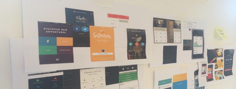
Discoverability sometimes also referred to as “learnability” is the ease at which users can find new features or functions with an app and learn to use the things that they find. While this has always been an important part of user experience design – it becomes even more important in the mobile design environment where limitations on screen real estate make discoverability a more significant challenge.
The easier your mobile application is to learn to use and the easier it is for your users to find the functionality to learn it – the more useful that application is likely to be to the user. The user experience is also likely to greater.
Discoverability and Learnability
Discoverability refers to the ease with which users can discover features within an application. Learnability refers to how easy it is for the user to learn to use the application and its features. Whilst not identical concepts they are closely related enough that you can treat them together in your designs.
A Little about Learnability
There are several factors that affect the implementation of learnability in apps:
Learnability must be easier the less important an app is in a user’s daily life. People will put more effort into learning when they use something regularly than they will if something will only be used once a month or once a year.
Learnability is easier the more frequently an app is used – familiarity with an interface, conversely to the point above, makes it easier to use.
Learnability might want to be delivered in proportion to cost. If someone spends $100 on an app – they’re more likely to spend more time learning to use it than they will with a $1 app.
Learnability can be affected by competing offerings – the more complex your competitor’s products are the more likely those users will tolerate complex learning curves in your products.
Learnability, to some extent, must reflect complexity. If your app only has 2 functions it really should be very easy to learn to use and execute those functions; it is clearly going to be harder to pick up 200 functions in the same time.
It is also worth noting that evidence suggests that steeper learning curves may, in direct opposition to standard UX experience practice, create more loyal users with greater capacity. (In those who persist with the application rather than giving up on it).

© Kartik Shradha, Fair Use
Areas of UI that Help with Discoverability and Learnability
When making applications (and especially mobile applications) discoverable and learnable you’ll want to focus on UI to facilitate that and in particular:
Action Bars – these provide the opportunity for the user to “bank” their most commonly taken actions. This is in contrast to the navigation bar more traditionally used in web applications. They remove the clutter from the screen and focus on what a user is most likely to want to do in any given circumstance.
Social logins – it’s a good idea to first consider whether users will want to link their social profiles to your app. However, if they are going to be OK with that – logging in with a social network can save time, save account creation and still provide you with useful data for your app design team.
Big Buttons – the bigger the button, the clearer it should be that the user needs to take an action. Think Badoo and its’ tick/cross approach to dating, for example. Of course, big buttons are best in apps that are going to offer a limited number of options to a user at any point in time. Otherwise they’re likely to become very annoying and require a ton of scrolling to handle properly.
Notifications – when something changes for the user, let them know. Notifications don’t have to be dramatic and highly intrusive either. The simple digit count on message apps so that users are aware there are new messages available to them, for example, is a great way to update someone without intruding into their day.
Discoverable controls – mobiles offer a whole new set of interactions with a device. Touch-sensitive screens, accelerometers, GPS readings, swipe controls, gesture controls, image controls, etc. it can be incredibly useful to make these controls make themselves known as users experiment with their devices.
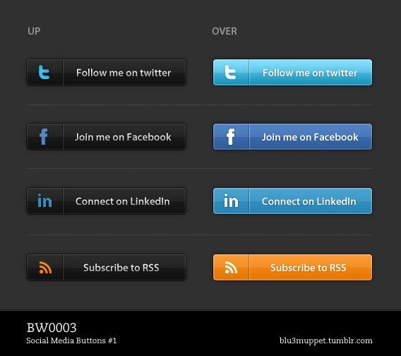
© bluemuppet, CC BY-SA 3.0
The good news is, of course, that many of these discoverable approaches are already available as UI patterns. You don’t always have to reinvent the wheel in order to assist your users via UI design.
Testing for Learnability and Discoverability
It can be hard to test for both of these concepts prior to implementing a design. They are a consequence of usage and as such even prototyping may not lead you to the answers that you seek when it comes to these concepts.
It may be best to agree that you need to iterate a product from an alpha or beta version to a launch version to test learnability and discoverability. They should also be revisited at a later date once your user base has become more familiar with the product and you can gain a better understanding of how these concepts played out in “real life”.

The Take Away
Discoverability and learnability are not quite the same thing – however, they both complement each other. The need for users to be able to discover functionality becomes critical on a mobile interface where limited screen real estate requires different approaches compared to the desktop. Learnability, as we have seen, should reflect the user’s needs and investment in the application – the more it is used and the more it costs – the more likely the user is to tolerate a steeper learning curve.
References
See some great examples of discoverable controls in UI Design patterns here.
UX Booth looks at learnability with an example drawn on Google Maps here.
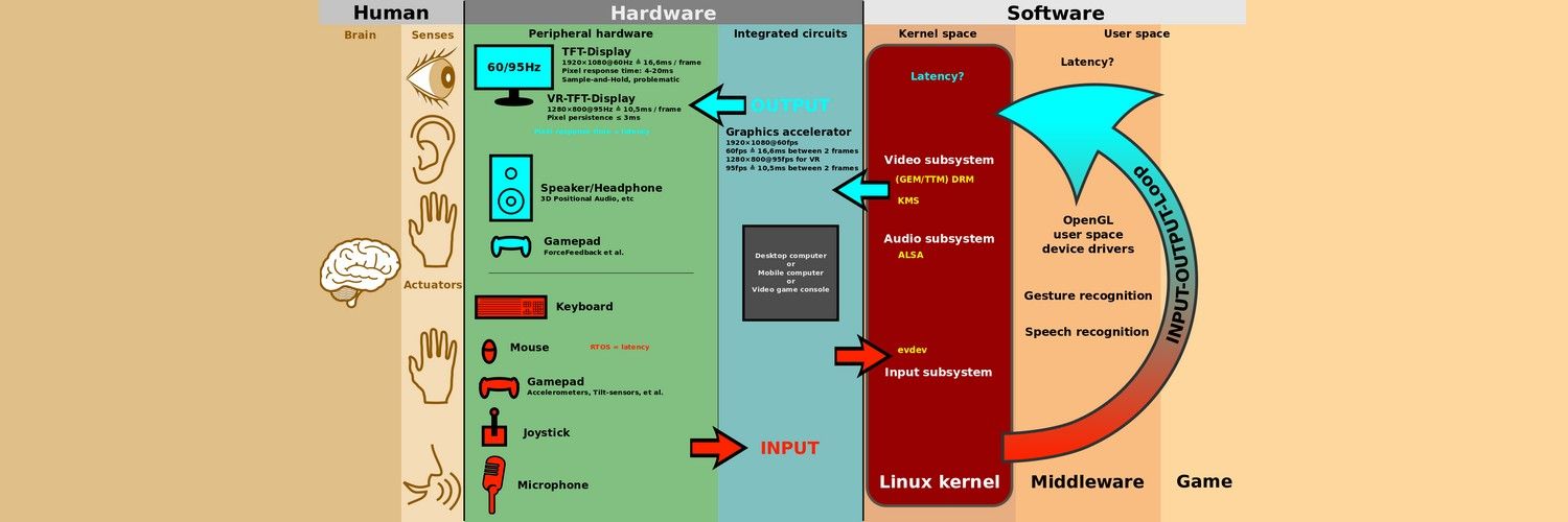
Hero Image: © ScotXW, CC BY-SA 3.0
