If you’re struggling to create a brand identity for your design business then we’ve got a little help for you. When it comes to building a strong brand it can be useful to keep some simple ideas in mind:
Define What Your Brand is About
Vision and mission statements may seem like dry corporate ideas but the purpose behind them is to encapsulate what you really stand for. The same is true of brand values. Before you develop any branding you need to know what you’re going to say about your business with that branding. Don’t focus on logos, colours, etc. first – think about what it is you want those things to tell your clients. A formal statement of brand values on your website can help inform clients of your thought processes too.

Author/Copyright holder: TheBusyBrain. Copyright terms and licence: CC BY 2.0
Don’t pick values because you think that they’ll sell though – pick them because they’re important to you and the way you work. Honesty, is always the best policy.
Brand Identity is Fluid
Brands aren’t logos and they’re not colour schemes. Rigid style guides no longer demand the precise placement of a logo on every page with instructions on how it should be rendered. Instead brand identity has become fluid.

Author/Copyright holder: CPOA. Copyright terms and licence: CC BY-ND 2.0
Have you ever visited the Google homepage to find that their logo wasn’t the multi-coloured logo and had been transformed for Christmas or for Chinese New Year? That’s because Google knows that its identity carries throughout these transformations.
Now, we’re not suggesting you have the resources to ape Google for your design business but you can grab a lesson from them. Each touch point you have with a potential customer offers you a chance to show the personality of your work. You could rework your logo slightly for your website, your business card, your presentations, etc. but that might be too much work for the smallest businesses.
What you can definitely do is include a different aspect of your work (with a unifying theme) on each touch point. Showcase what you’re really good at and show that you’re more than a one-trick pony.
But Consistency Counts…
Author/Copyright holder: Ged Carroll. Copyright terms and licence: CC BY 2.0
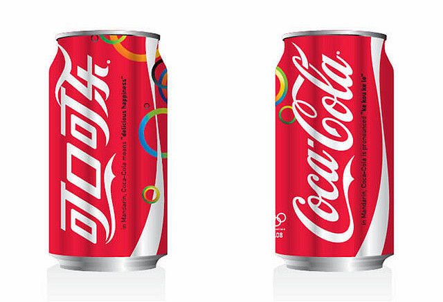
Your branding should still be readily identifiable as belonging to you no matter how much you mix and match. Did you know that Coca-Cola in China is not Coca-Cola but has been transliterated into Chinese? However, walk into a Chinese store and you’ll be able to readily identify a can of Coke because it looks like a can of Coke. Don’t confuse your clients with mixed messages; always ask – “Can you tell that this is our product?” before using something as branding.
Keep Things Simple
While tone and content can enhance your brand; the most important message is visual. Branding should be recognizable at a glance. As people interact with your brand more often; you want them to know your work when they see it. Focus on a visual identity for a strong brand and then ensure that the words you use support the visual message.
Header Image: Author/Copyright holder: Jasmine Sandler. Copyright terms and licence: All rights reserved. Img

