Testing is incredibly important to the user experience. It’s not a one-off exercise but rather a constant process that should inform future development cycles. Testing is, however, often a costly exercise and small companies often can’t afford to do as much testing as they’d like. So here are some useful tips on making a small budget go farther and still deliver useful results from user tests:
1. Test Your Focus
Grab three people, from outside of the organization you work from, show them the application or website. Can they tell at a glance; what you do, where they can get more information and how to send you an e-mail or give you a call? If they can’t – it’s time to redesign the landing zone until they can.
2. Make it Easy for Users to Share Feedback
Author/Copyright holder: Armando Sotoca. Copyright terms and licence: CC BY 2.0
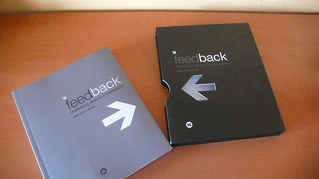
Set up a forum, a Facebook page, a Twitter feed, etc. but also ensure that your users can give you feedback from within the site or the application – the easier it is to leave feedback, the more likely that users will actually provide it to you. Don’t make people go looking for this.
3. Use That Feedback
Data collection is often done for data collection’s sake. If you do let people give feedback, the least you can do is read it, thank them for it and when appropriate act on it. Giving people credit for their feedback and showing that you have heard them is also a great way to improve both the user experience and the customer experience.
4. Hammer Links Regularly

Author/Copyright holder: Tim Franklin Photography. Copyright terms and licence: CC BY-NC-ND 2.0
Before you launch your website/application and every single month thereafter; go through and click all the links. Do they work? Do they take people off site? If so, was it clear that was going to happen? If your links behave in the expected manner – you’re not only doing your users a favour but you’re your Google (which doesn’t like broken links at all) rank a favour.
5. Check The Mobile Experience

Author/Copyright holder: Michael Coghlan. Copyright terms and licence: CC BY-SA 2.0
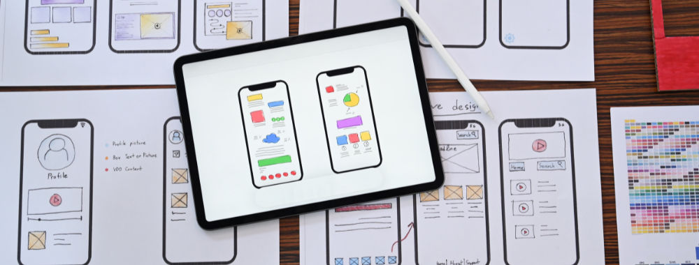
Put your product into people’s hands on a smartphone and on a tablet screen; watch what they do. Any pinching or rapid scrolling movements? You might want to eliminate those for a start. Ask what their favourite applications/website does that yours doesn’t on that device. Pick up simple pointers for usability.
6. Don’t Ask for Design/Development Advice
Users, by and large, aren’t your designers and developers – they have no idea how something should be done; they just know what they want to do. It’s a great idea to ask users what they would like to do with your application but don’t try and get them to put that into practice by describing how it should be done… it won’t work. It will leave both you and your user frustrated. Let them concentrate on the what and you keep an eye on the how.
Header Image: Author/Copyright holder: Harsha K R Copyright terms and licence: CC BY-SA 2.0


