If you missed the first part of our series on learning design, yesterday, you can find it under the UX Daily tab on our website. Today, we’re going to continue with visual elements and then explore some other areas to improve the UX of learning experience design:
Follow the Law of Proximity
It can be tempting to try and split visuals and text that relate to each other over a standard page break or to better maximize the use of space. The trouble is that from a user’s perspective this is needlessly distracting. Don’t present a table half a page away from its explanation, etc. The idea is to help people make connections between the visual elements and the text – if they aren’t next to each other… you’re making this a much harder job than it needs to be.

Author/Copyright holder:Unknown. Copyright terms and licence: Unknown.
This rule is most often violated when content is animated. There’s some text and then a video. The user clicks on the video and the video plays and nowhere in the video is there any reference to the content that it relates to. Don’t be afraid to recap; use a voice over to bring the connection together or labels, etc. to do so.
Avatars Add Social Proof to Learning Experiences
We’re social creatures and it should come as no surprise that when you tap into our social behaviours; we learn better from an experience than from those where no such social element exists. This is why so many people prefer classroom training to other forms of learning; it’s not that they’re incapable of learning from a book – it’s that they feel alone when they learn from a book.

Author/Copyright holder: Edweek. Copyright terms and licence: All rights reserved Img source
You can use avatars to add a human face to the proceedings (and we stress that in most instances a human face is infinitely preferable to an orc, an alien, etc.). If you don’t have budget for this – you can still capture the human voice by using a conversational narrative tone. And please, don’t even think about automating the spoken word – there may be huge admiration for Professor Stephen Hawking’s ability to overcome his disability but the robotic voice is not one that most people can relate to for long periods of time. And you’re probably not offering the same level of in-depth world class education as Professor Hawking does either.
The Use of Humour Should be Cautious
Author/Copyright holder: Swiss Miss. Copyright terms and licence: All rights reserved Img source
I like to think that I’m pretty funny when I deliver training. Certainly when I worked in the UK, one of the positive aspects of feedback on my courses is that they were highly entertaining. Then I moved to Dubai and with an ESL audience – my jokes fell flat, they were often missed or they simply didn’t work without a similar cultural reference frame. I worked out how to make my audiences laugh again in the end but… humour is incredibly subjective. It’s probably best avoided unless you know your audience incredibly well. Otherwise it might become irritating fast.
Conclusion
This series continues tomorrow where we’ll be looking at more tips for improving the UX of learning experiences by design.
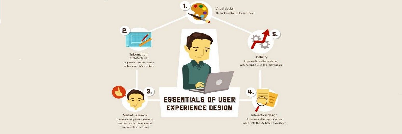
Header Image: Author/Copyright holder: homestead. Copyright terms and licence: All rights reserved. Img
