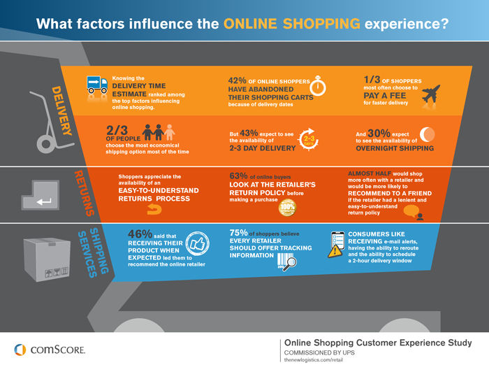
There is perhaps no bigger source of frustration for the e-retailer than cart abandonment. It says that the UX of their site/app was perfect right up until the point that the user had to get their money out and then something went wrong. Let’s take a look at the main causes of shopping cart abandonment and how to head them off at the pass:
- The number one reason for exiting the cart process is being shown additional costs to the ones that we thought we were agreeing to. There’s nothing more annoying than trying to pick up a bargain to find that the cost of postage is 10 times the market rate. It’s easy to avoid this problem; don’t do it.
- There are several other price related reasons but they tend to come down to that the overall price is too high (e.g. when you put postage, tax, etc. on top it’s too much) or that your competitor’s price was better. It’s hard to compete solely on price but you do need to ensure that your pricing is in the right ballpark or that you have a very compelling reason for the differences.
- A very common problem is that people get sick of the length of the checkout process itself. People don’t mind giving you their name, address and card details – they object to being asked to complete full demographic profile assessments when they’re ordering a pizza for delivery. You need to ensure that your carts are built with the user in mind. Of course, you can ask a question or two that’s not essential but don’t make the user feel like they’re on Mastermind or they will go elsewhere.
- Payment security also raises a couple of problems. There’s the excessive approach (Verified by Visa has not helped with this because it’s a genuine PITA for those not using their cards at home) which puts people off by forcing them to jump through too many hoops. Fix this by simplifying the process. Then there’s the opposite where the user doesn’t feel you’re doing enough to keep their payment secure. Fix this through the use images, explanations, etc. to demonstrate your commitment to payment security.
- Delivery options didn’t work. I’ve spent much less money on clothing this year than I would have liked to. It is amazing the number of websites that won’t deliver to Cambodia (though they will deliver to Vietnam and Thailand). If you can’t send me my stuff I won’t buy it. Make sure that your delivery options are complete and that they work.
- Currency options. I live in Cambodia. We use the US Dollar as our de factor currency. No-one uses the Cambodian Riel for substantial transactions. That means that I would like to see prices in Dollars and not Riel. Make sure that prices are in the right currency (or at least very easy to change to the right currency) or people will walk away from your website.
Header Image: Author/Copyright holder: ComScore. Copyright terms and licence: All rights reserved. Img
