It’s not really fair that before we can show an interviewer how great we are for their position – we have to land that interview in the first place. A good CV can make or break your career prospects; you cannot get a great job without getting an interview. Sadly, in nearly all professions including UX many CVs are simply not fit-for-purpose.
Why do You Need a CV?
This is fairly obvious. A CV is a tool for opening doors to opportunities. It has to create the right impression on the person reading it for them to put you on their “possible hire” pile. Without that impact your CV is going straight into the circular file under someone’s desk and the door to a better job remains resolutely closed.
A CV needs to show a little of your personality, it has to demonstrate you have what it takes to do the job, it should offer an insight into what you bring a team and ideally, show a commitment to learning and personal development too
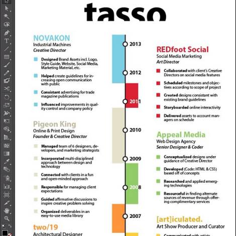
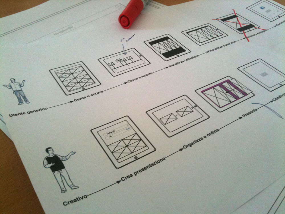
Author/Copyright holder: Tasso Art. Copyright terms and licence: CC BY-ND 2.0
What Should a Good UX CV Contain?
There are some fairly simple rules to developing a great UX CV and these include:
Open With a Great Personal Statement
Your address and contact details belong at the end of a CV. You open the CV with the information that the recruiter really needs to see - your personal statement. This is where you get to tell the recruiter who you are and what you want to do and demonstrate your love for UX.
Keep sentences short. Use active verbs. Make bold and clear statements. This statement will go with your CV wherever it gets sent in the recruiting organization (unlike the cover letter which will often go in the bin following the first sift of CVs) – so make it work hard for you.
Keep it Short and To The Point
With the single exception of the contracting market (where it can be impossible to keep things very short); the rest of the recruiting world expects to see a CV of no more than 2 pages. If you can boil things down to a single page, without losing important information, so much the better. No-one needs to read a novel about your work life.
The longer your CV, the more likely it is that it will be thrown out because no-one can be bothered to read it. And let’s be fair; if you can’t summarize your career information well – how will you summarize research well?
Have a Logical Organized Format
I prefer to move from my personal statement to my experience to my education and then anything else I might (or might not) include such as interests and contact details. Each section is clearly defined and formatted for consistency. You don’t have to follow my flow but you do need to make it easy to access information and make it obvious where the reader can find the information that they need.
Consider Separating Experience from Work History
The truth is that most jobs in a linear career involve similar responsibilities and result in similar achievements. Instead of trying to stuff everything you’ve done in with every job and repeating a ton of stuff – why not just list your work history (one line per job) and then have an experience section listing your main achievements in life? It’s easier to read and far less tedious on a recruiter’s eye too.
Make Education Relevant
There’s nothing more ridiculous than a mid-career professional listing all their school subjects with grades against each. Nobody cares about what you did at school by the time you’re in a career – what they want to see is your professional development. Professional qualifications and your degree is more than enough in this section unless you’re hunting for your first job.
You can also stop listing every single module that made up your degree. Nobody cares about those either. A degree holds currency for about a year (if you’re lucky) after you’ve received it. After that – your studies become increasingly divorced from current practice in a field. So kill the list and free up that space to sell yourself better.

Author/Copyright holder: Sergio Rivas. Copyright terms and licence: CC BY-NC-ND 2.0
Interests and Hobbies
By and large, I’m not a fan of this section on a CV. When I’m hiring, I’m hiring people for what they can do for me and not the fact that they like to go abseiling on weekends. However, there are hiring managers out there that love this section.
If you’re going to use it. Be sparing – a line or two is enough. Don’t list banal data like “I like watching TV, reading books and listening to music.” Everyone does – it doesn’t make you interesting. Do include things that might make you stand out from the pile. “I am engaged in voluntary community work for a charity for the visually-impaired.”
What Shouldn’t a Good UX CV Contain?
There are some fairly simple rules about what you shouldn’t include on a CV too:
Obvious Typos
Look, the truth is your CV won’t go in the bin if there’s a mistake or even two on it but if there’s a mistake in every line – good bye. If you’re not the best writer in the world; get someone else to proofread your CV before it goes out the door. Attention to detail matters to employers.
No Explanation of Rapid Turnover of Work
My CV is full of 1 year (or less) assignments. That’s because I’m a contractor when I work for others – it’s for a set period of time and then I move onto something else. The only way people can know this is if I tell them. Employers aren’t keen on people with twenty recent moves on their CV without explanation; it sounds like you have no staying power.
Photos and Graphics
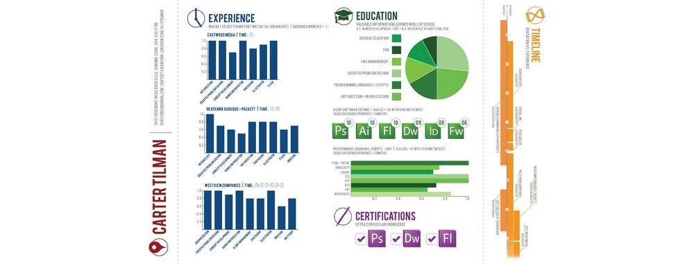
There are some job markets where a photo is an essential. In these markets choose a professional head shot and use that. Otherwise, don’t include photos, graphics, etc. on your CV. The more you stray from a traditional format – the less likely you are to be recruited. You may get noticed for use of these things but rarely will it impress anyone.
Summary
Writing a CV can be hard work but if you use the tips above; you’re much more likely to get the results you want from the exercise and that new UX job you’ve always wanted. Good luck.
