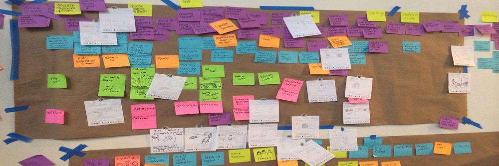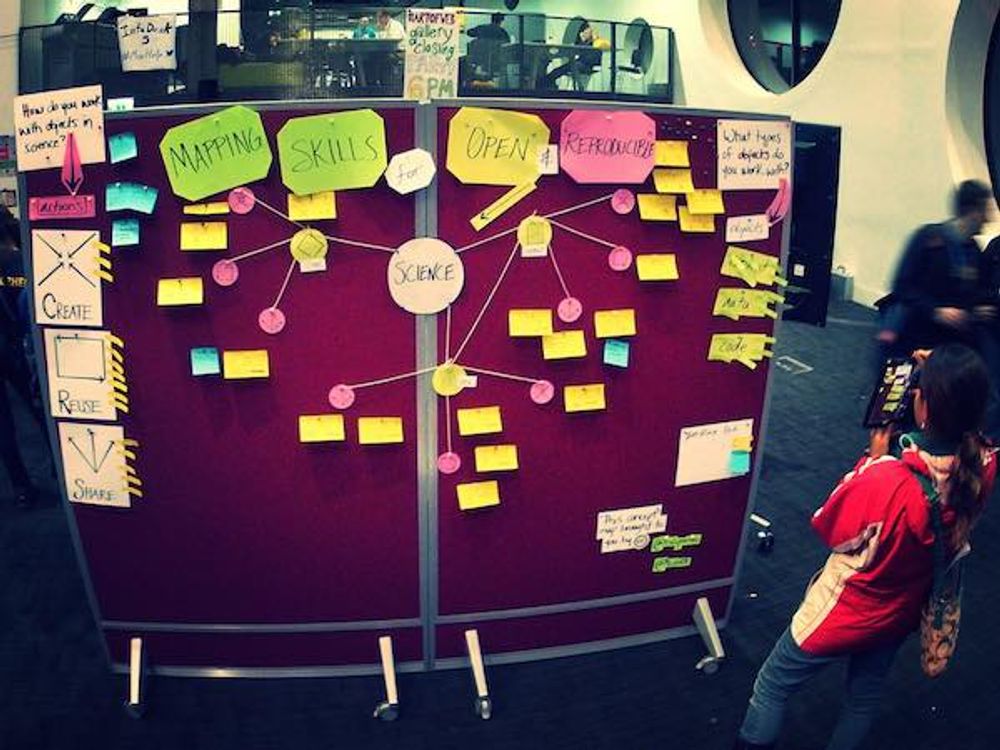
Tree Testing helps you to find where users get lost in your navigation.
Tree testing provides goal-oriented verification of a navigation hierarchy. No other part of the solution is involved since users only interact with a simulation of the menus. In the video William Hudson talks about getting started with tree testing:
Show
Hide
video transcript
-
00:00:00 --> 00:00:33
We're going to be talking about getting started with tree testing. Tree testing *simulates* a hierarchical navigation structure. So, those are just the layers of menu that you expect your users to wade through in a typical application or website or mobile app, for example. And it's purely text-based; so, this is simply how Optimal Workshop, and their solution is called "Treejacks".
-
00:00:33 --> 00:01:00
Here, for example, it's Home phone, My Account, Help and Support, Internet and so on. And this is how – you can change the colors. I believe you might even be able to change the fonts, but that's all you can do. There is nothing else that you can do in terms of the visual presentation. And, again, that's one of the strengths – that you're not distracting people with unnecessarily complex visual designs – you're looking purely at the navigation.
-
00:01:00 --> 00:01:31
So, starting from the home page, each level of navigation is shown to participants in turn. And so, that's the top level. So, being given a task, I now have to click on one of those *six* items. Most tree testing services ask you to upload a spreadsheet with your hierarchy. And I'll give you a full example of a project where we've done exactly that, and you can see the format; it's very straightforward. It's just done hierarchically in a spreadsheet. Separately, you provide a list of tasks. And, for a lot of these testing services,
-
00:01:31 --> 00:02:02
you provide a correct response or a set of correct responses. I did work on one site where we ended up giving people all kinds of correct responses because they could get to the products that were being sold a number of different ways and they were all valid; but, of course, that ended up contributing to users' confusion, as well, unfortunately. But, for basic tree testing, no visual design is needed. So, we just upload the spreadsheet of the menu hierarchy and off we go.
-
00:02:02 --> 00:02:33
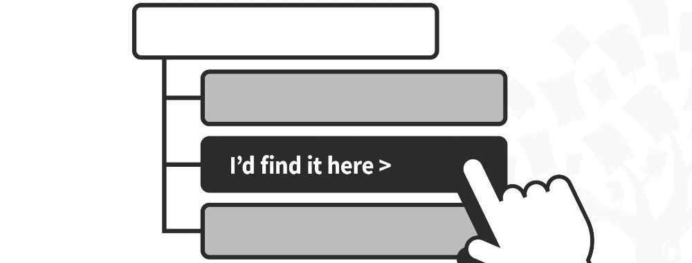
As the researcher, you can specify how many of the tasks each participant must do and whether tasks can be skipped. And if you're really keen-eyed, you might see in the top right-hand corner of this screenshot on the right that it says "Skip this task" – which is user-definable, researcher-definable. You can decide whether your participants are able to skip tasks as they're going along. Optimal Workshop has some recommendations for their Treejack tool. They suggest a maximum of 10 tasks, and of course that can vary.
-
00:02:33 --> 00:03:02
If they're really complicated tasks, you might want to reduce that number. If they're really simple tasks and you've got a really short tree navigation hierarchy, then you might increase that number. Do write tasks that test the part of the website you want to improve. So, if you're working in a particular area, then focus on that – obviously. Write tasks as hypothetical scenarios based on your typical visitors. So, you want to make this sound like something realistic from their perspective.
-
00:03:02 --> 00:03:33
And don't mimic the language that's used in your navigation. Use different language than the labels on your tree. Otherwise, it just becomes a word-matching exercise and you will have achieved nothing; you will end up going to all this effort and expense and you will get results that are of no value to you because all people did was to look at what you wrote and match it to the text on the screen. So, don't do that, as you must use common words that are *natural* for your tasks without mirroring the navigation terms.
-
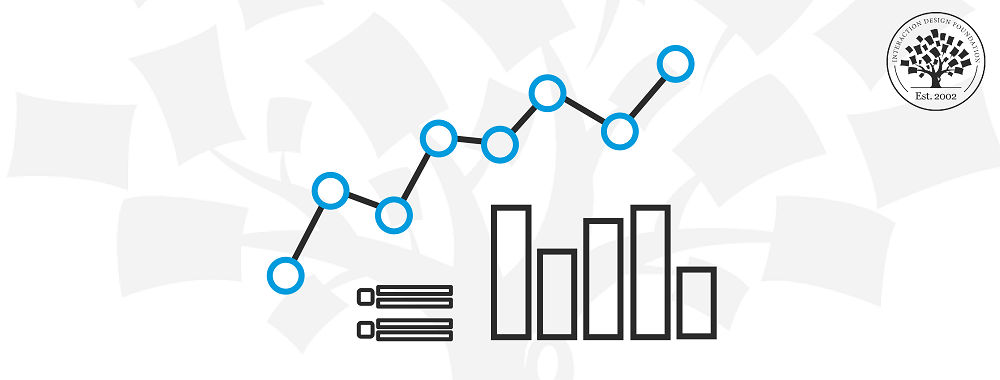
00:03:33 --> 00:04:00
This is a simple summary result for the tree testing. This one again is from Optimal Workshop, but most of the tools have a very similar kind of summary. In this case, we've got a pie chart and the successes are shown in green. And there is the idea of a direct success and an indirect success. The direct success is when people have gone straight to the correct answer without any variation.
-
00:04:00 --> 00:04:32
Indirect is where they've gone down one path in your navigation hierarchy and had to backtrack. So, if they still end up in the right place, that's still referred to as a success – but it's an *indirect* success. And you can analyze these figures separately if you wish. If you're getting a lot of indirect success, it means people are getting there in the end but they're confused. And, of course, in *real life*, if you're talking about an actual website or mobile app, you may see a lot of people simply giving up rather than persevering with the study, which is what they're doing when you're doing the research.
-
00:04:32 --> 00:05:03
The red is fail, and that too is direct and indirect. And in both, in the same situation, the same concepts apply that if they've wandered around a bit to fail, it's indirect, but if they've actually gone straight to an incorrect solution without backtracking, then it's called a direct failure. And then, finally, at the bottom of this chart, you have the skips, which hopefully will be zero, and certainly will be zero if you said that users are not allowed to skip tasks.
References & Where to Learn More
Optimal Workshop’s Treejack (tree-testing tool)
Image
© Daniel Skrok and Interaction Design Foundation, CC BY-SA 3.0