Today, we’re going to take a look at three contexts of the concept of use: useful, usable and used. The first two terms, useful and usable, are bandied around a lot in terms of user experience and design while the third term, used, barely gets a mention. Yet, as we’ll come to see it may be the most important of the three terms to designers and businesses alike.

Author/Copyright holder: MsSaraKelly. Copyright terms and licence: CC BY 2.0
Table of contents
Useful
A product which is useful is one that allows a user to accomplish a task or objective. While in many contexts these tasks or objectives are explicit and measurable in other contexts they may not be.
For example; a word-processing package such as Microsoft Word or Writer in LibreOffice will enable the production of written documents. These may be letters, reports, whole books, etc. but the task is explicit and the outcome measurable. Can I write a letter using this tool? Yes, you can. This is true for anyone who wants to use a word-processing package.
On the other hand a piece of art may be “useful” to one person as a way of brightening up their work space, for example, but may not be “useful” to another. There is a subjective quality to art that means the task of “brightening up the work space” may require very different products to satisfy the criteria of “useful”.
Whichever form of useful is alluded to, however, it is important that there are a number of potential users that find a product useful. (From a commercial perspective this must be at least enough users to make the product profitable).
Something that is not useful is unlikely to be accepted by any user.
 Author/Copyright holder: Alastair Cook. Copyright terms and licence: CC BY-SA 3.0
Usable
Usable refers to the usability of a given product. It is more than “useful” it examines the way that the product will be used and whether it enables the user to do so in a pleasurable, simple (or as simple as possible) and effective manner.
David McQuillen in his article in Darwin Magazine – Taking Usability Offline says; “"Usability is about human behavior. It recognizes that humans are lazy, get emotional, are not interested in putting a lot of effort into, say, getting a credit card and generally prefer things that are easy to do vs. those that are hard to do."
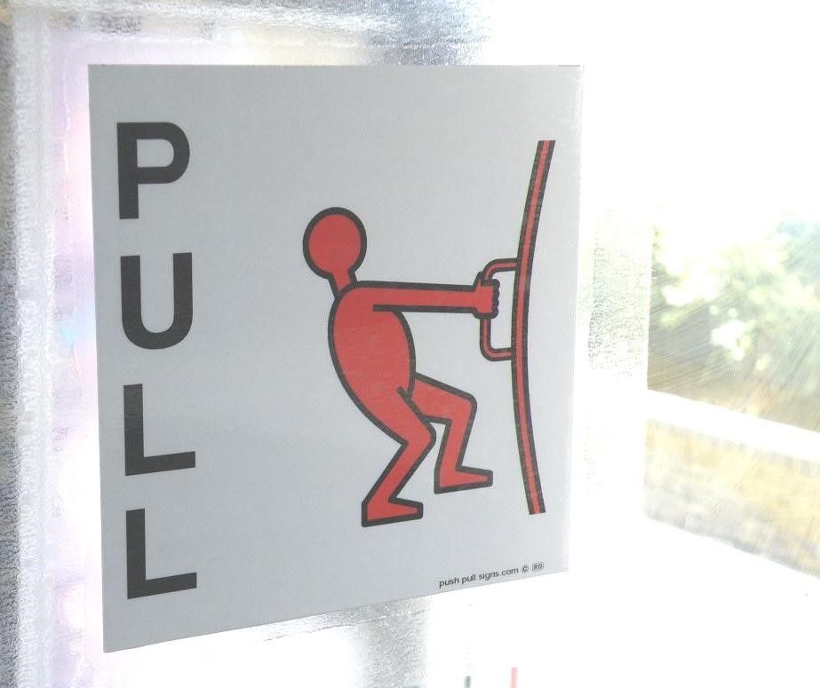
Many “useful” products fail to be “usable”. Think of a door with a handle on the outside with the instruction “push only” on it. A door is definitely a useful product – it keeps inside and outside separate. It allows for the efficient use of air conditioning and heating. It provides a “noise breaker” between environments. And so on…
But how usable is a door that needs instructions? Really there are only two states of using a door – pushing or pulling. It should be obvious from a user’s point of view which action is required when they see the door – if it’s not and it requires a sign to explain it; that’s a failure of usability.
It’s worth noting that usability failures are often less catastrophic to a product than a failure to provide something useful. This is evidence by the number of doors out there in the world today with “push” or “pull” signs on them. Poor usability is often a minor inconvenience (you may mutter about how stupid that door is but you’ll probably do very little to change the door – it’s too much effort for too little reward) rather than a deal breaker.
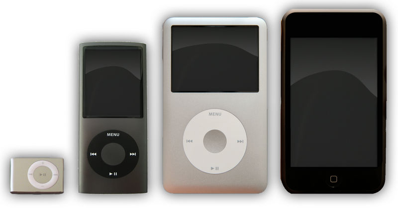
However, many brands (such as Apple) have built entire product ranges on making devices that are more usable than their competitors even though their usefulness is actually identical. The iPod, for example, was not the first MP3 player. It was, however, the most usable of MP3 player designs, at the time, from a user’s perspective. That usability was the difference between the iPod becoming “just another MP3 player” and become the world’s top selling and most desirable MP3 player.
Author/Copyright holder: Aido2002. Copyright terms and licence: CC BY-SA 3.0
Used
A product may be both useful and usable and still fail to be used. The ultimate aim of a design is not to be useful or usable but for users to use that design. Without users a product is a failure and it doesn’t matter how great the design was – it’s still a failure.
Two famous examples of this exist in the sphere of personal transport. The first will probably be a distant memory to most of our readers, the Sinclair C5. Sir Clive Sinclair was among the industry leaders who popularized computing and helped it get into the home. His ZX Sinclair range of computers sold millions of units and the happy buzz of tape loading games was heard in homes all over the planet.
On the back of this success Sir Clive decided to unveil his passion project. A one-person battery powered and environmentally friendly car. (Though it was called an “assisted pedal cycle” in marketing literature). Millions of pounds were invested in the C5 and its launch. It was both useful and usable but sadly, the public hated it. Nobody would use a C5 it was universally mocked on British TV and media. As a result, the product sold only 5,000 units from an initial production run of 14,000 before the company went into receivership.
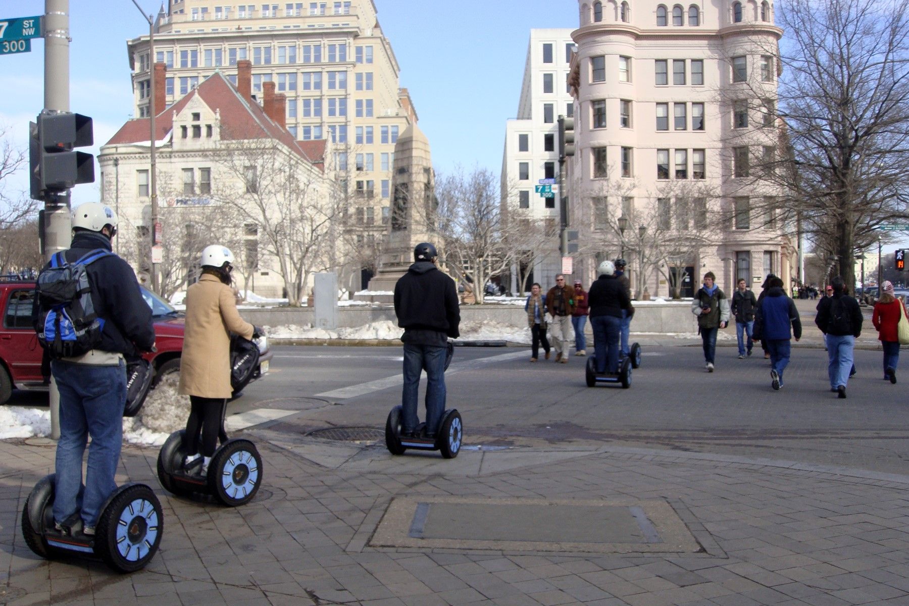
The second was rather more recent. The Segway, a personal vehicle which allows users to go anywhere (pretty much) on two wheels was unveiled in 2001 and launched in 2002. It’s inventor, Dean Kamen, predicted it would sell millions of units and become adopted everywhere. In reality it sold fewer than 30,000 units in the 6 years following its release. The company has been sold and resold multiple times since it was launched and while the Segway has achieved some minor niche successes – the ugly truth for the Segway is that people don’t use the vehicles.
Author/Copyright holder: Mariordo. Copyright terms and licence: CC BY-SA 3.0
Why did these two useful and usable products fail to get used? Well, in the case of the Sinclair C5 the product failed to meet a defined need. Today, as the BBC argued recently the Sinclair C5 might have been very popular as the public have become very environmentally aware but back at the time of the C5’s launch – environmental issues simply weren’t a pressing concern.
In the case of the Segway, Wired Magazine says; “Well, That Didn’t Work: The Segway Is a Technological Marvel. Too Bad It Doesn’t Make Any Sense.” The company failed to ensure the product would be legal to use at the time of release (and in many places it wasn’t and still isn’t legal to use them in public places). Early adopters also reported being mocked for using Segways and slurs about body image certainly won’t help sell units.
A product must be used if it is to be considered a success. You can deliver a useful and usable product and it’s still possible that users won’t want to use it.
The Take Away
A product must be useful if it is to be used. If it achieves no purpose it has no point and that means it is never going to be successful. A product should be usable to increase the chances of use – the more usable a product is, the more enjoyable it will be and the easier it will be to persuade others to use it. However, neither usability nor usefulness guarantees that a design will be used. There are other considerations outside of usability and usefulness that will impact the market adoption of a product.
References
Wired Magazine explains the failure of Segway.
You can find out about the many legal issues facing the use of Segway vehicles on the Wikipage here.
The BBC looks back at the failure of the C5 and what might have happened if it had been launched today.
There’s also this great resource full of usability disasters here.
Hero Image: Author/Copyright holder: russell davies. Copyright terms and licence: CC BY-NC 2.0


