A big part of a UX Designer’s career is spent communicating his/her findings to other members in a UX team. But to make a career in UX design, one type of communication you will have to master is the ability to showcase your design skills to the people who are likely to hire you. To achieve this, UX designers develop portfolios – i.e., a collection of case studies highlighting past work they’ve done and how this work demonstrates the skills they have developed. Let’s find out what the key ingredients are in a great portfolio.
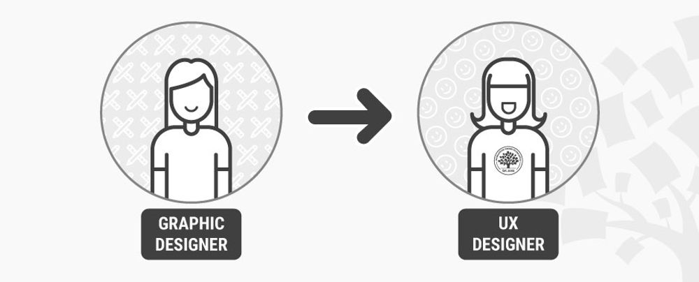
To anyone coming into UX design from a technical background, the term “portfolio” will most likely sound unfamiliar. On the other hand, people working in graphic design and the visual arts should be most familiar with this term. A portfolio, in the arts, is a collection of undertaken work which can be shown to potential employers as a way to indicate someone’s skills and flair in the visual arts. In UX design, a portfolio contains examples of previous work, too. However, in this case, a portfolio is used to demonstrate the process undertaken to reach a result, rather than the result itself.
“Design is not art. It is about crafting solutions to real issues.”
— Mark Boulton, Designer
Format of a portfolio
A portfolio is traditionally a folder containing printed pages and materials, which potential employers can examine. In our 21st-century digital world, most UX designer portfolios are distributed via PDF files, or—more often than not—a UX designer might create a personal webpage to showcase a portfolio. A third way to demonstrate your work to employers is by uploading it on a dedicated community website, such as Behance.net.
Portfolio content
No matter the presentation format of your portfolio, you must remember one golden rule: UX portfolios are about process, not end result. To clarify, this means that your portfolios are not just a bunch of screenshots of your designs (or indeed, final product). The visuals must be accompanied by clear explanations that draw the readers’ attention to what went on behind the scene, in order to produce the visual shown. In short, the portfolio tells the story behind the generation of a new product or service, a story which should clearly demonstrate that you took careful and methodical steps to develop the user experience from scratch. Most UX designers abide by the “design thinking” process, and it’s a good rule of thumb to try and reflect how you employ this approach when telling your story. Effectively, then, a UX designer’s portfolio is a collection of case studies, rather than a mere collection of visuals.
“I wish that portfolio sites had a better way for UX designers to show how they THINK and not just pretty pixels & nice wireframes.”
– Sarah Doody, UX Designer & Product Strategist
Having said this, it’s understandable that you might not have played a role in all parts of designing a user experience. After all, most designers work as part of a team. Showing the output of collective work is OK, as long as you are clear about the elements for which you were responsible. Employers also need to see that you have a full understanding of the entire process and have been involved in most, if not all, steps along the way, whether that’s on the same project or across multiple ones.
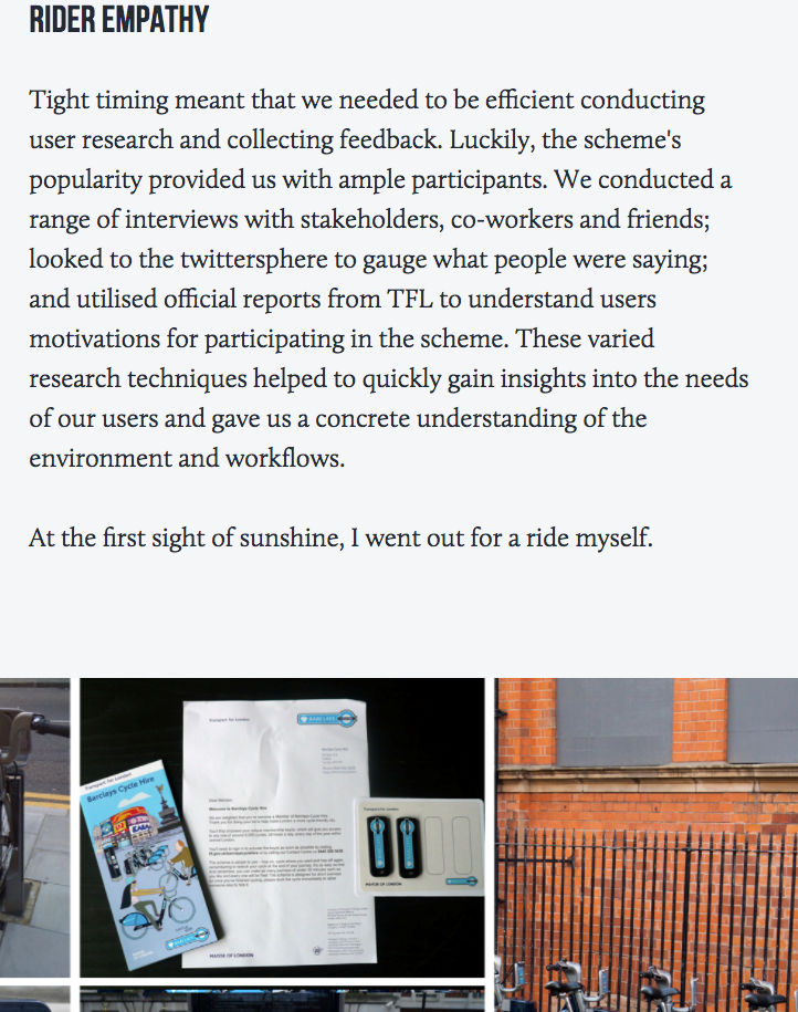
Copyright holder: Simon Pan, simonpan.com. Copyright terms and license: Fair use
The RIGHT way to do it! Here the designer gives the meaty details of their story, explaining how they went about the first step in the design thinking process, which is empathizing with users. They are clearly showing the reader that they have an understanding of the process, the tools, the situation and how to go about it.
UX design involves several specializations. Given that, it is good to bear in mind that if you are applying for a specific type of role in UX (e.g., a user researcher or a UI designer), you may need to tweak the content of your portfolio towards more examples relating to the type of role you are applying for.
Finally, remember that especially for someone with several years of UX training and experience, it might be tempting to try and demonstrate the volume of your work by including each and every project you have worked on. This is not the right way to do it. A portfolio should contain only your best work. Remember also that recruiters won’t dedicate days, or even hours to go through one applicant’s portfolio. A few minutes of their time is all you will have, so make it easy for them to select you by carefully balancing the contents and volume of your portfolio content. If they are impressed, they will invite you for an interview and you will possibly have more time to show them more work there.
These are the top questions you need to ask yourself while preparing the portfolio:
Does it contain my very best and recent work?
Is the demonstrated work suited for the type of role I am applying for?
Does it demonstrate that I fully understand the design process?
Can it be read and understood in 5 minutes or less?
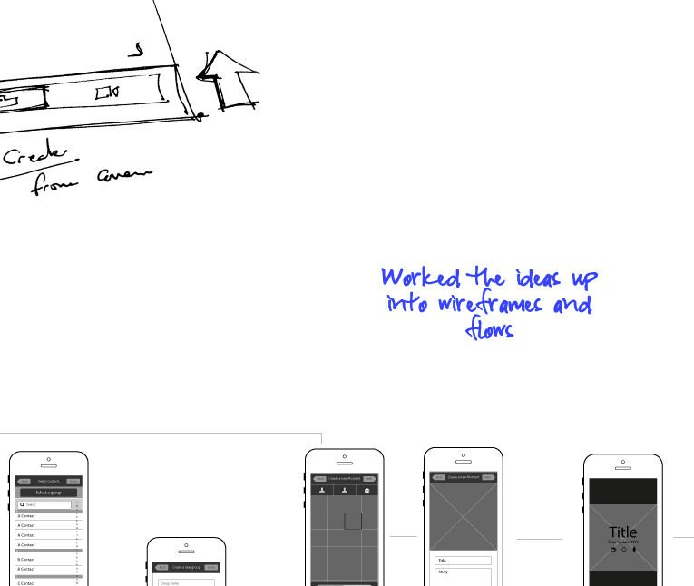
Copyright holder: Anthony Anderson an.thony.co.uk. Copyright terms and license: Fair use
You don’t need to be overly descriptive when telling your story. Sometimes, just a few words are enough to show an employer that you have a good understanding of the process.
How do I tell the story of my experience in a case study?
Let us repeat another point. We know you got it the first time, but this is important: A case study is the story about how you ended up with the design for a user experience. Stories have to be compelling—if they are going to be successful. You need to hook your reader and bring what happened to life with the same sense of immediacy and relevance you’d find in any page-turner of a tale. So, make sure that your story is engaging, interesting and keeps the reader anxious to find out more (hint: they will if they hire you!).
“It’s not about ideas. It’s about making ideas happen.”
— Scott Belsky, founder of Behance.net
To create a compelling story in your case study, there are four main sections that you should remember to include.
The design problem: In a few words, describe the challenge that you needed to meet through your design. What was the situation? What needed to change? How important was the problem?
The barriers: Explain also what made this particular problem challenging. It could be a special set of users with irregular needs. It might be the device form factor for which you were called to design. Make sure that the monsters in the story are clearly shown – the bigger the monster, the more engaging the story and, obviously, the more heroic the protagonist (you).
The process: This is a crucial part. Remember we said UX portfolios are all about process and not the product. You should spend most of your time considering this section, because here you will demonstrate how you tackled the monsters and managed to emerge victorious. Explain how and why you chose the right weapons to fight the monsters with (i.e., your tools), how you might have adapted them to meet the particular challenge (if you did) and your strategy, tactics and skills while employing these weapons. Show how you took blows and bounced back, or any particularly clever tricks that you came up with to deal with adverse situations. Rough sketches, diagrams, user flows, mockups and wireframes are all essential tools for telling the story, so don’t be shy to include them without worrying about how good they look.
The end result: Everyone likes a story with a happy ending. It’s what Hollywood was built on. Perhaps we are making things sound a bit more dramatic by talking about monsters and weapons, but in reality, it’s not that much different. Lives, capital, resources and careers hinge on the success of UX design. It’s the stuff great movies are made of. Show your end product, the results of user testing, and how it helped people live happily ever after.
The Take Away
You will find much advice on the web about how a great portfolio can be built. Here, we have only scratched the surface and basics about what a portfolio should contain. There are many other choices that you will need to make when preparing yours – for example, colors and typography, layouts, navigability, etc. Many of these are personal choices that reflect your character and who you are. However, as long as you follow these basic rules for a portfolio, you will be off to a good start in making your own.
In all cases, remember that the UX portfolio is essential to your career. Through the portfolio, employers can get a glimpse into how you put your skills and knowledge into practice. It has to convey the way you think, instead of just the end product of your thinking. Wrapping up your experiences after a completed project in the form of a case study will help you gradually build up your portfolio and create a compelling story about how you designed your own career.
If you wish to dive right in and get started with your UX portfolio, then we have a practical course to guide you through every step of the process. You'll learn what design leads at SAP, Google and Oracle expect from a good portfolio and how to navigate the complex decisions and trade-offs you'll encounter in the portfolio-building process.
References & Where to Learn More
Hero Image: Copyright holder: Bill Ohl, Flickr. Copyright terms and license: CC BY-ND 2.0
Course: How to Create a UX Portfolio
Hawk, S. (2016) 9 inspiring UX portfolios
Bank, C. (2016) 10 UX portfolios done right
Justinmind (2017). UX design portfolio: examples and websites
Wang, S. (2017). Fitbit: A UX case study


