If there’s an area of product development where products down right suck; it’s enterprise software projects. I’ve worked on many of them as a training lead and found myself sitting down to develop work instructions and processes that are ridiculously convoluted. That’s because the underlying software seems to have been designed by somebody who has no idea of the work that people will actually do with that software.
So how can UX design improve that experience? Well, it could start by avoiding these mistakes:
Choosing Technology Before The Project
I once worked for a telco with an appalling CRM (Customer Relationship Management) system. It had been bought for $1 off the shelf at a bankruptcy sale. That was understandable they’d just been starting out in a highly competitive market.
What was less understandable was that when they selected the next CRM system (which will remain nameless) the decision of what to use was made by a purchasing team and IT. No-one spoke to the users of the system, no-one spoke to the business departments that needed to work with it – the technology was picked before anyone got a shred of input into the process.
Your choice of technology should be influenced by the users and their needs. It should not be chosen for being “best in breed” (who cares? Is your business identical to other businesses?) or for being sold by the best sales person.
In one memorable start up project I worked on, all the enterprise software was selected for being best in breed. The only thing that no-one had done was see whether all of this software worked well together… it didn’t.
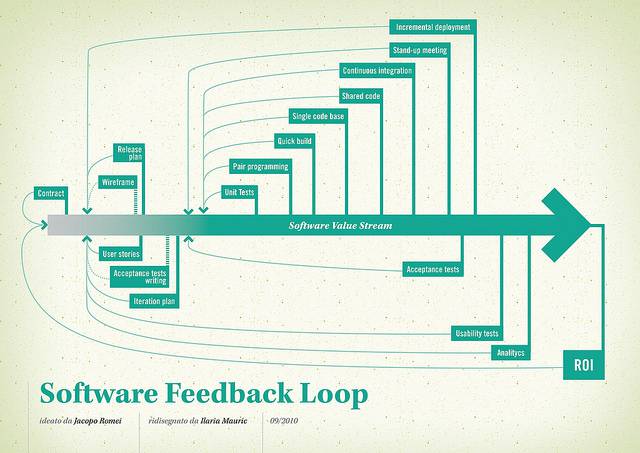
Author/Copyright holder: Jacopo Romei. Copyright terms and licence: CC BY-SA 2.0
Failing to Identify What the Current System Does Well and Doesn’t Do Well
Yes, your 7 year old billing system might suck. But if you can’t document why it sucks; how do you know that your next purchase will be any better? You have to establish a baseline to be able to chart the value of the new project.
You need the implementation to solve problems that you are facing now and to avoid introducing new problems. Working out what your current offering does well can help you ensure that the new system supports those processes and working out what it does badly, tells you what you might need to fix with your investment.
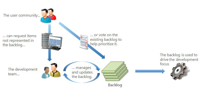
Failing to Get User Input Throughout the Project
That telco with the new CRM? Didn’t involve users until User Acceptance Testing. You know what they found? The users didn’t like it very much. In the interim between the end of the old system and the introduction of the new system an IT bod had created a new interface for the old one. It worked very well, it was clean and intuitive. The new system was not.
Yet, once an enterprise has spent millions on a new piece of software, it’s going into production whether users like it or not. The issues were not the fault of the technology (I’ve used that product elsewhere – it can be very good when it’s been designed right) but the fault of the design and development team that despite sitting in the same office as the users, couldn’t find the time to talk to them.
Author/Copyright holder: Unknown. Copyright terms and licence: Unknown. Img source
Focusing on Adding Features Rather Than Design
Design of systems is not just about adding new features. In fact, in many cases for enterprise systems the problem is not the lack of features. It’s the lack of simplicity. It’s the lack of an intuitive path to follow for a process. It’s a lack of quality connections between one system and another.
Design in the enterprise context needs to focus on making it easier to conduct the job. If you need another feature, great add it. If you need to remove features to reduce complexity, do it. There’s no formula for developing the perfect system by adding 3 features and removing 1.
Letting Politics Rule the Design Process
I think I could write a book about disastrous political decisions made in organizations that I’ve worked in. Company politics is an abysmal way to run a design project. The priorities should be business objectives and user needs. Not on who wants what level of input into the final design.
Don’t design by committee. Help the project board develop a fair and balanced process for decision making before you start. Then, as much as you can, hold them to that process.
I once worked with a team on a database design project. They were told by the finance team that they had to create a unique identifying key for every single product in the warehouse. That’s not a unique key based on the product type but for each individual example of that type even when they were all the same. Why? Finance thought it would make it easier to work out where things were going missing.
What actually happened was that if a single product went missing, the guys in the supply team would then have to scan 20,000 products to work out which one had gone missing. That single detail cost the company $20 million in the first year of operations. Something that everybody in the project team knew apart from finance.
They got their way based on politics and the company got the bill for it. It cost an awful lot more to fix the problem after the implementation too.

Author/Copyright holder: Office Politics. Copyright terms and licence: All rights reserved. Img source
Failing to Test the System as It Will be Used
It’s great to see testing of any kind on a software project. Unfortunately, if you don’t test a system as it will be used in the highest stress operating conditions – you can miss something vital. We did on a project for a start-up.
The retail system and processes were fully tested with real users. What we failed to do was put any stress on the situation. We’d assumed a gradual turnover of product with a gradual increase of business. When more than 20,000 people appeared at each store and had to wait outside in boiling heat (more than 40 degrees centigrade), we found out how badly we’d got it wrong.
The system was too slow and convoluted to process huge sales volumes. Our failure actually caused a riot outside one of our stores… fortunately, we could and did amend the process on the fly and no more disasters occurred. But it would have been better if we’d have avoided it in the first place.

Author/Copyright holder: z Q. Copyright terms and licence: CC BY-NC-ND 2.0
Summary
Consumer products get a lot of love in the UX sphere. Companies like Apple, Google, Samsung, etc. have been brilliant at focusing on experience to win sales and grow their businesses. Inside the Enterprise this focus is still lacking to a great extent.
You can improve the UX of enterprise projects easily if you take steps to avoid the issues above.
Header Image: Author/Copyright holder: D. Keith Robinson. Copyright terms and licence: All rights reserved. Img Source


