Bringing Numbers to Life
Demo, mockups, apps, videos, documents, images
Digital assets linked to the book BRINGING NUMBERS TO LIFE
Note: When viewing the pdf files, set your viewer to single page view, and arrow through the pages as with a slide deck to achieve the full animation effect.
Chapter 1 | AN EVOCATIVE USE CASE
L1.1 | TI Ferry Chase (video)
This is a GoPro helmet-mounted video taken by Tom Gandesbery on September 13, 2014, San Francisco Bay. This captures the bay area windsurfing experience.
Chapter 6 | WORKING WITH NUMBERS
L6.1 | Vizcreator Design Presentation (pdf)
This was the final deliverable from the design consultants at Codestreet LLC. It presents the overall model for a chart-centric data exploration tool.
Chapter 7 | RED HERRINGS
L7.1 | Banzai Pipeline (video)
This product mockup was done as a gamification concept at SAP. Targeting the use case of a sales team managing their pipeline – the metaphor used to describe the set of deals in various stages of progress – the Banzai Pipeline uses a collaborative “gameboard” visualization. The concept’s UI styling and skin is that of SAP’s working standard at the time. Geff Gilligan and Hamilton Meyer contributed.
L7.2 | Banzai Pipeline (pdf)
This is the same content as in L7.1, in pdf form. Viewing this with the pdf Notes section displayed will reveal the narrative.
Chapter 9 | THE WORK BEGINS
L9.1 | LAVA Concept, Budget Overrun (video)
This video demonstrates is a budget management application concept using basic LAVA principles. Led by Jerome Monteu Nana, it was the first interactive LAVA prototype, and won the award for the most usable app at SAP’s Sapphire user conference.
L9.2 | LAVA Board, Sustainability (video)
This was the first comprehensive mockup of the LAVA experience. Sponsored by Steve Kopp and based on a use case provided by BOBJ’s internal reporting group – although with hypothetical numbers – this demo drove the dissemination of LAVA’s potential throughout the company and its customers. It exhibits an interim design state for Points and the Lattice, and uses the tablet form factor as a midway scale between larger and smaller screen sizes. Kopp’s research team, with Christophe Favart, later built a working version called Panorama.
L9.3 | LAVA Board, Sustainability (pdf)
This is the content in L9.1, presented in paginated pdf form.
L9.4 | LAVA Board, CFO (video)
This is a mockup done for SAP’s internal financial reporting group of Helen Poitevin, Benjamin Kayser, Felix Schoettle, Jurgen Habermeier, and Nadin Eberlein. It represents SAP’s financial rollup structure using surrogate datafrom a hypothetical global apparel enterprise.
L9.5 | LAVA Board, CFO (pdf)
This is the content in L9.4, presented in paginated pdf form.
L9.6 | LAVA Lattice, China Telecom (video)
This was the first interactive prototype of the Lattice, built by a team in Shanghai as a concept for China Telecom, with realistic but hypothetical data. Led by designer Clair Xie, we used this for our 20 usability tests in the US and Europe. We only had the development team for a short time, so we were never able to evolve the design based on test feedback. For example, we put a lot of effort into horizontal Strip sorting – although a powerful feature, not one of the basic use cases.
L9.7 | LAVA Lattice, China Telecom (interactive prototype)
This is the app shown in L9.6, in interactive form for you to play with. Beware, it is buggy, browser-sensitive, and prefers a certain browser width. Only the Lattice, at the bottom, is fully functional. The Gallery and Points at the top are not.
L9.8 | LAVA Dashboard demo, VP of Sales (interactive app)
This is a sample design provided to showcase how LAVA could be used in SAP’s Dashboards product (formerly Xcelsius). This was a forced marriage, as Dashboards is not well suited to the LAVA model. There are no Lattices here, but you can get a sense of Board navigation, and the nifty interactive sales pipeline modeler. Project was led by Anita Gibbings.
Chapter 10 | THE RESPONSE
L10.1 | LAVA Lattice Usability Tests (video)
This is video footage of a LAVA Lattice usability test, with participant identity of course hidden. Most participants were professional BI analysts. This was from our second round of tests, so the moderator needed to guide the participants around known bugs, and deemphasize certain features, as we lost the resources to update the app. All or most were able to complete the complex task offered at the end of the session.
The first session, L10.1a, is from our first round of tests, with our initial prototype. This participant almost instantly understood how the Lattice worked, and helped us to define problems in the design, some of which we changed for the second round six months later. Session 1 was conducted in the US, the second in Europe.
The second session, L10.1b, is from the second round, with a revised prototype. This test is truly us designers exposing our nakedness, as the user struggled to understand the horizontal sorting feature, which we already knew was a power feature, and a cause of unnecessary confusion, but could not be removed due to lack of resources. Plus, keep in mind that the participants were unfamiliar with the fairly obtuse and confusing data, and that they and the moderator were conducting the session in their non-native languages. Still, such tests are humbling but useful, as we wanted to find product aspects that caused confusion. Despite the struggles, the participant had an overall favorable review at the end, which was encouraging. In this case, as with most others, the criticism targeted the completely novel presentation and interaction, but that once this initial hurdle was overcome, people liked it.
Interestingly, female participants in general more easily discovered functionality, and became comfortable using the prototype, than their male counterparts. They seemed more inclined to explore, to try things, and select them, while the men spent more time looking and analyzing.
L10.2 | Authoring LAVA Points/Tiles (video)
This is a screen recording from Lars Schubert at SAP partner Graphomate. It shows the use of their Design Studio plugin, enabling the authoring of LAVA Points – but called Tiles in the product.
Chapter 15 | LAVA’S INTERACTION SYSTEM | THE LATTICE
L15.1 | Bar Chart Scroll Preview (video)
This demonstrates the behavior of the Bar Chart Scroll Preview innovation, which allows horizontal bar charts to appear coherently, and be navigated, on screens of any size.
L15.2 | Bar Chart Scroll Preview (pdf)
This is the content from L15.1, presented in paginated pdf form.
Chapter 18 | OTHER EXAMPLES
L18.1 | Pele Data Exploration Concept (video)
This was done as a research project with Christophe Viau, intern and phd student, and SAP design intern Kayhan Atesci. The charter was to create a very immersive data exploration experience, combining word/image and navigation/consumption, in a mobile-first approach.
L18.2 | Pele Data Exploration Concept (pdf)
This is the content from L18.2, presented in paginated pdf form.
L18.3 | Spendwell Demo (video)
Spendwell was a personal finance application for smartphones, initially released in India in 2013, to be driven by that nation’s system of sms messages for digital financial transactions. The intent was to provide simple, insightful, and automated access and analysis of personal finance data, leading to creation of a personal purchase database with product-level metadata, such as receipt breakdowns and UPC/SKU data.
L18.4 | Spendwell Demo (pdf)
This is the content from L18.3, presented in paginated pdf form.
Chapter 22 | REPRESENTING THE FORMLESS, MALLEABLE, BOUNDLESS, & EVOLVING
L22.1 | SABRE Golden Path initial (pdf)
This is the Golden Path mockup from work done for the SABRE Travel Information Network while at Aaron Marcus & Associates in 1995.
It demonstrates the technique we invented to simulate the phone-based interaction of travel agent and customer in the booking process.
L22.2 | SABRE Golden Path final (pdf)
This is final golden Path mockup of the SABRE Travel Information Network flight booking application. The content should be self-explanatory.
Chapter 23 | FREE SAMPLES
L23.1 | Circadian (video)
This demonstrates the base-level functionality of the Circadian global timezone clock, on smartphone and watch.
L23.2 | Circadian (pdf)
This is the content from L23.1, presented in paginated pdf form.
Chapter 24 | CONCLUSIVE
L24.1 | CasaBOBJ (video)
This is the entry from BOBJ’s Shared Services organization for the humor night at the annual management offsite meeting, held in Poitiers, France in 2005. My theme was to encourage cooperation between the two development centers in France (Paris) and North America (Vancouver), for which I used the famous film Casablanca for raw material.
There are many inside jokes that only BOBJ people will get, but the message runs deep about the importance of UX to the company, and my quest for executive support amidst political rivalries and budget cuts. Microsoft had just undercut the profits of our cash cow, Crystal Reports, by releasing its competing Reporting Services product for free. Global budget cuts meant severely limited travel, further hindering inter-office cooperation. My fantasy plot was that both development centers had been moved to Morocco to save costs.
The fit with the movie plot is eerie.
L24.2 | Hu Does Requirements? (pdf)
I wrote this comedy routine for a following off-site which never occurred due to the SAP acquisition. It pokes fun at the realities of multi-site, multi-cultural, collaborative development that became even more prevalent at SAP. It’s a near word-for-word match of the famous Abbot & Costello vaudeville routine “Who’s on First?” – often referenced as a lighthearted example of poor or misunderstood communication – but substitutes multi-cultural name formats and development team roles for the pronouns and baseball positions used in the original. You can find the original on Youtube.
Product manager Jay Xiong and I performed this for his development organization at the 2012 holiday party in Shanghai. This is just the script. By referencing the expert cadence of the original, and with practice, it’s performance can be hilarious.
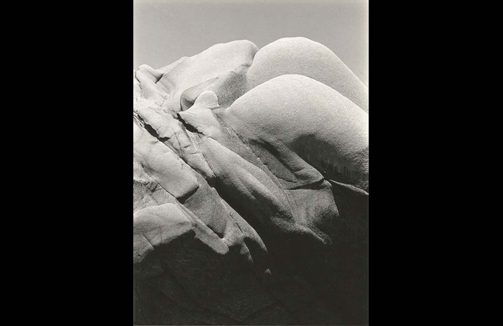
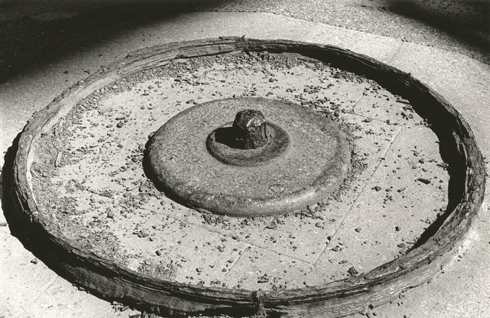
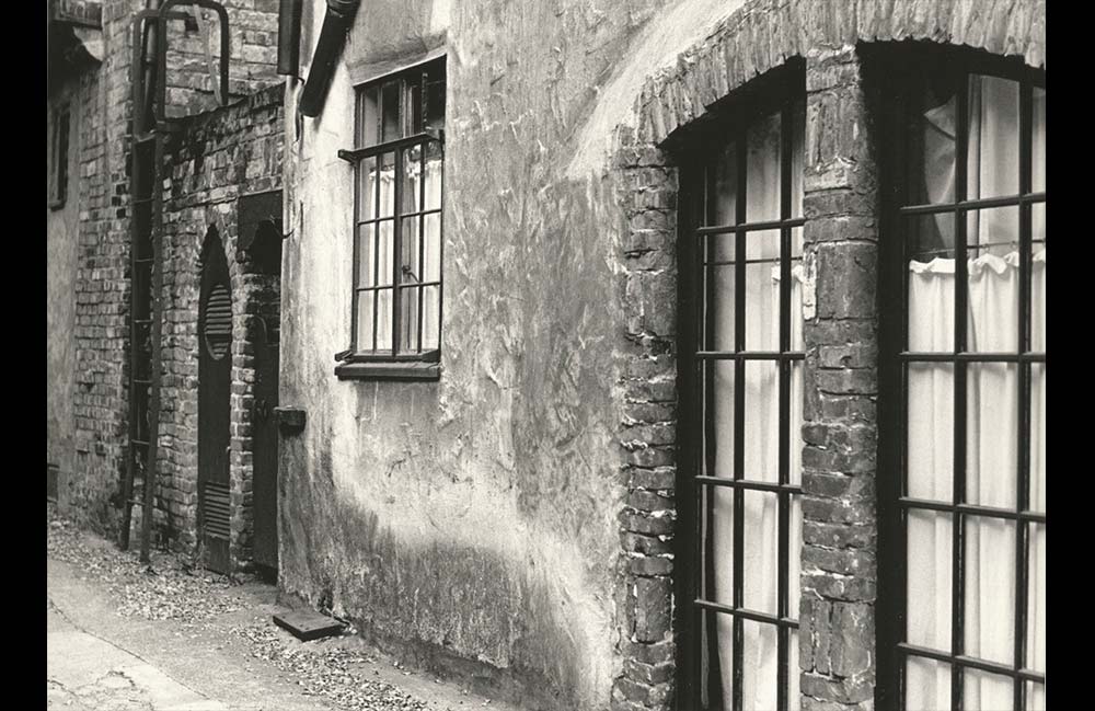
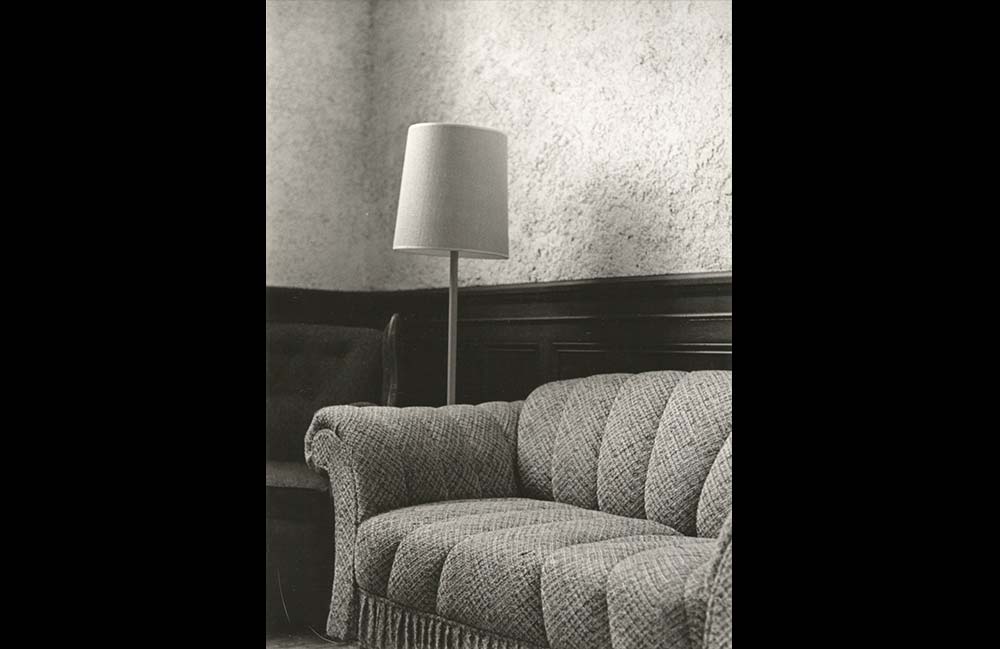
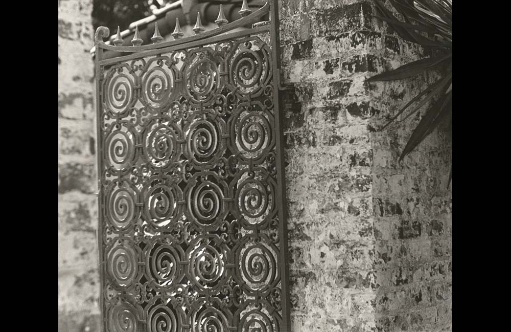
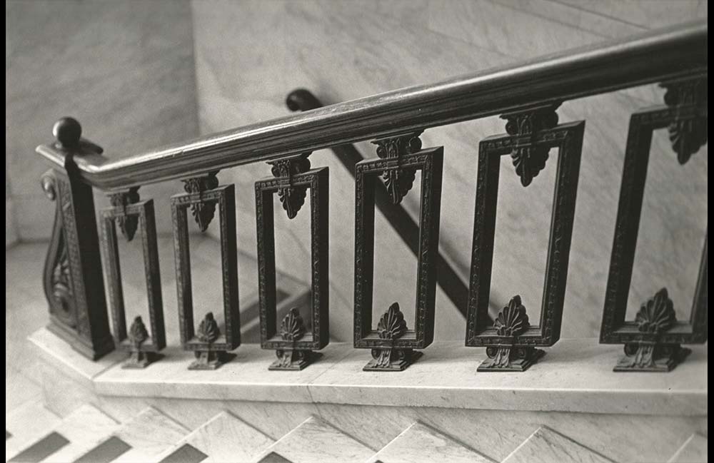
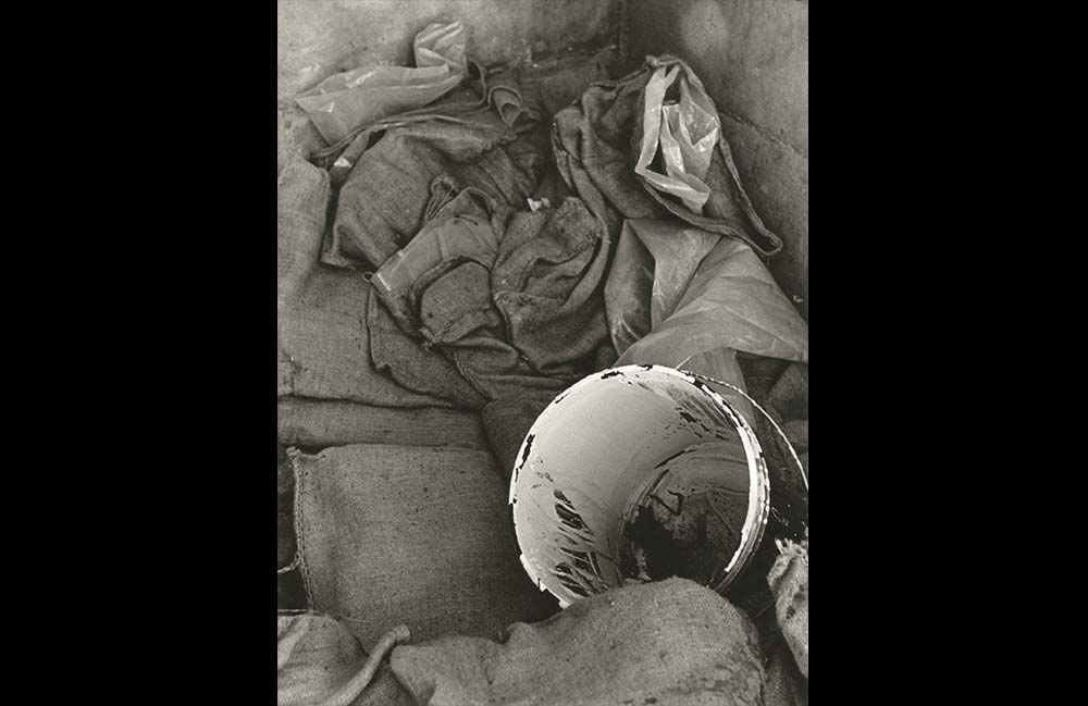
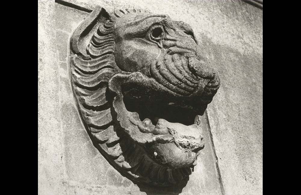
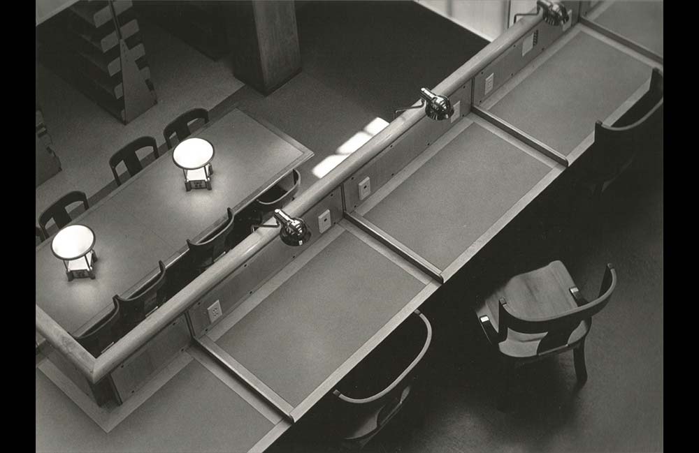
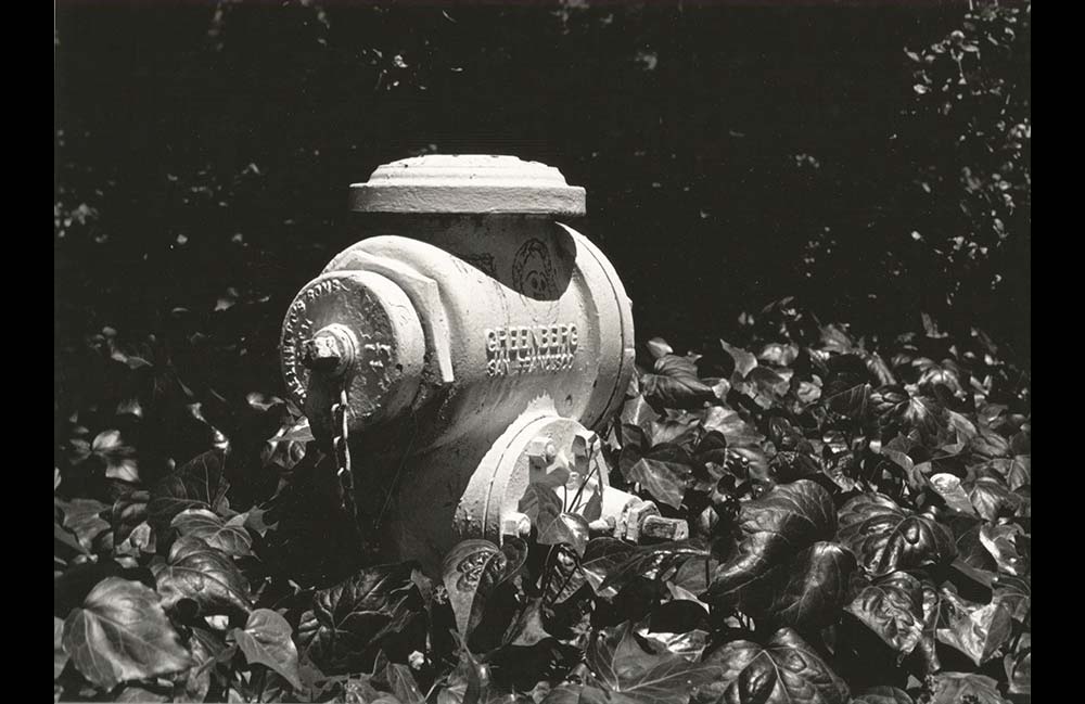
L24.3 | Caroline Jou Armitage Photographs (images)
These are my wife’s photographs from her introductory photography course at the University of California Berkeley, taken at age 20. Although being new to the craft, and with no formal art or design training, she produced these samples from an amazing series of images. These are raw scans of the prints, with no digital treatment. There are as many others of equal quality, all taken with one 36-shot roll of film. This was essentially the first time she had ever picked up a camera for anything beyond casual snapshots.
Some of us are simply born with aesthetic sensibility and skill.
