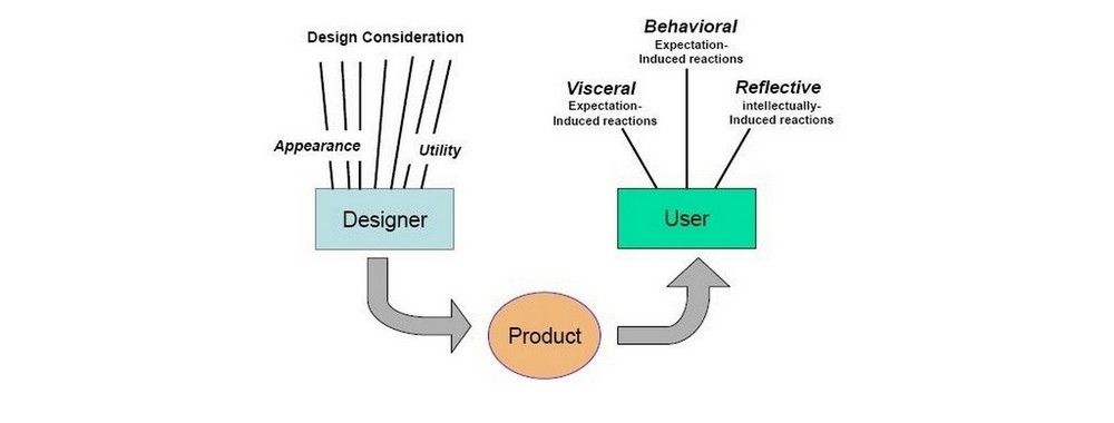
A myriad of fields, skills and insights come together to create the overarching discipline of user experience design. Psychology and behavioral science play a big part in UX design because understanding people, the way their minds work, what they want and don’t want, will help us create better products and services and, consequently, more successful designs. Let’s explore five behavioral science insights you can use right now to design better products—they’ll be especially useful if you’re a product designer, UX designer, product manager or anyone involved with the product design process.
What is behavioral science and behavioral design?
First, it’s essential to understand behavioral science and the related discipline of behavioral design. Here’s a quick breakdown:
Behavioral science studies the cognitive processes of organisms, animals or humans. It uses observation, scientific experimentation and mathematical modeling to draw conclusions on how and why people or animals behave. Behavioral science encompasses psychology, anthropology, psychobiology and more.
Behavioral design combines design, technology and psychology (behavioral science) and applies it to the design process. To practice behavioral design, we must understand how people think, how and why they make decisions and how to influence them to inform the design of products and services.
1. Engage the Pre-Attention Area of the Brain to Create Eye-Catching Products
This is the part of the brain that grabs attention—it’s known as the visual cortex. It can be extremely useful in product design, especially if one of your main objectives is to catch a user’s attention. In the Master Class, Behavioral Design: Create Engaging Products with Behavioral Science, Dr Susan Weinschenk (AKA The Brain Lady), we learn that there are four areas of the visual cortex (V1, V2, V3 and V4) and each one has a particular sensitivity.
Color
Look at the image below; on which side is it easier to see the number 2? It’s the right-hand side, and that’s because a certain part of the visual cortex is sensitive to color—we can see the 2’s as they’re in a different color from the jumble of letters and numbers.

© Interaction Design Foundation, CC BY-SA 3.0
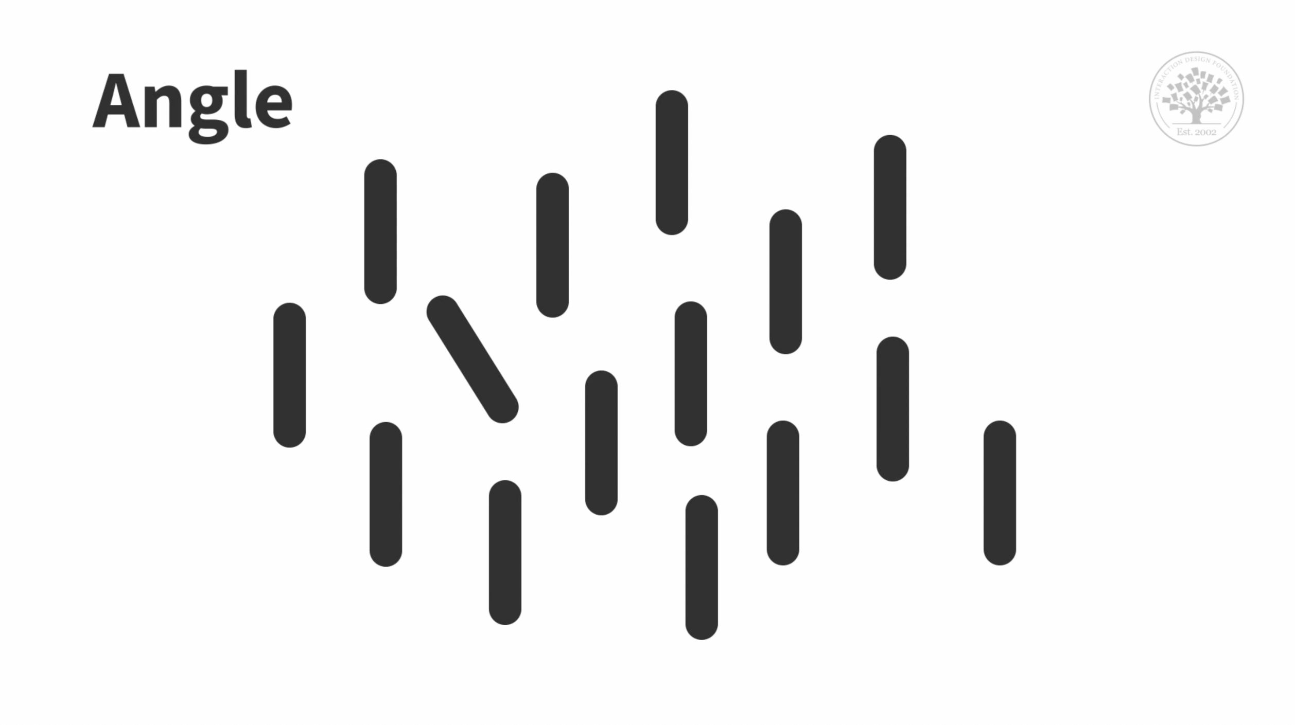
Angle
Another part of the visual cortex is sensitive to angle. As illustrated in the image below, we notice one line in particular because it’s slanted, while all the others are vertical.
© Interaction Design Foundation, CC BY-SA 3.0
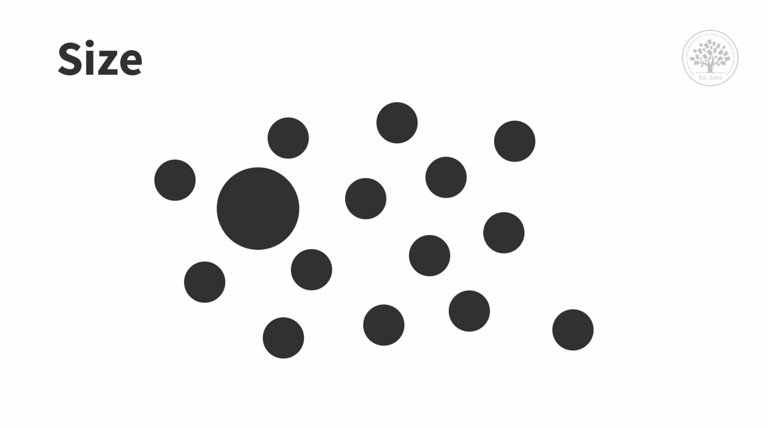
Size
Similarly, when something is a different size from the other objects around it, we notice it. It’s another aspect we can use to catch attention.
© Interaction Design Foundation, CC BY-SA 3.0
Movement
It may seem obvious, but we automatically detect when there is movement. We don’t often realize it, our attention is fleetingly drawn to small movements throughout the day, whether it’s an insect flying close by or a piece of paper shifting from a brief draught.
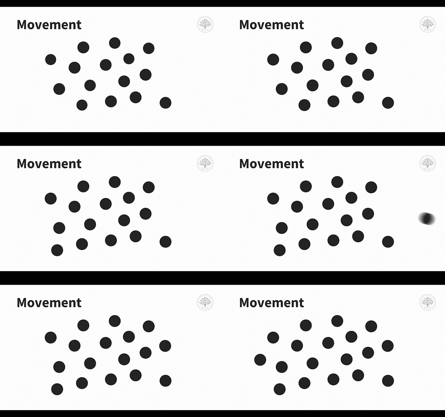
© Interaction Design Foundation, CC BY-SA 3.0
To utilize the pre-attention visual area to its full potential, only use one or two visual attributes simultaneously. If you try to use all of them at once, the pre-attention area goes quiet.
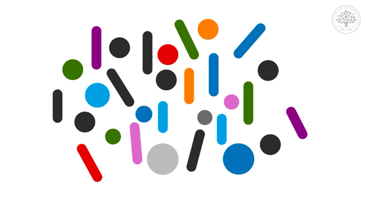
If you try to engage all pre-attention visual areas simultaneously, that part of the brain goes quiet. Only use one at a time, or just shape and color.
© Interaction Design Foundation, CC BY-SA 3.0
2. Reach Your Target Audience with Mental Models
As we learn something new, we create new neuron connections. However, from childhood through to adulthood our brain prunes some of these connections. It’s a natural process that’s necessary for brain development. But it’s for this reason that learning a language is more difficult later on in life. This same pruning happens when we use and experience different technologies. The technology that we use as a pre-teen or adolescent sets our mental model for the rest of our life. Behavioral Economist, Guthrie Weinschenk, shares his favorite example to illustrate mental models that relate to technology:
This means that mental models change from one generation to the next. For instance, have you seen how accustomed young children are with touch screens? They’re far more comfortable with them than someone much older but who’s been exposed to them more. The critical factor here is when they were exposed.
How does this influence design? If you want to ensure the success of your product, you need to be acutely aware of these mental models. Let the mental model(s) of the generation(s) you’re targeting inform your design.
3. The Science of Decision-Making Affects the Success of Your Products
Research shows that decision-making is an unconscious process. Even conscious decisions, where we apply our logic, have an unconscious component.
Emotions and feelings influence decisions, not just logic and reasoning. Emotions are so important that without them we can’t make any decisions. Susan Weinschenk explains why in this clip:
This means that there are no unemotional decisions. Confidence also influences decision-making. It may seem obvious, but you’re more likely to make a decision when you are confident in it. However, a feeling of confidence is subjective and varies from one person to the next. Susan Weinschenk describes it best:
There’s a part of the brain that monitors time, meaning that we will unconsciously make the connection between the length of time it takes to make the decision and a lack of confidence. This unconscious knowledge further prevents us from coming to a resolution.
Decision-making is more complicated than we realize, it happens unconsciously, it’s emotional and requires confidence. This is where behavioral design comes in, you need to make an emotional connection to trigger action and decision-making. Consider how you can build trust with your desired audience so that their confidence in you grows and consequently, they take action.
Change Behavior With Partitions and Groupings
Guthrie Weinschenk has a scenario that clearly explains the concept of partitions:
What’s the answer? The big bag! You will eat more of a snack when you have a large bag, instead of multiple little bags. The obstacle of opening a new bag is a partition. When we encounter a partition, it prompts us to think about our decision. If we have an enormous bowl of chips on our lap, we’ll instinctively keep grabbing more handfuls. Conversely, if we finish one small bag of chips and we’re in the mood for more, we’ll be more deliberate in our decision to grab another one because of that one small partition—opening the bag. In other words, partitioning gives you a decision point at which you are to evaluate your actions, in this case, to stop or carry on. The decision points shift your decision-making from automatic to deliberative.
You can use partitioning to frame your product or service in a more favorable way. It can make small numbers seem big and big numbers seem small. For instance, have you ever come across a product framed in this way “Get quality insurance for just $1 a day”? That sounds a lot better than $365 a year.
To make small numbers seem big, let’s use Guthrie Weinschenk’s example of cigarettes. If you’re trying to convince someone of the damage they’re doing to their lungs by smoking, imagine you could show them how many cigarettes they would smoke in their lifetime. A few cigarettes a day may not seem so bad, but if all the cigarettes were piled up in one place, the full magnitude of smoking can be appreciated.
Humans can be influenced by the size of partitions and how they are grouped and framed. Use big groups and fewer partitions to keep people in the automatic decision-making mode and make small numbers seem big. On the other end of the spectrum, use small groups and many partitions to encourage behavior change and make big numbers seem small.
5. Embrace People’s Social Need in Your Designs
We all know that humans are social creatures. And it isn’t just for making us feel good, but is critical for our very survival. Research shows that not having social connections can be fatal.. Here Susan Weinschenk shares research on this topic:
Social interactions are essential, they’re built into our biology and psychology. This knowledge is especially important if you’re designing a product with a social aspect. You need to make it obvious how people can connect socially. Even if your product doesn’t have a social aspect, or you don’t feel it’s important to your design, remember that people will find a way to use any tool or technology socially. Imagine you’ve just bought yourself a new set of gardening tools. You’re so pleased with them you want to show them off and you expect your friends and family to be equally impressed. Initially the garden tools were just for you, but then it becomes a topic of conversation and who knows, you may just convince someone to garden with you!
The Take Away
Behavioral science provides us with a multitude of insights that we can apply to our design process. When we understand people we can create better, more successful products. Use these five insights to catch your user’s attention, design products best suited for the audience or generation you’re targeting, influence their decision-making and connect with them emotionally and socially. Strive for behavioral design to get the best user experience and the most successful products.
References and Where to Learn More
Watch Susan and Guthrie Weinschenk’s Master Class, Behavioral Design: Create Engaging Products with Behavioral Science
Learn more about behavioral design in this blog post by SUE | Behavioral Design and this Medium article.
Read one of Susan Weinschenk’s Books: 100 Things Every Designer Needs to Know about People, 100 More Things Every Designer Needs to Know about People or How to Get People to Do Stuff: Master the Art and Science of Persuasion and Motivation
Read Guthrie Weinschenk’s book I Love You, Now Read This Book.
Image: © Hal Gatewood, Unsplash License
