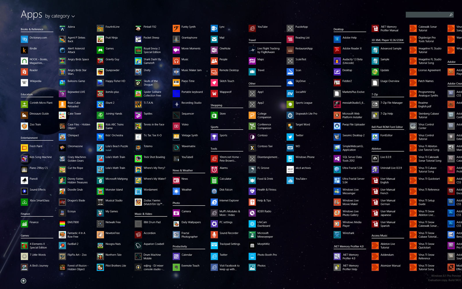
The humble icon has come a long way in a very short time. For those of us who have grown up in the modern age it may feel like this is a world that has never lacked for computer icons; they are ubiquitous. The reality is that the icon is a rather more recent invention with the first real icon based GUI only appearing for consumers in 1981!
It is worth noting that the word icon is derived from the Greek word eikon and literally means “image”. Iconography (the study of icons) has been traditionally associated with religions where icons are images of holy figures. However, as an icon in computing is an image that is supposed to represent a function; the term was hijacked and today there is almost certainly more work done on icons in technology than icons in religion.
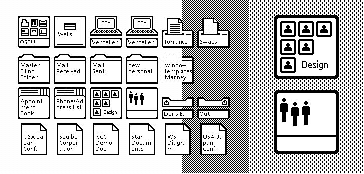
The Xerox Star
Xerox is credited with developing the first GUI (graphical user interface) in the early 1970s. This GUI was applied to the Xerox Alto; a research computer that cost an incredible amount of money. Only around 2,000 of them were ever sold and as such it wasn’t really a “consumer” machine.
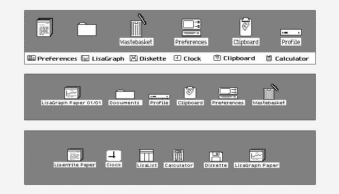
However, the Xerox Alto would lend all its aspects to the Xerox Star which in 1981 became the first ever consumer release model to use icons. These icons such as trash cans and folders and printers, have remained nearly unchanged all the way through to today.
The Apple Lisa and The Apple Macintosh
The Xerox Star is not particularly well-remembered and it took the release of the Apple Lisa in 1983 to make the use of icons as part of a GUI popular. The icons on the Apple Lisa were near identical to those on the Xerox though some of them were drawn with a little more attention to detail.
The Macintosh was released in 1984 and the machine’s icons are legendary. The artist Susan Kare designed the icons for this machine and she said; “"I believe that good icons are more akin to road signs rather than illustrations, and ideally should present an idea in a clear, concise, and memorable way. I try to optimize for clarity and simplicity even as palette and resolution options have increased."
Susan Kare would go on to design the icons used in Windows 3.1 too in 1992.
The Amiga Workbench
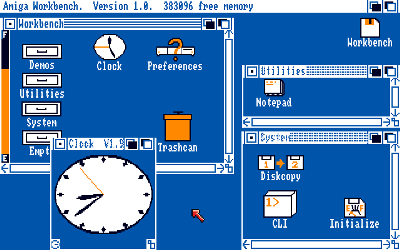
It took until 1985 before icons became more than just black and white representations. The first four colour icons appeared on the Amiga 1000. This also allowed for multi-state icons; icons which showed you at what phase of a process you were.
The Apple Macintosh (Again)
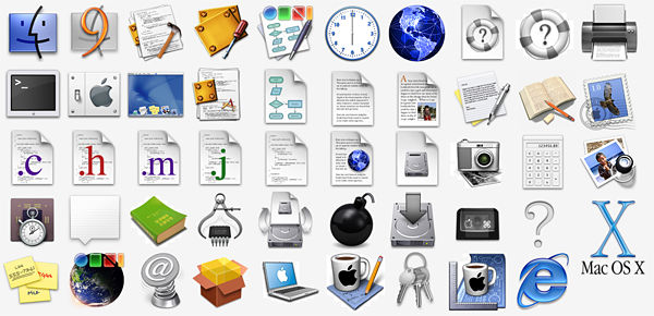
Those lovely folks at Apple gave the Macintosh line a reboot in 1991 and introduced colour icons and a “raised” effect that showed clearly that the icons were meant to be “clicked”.
Then Apple raised the bar again in 2001 through Mac OS X (v 10.0) and the “Jelly Mac” came equipped with the most realistic icons ever seen. Though Microsoft were also refining icons that year and Windows XP came with icons that all use a single light source with semi-transparent drop shadow.
Apple went back to the drawing board in 2007 and developed a different way to stack their icons; though the icons themselves were left nearly unchanged.
If you’d like to learn more about icons and other forms of visual representation in computing and technology; please read Alan Blackwell’s book here which goes into much more detail. It’s free to read online.
Imgs: Xerox Star, Apple Lisa, Amiga Workbench, Mac Icons, Banner Icons
