Skeuomorphism has been a very useful concept in design, then it became the most hated concept in design, and then it came back from the dead. Understanding skeuomorphism lets designers help users through learning curves and make decisions as to whether skeuomorphism still serves a purpose today.
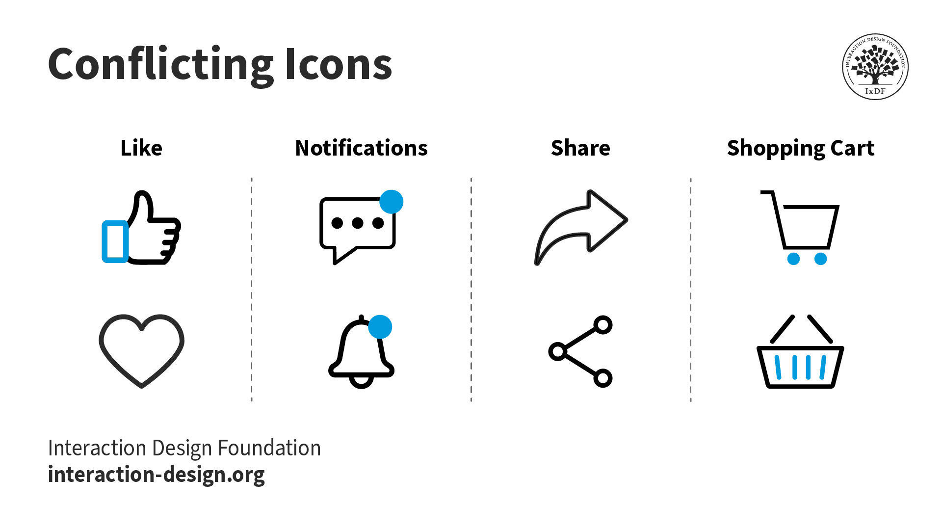
Skeuomorphism is where an object in software mimics its real-world counterpart. The “trash can” is, perhaps, the most recognizable skeuomorphic object. Though the good old “save” icon was once skeuomorphic but following the demise of the floppy disc – it no longer bears resemblance to the world of today.
Skeuomorphism began to take shape in the 1980s. One of its earliest proponents was Steve Jobs of Apple. The idea was simple; computer interfaces would be much more intuitive to users if skeuomorphic design were applied.
That trash can let users drag stuff they didn’t want on their computers to an actual bin. You could move files to folders (another real-life equivalent). It meant that we weren’t baffled by all these new facilities because we had something to reference them against in real life.
James Gibson, the environmental psychologist, once suggested that we perceive the world as a set of “affordances”. An affordance is an object that’s shape suggests its use. The most commonly cited affordances would include door handles and push buttons. Skeuomorphism also represents “perceived affordances”. It fits with our natural interpretation of objects but in a digital world.
The Trouble with Skeuomorphism
Skeuomorphism helped a generation through the learning curve of coming to grips with a digital era. But, it also began to hold us back. We became familiar with the concepts and they entered the language and our day-to-day lives but skeuomorphic design led to huge amounts of clutter on the desktop. They brought too many useless details to our computers which we no longer needed.
There’s a whole generation out there now that has never known a world without computing. The visual metaphor isn’t necessary any more.
![]()
Author/Copyright holder: Lifemaestro. Copyright terms and licence: CC BY-SA 3.0
The Rise of Flat Design
In 2007, Forbes magazine announced the death of skeuomorphism. Apple (to be followed quickly by Google) had settled on a new form of design – flat design
Flat design mandated that graphic user interfaces (GUIs) should be freed from clutter. There was no need for bevelled edges, gradients, reflections, and skeuomorphism. The digital interface should be exploited for its own strengths.
Visual clarity was put at the forefront of design. If you use Windows 8, for example, you’ll find that the start button brings you to a shining example of flat design. All those icons are gone and they’ve been replaced with tiles – tiles that bring you actual data in both written and graphical format – they can deal with greater levels of complexity in the interface without compromising the user experience
Of course, Windows 8 was not universally loved but that may have something to do with the transition between the old and new being so dramatic. It might have been easier to inch away from skeuomorphism for Microsoft rather than to run away from it.
iOS 7 was Apple’s leap into the world of flat design and was, from a consumer acceptance perspective, more successful than Microsoft’s. This may have something to do with Apple’s trendy, design audience compared to Microsoft’s more staid and older demographic. However, the minimalist approach of iOS 7 was hailed as a work of genius. Skeuomorphism was declared dead on the spot – the new metaphorical, rich flat design was the way forward.
We’d argue that skeuomorphism and flat design aren’t as far apart as they appear. A camera icon, for example, still appears on the camera functionality in iOS 7. It may be a slightly less realistic camera icon than would have been used in the past but flat design doesn’t so much replace skeuomorphism as mute it.
![]()
Author/Copyright holder: GraphBerry. Copyright terms and licence: CC BY-SA 3.0
The Return of Skeuomorphism
Those that declared the death of skeuomorphism got carried away. It might have seemed logical at the time – smartphones and tablets were after all only extension of the computing frameworks we already knew. But then something changed – the smart watch arrived on the market.
![]()
Author/Copyright holder: Pebble Technology. Copyright terms and licence: CC BY-SA 1.0
Watches have not been a traditional part of the computing line up. In fact, the digital watch has always been regarded with a certain scepticism (or even disdain) among the watch wearing community at large. It may do the same thing as an analogue watch, it may even do it as well as an analogue watch but for the majority of watch wearers – it doesn’t do it as prettily.
Phones, tablets, desktops, laptops can make a fashion statement but for the majority of the time; they aren’t part of our day-to-day fashion decisions. The smartwatch is different.
To encourage people to use the smartwatch, manufacturers need to convince them to give up their old watches. It seemed unlikely that Rolex, Tag Heuer, Breitling, Patek Phillipe, etc. would be shaking in their shoes if the smartwatch experience was a digital one.
Skeuomorphism was embraced by canny smartwatch manufactures once again. The faces of smartwatches are designed to mimic that analogue watch experience. So that when the user goes to examine the time – the real world and the digital are as one.
In fact, it can be argued that the smartwatch itself is skeuomorphic. It’s not a watch. It’s a computer. But it’s a computer that you wear on your wrist. The current designs which all mimic the wrist watch may be a gentle way to ease consumers into a transition before a new form of iconic design arises for future generations of smartwatches.
The Take Away
Design trends come and go. Skeuomorphism can be very useful. It can also be taken too far. Flat design came about in response to the over use of skeuomorphism. The current trend in smartwatches is a return to it – but for how long?
References
Check out our fantastic IxDF course, Affordances: Designing Intuitive User Interfaces.
The BBC takes a long look at the history of skeuomorphism in devices.
Kelsey Campbell-Dollaghan argues the case for the permanency of skeuomorphism in design: Skeuomorphism Will Never Go Away, And That's a Good Thing
The Next Web examines the contrast and debate over flat design vs. skeuomorphism.
Forbes’ premature celebration of the end of skeuomorphism can be read and enjoyed by the curious learner.
Fast Company examines the rise of skeuomorphism on the wrist.
Hero Image: Author/Copyright holder: Klaus Göttling. Copyright terms and licence: CC BY-SA 3.0


