User testing may be the final word in usability, but usability guidelines, or "heuristics," are rubrics designers use to evaluate their designs. These guidelines are the product of decades of research and experience. They have traditionally been applied to mobile or desktop interfaces but were updated to allow AR designers to make the most of their AR experiences.
Frank Spillers is an accomplished AR designer and the founder of award-winning UX consultancy Experience Dynamics. In this video, Frank introduces the adapted heuristics used for AR design and provides examples for you to practice the use of heuristics on.
Video copyright info
Copyright holder: CoMinder Appearance time: 0:56 - 0:57 Copyright license and terms: CC BY Link: https://www.youtube.com/watch?v=iqlv8ZUIgmM&ab_channel=CoMinder
Copyright holder: Eugene Kovryga Appearance time: 0:57 - 0:58 Copyright license and terms: CC BY Link: https://www.youtube.com/watch?v=UsoN69tdPeg&ab_channel=EugeneKovryga
Copyright holder: Pablo Picanto Appearance time: 0:58 - 1:01 Copyright license and terms: CC BY Link: https://www.youtube.com/watch?v=shyb7j_7DWw&ab_channel=PabloPicanto
Copyright holder: CurvSurf Appearance time: 1:05 - 1:11 Copyright license and terms: CC BY Link: https://www.youtube.com/watch?v=WK1cFcBloDM&ab_channel=CurvSurf
Copyright holder: HCI LAB University of New Brunswick Appearance time: 1:12 - 1:14 Copyright license and terms: CC BY Link: https://www.youtube.com/watch?v=cNYckhMfU5s&ab_channel=HCILab-Univ.ofNewBrunswick
Copyright holder: CurvSurf Appearance time: 1:14 - 1:16 Copyright license and terms: CC BY Link: https://www.youtube.com/watch?v=FzdrxtPQzfA&ab_channel=CurvSurf
Copyright holder: HUESKER Group Appearance time: 1:41 - 1:47 Copyright license and terms: CC BY Link: https://www.youtube.com/watch?v=Sl1M1i3Ltkc&ab_channel=HUESKERGroup
Audrey Labrie and Jinghui Cheng adapted the original heuristics guidelines—initially created by Jakob Nielsen and Rolf Molich—for a mobile AR context. These guidelines are more than just suggestions; they can be used as a scorecard to evaluate how an AR app performs on each criterion and where to improve the UX.
Heuristics for AR Experiences (Labrie & Cheng 2020)
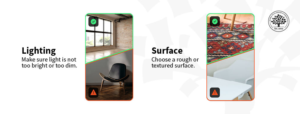
Visibility of system status. The system should keep the user informed during the interaction. When scanning surfaces, for example, the user should be informed when the physical surfaces are difficult to detect (for example, if they are too reflective or too dark). After successful surface detection, the system should notify the user that the object can be placed. If it takes time to load an object, the system should inform the user.
Match between the system and the real world. Virtual objects should appear and behave as realistically as possible. Their sizes should be proportional to the physical environment and fixed to surfaces, as in the real world. Objects should not overlap, and the system should detect collisions between objects.
User control and freedom. It is possible that the user places a virtual object in an unwanted location or selects, deletes, or rotates it by mistake. Therefore, the system should support undo, redo, and confirm with the user when the deletion is selected.
Consistency and standards. Gestures used to translate and rotate an object should be intuitive. It is particularly important to indicate how the user can manipulate the object. If an object's height is required, it should be done by an extra UI component (like a vertical slider). Directly moving the object on the vertical dimension can be easily confused with object translation.
Error prevention. Possible errors include placing or deleting an object by mistake. The system should ask for confirmation for these error-prone actions that can lead to consequences and inconveniences. If the user does not confirm, the object will return to its original location.
Recognition rather than recall. Possible actions regarding interaction with virtual objects should always be visible. When adding an object to the scene, the system should display an image of the selected object to avoid recall (like remembering what object is to be added). When an object is selected, all possible actions should be shown on the screen (functions like undo/redo, delete, and change color); useful gestures for translating and rotating the object should also be indicated. When no object is selected, the system should show the possible actions related to the entire scene (take a photo, favorites, reset scene).
Aesthetic and minimalist design. The system should not show irrelevant or rarely used information to the user. Extra information could be shown when the user makes the corresponding selection. Examples of the common relevant information during the different stages of interaction are:
(1) when placing an object, there should be a placement shape indicating the position and the size of the object; and
(2) an indicator of selection and options for object operations should be displayed when selecting an object.
Help users recognize, diagnose, and recover from errors. Help for error recovery is important. For example, the moment the system has trouble detecting surfaces, the user should be informed of the reason and help the user correct the error. If the user is moving a virtual object on an undetected surface, the user should have the option to re-activate surface detection.
Help and documentation. Such a system usually should not have explicit documentation because it should be intuitive. However, they should have a brief tutorial for first-time users. Particularly, surface detection is an action that most users are unfamiliar with. So a brief tutorial and explicit indication should tell the user how to detect surfaces. The possibility of translating and rotating the objects should also be clearly communicated to the user.
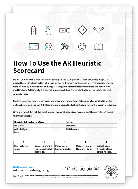
We’ve included the heuristic scorecard below, which you can use to evaluate and improve your AR apps.

The Take Away
Usability in AR can be tricky, but AR heuristics are a tried and true method to evaluate your designs before even starting user testing.
You can identify common pitfalls leading to wasted time and money by continually evaluating your designs with heuristic scorecards. While usability tests are invaluable, they are much less valuable when they identify an obvious UX error or an easily avoidable issue.
You can use these heuristics to eliminate ideas early on that may sound good on paper but can't be user-friendly. This puts designers in a much stronger position before going into prototypes. The heuristics also provide guidance to improve existing designs. They are guiding principles that ensure each iteration moves closer toward the ultimate goal of a user-friendly interface.
References and Where to Learn More
Explore the definitive heuristic guidelines for AR for mobile, Adapting Usability Heuristics to the Context of Mobile Augmented Reality.
Read the original Nielsen Heuristics or the more readable version from UX Planet.
See how Google uses AR to improve Google Maps and an overview of Google's plans for AR and VR.
Hero Image: © SN Digital LLC. Fair Use
