Your constantly-updated definition of User Control and
collection of videos and articles. Be a conversation starter: Share this page and inspire others!
97shares
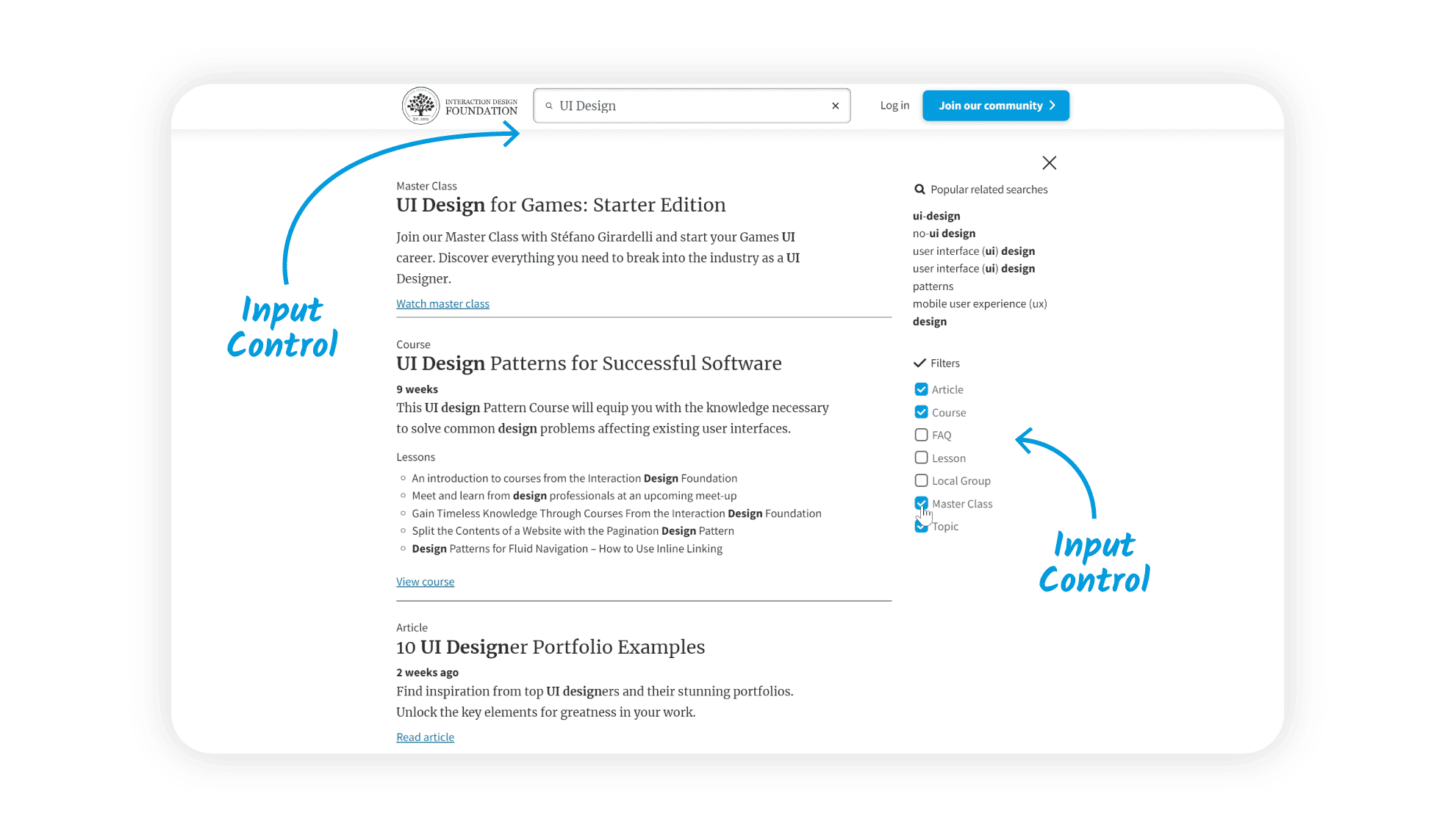
What is User Control?
User control in user experience design refers to the principle where designers let users have autonomy and independence in their interaction with a digital interface through such features as undo buttons. This user-centric design approach makes sure the user has the freedom to navigate, interact and make choices within a system or interface according to their preferences and needs.
While users should have a great degree of freedom and control—including to press Enter—how much control to give users, and how, is a significant design consideration.
User control is a vital part of user experience (UX) design—something that’s primarily due to its potential to enhance user autonomy in good designs. A high degree of user control translates to a user interface (UI) that adapts to the user's preferences and needs—an interface that helps deliver a good user experience.
When designers give users control, they give them essential affordances, comforts and adaptability—rather than dictate a rigid pathway for them. This adaptability gives users the freedom to interact with the interface, and does it in a way that suits their unique personal style or cognitive process. It helps alleviate pain points while a user interacts with a digital product, too. So, the overall user experience is far better and much more in line with user-centered design. The user really gets a sense of empowerment and satisfaction while they encounter the product brand.
User Control and Jakob Nielsen's Usability Heuristic
The concept of "User Control and Freedom" is a key heuristic—one which usability expert Jakob Nielsen, of the Nielsen-Norman Group, proposed. It’s third in his list of ten Usability Heuristics—and heuristics are rule-of-thumb strategies that come from previous experiences with similar problems. “User Control and Freedom” underlines just how important it is to give users the flexibility to navigate the system freely—and reverse their actions whenever they have to.
According to Nielsen, designers should create interfaces so that users can undo and redo actions without anything keeping them back. This heuristic is all about the need for product designers to provide "emergency exits" so that users can leave—and effortlessly so—any unintended state without going through an extended process. When designers stick to this heuristic among their design principles, they can really improve system usability and user satisfaction.
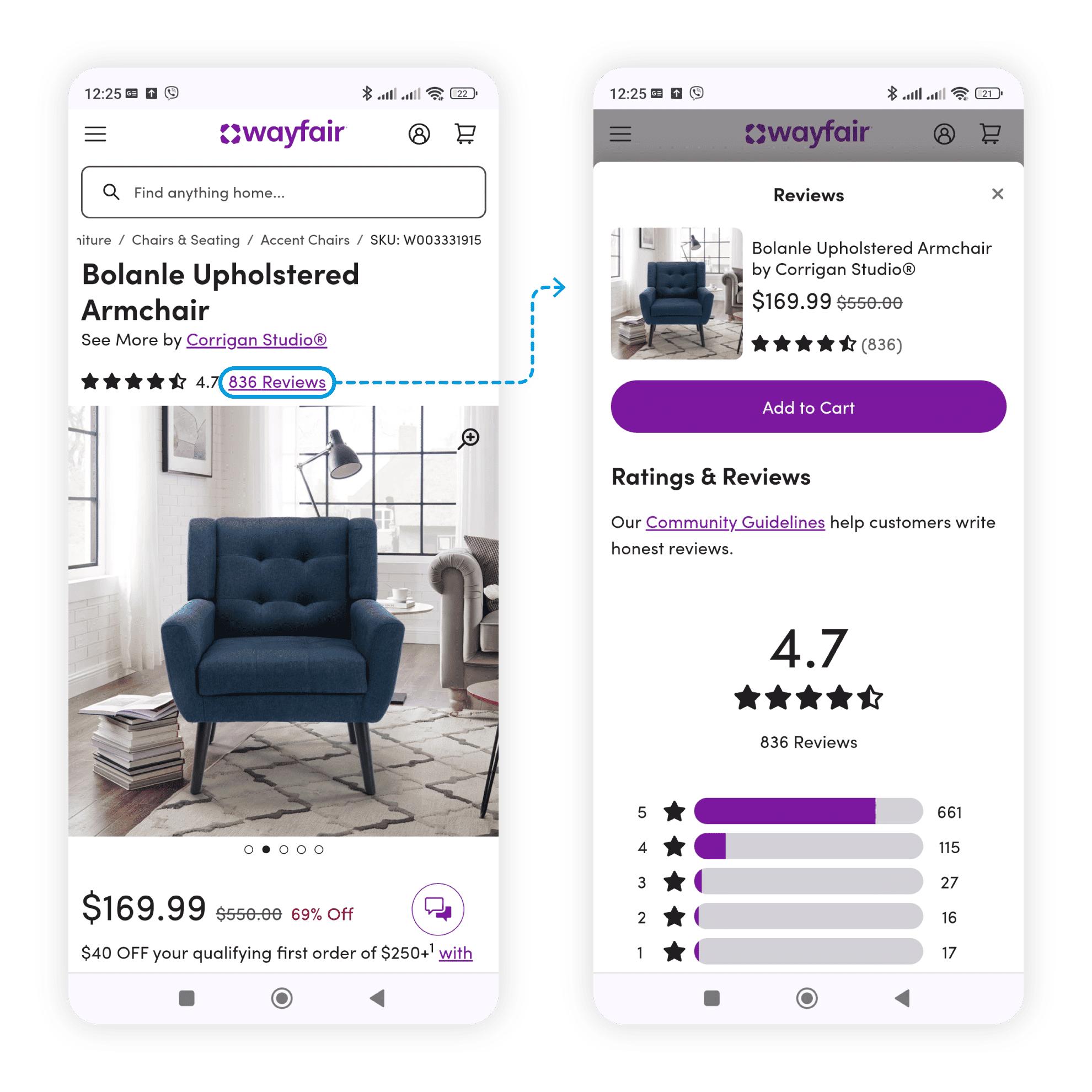
When users on Wayfair.com click on the Reviews link, a drawer opens and expands to the full screen. Both the site’s and browser’s Back buttons return users to the initial product overview page, as users expect. They can also swipe from left to right to close the drawer.
User Control: A Catalyst for User Satisfaction and Trust
User control plays a critical role, too, since it helps nurture and build up user satisfaction and trust. A digital interface that lets users navigate freely and reverse actions really gives the people who use it a sense of reliability and assurance. Users feel confident to use the product—and they’re much more likely to return, something that ends up in the form of higher user retention rates. What’s more, user trust builds on the perception users have of the product's credibility. This fact is something that can greatly impact the product's market reputation—and, naturally, its longevity overall.
User Control: An Antidote to User Anxiety
User anxiety is a common issue in UX design. Understandably, it often comes from the fear users have of making irreversible errors. So, when designers offer them a high degree of user control, they can mitigate this anxiety a great deal. The knowledge that they’re easily able to reverse actions and they can navigate freely within the interface alleviates users' apprehensions—and encourages them to explore the product fearlessly.
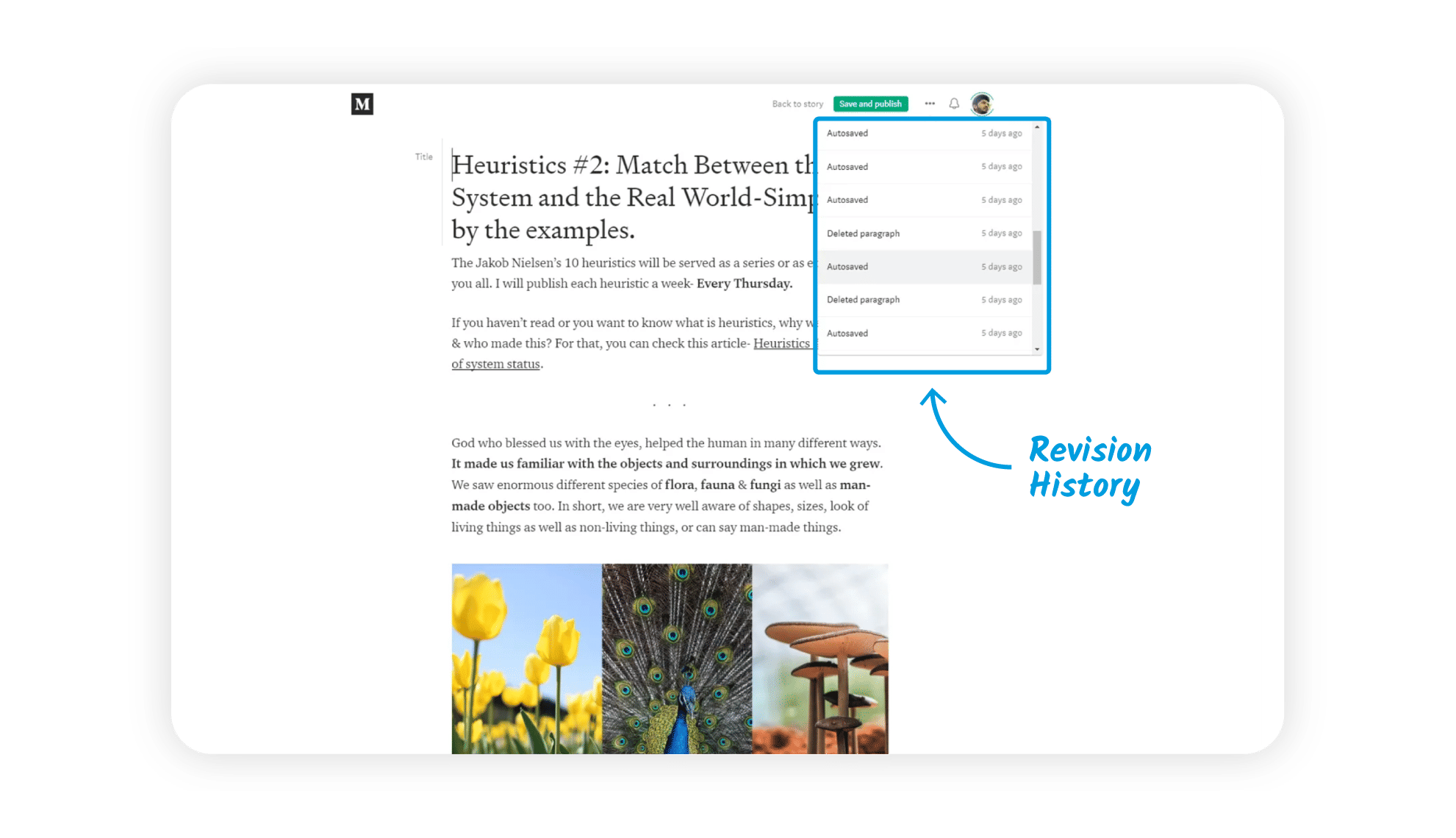
Medium’s revision history lets users check their article’s progress.
What are the Challenges to Design for User Control?
To design for optimal user control can lead to more difficult design decisions throughout iterations in the design and development process. The primary concerns for designers come down to how they:
1. Balance User Control and Simplicity
One of the main challenges that designers face whenever they try to incorporate user control is to keep things simple. And to maintain simplicity is a huge part—and challenge—of getting things right for users. While users appreciate having control, they also value simplicity and ease of use. For example, if software designers offer too many options or flexibility in an app, it can overwhelm users—and lead them to decision paralysis. So, the challenge is—for designers—to strike a balance between how they provide user control and maintain a minimalist and intuitive interface.
2. Prevent Unintended Consequences
While it's an essential thing to let users undo actions, designers have got to make sure that these functionalities don't compromise the integrity of the system or lead to data loss, too. This calls for careful planning throughout the UX design process and robust system design as the product develops for the target audience.
3. Adhere to Standard Conventions
To design for user control—and do it well—means to follow standard conventions, too. Users often have deep-held expectations about how certain functions should work. And these notions come from their previous experiences with other products. So, if designers deviate from these conventions, they can confuse users and work against their product’s usability. So, while designers innovate and add unique elements, they’ve got to make sure that they keep to established norms and design patterns.
Watch our video on UI design patterns to understand more about what users can expect to encounter in mobile apps, website designs and more:
ShowHide
video transcript
Transcript loading…
What are Examples of User Control in UX Design?
Various elements in UX design exemplify user control. Here are important elements that really highlight how designers can incorporate user control into their products—and do it effectively:
1. Undo and Redo Options
Most digital interfaces provide undo and redo options. This feature is a prime example of user control—and it lets users easily reverse their actions. For instance, text editors often have undo and redo buttons that let users revert their changes or reapply them—respectively.
A user on this Trustpilot page can select Undo and Redo to go back to a previous mode or return to the latest mode of text.
Customizable settings are another very important aspect of user control in UX design. Many applications and websites let users tailor the interface according to their preferences. Users can modify display settings, choose themes or rearrange the layout. They—therefore—can enjoy a great deal of control over the interface.
Users can control the light intensity on their smartphone screens to suit their tastes or the time of the day.
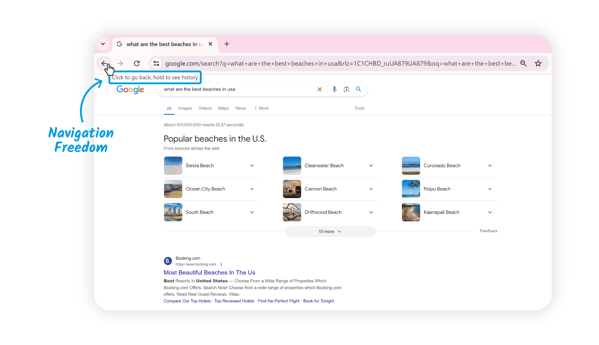
Navigation freedom is an aspect of user control that’s absolutely critical. A well-designed interface should let users navigate freely across different sections. Consistent and visible navigation menus, breadcrumb trails and back buttons are common elements that provide navigation freedom.
This partial screenshot (from the top left of a Google.com results web page) shows Google Chrome’s back button—including the functionality to hold and see the history.
Confirmation dialogs are common in interfaces where users perform significant or irreversible actions. Before users execute such actions, the system prompts a confirmation dialog that asks the user to verify their intent. This feature makes sure that users get the final say in important system changes—and so enhances user control.
Note how this dialog box can grab the user's attention, also featuring a red button to proceed.
Text fields, checkboxes, dropdown menus and sliders give users control over both input and interaction. These features let them input information or make selections as they move through their user flow to get what they want to do done.
Users can exert control in several ways, such as in text fields and through buttons.
Accessibility features—such as screen reader compatibility, keyboard navigation and adjustable font sizes—help make sure that users with disabilities have equal control and access to the interface. Features that support accessibility are mandatory in many jurisdictions, too.
This video explains the need for any design team to design with accessibility in mind:
ShowHide
video transcript
Transcript loading…
What are Risks and Considerations of User Control?
While design for user control is generally beneficial, it's not without its risks. Among the points to bear in mind is that if designers give too much—or too little—control, it’s something that can lead to various issues.
1. Overwhelm for Users
To provide too much control can overwhelm users. When users have too many options or settings in front of them, it’ll raise their cognitive load—and they may feel confused and even anxious. That’s the sort of scenario that can lead to decision paralysis and a poor user experience.
2. Compromise of Functionality
On the other hand, if designers give users too little control, it can make them feel constrained—and likely very frustrated. To give users full control over all aspects of the system, though, could jeopardize the product's primary functionality. Users might alter critical settings without realizing it—or perform actions that harm the system's functioning. That’s a vital balance to strike in human-centered design systems.
3. Violation of Standard Conventions
When they try to provide user control features that are unique, designers might feel tempted to deviate from both standard conventions and effective design patterns. This can confuse users and lead to usability issues. Designers might inconsistently place controls, labels or more and frustrate their users as they try to proceed in flow through their tasks.
4. Poor Discoverability
Unless designers mark available control options clearly with obvious cues or instructions, users may not be aware of all these options or how to access them.
Watch as Product Design Lead at Netflix, Niwal Sheikh explains Netflix’s application of discoverability for users:
ShowHide
video transcript
Transcript loading…
5. Technical Limitations
Technical limitations or platform restrictions may restrict user control. If designers don’t work closely enough with developers, the latter may not implement the desired user control features effectively.
What are Best Practices to Design for User Control?
To design for optimal user control means to follow certain best practices. These practices are a great help that can guide designers to make interfaces that effectively empower users, prevent errors—and more.
1. Understand User Needs and Preferences
The first step is to understand the users themselves. Designers should do UX research—and do it thoroughly—to understand users' needs, preferences and expectations. This knowledge can guide the decisions designers must make regarding the degree and form of control to give their product’s users.
UX Strategist and Consultant, William Hudson explains why it’s so important to conduct solid user research in this video:
ShowHide
video transcript
Transcript loading…
2. Prioritize Essential Controls
Designers should put a great deal of focus on providing controls that are essential for users to accomplish their tasks and meet their goals. Don’t overwhelm users with complex controls or ones that aren’t necessary. Undo and redo options are fundamental to user control—and these options give users the confidence to perform actions. That’s because they know they can easily reverse their choices if they need to.
3. Use Familiar UI Patterns and UI Elements
Designers who use familiar UI patterns and visual design elements can really give user control a boost—and so make the interface that much more intuitive. These include buttons, sliders, checkboxes, dropdown menus and other elements that users are used to finding. Consistency in the use of these elements across different sections of the interface is something that can enhance user control, too. And when users find consistent controls, cues and more, they can quickly understand their purpose and how to use them effectively.
Author and Human-Computer Interaction Expert, Alan Dix explains critical considerations when designers create screens for target users:
ShowHide
video transcript
Transcript loading…
4. Provide Clear Navigation
Clear and intuitive navigation is a crucial thing for user control. Users should be able to easily navigate through the interface, find what they're looking for and know where they are at any time. Designers can achieve this through clear labels, consistent layout and visible navigation menus. Again, established conventions are crucial keys to provide user control in this way. Designers should—therefore—follow common UI patterns to help reduce the learning curve and make the interface a great deal more intuitive.
5. Give Contextual Guidance
Contextual guidance is a vital way for users to understand how to navigate and interact with the interface very effectively. So, it’s good to provide tooltips, onboarding tutorials or contextual help that can help users make informed decisions and use the available controls. Apart from assisting users properly, when designers provide good contextual guidance, they show they’ve got empathy with their users.
Watch this video to understand the importance of empathy in design:
ShowHide
video transcript
Transcript loading…
6. Provide Clear Feedback, Validations and Error Handling
It’s vital to provide real-time, clear feedback in user control. Whether it's a success message after a form submission or a loading indicator during a data fetch, timely and clear feedback is ultra-important. It keeps users informed about what’s going on—the system status. Input validations and error handling mechanisms are crucial ways to keep user errors from happening. Designers can guide users towards correct actions—and prevent mistakes—by validating inputs and giving users clear error messages.
7. Allow Customization
To permit customization is a very effective way to make user control that much better. Users should have the option to customize the interface according to what they prefer—and it’s something that can greatly improve the user experience and give users a real sense of ownership over the interface.
Users should be able to customize many aspects of their experience with a brand.
Regularly test the interface with users in the real world to get and collect their feedback—and find areas for improvement. From usability testing, iterate and refine the design based on these user insights to optimize user control. Designers who conduct user testing well can fine-tune such vital areas as information architecture and visual elements—and these improvements can afford their users a better sense of control in the next iteration.
9. Consider Accessibility
Always design with accessibility in mind. It’s often a legal requirement to follow accessibility guidelines and give options for users with disabilities. For example, users with low vision abilities won’t likely be able to appreciate visual or graphic design features—and so their screen readers will need to tell them about a web page’s content. To give users of all ability levels control and access to the interface is a sign of empowerment that brings many benefits, both for users of all abilities and for the brand itself.
10. Balance User Control and System Control
It’s important to strike the right balance between user control and system control. Still, this can be quite a challenge. On the one hand, it's vital to give users the freedom to interact and make choices. Even so, the system has got to guide and assist users through automation, defaults and error prevention as well. When designers balance these two aspects—and do it well—they address a crucial need as users can enjoy a smooth and effective user experience.
Remember, a great UX design is something that empowers users through thoughtful products or services. And it gives them control and freedom while balancing it with system control in an interface that’s responsive to user input—one that provides meaningful feedback and allows for error recovery and undo actions. To design best for users’ control is to create an environment where users feel in control both of their actions and of the resulting outcomes.
Overall, users should have the liberty to make choices within a digital product, and they’ve got to enjoy the freedom to navigate and explore without feeling restricted or trapped. Designers afford user control best when they create interfaces that are responsive, intuitive and adaptable to individual user preferences. The digital products that meet users’ needs and expectations in seamless, enjoyable experiences where users feel they’re in the driver’s seat are ones that can enjoy greater chances of soaring high in the marketplace.
Take our Master Class How to Design with the Mind in Mind with Jeff Johnson, Assistant Professor, Computer Science Department, University of San Francisco.
In what ways can too much user control negatively impact the UX?
Too much control for users is something that can confuse them and degrade the user experience (UX). Too many choices or complex navigation paths can leave them feeling overwhelmed—a phenomenon called choice overload. This can lead to decision fatigue—where users have trouble making decisions, and they might even abandon the task altogether. What’s more, excessive customization options might drive users to spend too much time setting up an interface—instead of using it productively.
What’s more, too much control can detract from the consistency of the user experience across different parts of an application or website. Users might struggle to remember their custom settings—and get frustrated when they can’t replicate the same environment on different devices or when going back to the application after some time.
What are common features that enhance user control in digital interfaces?
Undo and redo buttons, customizable settings and clear navigation paths do this. Undo and redo buttons let users easily correct mistakes—and so give them a safety net that encourages exploration without fear of permanent errors. Customizable settings let users tailor the interface to their preferences—improving comfort and efficiency. This could range from changing themes to adjusting notification frequencies—so giving users the power to shape their experience.
Clear navigation paths—through well-organized menus and intuitive layout designs—guide users smoothly from one task to another. This organization helps users understand their current location within the application—and how to reach their desired destination without getting confused. For instance, breadcrumb navigation shows the path they take and offers them a quick way back to previous steps.
Feedback mechanisms—like confirmation dialogs and progress indicators—also play a role that’s vital. They inform users about the system's state and the outcome of their actions, so users really feel in control of the process.
How does user control differ in mobile vs. desktop UX design?
The differences are mainly due to screen size, interaction methods and context of use. Mobile devices have smaller screens—something that limits the amount of information and control options that can display at once. Designers must prioritize content and features—and so often simplify interfaces and offer more guided experiences.
In contrast, desktop environments provide larger screens and the precise control of a mouse and keyboard—something that allows for more complex interactions, multiple windows and extensive menus. Users can manage more tasks at the same time and customize their experience in detail.
Interaction methods also vary. Mobile UX relies heavily on touch gestures—like swiping, tapping and pinching—making direct manipulation of on-screen elements essential. Desktop UX—though—uses pointers and keyboard shortcuts, and gives fine control for complex tasks.
Last—but not least—context of use also has an influence over user control. Mobile devices support users on the go—and call for quick, straightforward interactions. Desktops—since they’re suited for longer, focused sessions—can afford more complex and feature-rich interfaces.
How does user control contribute to the accessibility of a digital product?
Greatly—and that’s because it lets individuals interact with technology in ways that best suit their needs and preferences. Features such as adjustable font sizes, contrast settings and voice commands are what enable users with visual impairments to perceive content more easily. And customizable keyboard shortcuts and navigation aids cater to those with motor difficulties—and make it easier for them to move through digital environments.
What’s more, the ability to modify the speed of video content or the option for text-to-speech functionalities helps users with learning disabilities process information—at their own pace. These control options make sure that digital products are more inclusive—supporting a wider range of physical and cognitive abilities.
In essence, user control empowers individuals by providing them with the tools to tailor their digital experiences. That’s something that doesn’t just improve usability for people with disabilities—it enhances the overall user experience, making digital environments more welcoming and accessible to everyone, too.
Understand more about accessibility and inclusive design. This video explains the importance of design for accessibility:
ShowHide
video transcript
Transcript loading…
What are some examples of user control features that improve usability?
These include customizable settings, feedback mechanisms and adaptive interfaces. Customizable settings let users adjust the layout, colors and font sizes to match their preferences and comfort levels. Feedback mechanisms—such as visual cues and sounds—tell users about their actions' outcomes, and help them understand the system's response and feel in control.
Adaptive interfaces automatically adjust based on user behavior or environmental conditions. For example, a reading app might switch to a dark mode in low light conditions.
What’s more, features like voice commands and gesture controls give alternative interaction methods—and so accommodate diverse user capabilities and preferences.
Watch this video to understand more about usability:
What types of feedback mechanisms enhance user control?
Feedback mechanisms that enhance user control include visual cues, auditory signals, haptic feedback and progress indicators. Visual cues—like highlights or animations—direct users' attention to changes or important features, so helping them understand their interactions' effects. Auditory signals—like beeps or chimes—give them immediate feedback on actions, and confirm that the system’s received the user's input.
Haptic feedback—or vibrations—offer a tactile response to touch interactions. For instance, when a user presses a button on a touchscreen, a slight vibration can simulate the feeling of pressing a physical button—so confirming the action for the user without their needing to look.
Progress indicators—like loading bars or spinning icons—inform users about the status of their requests or the loading time. These help users understand that the system’s working on their command—and so keeping them from having to make repeated inputs or abandoning the interface.
Professor Alan Dix explains touch and haptics in user interfaces:
ShowHide
video transcript
Transcript loading…
Video copyright info
Copyright holder: On Demand News-April Brown _ Appearance time: 04:42 - 04:57 _ Link: https://www.youtube.com/watch?v=LGXMTwcEqA4
How can UX designers overcome obstacles to user control in complex systems?
Simplifying interfaces, offering personalized options and providing clear guidance are ways to do this. Simplifying interfaces is about breaking down complex processes into smaller, manageable steps—an approach that lightens cognitive load and helps users understand how to navigate the system effectively.
When designers offer personalized options, they let users customize their experience according to their preferences and needs. For example, to let users configure dashboard widgets or notification settings is something that can make complex systems more approachable and user-friendly.
And to give users clear guidance through tooltips, tutorials and contextual help can help users to really understand how to use complex features. When these forms of guidance are well-designed, users get this support without feeling overwhelmed. Plus, they can learn at their own pace and become proficient with the system.
What’s more, to use progressive disclosure techniques—revealing information and options as needed—keeps information overload from happening. Plus, it focuses the user's attention on the task at hand.
Watch as Design Director at Societe Generale, Morgane Peng explains how to balance simplicity and complexity:
ShowHide
video transcript
Transcript loading…
What are the common challenges in implementing user control in UX design?
There are common challenges to this—and they include how to balance user freedom with a clear, guided experience, make sure that there’s accessibility for all users, and keep a clean and intuitive interface. One aspect of how to balance user freedom means to give users the power to customize and control their experience—and not overwhelm them with too many choices or complex options that might confuse or frustrate them.
To make sure accessibility is a reality is another challenge. That’s because designers have got to consider diverse user needs—including the needs of users with disabilities. Features that enhance user control for some might complicate the experience for others. This consideration is something that calls for thoughtful design choices—to accommodate a wide range of abilities and preferences.
To maintain a clean and intuitive interface while providing user control options requires careful planning—and designers have got to integrate these features seamlessly. That means they can’t clutter the interface or detract from the core content and functionality. So, often they’ll have to find innovative ways to present customization options—without overwhelming the user.
Take our Master Class Accessible and Inclusive Design Patterns with Vitaly Friedman, Senior UX consultant, European Parliament, and creative lead, Smashing Magazine.
How should one evaluate user control during usability testing?
For one thing, observe how easily users navigate the interface and customize their experience. Begin by setting specific tasks that call for interaction with control features. These include to adjust settings, use undo and redo functions, or customize layout preferences. Watch how users go about approaching these tasks—and note any confusion or frustration from them.
Pay close attention to the feedback you get—both verbal and non-verbal. Users often express difficulties or satisfaction through comments and body language. This feedback can highlight areas where user control is either empowering or overwhelming.
Quantify success rates, time to completion and error rates for tasks that involve user control features. High success rates and low error rates indicate effective user control, while long completion times might suggest complexity or usability issues.
After testing, ask users directly about their experience with control features. Surveys or interviews can provide insights into how users perceive their level of control and whether they found the customization options useful or burdensome.
What are the ethical considerations of user control in UX design?
In UX design, ethical considerations of user control center on how designers respect user autonomy, ensure privacy and avoid manipulation. Designers must balance how they provide enough control to empower users while not overwhelming them with too many choices. Too much complexity can lead to frustration or decision paralysis, and undermine the user's autonomy and satisfaction.
Privacy is a critical ethical concern. Users should control their personal information, and decide what to share and with whom. Designers have got to make sure that privacy settings are clear and accessible and let users opt-out easily from data collection or sharing.
Another important aspect is to avoid manipulation. Features to enhance user control shouldn’t trick users into making decisions against their interests. Dark patterns, such as pre-selected consent boxes or misleading navigation, exploit user control for business gains, and raise ethical issues.
Take our Master Class Accessible and Inclusive Design Patterns with Vitaly Friedman, Senior UX consultant, European Parliament, and creative lead, Smashing Magazine.
What are some highly cited scientific articles on the subject of user control?
Jannach, D., Naveed, S., & Jugovac, M. (2017). User Control in Recommender Systems: Overview and Interaction Challenges. In D. Bridge & H. Stuckenschmidt (Eds.), E-Commerce and Web Technologies (pp. 21-33). Springer International Publishing.
This publication provides an overview of the importance of user control in recommender systems and the associated interaction challenges. The authors argue that while recommender systems can be valuable tools for helping users find relevant items, they can also make incorrect assumptions about user preferences. To address this, the paper reviews different approaches from the research literature that aim to put users in active control of the recommendations, such as allowing them to specify preferences explicitly or provide feedback on the recommendations. The paper highlights the design challenges that are involved in implementing effective user control mechanisms and presents the results of a survey-based study that gathered user feedback on implemented control features. This work’s influential in demonstrating the need for user control in recommender systems and outlining the key considerations for designing such control mechanisms, which is highly relevant to the fields of human-computer interaction and user experience design.
Peissner, M., & Edlin-White, R. (2013). User Control in Adaptive User Interfaces for Accessibility. In P. Kotzé, G. Marsden, G. Lindgaard, J. Wesson, & M. Winckler (Eds.), Human-Computer Interaction – INTERACT 2013 (pp. 744-751). Springer Berlin Heidelberg.
This publication explores the importance of user control in adaptive user interfaces, particularly in the context of accessibility. The authors argue that while adaptive interfaces offer great potential for improving accessibility, the adaptations can also cause usability problems—such as disorientation and a loss of user control. To address this, the paper presents an experimental user study that investigates the effectiveness and acceptability of different adaptation patterns designed to increase the transparency and controllability of runtime adaptations. The results suggest that these patterns help users optimize the subjective utility of the system's adaptation behavior and that user preference and acceptance of the patterns depend on the specific cost-benefit conditions. This work’s influential as it really shows the need for user control mechanisms in adaptive interfaces and provides empirical insights into the design of such mechanisms—and that's highly relevant to the fields of human-computer interaction and user experience design, especially for accessible systems.
Earn a Gift, Answer a Short Quiz!
Question 1
Question 2
Question 3
Get Your Gift
Try Again! IxDF Cheers For You!
0 out of 3 questions answered correctly
Remember, the more you learn about design, the more you make yourself valuable.
It's Easy to Fast-Track Your Career with the World's Best Experts
Master complex skills effortlessly with proven best practices and toolkits directly from the world's top design experts. Meet your expert for this course:
Alan Dix: Author of the bestselling book “Human-Computer Interaction” and Director of the Computational Foundry at Swansea University.
User Interface Design Guidelines: 10 Rules of Thumb
Learn to design with your user’s needs and expectations in mind by applying Jakob Nielsen and Rolf Molich’s Ten User Int
1.4k shares
1 mth ago
Open Access—Link to us!
We believe in Open Access and the democratization of knowledge. Unfortunately, world-class educational materials such as this page are normally hidden behind paywalls or in expensive textbooks.

