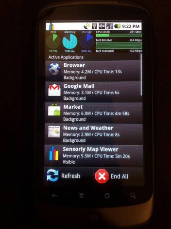
I have a confession to make. I bought a $700 smartphone and have now permanently disconnected it from being online during the day. Why? The notifications are driving me berserk. Ding! You have a Facebook message. Ding! It’s 1 degree colder outside than it was yesterday. Ding! Your phone company has released another minor variation of Android. Ding! Something equally pointless.
Author/Copyright holder: Clive Darra. Copyright terms and licence: CC BY-SA 2.0
Yes, I’m sure that there are manual settings for notifications in each application etc. but here’s the thing – I don’t want to spend the rest of my life configuring other people’s applications. I want them to understand that I have a life and that I’d like others to respect my time. With that in mind – let’s look at notifications and how the UX could be improved.
There are three essential types of alert on most smartphones; badges, visual alerts/banners, and audio alerts. So let’s take a quick peek at each of them:
Badges
A badge is simply a numeric count that appears against an application’s icon. It lets you know that 847 people have tried to Facebook you today or that there are 3 weather reports you haven’t read yet.
Nearly 99.99999999% of all alerts should simply take the form of badges. I am in no burning hurry to find out who commented on my cat post on Facebook; if I was – I’d be on Facebook rather than waiting to hear it ding.

Author/Copyright holder: miyabi teraminato. Copyright terms and licence: CC BY-NC-ND 2.0
Once I’ve activated an application using a badge alert; I also need to be taken to the source of the alert(s). Don’t hide that stuff – it’s why I opened the app in the first place. Secondly, I also want you to clear those badges once they’ve served a purpose. I am not going to open all 800 Facebook messages about my cat picture – once I know they’re there – you can get rid of that badge.
Visual Alerts/Banners
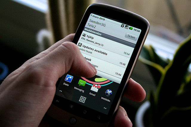
OK, I am willing to concede that 99.99999999% may have been a bit of an exaggeration. There are things I’d like to know – not intrusively – that might need more than a badge. These things include news items, e-mail alerts, etc. They definitely don’t include advertising junk and minor bits of information though – that can all be signposted with a badge.
Author/Copyright holder: Johan Larsson. Copyright terms and licence: CC BY 2.0
No amount of noise in the world will make me reply to an e-mail faster if I’m driving a car on in the pub. So keep them silent and just informative enough so that I can make a quick decision on whether I care enough to read anymore or just junk these alerts.
Audio Alerts
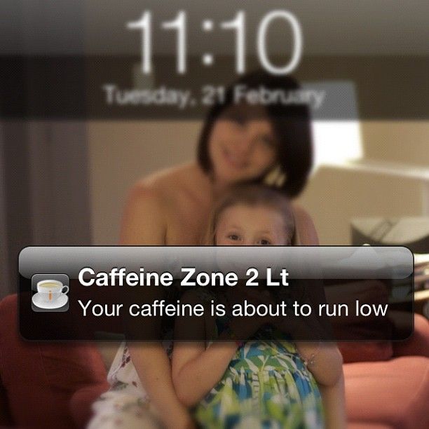
It would be best if most application designers only include audio alerts as an option. The only things which really justify making a noise are the receipt of an SMS, the receipt of an IM/VoIP call, and any reminders that I’ve set. Everything else should be blessedly silent.
Author/Copyright holder: Richard Giles. Copyright terms and licence: CC BY-SA 2.0
Now, if I really do need to track my cat picture on Facebook with audio alerts – that should be an opt-in choice rather than an opt-out one.
Header Image: Author/Copyright holder: Johan Larsson. Copyright terms and licence: CC BY 2.0
