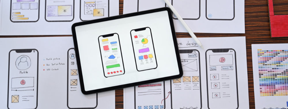
There’s so much evidence that the smartphone user isn’t invested in mobile internet so much as they are invested in the use of apps, that it seems impossible for a brand to avoid investing in developing its own app.
This should mean huge opportunities for UX designers. With every brand seeking an app, surely UX will be at the forefront? Unfortunately, what it often tends to lead to is an awful lot of cooks stirring the UX pot. When it came to websites… the marketing team had a lot of input in the process and the rest would be handled by UX designers and the development team. But an app? That’s different.
Why? Mainly because apps are new and everyone in the company is likely to want to contribute their 2 cents worth to delivering an app. It will look good on their CV and show their commitment, publicly, to the customer experience too.
UX design starts to become less about user experience in this instance and rather more about political tight rope walking. That in turn leads to a less able user experience and potentially puts the brand at risk.
Four UX Mistakes that Come From This Approach
If you have 112 cooks working on a dish, each one adding what they think will add a little zing; your end product is likely to be a revolting meal that no-one wants to eat. The same is true with app design and there are some fairly common issues that come from this approach:
Over-Design
Product design sits with a single team or individual for a good reason. That person can make decisions based on data and respond to them in a way that appears to be supported in data. When everyone in the company is making decisions… you end up with over-designed products. They try to tick too many boxes all at once and the result is a mess that alienates rather than embraces the user.
It’s vital for the UX pro to keep the user at the forefront during design discussions. Get user personas distributed early in the process and ensure people understand them and can work with them. Refer to them in meetings, try and get interested parties to walk a mile in your users’ shoes.
Don’t be afraid of pulling out other disastrous apps and getting your in house “advisors” to play with them. Why does the user experience suck with this product? How can we avoid repeating these mistakes?
Try to keep people on track with the idea that in order for your app to succeed it has to be accepted. There has to be balance between the business and the user and design has to reflect that.
Author/Copyright holder: Intercom. Copyright terms and licence: All rights reserved Img source
Where Did the Usability Go?
The more input you’re getting, the more you need to show that users have had a chance to reflect on that input. Usability testing should be introduced very early in the process. It is so much easier to push back on behalf of the user when you have concrete evidence to support that push back.
Involve interested parties in your usability testing too. Ensure that they can access videos or notes about what has been observed. Try to involve key customers in usability testing wherever possible. It’s much harder to ignore a company that accounts for 5-10% of your business than it is to ignore a single user plucked randomly from the pile.
Feedback from your customers and users carries real weight throughout a business. So make certain that you’re getting that and use it to defend against scope creep and demands for redesign.

Author/Copyright holder: Thomas Link. Copyright terms and licence: CC BY-SA 2.0
Textual Diarrhoea
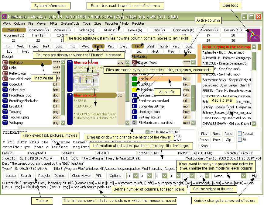
The screen real estate that an app will run on is completely different from the screen real estate that websites tend to run on. You can’t just lift text directly from one to the other. The key to a great mobile user experience, in most instances, is brevity.
You need to cut down on endless amounts of text and concentrate on conveying key messages to your audience instead. That means working on your content with your users. Again the more research you have, the easier it’s going to be to defend against the idea that you need to write a corporate bible to get users involved with your app.
In fact, most brand apps, have limited use. You won’t expect your users to constantly interact with them. You’re going to expect maybe one or two interactions a year, in many cases. Those brief interactions dictate the user experience. Too much text and you’re going to drag the pleasure out of any experience that the user has with your app.

Author/Copyright holder: Eric Heupel. Copyright terms and licence: CC BY-NC 2.0
Launching Too Early
Users are much less forgiving of performance issues and error messages in apps than they are on the web. There is a reasonable expectation that if the provider has control of the environment they are interacting in, that the provider should be able to release a high quality working product the first time around.
Once again, that means an investment in testing prior to launch. You can’t go to market and rely on fixing the problems… your brand app represents your brand’s reputation. Tarnish that reputation and you may never recover in the mobile space.
The same is true during product iteration, you have to keep testing and pushing for the user experience to be consistently great. Fixing one problem and replacing it with three more is not going to work in the brand app space.
Overall – UX for Brand Apps
Ensuring the user experience for brand apps is all about being a user experience designer. The only real differences are in the reach of communications (you have more people who consider themselves stakeholders) and the increased need for constant user feedback.
That means focusing on testing and developing metrics and personas that matter to your stakeholders. You can resist someone’s input if you can show that their requirements will destroy the user experience or seriously impair it. But you have to have the data when you need it.
Header Image: Author/Copyright holder: Jason Howle. Copyright terms and licence: CC BY 2.0


