Your constantly-updated definition of Mobile User Experience (UX) Design and
collection of videos and articles. Be a conversation starter: Share this page and inspire others!
4,048shares
What is Mobile User Experience (UX) Design?
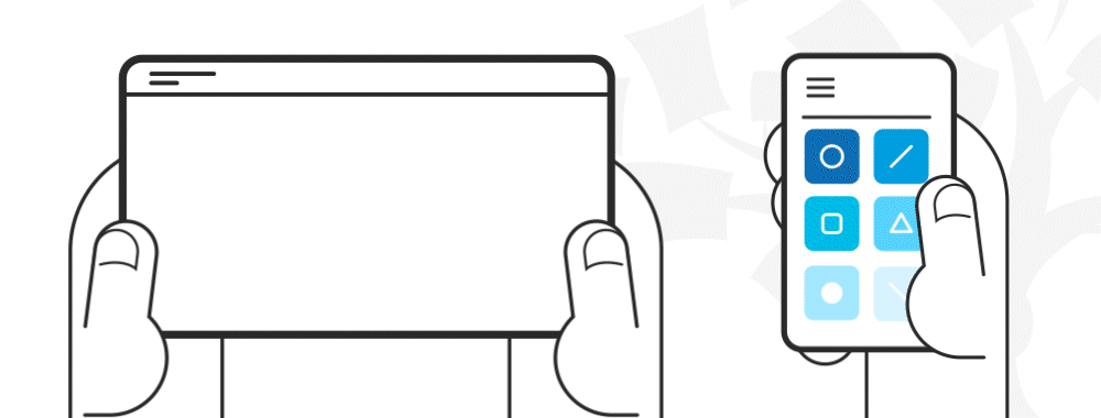
Mobile UX designs are interfaces for hand-held and wearable devices. Designers focus on accessibility and efficiency to optimize these on-the-go interactions.
ShowHide
video transcript
00:00:00 --> 00:00:30
In this five-step process to designing for mobile, I want to point out some of the aspects or steps that are so critical and tell you why they're so critical and explain a little bit about how they work. The first step, *assess*, is requirements, your internal priorities,
00:00:30 --> 00:01:05
your business objectives. And so – that's for step one – the last step, step five, should be familiar as well, it's *sketch*. So, we'll also add sketch, review, refine and have that sort of iteration. But it's what happens in steps two, three and four that are really, really critical and make the difference in a mobile UX design that outperforms and differentiates and creates a very, very deep bond with users and in a way that what we call *user adoption*.
00:01:05 --> 00:01:36
So, step two, *understand* user needs, and that means understand their context of use, problems they're trying to solve, their tasks, their goals, all the things that make up personas, and then make up journey maps. Once you do that very crucial user research step, it's step three where you *define* your value proposition and your emotional value. So, emotional value is what users get from the app so that you essentially support their tasks,
00:01:36 --> 00:02:01
you support their goals, you support a social aspect of their experience. You help them by giving them features and functionality that they find useful. Maybe you surprise them pleasantly, delight them. Understand their cultural needs. Understand their safety needs. Whatever it might be, you define that value proposition,
00:02:01 --> 00:02:30
but also emotional value, that chance to connect with a user in such a way that they feel at home with your app or mobile content. So, that's step three. Step four is where you take what you've learned from user needs and from defining your value proposition and your emotional value, and you then *create a UX strategy* that's like a blueprint for when you get to sketching in the next step.
00:02:30 --> 00:03:02
So, a differentiated UX strategy is something that makes your app special and connects with your users in a special way. You can't just generate this internally. A lot of product folks have pressure in their jobs, product managers, to differentiate, and they typically rely on market research, focus groups, surveys, that kind of thing. That's market research. And so, what we're talking about is if you get into the behavior of your users,
00:03:02 --> 00:03:30
if you really dig into their contextual experience and what surrounds it and what they do as they go through their day and their lives and how they live it – if you get into that, then you can understand their needs, define their value proposition and their emotional value in a way that helps you differentiate. So, it might be how you approach the design, what features you drop
00:03:30 --> 00:03:53
or that you add. In other words, the priorities and the good decision-making is what all of UX is about. It's about good design decision-making, And this five-step process is based on a very powerful and proven approach that I've taken in my work over the years, and this is basically the way to do it.
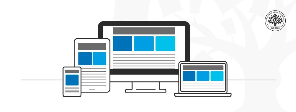
Mobile design has different limitations and requirements than computer interfaces. Many companies have mobile and computer-based designs for identical products. Designers learn to distill essential elements for smaller screen sizes and to optimize their designs for users on the move.
The importance of mobile user experience design grew dramatically in 2014 when mobile users suddenly became the online majority. Designers quickly learned they couldn’t simply miniaturize a desktop interface. They needed to reevaluate the needs and limitations of the growing audience of mobile users.
Since then, mobile design has evolved to find the best use of smaller screens.
Experiences are now tailored specifically for mobile environments and specific contexts of use.
Attention spans are shorter in mobile UX. Users want results fast, with minimal effort and zero friction. They’re often distracted. Signal and power loss are frequent worries. These users often walk and use devices at the same time.
Typically, mobile users find themselves in three scenarios:
Micro tasking: they use devices in short, intense spurt—e.g., to buy tickets.
Local: they use devices to see what’s happening around them.
Bored: e.g., they surf news feed links while waiting.
Tips for Mobile UX
Here are some practical guidelines to design for mobile interfaces and a mobile-first approach:
1. Minimize Content
Smaller screens mean essential elements need to be legible on a smaller resolution. You must make a clean, legible layout to cater to mobile users.
Design for minimal page-loading times. Less than 3 seconds is ideal.
Users might not complete a task all at once. Make sure they don't get lost easily. Also, most users use one hand, and some fingertips are larger than others.
Questions related to Mobile User Experience (UX) Design
What makes a good mobile user experience?
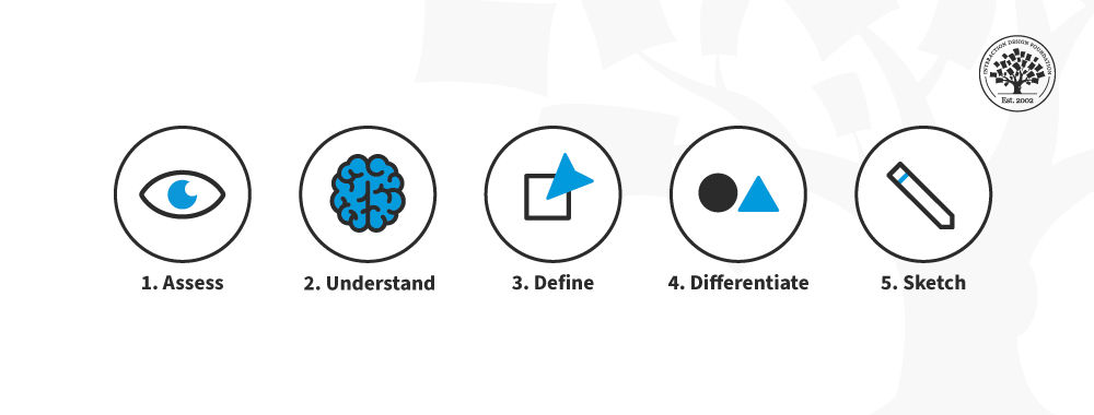
A top-notch mobile user experience follows a structured five-step process, as explained by Frank Spillers, CEO of Experience Dynamics. Firstly, assess your internal priorities and business goals.
ShowHide
video transcript
00:00:00 --> 00:00:30
In this five-step process to designing for mobile, I want to point out some of the aspects or steps that are so critical and tell you why they're so critical and explain a little bit about how they work. The first step, *assess*, is requirements, your internal priorities,
00:00:30 --> 00:01:05
your business objectives. And so – that's for step one – the last step, step five, should be familiar as well, it's *sketch*. So, we'll also add sketch, review, refine and have that sort of iteration. But it's what happens in steps two, three and four that are really, really critical and make the difference in a mobile UX design that outperforms and differentiates and creates a very, very deep bond with users and in a way that what we call *user adoption*.
00:01:05 --> 00:01:36
So, step two, *understand* user needs, and that means understand their context of use, problems they're trying to solve, their tasks, their goals, all the things that make up personas, and then make up journey maps. Once you do that very crucial user research step, it's step three where you *define* your value proposition and your emotional value. So, emotional value is what users get from the app so that you essentially support their tasks,
00:01:36 --> 00:02:01
you support their goals, you support a social aspect of their experience. You help them by giving them features and functionality that they find useful. Maybe you surprise them pleasantly, delight them. Understand their cultural needs. Understand their safety needs. Whatever it might be, you define that value proposition,
00:02:01 --> 00:02:30
but also emotional value, that chance to connect with a user in such a way that they feel at home with your app or mobile content. So, that's step three. Step four is where you take what you've learned from user needs and from defining your value proposition and your emotional value, and you then *create a UX strategy* that's like a blueprint for when you get to sketching in the next step.
00:02:30 --> 00:03:02
So, a differentiated UX strategy is something that makes your app special and connects with your users in a special way. You can't just generate this internally. A lot of product folks have pressure in their jobs, product managers, to differentiate, and they typically rely on market research, focus groups, surveys, that kind of thing. That's market research. And so, what we're talking about is if you get into the behavior of your users,
00:03:02 --> 00:03:30
if you really dig into their contextual experience and what surrounds it and what they do as they go through their day and their lives and how they live it – if you get into that, then you can understand their needs, define their value proposition and their emotional value in a way that helps you differentiate. So, it might be how you approach the design, what features you drop
00:03:30 --> 00:03:53
or that you add. In other words, the priorities and the good decision-making is what all of UX is about. It's about good design decision-making, And this five-step process is based on a very powerful and proven approach that I've taken in my work over the years, and this is basically the way to do it.
Dive deep into understanding users by recognizing their needs, contexts, and objectives in step two. The third step is defining the app's value proposition, emphasizing emotional value. With insights from user needs and the specified value, step four involves crafting a distinct UX strategy. Lastly, you sketch, review, and refine the design. Ultimately, understanding and integrating the user's context with the design results in an app that resonates, delights, and ensures strong user adoption.
What is UX in mobile?
Mobile UX (User Experience) pertains to a user's overall experience while interacting with a mobile device, predominantly smartphones and tablets. It encompasses the design, usability, and functionality tailored for smaller screens and different user behaviors compared to desktops. Effective mobile UX ensures seamless navigation, intuitive design, and rapid load times, catering to on-the-go usage. As highlighted in our Mobile UX Design guidelines, it's crucial to consider factors like touch screen interaction, limited screen real estate, and varied device capabilities to create a satisfactory user experience.
What is the most important way to optimize a mobile user experience?
The cornerstone of enhancing mobile UX is task analysis. As Frank Spillers, CEO of Experience Dynamics, explains, task analysis involves observing users performing their tasks without emphasizing the technology they use.
ShowHide
video transcript
00:00:00 --> 00:00:30
So, task analysis is an extremely important technique. And, to be clear, you can do your task analysis when you do your regular user research and interview observation; that's the observation side. That's where you ask a user, "Hey can you show me how you do it today?" Now, don't worry about the technology; don't worry about any tools they may be using
00:00:30 --> 00:01:00
– you know – existing applications or whatever. Just have them go through what they normally do. It's even great in task analysis to see things in the absence of some technology like your design or whatever. So, if they want to show you how they normally do it, then you'll get to see their kind of workarounds, their patterns, their shadow spreadsheets – you know – ways of coping, their hacks and their adjustments, things they've done to make it work.
00:01:00 --> 00:01:32
And that stuff is just beautiful. But having them step through their problem solving step by step, kind of 'teach me how you do it' – that's the basis of task analysis. If you're doing *ethnography*, which is similar to interview observation – you're essentially looking for a few more cultural cues with ethnography; you're looking for things of cultural significance, and it might just be user culture. It might be in that region of the country you're learning about the users.
00:01:32 --> 00:02:02
Or it might be at a national level or international level if you're doing localization or cross-cultural research. It might even be the culture of an underrepresented group if you're doing inclusive research and inclusive design, trying to understand the experience of that community, their history, their lived experience as it relates to the problem they're trying to solve or how they approach it. So, task analysis is definitely one of these things that you want to build into your tool set.
00:02:02 --> 00:02:32
And essentially what you're going to do is take those observations from your research and you're going to map them out and kind of flow chart them, flow diagram them and see how you can take that structure and map it to your design kind of like as the user goes from here to here to here, how can my screen support this thing that they do here with this tool or this feature? Kind of see how you can make it flow much more intuitively
00:02:32 --> 00:02:36
so it feels good and makes sense to your users.
By having users show their current routines, you can identify workarounds, patterns, and individual adjustments. The goal is to comprehend their problem-solving process step by step. This method reveals invaluable insights, especially with ethnography, which delves into cultural cues and user behavior. Using the observations from task analysis, designers can map and flow chart user activities, ensuring the design supports these sequences seamlessly. The ultimate aim is to create an intuitive user journey that feels natural and logical.
What is an example of good user experience?
A prime example of good user experience can be observed in the Apple Watch, which functions not just as a standalone device but as part of a broader product-service system. This biofeedback device, when paired with services like Fitness Plus, seamlessly integrates with the user's lifestyle. Its cohesive design complements the mobile app and other devices, creating a harmonious ecosystem. Frank Spillers, CEO of Experience Dynamics, emphasized the importance of examining the entire ecosystem, from service to mobile app, to truly grasp how products like the Apple Watch provide an unparalleled user experience.
ShowHide
video transcript
00:00:00 --> 00:00:31
It's important to think about like an ecosystem of where your app lives. You know, a mobile app is not just an island; it's not on its own. It's in a *product-service system*. It's in a trigger point for launching, for example, services. And service design is a really, really wonderful UX approach to understanding,
00:00:31 --> 00:01:01
to backing off the mobile device itself and looking at the entire ecosystem. It might include Internet of Things – IoT; it might include other devices and other services that are there. So, really being sensitive to that is is really important. In this story, I'd like to tell you about how I did a study of Apple Watch users. And I want to just break down what we did. This is the fastest, leanest,
00:01:01 --> 00:01:33
most agile approach I think that you can come up with. By Sunday, we had started the recruiting, so we leveraged my company's participant database. It's good to have a participant database so that you can tap into users as needed. You can also buy responses and so forth. By Sunday night, we had already done three or four interviews. Essentially recruited folks, and then they said, "Well, hey, I'm available now," so it was like OK, get to meet on Zoom. Prior to this, we had created a discussion guide
00:01:33 --> 00:02:02
of the kind of things that we were interested in observing. And on the Sunday night we started gathering data. So, there were four of us; there were four different people that were moderating. And the moderation is really critical with a diary study because you have to keep in touch with users. You have to look at their data, look at their engagement: are they still filling stuff out? Are they sending stuff back to you? So, we'd start with a 30-minute interview. This is a very important course correction to diary technique,
00:02:02 --> 00:02:33
that diary technique is a self-report technique, so they get some questions; they're essentially recording their experience for you. To balance that self-report, you also do an interview, and by doing the interview you can learn a lot about that person; so, even just a 30-minute contextual interview with that person online. By Tuesday, because there were four of us, we were able to complete all the initial interviews and deploy the diaries. And we had 15 users in this study.
00:02:33 --> 00:03:02
And then over a two-week period we sent them a series of diaries every two or three days with open-ended questions, and these diaries ask them about their further experience. Now one thing that I discovered with diaries – and I said I've been doing it ever since I discovered it – I can't believe I didn't even think of it. It's a little bit stressful because you have to sort of construct the diary like the night before, like last minute. In the beginning, you start with a *general set of questions* that you're looking for.
00:03:02 --> 00:03:32
What you do is after the first diary you *shape the questions in the second diary* based on what you've learned from the first diary and that initial interview. So, that second diary is constructed real time by the researcher. And then you do the same thing for the next diary and however long. It might be a week; it might be two weeks. The longest diary study I've done is four weeks. But more typical is one week or two weeks, and you can start to see how the mobile device fits in with the fitness tracker,
00:03:32 --> 00:04:00
which is really a biofeedback device; that's what an Apple Watch is. It's a very sophisticated biofeedback device. But also with other services like Fitness Plus, which is Apple's add-on, ten dollars a month you get content delivered to you. And then the *ecosystem* that that watch or the phone and the watch, because they really go together, is that the ecosystem of apps and content and services that can be installed are very interesting. So, kind of looking at the overall ecosystem
00:04:00 --> 00:04:14
– the service side as well as the product side, as well as the mobile app and the device itself and how the two talk to each other and how they dance together. I think that's part of the interesting piece in this particular study.
What are the 7 aspects of user experience?
User experience (UX) encompasses more than just usability.
ShowHide
video transcript
00:00:00 --> 00:00:30
User experience, or UX, is critical to a product's success or failure. But what do we mean by *UX*? All too often, we confuse UX with usability, but they aren't the same thing. To understand the difference between UX and usability, let's look at a framework described by UX pioneer Peter Morville.
00:00:30 --> 00:01:01
Morville describes the seven factors of UX as: useful, usable, findable, credible, desirable, accessible, and valuable. The first factor of user experience is *useful*. A product must have a purpose. If a product has no purpose, it's unlikely to compete in a market full of purposeful and useful products. For example, an email app should help people communicate with one another.
00:01:01 --> 00:01:32
An email app that doesn't let you send messages isn't useful. Usefulness is *subjective*. We may call a product 'useful' if it's fun or has aesthetic appeal. So, a game such as Candy Crush may be deemed useful even if it doesn't enable you to accomplish a goal. *Usability* is about enabling your users to effectively and efficiently achieve their objectives. Products that are not usable are not likely to succeed.
00:01:32 --> 00:02:00
Besides giving your product a competitive advantage, a high level of usability can also make a huge difference in the safety and comfort of use. For example, when you purchase an airline ticket, Expedia's website allows you to compare different flights. You may also view the details of a selected flight to make an informed and comfortable decision and – more importantly – you're less likely to accidentally book a flight in the wrong direction!
00:02:00 --> 00:02:30
*Findability* refers to how well a product supports navigation and finding objects. For example, a website that makes it easy to navigate to the right content has high findability. A streaming service with millions of choices such as Netflix is a great example of designing for findability. If Netflix users can't find something to watch on a Friday night, it doesn't matter how great the hidden content is – they'll stop using it.
00:02:30 --> 00:03:03
*Credibility* relates to the user's trust in the product. It's nearly impossible to deliver a good user experience if users think the product is untrustworthy or illegitimate. They'll take their business elsewhere. For example, between 2018 and 2021 a series of scandals hit Meta, formerly Facebook. From privacy abuse to purposefully hiding research that proved Instagram was harmful to a large user base, particularly teenage girls,
00:03:03 --> 00:03:30
each revelation damaged the company's reputation. Even as governments slapped fines and tightened regulations around privacy, Meta's own leaked internal research revealed that the company was rapidly losing users to other platforms. Emotions play a large role in desirability, which is conveyed through design, imagery, brand identity, and emotional design.
00:03:30 --> 00:04:03
The more desirable a product, the more your customers will want to use and recommend it to their friends. Airbnb does a great job of creating a desirable experience. The app turns a stranger's home into a desirable vacation destination that people are willing to explore and recommend. *Accessibility* is about providing an experience that users of a full range of abilities can access. This includes ensuring people who have some form of disability,
00:04:03 --> 00:04:31
audio, visual, motor or cognitive, can interact with your product without difficulty. An accessible interface uses colors that colorblind people can see, legible text, even for people with low vision, and so on. Sadly, accessibility often gets lost when we create user experiences. Some companies may feel that accessibility is a waste of resources because it represents a small portion of their users.
00:04:31 --> 00:05:03
However, when you design for accessibility you create products that are easier for *everyone* to use, not just those with disabilities. It's the ethical thing to do, and in some jurisdictions it's the law. Finally, the product must deliver *value* to the business that creates it and the customer who uses it. Without value, it's likely that your product's success will eventually be undermined. A product can provide value to different users in different ways.
00:05:03 --> 00:05:17
For some users, desirability is more important; for others, accessibility is more important. Essentially, value is the *sum* of all the different user experience factors combined.
As described by UX pioneer Peter Morville, the seven critical aspects of UX are:
Useful: Products must serve a purpose, fulfilling specific needs or desires.
Usable: It's essential for users to achieve their goals effectively and efficiently.
Findable: Products should support easy navigation, ensuring users can find desired objects or content.
Credible: Trustworthiness is crucial; users should believe in the product's legitimacy.
Desirable: Driven by emotions, this aspect pertains to design, imagery, and brand identity.
Accessible: Products should cater to users of all abilities, including those with disabilities.
Valuable: Ensuring both business and user derive value is vital for sustained success.
How To Build a Mobile App?
ShowHide
video transcript
00:00:00 --> 00:00:32
So, let's apply this kind of thinking that we've learned: mobile-first, task-first, and content-first. And let's apply it to – I'm just going to choose a random example – say like a patient medical chat with a doctor. And the first thing I'm going to do is I'm going to think, "Well, this is for mobile primarily." So, I could even use a little whiteboard like this.
00:00:32 --> 00:01:02
And I even have some little mini-whiteboards. You can buy little tiny squares that are about the size of a mobile screen. And you can use those to help you focus on mobile. This is more like a tablet format. But what I'm going to do is I'm going to first of all sketch out my screen. So, I'm going to mobile-first, so I'm going to put the screen there. Because it's mobile, my buttons are going to be really big. Next, I'm going to think, "What's the task?" So, a medical chat, so it's
00:01:02 --> 00:01:32
your patient chatting to her doctor. And then the other thing is *content-first*; so, maybe we'll start with content-first, and then as we're thinking about the task and as we're thinking about mobile. The first thing I want to do is emphasize security. I'm going to put like some kind of lock symbol, that this is like some kind of secure connection between my doctor and me. And the reason I'm going to do that is because that is compliant with regulations for HIPAA compliance in the US.
00:01:32 --> 00:02:03
I might actually show that my doctor has sent me a message. So, I might have like a message and then have like a number too or something like that. Once the user taps on it, it's going to open the doctor's message. I'll have a note here that this will be like: "Your doctor said this at this time and date." So, I might make a note here, content-first, time, date. And then also make a note whether I've seen it or the doctor's seen it.
00:02:03 --> 00:02:32
And notice what I'm using is essentially a chat mental model of a back-and-forth. But because sometimes there's a lot of story that goes with a medical problem, like you might be describing your small child and the small child may have an existing condition. Things may have happened that you want to tell your doctor. In other words, what I'm trying to say is it's not one sentence. So, for that, because I'm thinking mobile-first, maybe I'll maximize to full-screen
00:02:32 --> 00:03:01
so that the patient has the entire thing and then when they're done there's going to be a big Send button there for mobile. If I have attachments, because I'm definitely going to have attachments, I'll have an attachment thing like a picture that they could take, a picture of the child's leg or a health record that they might want to upload or a link or something like that. I'm going to allow links, so links – okay; attachment – okay. And so, I'm going to have some emoticons on almost like a "How are you feeling?"
00:03:01 --> 00:03:32
and I'll just take notes of that: How's the patient feeling? Because in this case I've just made this case like the parent is the user, is the patient advocate. So, how's the patient feeling? And that way I can kind of add some *emotional priority* to the message, because if the doctor knows, for example, that you're happy but you're reporting – you know – something happened, the doctor knows to respond, just like a doctor could tell *in real life*. And a lot of these systems are becoming more mainstream now – you know – where
00:03:32 --> 00:04:05
you can video your doctor; and might even add that feature later, might test that with users, where it's like Start Video – if the doctor is online, I might just Start Video, and if there's a charge, it might say – you know – "Just please know that you're going to be charged (or whatever) for this" or "Your insurance is covered for this." Something to reassure the patient so they're not just hitting the video thing. I might even change that and say Video Request so the doctor has to approve a video call. And that way the doctor can schedule it into her busy week or day or evening or whatever it is,
00:04:05 --> 00:04:30
so that the patient's not on demand, like FaceTiming – you know – and creating problems. Thinking about that, how that content scales, how the user can go full-screen; also how they can potentially search, so I might add that as a note. I want to have a search here, search messages. There's going to be a lot of these. There might be dozens. You think of a chronic patient
00:04:30 --> 00:05:01
– you know – a care situation could go on for years. I want to have saving of attachments. I want to also be able to edit. So, I might add a note there that there's going to be an edit of – I'm going to really make a lot of desirable stuff just kind of off the top of my head. But normally I would do user research, trying to understand patient-doctor communication, talk to doctors, talk to clinicians, to nurses, nurse practitioners, and talk to patients – and not just the patient themselves,
00:05:01 --> 00:05:30
but the *patient advocate* like a parent who's looking after, for example, their parent or grandparent or a child or somebody with a disability, and have a way for them to edit conversations, to make sure they're private. If privacy or security comes up as a top concern, I might add an *extra layer of security* which we just don't see in our apps. Things with patient records – some conversations might not matter. There might be some very, very sensitive material.
00:05:30 --> 00:06:01
In the healthcare world, they talk about trauma-informed approaches, and so we kind of maybe need to start bringing that to our app strategy as well. So, I hope that gave you some example of how to kind of blend a mobile-first approach – you know – big button, small screen, a task first: what does the user need to do? "Has my doctor come back to me yet? Is there a new message that I can reply to?" But then also what makes it desirable? You know – what content is important to include there?
00:06:01 --> 00:06:27
And really in a content-first approach, I might lay it out. I might start with just the message, and then think about just the message. You know – instead of writing the Chrome, I might just focus on the message and all the things that I mentioned that I might add to the message. I might think about making that experience as pleasant and as comfortable and as safe as possible, and that could be like in a content-first approach.
To construct a mobile app tailored for patient-doctor chats:
Employ a mobile-first, task-first, and content-first strategy.
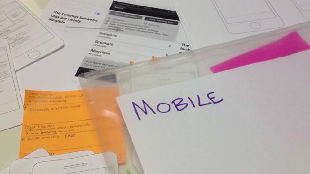
Begin with a sketch emphasizing large buttons suitable for mobile interfaces.
Prioritize content, focusing on security, and protective measures for health information (HIPPA).
Allow users to see incoming messages from their doctor, specifying the date and time of the message. The app should support a chat format but with provisions for longer, descriptive messages.
Enable a full-screen mode for typing, and add features like attachments for photos or health records and emotion icons to indicate the patient's feelings.
Consider features like video calls, but ensure privacy with a video request system.
Enable searching and editing of messages while emphasizing security for sensitive content.
What is Tappability in mobile UX?
Tappability in mobile UX refers to the efficiency and clarity of tap-based interactions on mobile devices. It minimizes unnecessary taps, ensuring users know what's tappable without confusion.
ShowHide
video transcript
00:00:00 --> 00:00:32
The idea is to minimize the amount of tapping that goes on. And so, we call this *tappability*. As we say with all UX, test it with users – make sure it's there. But there's a lot of little things that users can tap on – not everything has to be a huge button. And if it's task-oriented, then they can tap it and not have to do extra work basically.
00:00:32 --> 00:01:02
So, it's kind of tap-tap efficiency, but I want to talk for a second about *affordances* or *tappability affordances*. Remember that an affordance is a UI element that *invites the expected interaction*. The one that always comes to mind for UX people is the Norman Doors. You know – Don Norman, in his *Design of Everyday Things* wrote famously about: is it a handle that you pull or is it a bar like a flat thing that you push? And that should be the correct affordance because push is
00:01:02 --> 00:01:30
the physical force, push, and the handle pull is pull. But then doors *mix it* – they go push, but it's a pull. And they go pull, but it's a push, and so he talked about that and it's called a Norman door. And it reminds us about that affordance should be the right one and should invite the interaction correctly. Now, the hilarious thing about Norman doors in the real world is you get signs like it's a help strategy. It's usually instead of a pull there's a handle and it says 'Push'.
00:01:30 --> 00:02:05
So, on mobile what this means is that users need to know what's tappable. There's a bias that visual designers have for making things so clean and so beautiful that you can't tell what you can tap. And so, that's what we're talking about, is making affordances *clean but also clear* so that you know what you've selected. And I just want to say that animation can really help with this. It can help invite that expectation and add that affordance.
00:02:05 --> 00:02:32
So, the other thing that Don Norman talks about in addition to affordances is *signifiers*. And *signifiers are UI elements* – think of them as visual nudges so that they give the user a little prompt, something that they can get a feel for – for example, a pulsating button. You know, my favorite one was a menu, like a hamburger menu that followed you down the page on a mobile website.
00:02:32 --> 00:03:00
And it kind of pulsated a little bit, and you want to time that pulsation to a heartbeat. It really is a good 'boo boom, boo boom', as opposed to 'boom-boom-boom-boom-boom', which is going to create anxiety or... So, think about how you can use Material Design-type of suggestions for motion, for motion graphics or little animations or little moments of – you know – magic that can help increase signifiers.
00:03:00 --> 00:03:32
If you don't offer it, it can lead to a lack of discoverability, false affordances, and can lead to user frustration, uncertainty and errors. This is what the research shows. And the other thing I would add to that – you know – user frustration, "uncertainty errors" is the technical term – how about feeling stupid? Like, you're like "oh..." – you know. You don't want users to feel stupid when they're interacting with your app, just because there are not strong tappability affordances and signifiers.
00:03:32 --> 00:04:01
Here's an example for you: check this one out – you may have seen it before: What is the tapping object here? What should you tap? Study this for just a second; see what you think, well, just a second because you only have maybe three. It turns out that that virtual key card thing is not tappable. The object below, the grey thing, it's supposed to be a button, I think; it's related to like a help strategy, but the contrast is low.
00:04:01 --> 00:04:31
Notice the contrast, so you have grey on dark blue or something like that. The other problem with this is it's sort of you're stuck in this conceptual model that just doesn't work; it's like, what is a virtual key card? It's used for unlocking a bike, for paying for a bike. And they've introduced this idea of physical and virtual key cards, which is like 'whoosh!' – way beyond. So, there are a lot of things – you know – and sort of stepping back from the UI and seeing – you know – you could make something really tappable, but it might be the wrong tap,
00:04:31 --> 00:04:52
a wasted tap; or in this case, yes, you're drilling down just to try and pay and they're leading you into this, into their mind, into their labyrinth of virtual key cards. So, be *careful* with making the *right things tappable to support the task* and *animating the right things and using animation and motion graphics strategically*.
Tappability is closely related to affordances, UI elements that invite the expected interaction. Think of a button that looks pressable or a slider that looks slideable. Enhancing tappability means offering clear visual cues (or signifiers), such as a pulsating button, to indicate interactive elements. Clean design is vital, but it shouldn't maintain clarity. Proper tappability reduces user frustration, uncertainty, and errors, ensuring a smoother mobile experience. Dive deeper into mobile UX best practices in our course Mobile UX Design: The Beginner's Guide.
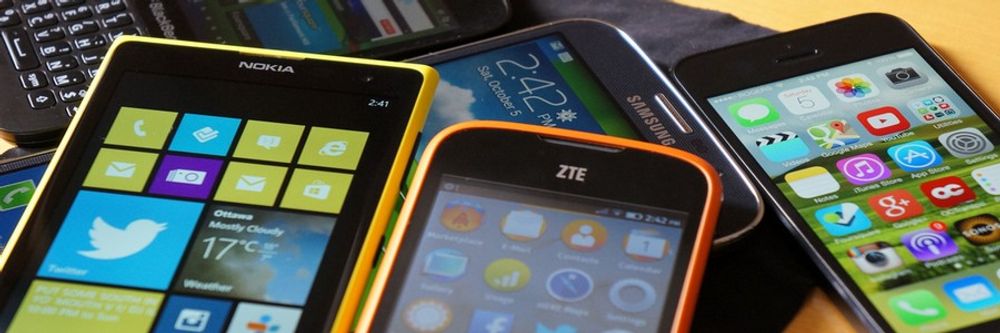
What’s the difference between a Smartphone and a Tablet?
Smartphones and tablets differ mainly in size, purpose, and user behavior. A smaller resolution characterizes a smartphone and is not always the primary access device. Users of smartphones often multitask, face more distractions, and interact in a profound social and emotional context, which includes environmental factors like low lighting. They require clear tapability on objects. On the other hand, a tablet offers a larger screen area and is easier to design for due to its size. It's often a multi-user device used more by consumers at home, with less business usage than smartphones. When designing for tablets, one should maximize the available real estate while ensuring objects remain easily tappable.
ShowHide
video transcript
00:00:00 --> 00:00:32
Let's get into the differences between smartphones and tablets for a minute. You're familiar, I'm sure, with a phone and a tablet, but I just want to point out a couple of key distinctions. The other thing I wanted to point out is I'm not showing too many tablet examples in this course, because tablet is easier – the resolutions are much larger. And if you're on the mobile web, responsive design takes care of that.
00:00:32 --> 00:01:01
The key, though, is to notice the difference. So, with smartphone we have *more distractions*, *smaller resolution*, *not always the primary access point*, that users are *multitasking*; they're in a *deep social and emotional context*. And that also includes *environmental factors* such as low lighting. And that they need to *know how to tap on objects*.
00:01:01 --> 00:01:30
And notice that compared to a desktop, that you can click on things and you can have things like hovers; and on mobile, classically this is one of the big things when you start doing mobile design, is, 'Oh, you can't do that on mobile. Mobile doesn't support that.' Actually, mobile can support hovers with a CSS hover class. But just to say that those are kind of key distinctions for smartphone. And tablet itself is less fixed, so users are kind of sitting there;
00:01:30 --> 00:02:03
in a way, easier to design for. If it's a mobile app, I guess that you're porting to a tablet as well – you know – as you usually do and then it's terrible if you don't, because if it's a mobile app and they just open it – and we're talking about an app now – and there's just a tiny little screen; it was optimized for mobile. So, you need to be respectful if you're doing a mobile app that you think natively in a mobile – in other words, you've got all that real estate and you want to lay things out nicely and have them feel and look appropriate to the tablet.
00:02:03 --> 00:02:25
More kind of consumers using tablets at home, less used in business than, say, a mobile phone. Multi-user device, so tablets are often shared with other users in a family kind of situation or in a home. Of course, the resolution is larger. You still need the *tapability*, though, so that's the key.
Where to learn more about mobile UX?
Dive deep into mobile UX on the Interaction Design Foundation. Start with Mobile UX Design: The Beginner’s Guide for foundational knowledge. To refine interface skills, explore the Mobile UI Design Course. Enroll in the Mobile UX Strategy Course: Building Successful Products for a strategic perspective on creating successful mobile products. Each course offers expert-led content, ensuring a comprehensive mobile user experience design grasp. Enhance your skills and stay updated with the latest in mobile UX.
ShowHide
video transcript
00:00:00 --> 00:00:32
I don't want you to design just another app or just *another boring app*. So, you might as well go the extra mile and think about *the context of use*. Where is the user using it? What else is going on? What would be helpful to them? You gain these insights from user observations and research, going to those places and spaces – you know – being in that, because it's not enough just to design another mobile app. This is not a course about creating just another mobile app. We're going to cover things like prototyping,
00:00:32 --> 00:00:52
testing, evaluating the app; strategy and understanding how to get closer to aspects of your mobile user experience that *differentiate* your app or mobile website or mobile content. So, with that, let's get started and dive in!
Earn a Gift, Answer a Short Quiz!
Try Again! IxDF Cheers For You!
0 out of 3 questions answered correctly
Remember, the more you learn about design, the more you make yourself valuable.
In the “Build Your Portfolio” project, you’ll find a series of practical exercises that will give you first-hand experience with the methods we cover. You will build on your project in each lesson so once you have completed the course you will have a thorough case study for your portfolio.
Mobile User Experience Design: Introduction, has been built on evidence-based research and practice. It is taught by the CEO of ExperienceDynamics.com, Frank Spillers, author, speaker and internationally respected Senior Usability practitioner.
All open-source articles on Mobile User Experience (UX) Design
We believe in Open Access and the democratization of knowledge. Unfortunately, world-class educational materials such as this page are normally hidden behind paywalls or in expensive textbooks.