There are as many different definitions for the word “touchpoint” in customer experience design and marketing as there are flavors on the average restaurant menu. Why? Because these disciplines have been evolving rapidly over the last decades and terminology has become fluid rather than static. To make matters more complicated – the term “touchpoint” is also often confused with the term “channel”.
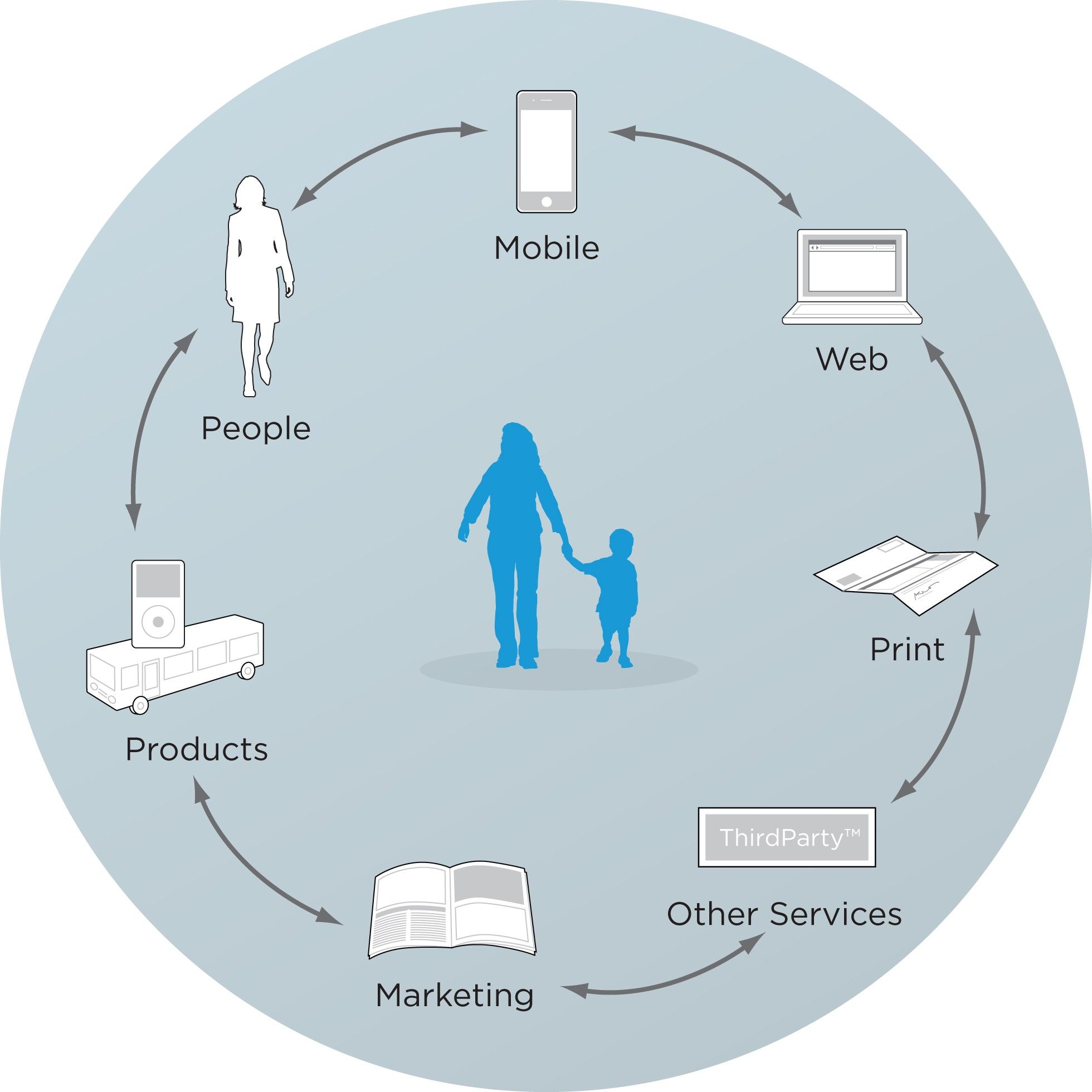
Author/Copyright holder: Rosenfeld Media. Copyright terms and licence: CC BY 2.0
Some simple examples of customer touchpoints. They are places of interaction with your brand rather than “channels” which are planned points of interaction.
What are Customer Touchpoints?
Let’s start by defining “touchpoint” in the widest and most encompassing manner and the word “channel” too:
“A touchpoint is any interaction (including encounters where there is no physical interaction) that might alter the way that your customer feels about your product, brand, business or service.” An example of an encounter with no physical interaction might be discovering an online review of your product. This definition is based on the one proposed by Laura Patterson, the President of VisionEdge Marketing.
A channel is where an interaction takes place. It might be via mail (if you send out a flyer or letter), it might be in the media (advertising), online (on your site or indeed on someone else’s site), physically (at a bricks and mortar location), etc.
Why take these definitions? Well, though there are other definitions of touchpoint (whilst the definition of channel is generally agreed upon now) most of these definitions are narrower in scope. They fail to acknowledge that, as with an online review, some touchpoints with our products, services, etc. are outside of our direct control.
"Your brand is a story unfolding across all customer touchpoints." as Jonah Sachs, the famous entrepreneur and designer said.
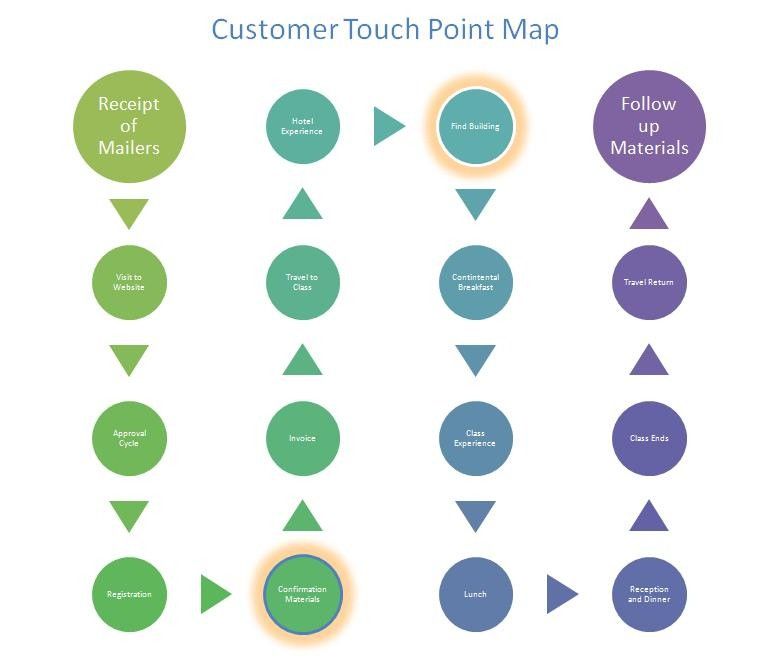
Author/Copyright holder: Jen Beever. Copyright terms and licence: CC BY-NC-ND 2.0
Touchpoints which need specific attention can always be highlighted on your touchpoint mapping (such as the heat spots in this example).
Why Do We Need to Understand Touchpoints?
If we want to improve interactions with our customers the key starting point is to understand what those interactions are and where they take place. Without that understanding it would be impossible to measure any improvements or indeed to see if changes made to those interactions were having a detrimental (rather than positive effect).
Designers can design interactions, at least those within our control, and to be able to do so they will need to understand what need is driving the interaction and where and when the interaction takes place. This is clear in the differences in designing for desktop and mobile applications, for example, we know that there is a higher risk of a mobile user being distracted regularly whilst working on an application than there is for a desktop user. Thus interactions on mobile need to be recoverable (e.g. the user can return and pick up where they left off) more so than desktop interactions need to be.
For smaller products it can be useful simply to list all the possible touchpoints (interactions) for the product. This enables a high-level overview of where the design team needs to focus their efforts to improve user and customer experience. For larger products, where such a list is likely to become unwieldy, the touchpoints can form the basis for customer journey mapping and a full understanding of how a “typical user” or an individual user interacts with the brand, product, etc. over time.
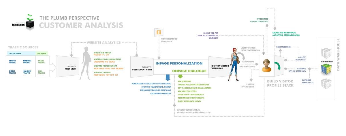
Author/Copyright holder: Pemq. Copyright terms and licence: CC BY-SA 3.0
Touchpoints can also be built into other forms of customer analysis as this excellent diagram shows.
What Do Customers Expect from Touchpoints?
Chris Ridson, the Design Director of Adaptive Path, suggests that touchpoints should provide a customer with the following interaction types:
Appropriate (e.g. that both the context of the interaction and the cultural tone of the interaction meet the needs of the customer or user)
Relevant (e.g. that the function performed by the interaction meets the utility requirements of the customer or user)
Meaningful (e.g. that the interaction was perceived as important or purposeful by the customer or user)
Endearing (e.g. that the interaction created some form of bond with the user or customer for example through desirability, creating delight or a playful tone)
It’s important to note that these are all things that can be designed – though it may take some user research to get to the bottom of how that design might take shape.
What About Touchpoints Outside of the Brand’s Control?
It is fair to say that some interactions are outside of your control, such as online reviews but that doesn’t mean that you cannot influence these interactions.
Online reputation management tracking can help you respond to negative reviews and comments effectively. They can also help you build a barometer of success on other actions to improve touchpoints – if your touchpoints worked perfectly each and every time, it would be unlikely that your customers would leave poor reviews online in the first place. Improving the touchpoints you can control will usually improve the ones you cannot too.
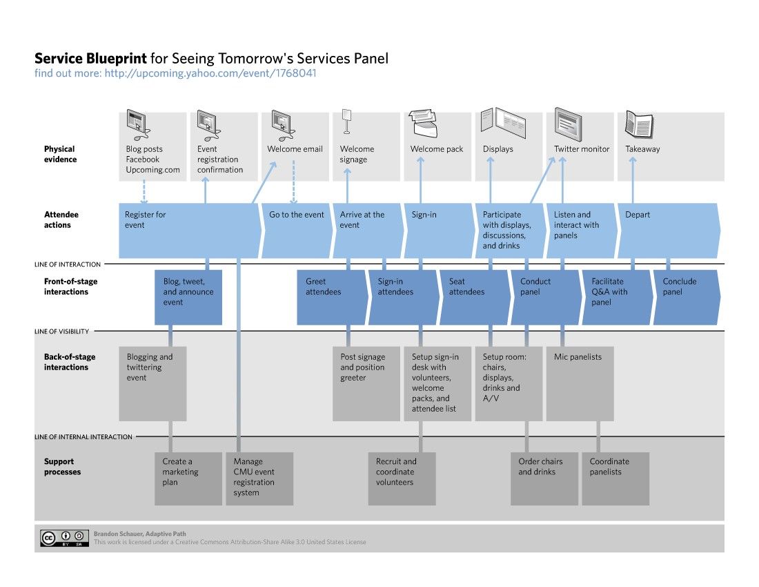
Author/Copyright holder: brandon schauer. Copyright terms and licence: CC BY-SA 2.0
Touchpoint mapping can become quite detailed when you consider all the interactions that go into each touchpoint as this service panel map demonstrates.
The Take Away
Customer touchpoints are where customers interact with your brand, product, service, etc. Developing an understanding of each touchpoint means that you can design better user and better customer experiences. This understanding can also be used to enhance user and customer journey mapping exercises. Improving touchpoints within your control can also help improve those that lay outside of your control too.
Resources
You can find Laura Patterson’s original article on touchpoints here - https://www.marketingprofs.com/articles/2018/34787...
Chris Ridson’s article on “Un-sucking the touchpoint” is also available here - https://articles.uie.com/un-sucking-the-touchpoint/
Gianluch Brugnoli, the designer at Frog Design, offers this graphical matrix approach to documenting touchpoints at Service Design Tools - http://www.servicedesigntools.org/tools/108
Hero Image: Author/Copyright holder: wilgengebroed. Copyright terms and licence: CC BY-NC 2.0


