Your constantly-updated definition of Perception in UX/UI Design and
collection of videos and articles. Be a conversation starter: Share this page and inspire others!
385shares
What is Perception in UX/UI Design?
Perception interprets sensory information to form a mental representation of the world. It's influenced by experience, expectations, attention and varies across individuals.
ShowHide
video transcript
Transcript loading…
The Role of Sensory Organs in Perception
Sensory organs are the gateway to perception. They receive information from the environment and convert it into electrical signals processed by the brain. Each sense has its own specialized organ: the eyes for vision, the ears for hearing, the skin for touch, the tongue for taste, and the nose for smell.
The sensory organs play a crucial role in shaping our perception of the world. For example, our eyes detect light waves and allow us to see colors, shapes, and movements. However, optical illusions or ambiguous stimuli can easily fool our visual system. Similarly, our sense of hearing allows us to detect sounds and understand speech, but it can also be affected by factors such as background noise or our own expectations.
Proprioception: The Sense of Body Awareness and Movement
Proprioception is the sense that allows us to perceive the position, movement, and orientation of our body parts without relying on visual or auditory cues. Here are some examples of proprioception in action:
Walking without looking at your feet
Typing on a keyboard without looking at your hands
Reaching for an object without seeing it
Maintaining balance while standing on one leg
Adjusting your posture to maintain stability on an unstable surface, such as a wobbly chair or a moving vehicle
Playing sports that require precise movements, such as basketball, tennis, or gymnastics
In each of these examples, proprioception plays a crucial role in allowing us to move and interact with the world in a coordinated and controlled manner.
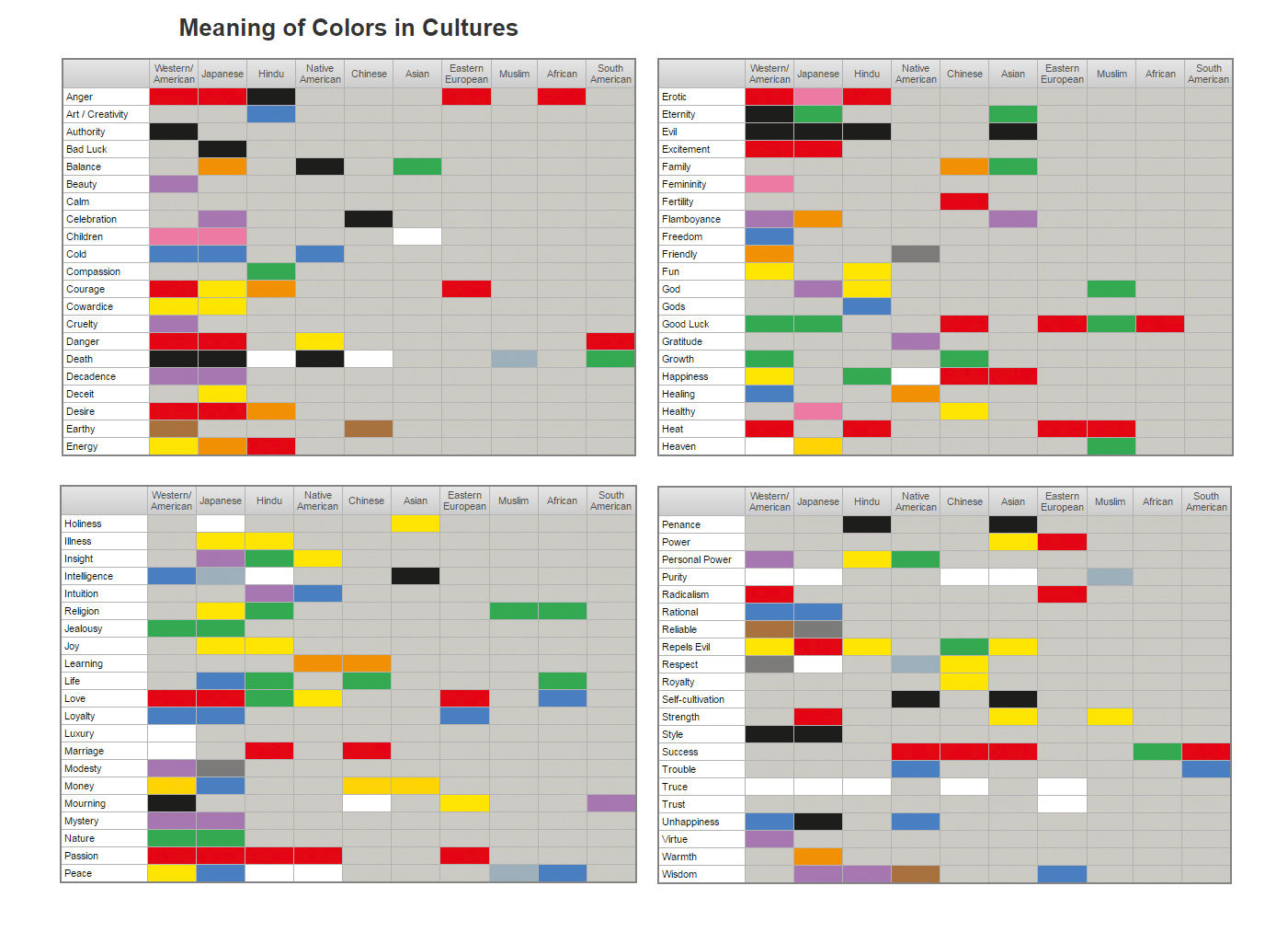
How Culture Shapes Our Perception of the World
Color may differ across cultures, significantly affecting how we communicate and interact with people from different backgrounds.
Our cultural background can influence how we interpret and organize sensory information. For example, in some cultures, eye contact is seen as a sign of respect and attentiveness; in others, it may be considered rude or aggressive.
Cultural values and beliefs can also affect how we perceive emotions. Some cultures place a high value on emotional restraint and may view displays of emotion as inappropriate or weak. In contrast, other cultures may value emotional expressiveness and see it as a sign of authenticity and sincerity.
Furthermore, language can also play a role in shaping perception. Different languages have different words for colors, which can affect how people perceive and categorize them. For example, some languages do not distinguish between blue and green as separate colors but instead use one word to describe both.
The Relationship Between Memory and Perception
Memory and perception are closely intertwined, as our past experiences can shape how we perceive the world around us. For example, if someone has had a negative experience with a particular food, they may perceive it as unappetizing or even disgusting in the future.
Memory can also influence attentional focus during perception. If someone is looking for a specific object in a room, their past experiences and memories of that object may guide their attention toward finding it.
On the other hand, perception can also affect memory formation. When we first encounter new information, our initial perception of it can influence how we remember it later on. This is known as encoding specificity: the idea that our memories are most easily retrieved when the conditions at retrieval match those present at encoding.
Perception and Illusions: How the Brain Can Be Tricked by What We See
Sometimes our brains can be tricked into perceiving things that aren't actually there. These perceptual illusions occur when our brains misinterpret sensory information in unexpected ways.
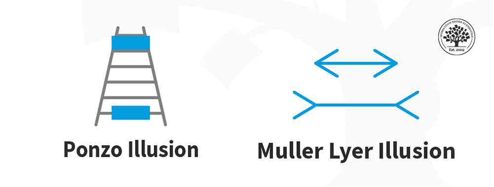
One example of a visual illusion is the Müller-Lyer illusion, where two lines of equal length appear to be different lengths due to the addition of arrowhead-shaped lines at their ends. This illusion occurs because our brains interpret the presence of the arrowheads as indicating that one line is farther away than the other, causing it to appear longer.
Another example is the Ponzo illusion, where two identical objects are placed on converging lines, creating an illusion that one object is larger than the other. This occurs because our brains perceive things in the context of their surroundings and interpret converging lines as indicating distance.
One crucial consideration in UX design is the role of attentional focus. Designers can use techniques such as color contrast, typography, and visual hierarchy to guide users' attention toward important information and help them make sense of complex interfaces.
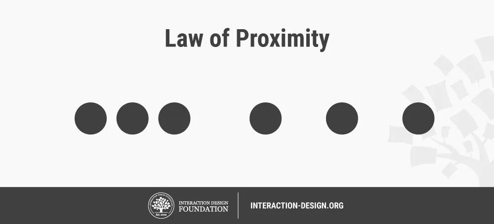
In addition, designers can also use the principles of Gestalt psychology to create visually pleasing and easy-to-understand designs. For example, the principle of proximity suggests that objects that are close together are perceived as belonging to the same group. In contrast, the principle of similarity indicates that things that share similar visual characteristics are perceived as belonging to the same category.
How do users form first impressions of a digital product?
Users form first impressions of a digital product within seconds, focusing on visual design, ease of navigation, and clarity of content. An appealing, user-friendly interface encourages engagement. For example, a website that loads quickly and presents information clearly can boost user retention. However, a cluttered or confusing layout may lead to quick abandonment.
To create a positive first impression, ensure your digital product has a clean design, intuitive navigation, and concise, relevant content. Regularly test your product’s first impression using methods like the 5-second test, where users view your interface briefly and recall their impressions.
Focusing on these elements can enhance user satisfaction and foster long-term engagement with your digital product.
How does perception influence user behavior on a website or app?
Perception shapes how users react the moment they land on a website or open an app. People don’t just look; they judge—and do it quickly. They'll feel more confident and stick around if something looks polished and easy to use. But if the design feels messy or confusing, they’ll likely bounce, abandoning the site or app. With that impression of the product, they might never even bother with the brand again. Worse, they might tell others to avoid it.
Users pick up cues from colors, spacing, fonts, and even button shapes. A clean layout tells them the site is trustworthy, and clear text makes them feel understood. When everything looks familiar and flows well, users move through it with ease. But one strange icon or slow-loading screen can break the experience and send users packing.
To guide behavior, design with clarity and intention. Make sure every visual element supports the message and helps users take the next step—whether that’s buying, signing up, or just exploring. Keep their perception on your side.
Enjoy our Master Class How to Design with the Mind in Mind with Jeff Johnson, Assistant Professor, Computer Science Department, University of San Francisco.
What are the most common visual perception principles used in UX?
UX (user experience) designers rely on several key visual perception principles to guide users' interpretation and interaction with interfaces. These principles, which come from the Gestalt school of psychology, help users process information quickly and efficiently.
One of the most common is proximity—placing related items close together so users see them as a group. Similarity plays a large role, too: elements that share color, shape, or size tend to be perceived as part of the same set. Meanwhile, figure-ground helps users distinguish important content (figure) from the background.
Continuity guides the eye along a path, making layouts feel more natural. Closure lets users fill in missing information—like recognizing an incomplete icon.
By applying these principles, designers reduce cognitive effort, create visual flow, and improve usability across digital products as users can more easily notice important elements, information hierarchy, and more.
How do mental models shape what users expect in a design?
Mental models shape users' expectations by drawing on what they already know. When someone opens a website or app, they bring assumptions from past experiences. For example, they expect a shopping cart icon to lead to checkout, a logo to return to the homepage, and a gear icon to open settings.
These expectations come from patterns they’ve seen time and again. Users feel comfortable and in control when a design matches these mental models. They can predict what will happen, which builds confidence. But when a design breaks these patterns, it can confuse or frustrate them—even if it looks intriguing and “cool.”
Good UX design respects users’ mental models. It builds on what they already understand, so they don’t need to relearn basic actions. By aligning with familiar patterns, designers reduce friction and help users get where they want to go, faster and with less effort—hallmarks of a seamless experience.
Watch as Chief Operations Officer at The Team W, Guthrie Weinschenk explains important points about mental models:
ShowHide
video transcript
Transcript loading…
Enjoy our Master Class How to Design with the Mind in Mind with Jeff Johnson, Assistant Professor, Computer Science Department, University of San Francisco.
What can I do to create a positive emotional perception in UX?
To create a positive emotional perception in UX, focus on clarity, ease of use, and small moments of delight. Users feel good when they understand what to do and they can do it without stress. Clear layouts, friendly language, and fast load times all help reduce friction.
Visual design also plays a big role. Choose colors that match your brand’s personality, use clean typography, and make sure everything feels consistent. Even micro-interactions—like a subtle animation when a user completes a task—can add warmth and satisfaction.
A personal touch goes a long way. Thoughtful error messages, welcoming onboarding, or a thank-you after a purchase help users feel valued and are hallmarks of a caring brand. People remember how a product makes them feel more than the features it offers.
Overall, design for emotion by showing empathy, reducing stress, and adding small surprises that make users smile or feel understood.
Watch as Author and Human-Computer Interaction (HCI) Expert, Professor Alan Dix explains important points about emotions and designing for usability:
How does user perception change across mobile and desktop?
User perception shifts a lot between mobile and desktop. On mobile, users expect speed, simplicity, and touch-friendly design. They often use apps or sites on the go, looking for quick answers and clear actions. Cluttered layouts or tiny tap targets can instantly frustrate users.
On desktops, people usually have more time and space to explore. They expect deeper navigation, larger visuals, and features that take advantage of the bigger screen—like side-by-side content or multi-step tasks.
Because of these differences, the same design can feel intuitive on one device and clunky on another. That’s why responsive design matters so much. You need to tailor the experience for each screen while keeping branding and function consistent.
In sum, users expect mobile to feel fast and focused, while they treat desktop as more flexible and detailed. Design accordingly—and with more users on mobile, it’s a good idea to adopt a mobile-first mindset and design for mobile in the first place.
Watch as CEO of Experience Dynamics, Frank Spillers explains important points about responsive design:
How do accessibility needs affect how people perceive interfaces?
Accessibility needs shape how people understand and interact with digital interfaces. If a design ignores these needs, it can feel confusing, frustrating, or even impossible to use. However, when it supports different abilities—like vision, hearing, or mobility—it sends a clear message. Accessible design is also a legal requirement in many jurisdictions, protecting the rights of users with disabilities.
For example, someone with low vision might rely on screen readers or high-contrast settings. If buttons aren’t labeled properly or text lacks contrast, they can miss key content. A user with motor challenges might struggle with small touch targets or complex gestures.
Inclusive design doesn’t just help those with disabilities—it improves the experience for everyone. Clear text, logical navigation, and flexible layouts benefit users in all kinds of situations, from poor lighting to temporary injuries. The latter can extend to temporary disabilities such as someone who’s got a hand injury and can’t use a mouse, or a person who has lost or broken their glasses and needs large text on the screen.
When a product meets accessibility needs, it feels respectful, usable, and welcoming. That creates trust—and trust shapes perception in a big way.
Watch our video to understand why accessibility is a big deal in design:
To test how users perceive your design, begin with quick methods like first-click tests or five-second tests. These give you fast feedback on what stands out and whether users notice key elements. Ask simple questions like: “What do you think this page is about?” or “What would you click on first?”
You can run moderated usability tests where users think out loud as they navigate. Watch where they hesitate, what they ignore, or what confuses them. Their behavior reveals much about their perception.
Surveys and interviews add depth. Ask how the design made them feel or if it seemed trustworthy and clear. Heatmapsor eye-tracking tools can show what draws attention and what doesn’t.
Whichever method you choose, keep the focus on clarity, ease, and emotional response. Perception shapes trust and action—so test with real users.
User Experience Strategist and Founder of Syntagm Ltd, William Hudson explains important points about first-click testing:
This paper investigates how perceived UX design attributes—such as aesthetics, usability, credibility, and usefulness—relate to users' receptiveness to persuasive features in fitness applications. Through Partial Least Square Path Modeling, the study reveals that perceived usefulness and aesthetics have the strongest relationships with users' receptiveness to persuasive features. These insights are valuable for designing fitness apps that effectively motivate behavior change.
This paper explores how user interface (UI) design influences consumer perceptions across cultures, specifically comparing Taiwanese and German consumers. Using a laboratory experiment with 703 participants, the study manipulated background color (red, blue, white) and product pricing to examine their effects on perceived usefulness, trust, emotional responses, and overall store perception. It found that color significantly influenced user reactions, with white backgrounds consistently fostering higher trust and positive emotional responses across cultures. This research is important because it demonstrates the necessity of culturally responsive UI design in global e-commerce, offering actionable insights for tailoring visual design to enhance user trust and engagement in different cultural contexts.
What are some popular and respected books about perception in UX design?
Colin Ware integrates principles from human perception and cognition to inform the design of more effective visualizations. By understanding how the human visual system processes information, designers can create interfaces that align with natural perceptual processes, enhancing clarity and user comprehension. This book is a cornerstone in the field of information visualization, bridging the gap between perception science and practical design.
Susan Weinschenk combines insights from psychology and neuroscience to explain how people perceive, process, and interact with design. Understanding these human factors enables designers to create products that better align with user behaviors and expectations. This book is valued for translating complex psychological concepts into practical design advice.
Earn a Gift, Answer a Short Quiz!
Question 1
Question 2
Question 3
Get Your Gift
Try Again! IxDF Cheers For You!
0 out of 3 questions answered correctly
Remember, the more you learn about design, the more you make yourself valuable.
It's Easy to Fast-Track Your Career with the World's Best Experts
Master complex skills effortlessly with proven best practices and toolkits directly from the world's top design experts. Meet your expert for this course:
Alan Dix: Author of the bestselling book “Human-Computer Interaction” and Director of the Computational Foundry at Swansea University.
All open-source articles on Perception in UX/UI Design
Learn the Role of Perception and Memory in HCI and UX
Have you ever wondered how your brain makes sense of the world? It's a fascinating process! If you want to design helpfu
631 shares
11 mths ago
Open Access—Link to us!
We believe in Open Access and the democratization of knowledge. Unfortunately, world-class educational materials such as this page are normally hidden behind paywalls or in expensive textbooks.
.webp)