As designers, your product’s end users are your priority. Through your work, you advocate the user’s perspective to business owners so that business and marketing decisions fit well with the overall customer journey. But it is also important to understand the business’s perspective and deliver value to them. If the business is not sustainable, you cannot deliver value to your end users.
User experience begins even before a person starts using your product or service. The first few interactions with the product are when they find out about your value proposition and evaluate whether or not they want to invest their time and effort in your offering. While these interactions are traditionally considered the marketing department’s responsibility, you can deliver a truly seamless user experience only if you work closely with business stakeholders.
“No product is an island. A product is more than the product. It is a cohesive, integrated set of experiences. Think through all of the stages of a product or service – from initial intentions through final reflections, from first usage to help, service, and maintenance. Make them all work together seamlessly.”
— Don Norman, inventor of the term “User Experience”
The Evolving Role of Design
People will have different expectations from a mobile application that tracks personal finances as compared to an online movie-streaming service. Each product or service provides a unique set of experiences to people who interact with them. And due to these differences in experiences, user experience design has a wide scope. The discipline of UX design includes principles and activities that originate from other fields such as industrial design, psychology, visual design, library sciences, anthropology, human-computer interaction and systems design.
7 Facets of UX Design
Due to its broad nature, there is no single definition of UX design. Industry leaders have presented different models to help us make sense of the discipline. One such model is Peter Morville’s UX honeycomb. Originally proposed in 2004 for websites and web content, the UX Honeycomb has stood the test of time and applies to user experience, in general. Peter Morville describes user experience through 7 subjective factors: useful, usable, findable, credible, desirable, accessible and valuable.
Show
Hide
video transcript
- Transcript loading…
Useful: A product must have a reason to exist. If people cannot put it to use, well, they will not buy it! A product is useful if it solves a problem or fulfills a need. It is worth noting that “usefulness” need not necessarily be about functionality. For example, a mobile game’s usefulness is its ability to entertain or thrill gamers.
Usable: The easier your product is to understand and use, the better it is for your users. People may put up with an unusable product if they need it (i.e., it is useful). But if there is a comparable product that fulfills a need, and is easier to use, people will prefer to purchase the more usable one. For example, the video conferencing application Skype was created in 2003, while its competitor Zoom was founded in 2011 (the same year that Microsoft acquired Skype!). In 2020, when a pandemic forced businesses worldwide to go remote, it was Zoom that took the video conferencing industry by storm. Even though Zoom had its share of bugs and usability issues, people found it more convenient than the other products available.
Findable: When users interact with your product, they should be able to find all its useful and usable features and functions. If people cannot find it, it does not exist! One reason that Zoom became popular was that people could set up and share conference links with invitees. The invitees didn’t have to set up an account or even install an application to join the call. Skype also offered a way to set up meetings without an account or the software. But many users simply did not know about the feature.
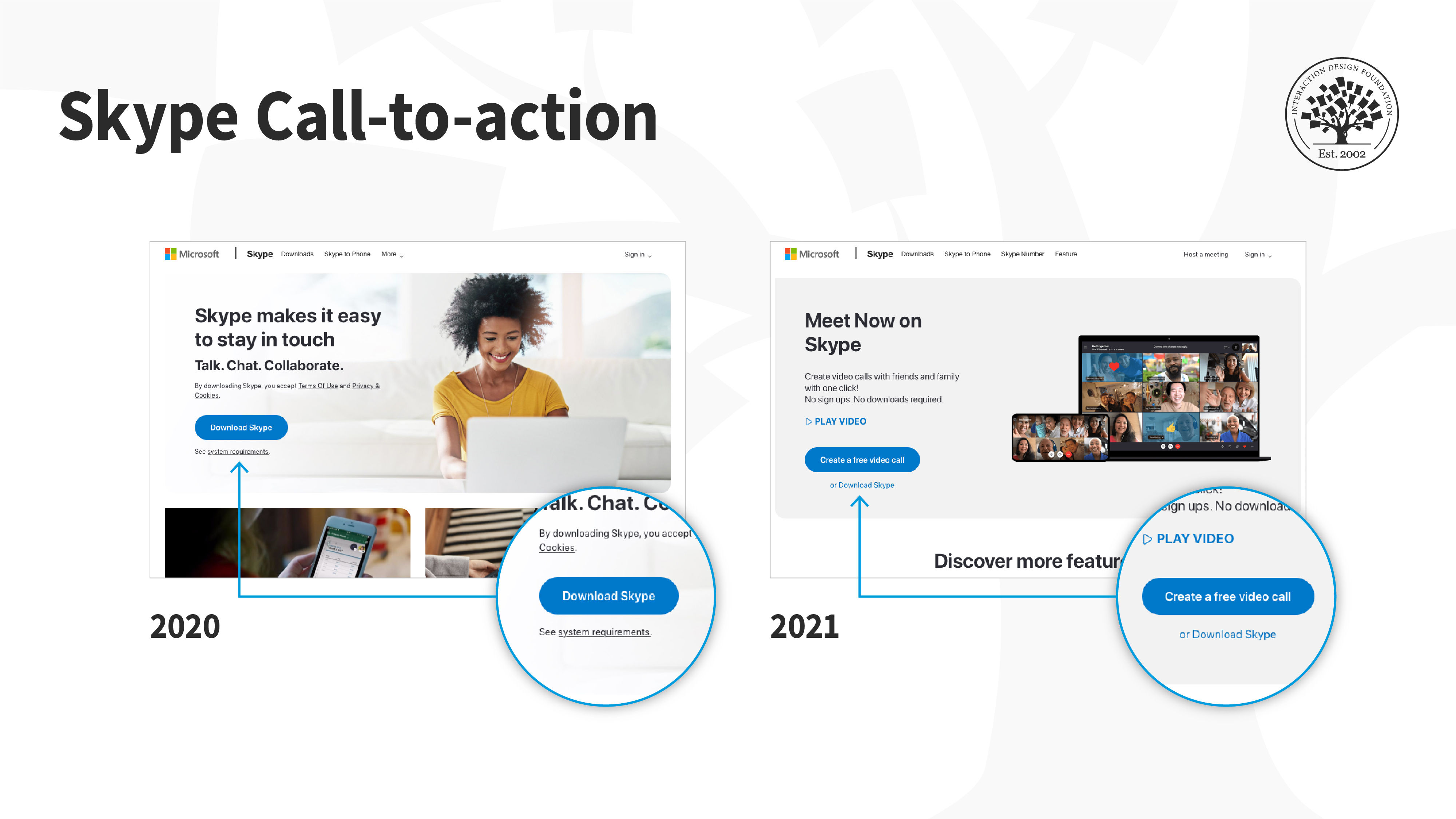
![Screenshots of Skype's website from January 2020 and January 2021. The screenshots are annotated, to highlight the change in button label from 'Download Skype' to 'Create a free video call'. The version from 2021 also highlights the text 'No sign ups. No downloads required.']()
Skype’s websites in January 2020 and January 2021 reflect its learnings from Zoom.
© Skype, Fair Use.
People want to be able to set up a meeting easily (without any downloads or sign-ups). Microsoft learned this the hard way when people rapidly adopted Zoom in 2020. For people who visited Skype’s website in January 2020, the primary Call to Action (CTA) was “Download Skype”. Skype’s feature that let people set up meetings without the software or login was not findable, and hence, for many users, did not exist. One year later, Skype’s website revealed what the company had learned. The new CTA read “Create a free video call”.
Credible: Trust is the foundation of all transactions. Customers expect our products to be reliable and fulfill their needs. If we collect personal or financial information, they expect it to be protected. If our customers cannot trust us, they will not bother to invest their time, effort or money in our products.
Desirable: Emotions play a large role in user experience. All other factors being equal, customers will always choose a product that looks and feels good. Aesthetics, brand identity and imagery make products more or less desirable. The more desirable a product, the more our customers will want to use and recommend it to their friends.
Accessible: Our products must cater to all our users — including people with disabilities. When we make accessible products, we make them easier for everyone to use. For example, most people’s eyesight diminishes after the age of forty. When we ensure that text on our applications is readable (has a large font size and high contrast ratio), people with partial vision, as well as those with regular vision, will be able to read without straining their eyes. Similarly, subtitles that help people with hearing difficulties enjoy videos also assist non-native speakers to easily understand what is being spoken. Designing for accessibility is not just the morally right thing to do, but also a legal requirement.
Valuable: At the heart of the honeycomb is value — for both customers and those who sponsor the product. For customers, value is the sum of all the other factors listed above. Some customers may seek desirable experiences, while for others credibility and usability may be more important. Value for those who sponsor the product — often businesses — is profitability and long-term viability. If the business model is not viable, even the best products will not survive in the marketplace.
Design for Value, Design for Conversion

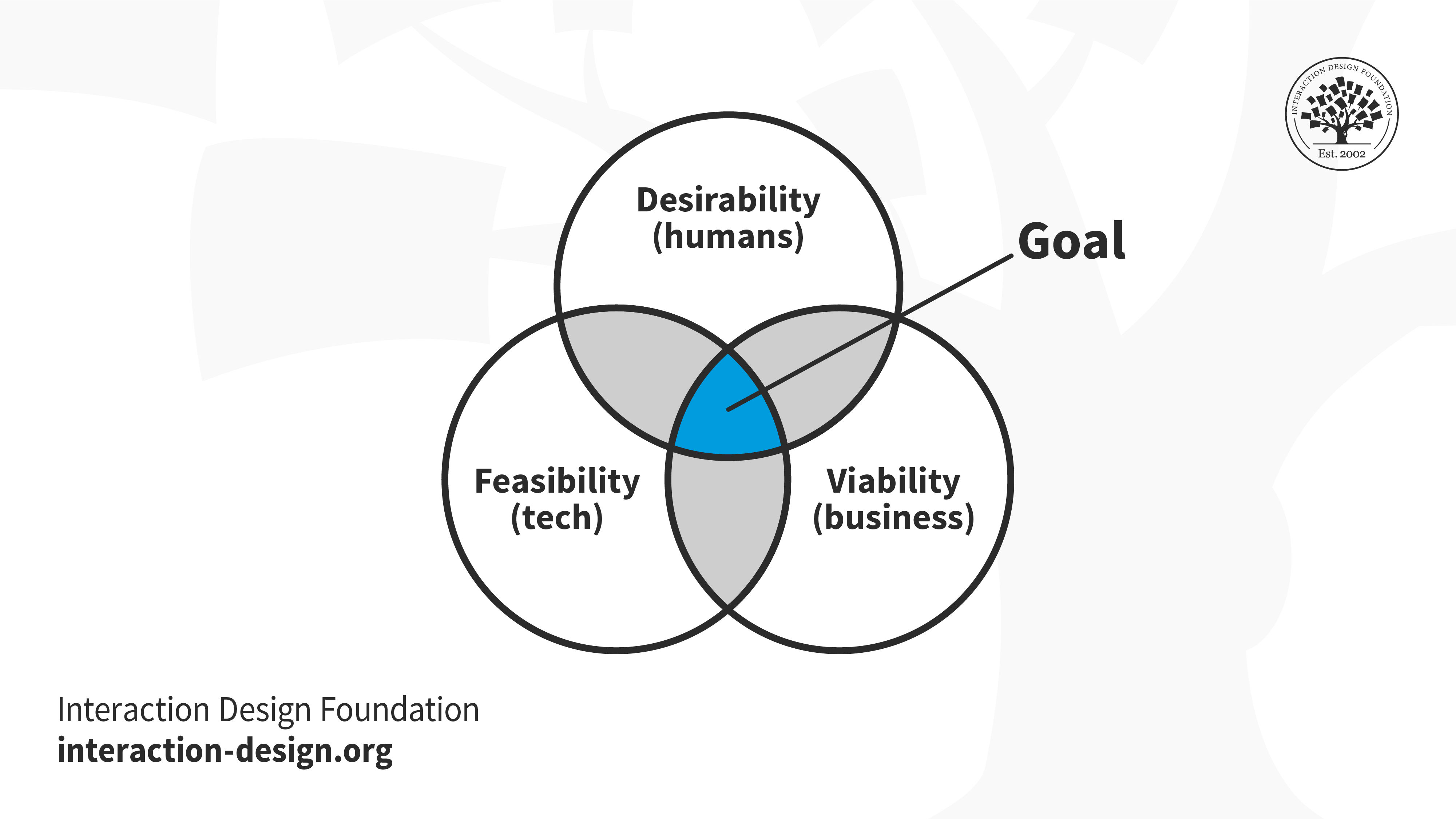
As designers, we must aim to balance the requirements of our users with those of business and technology. Our ideas for product improvement need to be technologically feasible, or else we cannot implement our ideas — no matter how good they may be. And even with a sound value proposition that can be implemented easily, our products will not survive without a viable business.
© Interaction Design Foundation, CC BY-SA 3.0
To state the obvious — it is expensive to run a business (or even a non-profit for that matter). The organization incurs costs in the development of products and services (research, design, engineering, customer support), infrastructure (building, electricity, wifi, etc.) and several other support and operational activities (HR, accounting, legal, etc.). Unless a business generates enough revenue, it cannot sustain itself.
Even if your work is altruistic, and you do not intend to profit from your design activities, you want people to benefit from your work.
“Finally, people have to actually purchase it. It doesn’t matter how good a product is if, in the end, nobody uses it.”
— Don Norman, Design of Everyday Things
Imagine yourself in the shoes of one of the designers at Zoom. How would you feel, knowing that your work impacted millions of users, who could work remotely, thanks to your product? Now think about the designers at Skype. How would you have felt, when, despite your best efforts on the product, your customers preferred your competitor — much newer, and with known usability and security flaws?
What Is a Conversion?
“Conversion means moving the user to the next level — whatever that means for you.”
— Laura Klein, from the talk The Three Reasons Users Don’t Convert
You can measure the value of your design efforts by tracking conversions. Conversions tend to be measured in monetary terms:
How many products did we sell?
What was the value of sales; that is, did we earn profits, and if so, how much?
How much did people donate to our campaign?
How you and your organization define conversions depend on:
What is your value proposition and how does it fit in the users’ context.
What action or sequence of actions do the users need to take to get the most out of your value proposition.
Conversion-centric design or conversion optimization refers to the set of tools and processes that marketers use to increase conversions.
As a designer, you deliver value to those who use our products and services (customers, users) and those who sponsor those products (businesses, non-profit organizations, entrepreneurs).
When we talk about product sponsors, we often refer to business owners, who seek value in terms of sales and profits. But conversion optimization is equally important for non-profits and projects where value is not defined in monetary terms. For instance, for a wildlife conservation organization, the value can be any of the following:
How much money did the organization raise?
How many volunteers signed up to work towards their mission?
How many people found out about their mission?
How many people signed a petition for a change in environmental protection laws?

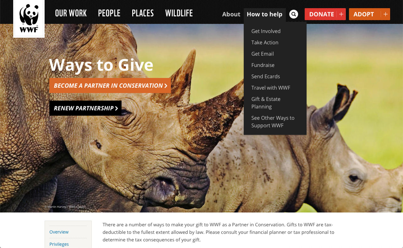
The World Wildlife Fund offers people several ways to help. Some of the conversions that WWF would measure include donations, merchandise sales and memberships.
© WWF, Fair Use.
It Takes a Village…
Traditionally, tracking and optimizing conversions are seen as the marketing team’s responsibility. In design-led organizations, the lines between departments are hazy. No single department can work independently. When you design for conversions, you will work closely with people across different teams in your company or organization to:
Identify all the elements of the customer’s journey with your product or service — for example, marketing communication, billing systems, legal fine print, customer support.
Understand your customer’s pain points, how your product fits into their lives and if there are any gaps between what the customers need and what they currently have.
Find out who the competitors are and why the customers flock to them.
Understand the business’s criteria for success and how they translate into your work as a designer.
Determine the conversion metrics that you need to track and how you can measure them.
Identify ways to optimize conversions, for example, through product enhancements, changes in communication or even through new pricing models.
Make sure your solutions are feasible — i.e., the engineering team can implement them without breaking the bank.
Measure the return on investment (ROI) of your design activities.
The Takeaway
User experience design is a vast and ever-evolving discipline that borrows from different fields, including industrial design, human-computer interaction, anthropology and psychology. According to Peter Morville, 7 subjective factors affect the user’s experience. The product or service should be useful, usable, findable, credible, desirable, accessible and valuable. What is valuable differs greatly between products, customers and businesses. As a user experience designer, not only should you prioritize your product users, but you also should aim to deliver value to product sponsors (usually business owners, but they can also be non-profits).
At first glance, it may seem that the product sponsors and customers have contradictory values — business seeks to generate revenues, and customers will try to save as much money as possible. Product sponsors invest time and money in the organization — products, services, research, operations and organizational infrastructure. The products that you design for your customers also sustain the organization. A business that does not generate revenue or a non-profit that cannot pay the bills will not survive. Without the business, you cannot deliver value to your end customers. The goals of business and customers, thus, are intertwined.
Conversions are quantifiable measures of value. As a designer, when you optimize for conversion, you aim to increase value to both customers and businesses. Conversion optimization is not the sole responsibility of one department. You will need to work closely with people across traditional departments to deliver the optimal customer experience.
References & Where to Learn More
Read about the original UX Honeycomb by Peter Morville here:
Semantic Studios | User Experience Design
Read the case study on how Zoom beat Skype at its own game:
Microsoft’s Skype struggles have created a Zoom moment
Images
Hero image: Pixabay, CC0


