Your constantly-updated definition of Conversion Rates and
collection of videos and articles. Be a conversation starter: Share this page and inspire others!
531shares
What are Conversion Rates?
A conversion rate in the context of user experience (UX) design is the percentage of users who take a desired action on a website or application. Desired actions range from making a purchase, signing up for a newsletter, to downloading an app. It is a vital metric for designers to optimize as it indicates how well a brand can encourage visitors to become participants or customers.
CEO of Experience Dynamics, Frank Spillers explains important ways to improve the customer experience:
Higher conversion rates are the dream and the chief motivating force for virtually all brands. Given that, to increase conversion rates so that potential customers become long-term, loyal ones will likely remain the most central goal for as long as companies do business. Across the digital sphere, countless blog posts address the problem of how to boost conversions for the brands behind the mobile apps, web pages and marketing campaigns that users encounter every day. From one brand’s desire to inspire more users to become customers via their product pages, to another organization’s need to alleviate its users’ pain points through an empathically-designed service, to another company’s attempt to make its free trial the most alluring for potential consumers, the general shape of the problem is the same—to keep raising the average conversion rate quickly and stably.
However, there’s much to examine and consider behind this—and what forms the approaches and solutions take can vary to a large extent. For one thing, brands, the industries they work in, as well as the people and other businesses they seek to serve best can differ immensely. Plus, there’s often far more involved in improving the UX and conversion rate than just the redesign of a call to action (CTA) button or a landing page. In UX design, the conversion rate is—specifically—a formula which puts the number of users who achieve a goal (such as convert into customers) over the total number of visitors (to that brand’s website) and multiplies the result of this division by 100.
The role that UX designers play to boost their brands’ conversion rates is possibly their most vital one. Users—including potential paying customers—come to a website or app because they want to achieve some goal. What stands in the way between their discovery of the brand and their becoming satisfied customers are issues like:
The number of steps or the intensity of tasks they must go through to get to their goal.
The risk of becoming confused or thinking about if they should turn to a competitor’s site or app for what they want.
What’s more, a critical point is that users—or visitors—come to a brand’s digital product with some problem. The “problem” could take many forms, such as:
Apply for help from a governmental agency.
Purchase a birthday present for a loved one.
Receive a newsletter or get on a mailing list.
Find the best car insurance rate.
So, the brand behind the site or app has to offer the best of what it has to its target audience—and help all users to intuitively proceed in their user or customer journeys without distractions or other factors keeping them back.
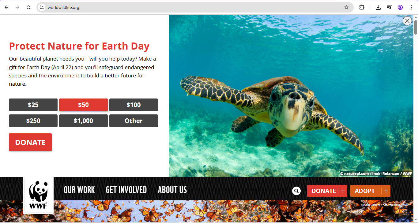
Conversion can take several forms—for example, this famous NGO offers different ways to donate, so people can make a real difference with whatever they want to give.
For example, consider the urgency of an elderly user who comes to an e-commerce site for the first time and needs same-day delivery for a birthday gift. It might be a last-minute need, and they might be unable to leave their home to purchase that gift. Price might well be a large factor. However, what’s likely to be equally—if not more—important is that they can trust the brand with their credit card details and don’t become frustrated by slow loading times or a complicated checkout process.
From the most pressing needs to more casual wants—such as signing up for an e-newsletter with gardening tips—a brand’s users enter their brand experiences in a journey format. If these journeys are pleasurable—or at least as stressless as possible—users will be far more likely to enter into a long-time relationship with a brand they truly trust. That’s why designers must meet the needs of all users and raise the chances that users become interested—quickly—and convert. From the most casual visitors who respond to an email marketing campaign, to solution-seekers with far more pressing needs, brands must meet these people at every touchpoint and guide them to get what they want—and ethically so.
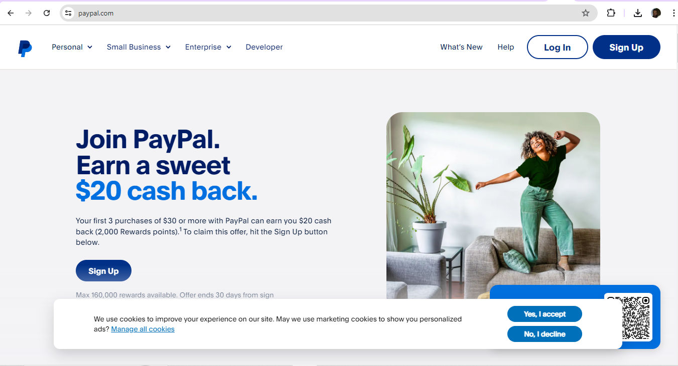
Consider the approach a newcomer to this site might make—someone who wants to use eBay, for example, for the first time and wants to set up a PayPal account. PayPal accommodates such needs in a clean, crisp, credible and considerate layout.
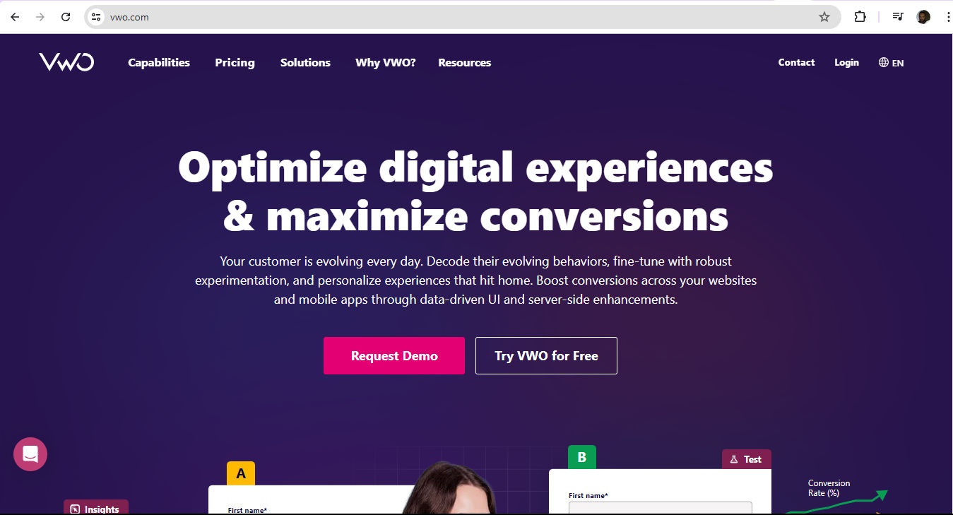
Conversion rate optimization (CRO) is the process designers use so that visitors—to a website, for example—can enjoy the best user experience and so be more likely to take a desired action. First and foremost, a brand must prove to its user base that it understands why they’ve arrived on its site or app. This calls for careful design to bolster trust and brand credibility so that users can go with their gut reactions and enter into that all-important seamless experience where they feel as though they’re engaging directly with a brand who knows them. The “magic” of a seamless UX means they can forget they’re using a smartphone—or another device—to access the brand with the solution they want.
High conversion rates give healthy direct feedback on how well a user interface (UI) supports users’ actions. A brand with a high conversion rate typically offers a seamless and intuitive user experience. It’s likely to be one where the design elements—like calls to action, navigation and messaging—are fully in line with what the users expect. A large part of those expectations is the technical side of the experience.
Low conversion rates, however, point to areas for improvement—such as the need for clearer navigation or faster page loads. For example, for that elderly user who needs the gift to arrive on the same day, they’ll likely not have the patience to tolerate slow-loading times or an e-commerce site that doesn’t appear right on a mobile device screen. So, the aspects of their user journey—and, ideally, customer journey—are events that the brand that wants to help them will need to have measured, examined and optimized beforehand.
CEO of Experience Dynamics, Frank Spillers explains important points about responsive design in this video:
ShowHide
video transcript
00:00:00 --> 00:00:30
Now, just to start off by saying responsive is a default. Responsive is not an option – *do it*. And the reason is because that's where the world is at. Everyone expects things to be mobile-optimized, and responsive just means that if I switch from my laptop to my tablet to my phone, the site's going to fit to that resolution; it's going to kind of follow me.
00:00:30 --> 00:00:52
And we know that users do that; that's the default. So, by doing responsive design, you're supporting device switching, and that's why it's important. You're also potentially making things a little bit more accessible and SEO-friendly, which is a factor for Google's algorithm that prioritizes responsive sites.
What are Conversion Events?
Conversion events are specific actions that brands and organizations measure to evaluate user engagement—and how effective their products, services and campaigns are. These can include a variety of user interactions, such as when users start a session, make a purchase or upgrade an app. Brands track each of these events to understand how well a website or app engages with its users and prompts them to take high-value actions within a certain timeframe. User feedback and usability testing are—therefore—vital parts of how designers understand how to optimize digital products like websites. For example, data about mobile experiences can shed key insights for designers to greatly enhance mobile conversion rates—vitally important in the mobile-first era.
Several other factors are vital in conversion events—such as the personalization that brands offer and the relevance they prove to users in their user journeys. Tailored experiences are far more likely to engage users and encourage them to not just convert but return, too. Conversion rate optimization for web development and design therefore needs to adopt a human face—one that meets the users at every step of the way on their user journeys. There’s a long way to go before—and after—users become paying customers in the sales funnel, and it calls for careful handling by the designers who need to maximize value for the customers and the organizations they serve.
Frank Spillers explains important points about user journeys in this video:
ShowHide
video transcript
Transcript loading…
What are the Best Metrics to Choose?
If they’re to succeed when they measure and track their brands’ conversion rates, designers—and UX researchers—need to pick the best metrics for the business goals at hand. Here are some common ones:
Purchase conversion rate: This is the percentage of visitors who make a purchase.
Lead conversion rate: This is the percentage of visitors who fill out a lead generation form.
Sign-up conversion rate: This is the percentage of visitors who sign up for a newsletter or account.
Click-through rate (CTR): This is the percentage of visitors who engage with a certain call-to-action or link.
What are the Best Tracking Tools and How to Understand Data Analysis?
Designers can pick from many effective options, such as—and in no particular order:
Google Analytics: Google Analytics offers comprehensive insights into website traffic, user behavior and conversions.
From what the tracking tools provide, the data that designers and researchers analyze can provide valuable insights. Key metrics to consider include:
Conversion rate trends over time.
Conversion rates by traffic source: These help identify the most valuable channels.
Conversion rates by user segment and device: These can uncover the behaviors and characteristics of the highest-converting visitors—extremely helpful for designers to make targeted optimizations.
UX Strategist and Consultant, William Hudson explains vital points about web and mobile app analytics—an important way to get insights behind the UX of products so designers can find ways to raise their conversion rates:
ShowHide
video transcript
Transcript loading…
Video copyright info
Author: Stewart Cheifet. Appearance time: 0:22 - 0:24. Copyright license and terms: CC / Fair Use. Modified: Yes. Link: https://archive.org/details/CC1218greatestgames
How to Optimize Conversion Rates through UX?
There are a variety of ways to pave the way for users to make the most of their experiences and convert. The most fundamental approaches include:
1. Understand the Users
Empathy is the keyword here—and so is a solid appreciation for what’s involved in the user journey. Who is the target audience? What are they after and why do they need it? Personas and customer journey maps make exceptional tools in the first instance to build up vivid insights into the world of the people a brand wants to help.
Author and Human-Computer Interaction Expert, Professor Alan Dix explains personas and why they’re so valuable in design:
ShowHide
video transcript
00:00:00 --> 00:00:34
Personas are one of these things that gets used in very, very many ways during design. A persona is a rich description or description of a user. It's similar in some sense, to an example user, somebody that you're going to talk about. But it usually is not a particular person. And that's for sometimes reasons of confidentiality.
00:00:34 --> 00:01:02
Sometimes it's you want to capture about something slightly more generic than the actual user you talked to, that in some ways represents the group, but is still particular enough that you can think about it. Typically, not one persona, you usually have several personas. We'll come back to that. You use this persona description, it's a description of the example user, in many ways during design. You can ask questions like "What would Betty think?"
00:01:02 --> 00:01:35
You've got a persona called / about Betty, "what would Betty think" or "how would Betty feel about using this aspect of the system? Would Betty understand this? Would Betty be able to do this?" So we can ask questions by letting those personas seed our understanding, seed our imagination. Crucially, the details matter here. You want to make the persona real. So what we want to do is take this persona, an image of this example user, and to be able to ask those questions: will this user..., what will this user feel about
00:01:35 --> 00:02:01
this feature? How will this user use this system in order to be able to answer those questions? It needs to seed your imagination well enough. It has to feel realistic enough to be able to do that. Just like when you read that book and you think, no, that person would never do that. You've understood them well enough that certain things they do feel out of character. You need to understand the character of your persona.
00:02:01 --> 00:02:30
For different purposes actually, different levels of detail are useful. So I'm going to sort of start off with the least and go to the ones which I think are actually seeding that rich understanding. So at one level, you can just look at your demographics. You're going to design for warehouse managers, maybe. For a new system that goes into warehouses. So you look at the demographics, you might have looked at their age. It might be that on the whole that they're older. Because they're managers, the older end. So there's only a small number under 35. The majority
00:02:30 --> 00:03:01
are over 35, about 50:50 between those who are in the sort of slightly more in the older group. So that's about 40 percent of them in the 35 to 50 age group, and about half of them are older than 50. So on the whole list, sort of towards the older end group. About two thirds are male, a third are female. Education wise, the vast majority have not got any sort of further education beyond school. About 57 percent we've got here are school.
00:03:01 --> 00:03:34
We've got a certain number that have done basic college level education and a small percentage of warehouse managers have had a university education. That's some sense of things. These are invented, by the way, I should say, not real demographics. Did have children at home. The people, you might have got this from some big survey or from existing knowledge of the world, or by asking the employer that you're dealing with to give you the statistics. So perhaps about a third of them have got children at home, but two thirds of them haven't.
00:03:34 --> 00:04:05
And what about disability? About three quarters of them have no disability whatsoever. About one quarter do. Actually, in society it's surprising. You might... if you think of disability in terms of major disability, perhaps having a missing limb or being completely blind or completely deaf. Then you start relatively small numbers. But if you include a wider range of disabilities, typically it gets bigger. And in fact can become
00:04:05 --> 00:04:32
very, very large. If you include, for instance, using corrective vision with glasses, then actually these numbers will start to look quite small. Within this, in whatever definition they've used, they've got up to about 17 percent with the minor disability and about eight percent with a major disability. So far, so good. So now, can you design for a warehouse manager given this? Well,
00:04:32 --> 00:05:01
you might start to fill in examples for yourself. So you might sort of almost like start to create the next stage. But it's hard. So let's look at a particular user profile. Again, this could be a real user, but let's imagine this as a typical user in a way. So here's Betty Wilcox. So she's here as a typical user. And in fact, actually, if you look at her, she's on the younger end. She's not necessarily the only one, you usually have several of these. And she's female as well. Notice only up to a third of our warehouse ones are female. So
00:05:01 --> 00:05:31
she's not necessarily the center one. We'll come back to this in a moment, but she is an example user. One example user. This might have been based on somebody you've talked to, and then you're sort of abstracting in a way. So, Betty Wilcox. Thirty-seven, female, college education. She's got children at home, one's seven, one's 15. And she does have a minor disability, which is in her left hand. And it's there's slight problem in her left hand.
00:05:31 --> 00:06:00
Can you design, can you ask, what would Betty think? You're probably doing a bit better at this now. You start to picture her a bit. And you've probably got almost like an image in your head as we talk about Betty. So it's getting better. So now let's go to a different one. You know, this is now Betty. Betty is 37 years old. She's been a warehouse manager for five years and worked for Simpkins Brothers Engineering for 12 years. She didn't go to university, but has studied in her evenings for a business diploma.
00:06:00 --> 00:06:31
That was her college education. She has two children aged 15 and seven and does not like to work late. Presumably because we put it here, because of the children. But she did part of an introductory in-house computer course some years ago. But it was interrupted when she was promoted, and she can no longer afford to take the time. Her vision is perfect, but a left hand movement, remember from the description a moment ago, is slightly restricted because of an industrial accident three years ago.
00:06:31 --> 00:07:04
She's enthusiastic about her work and is happy to delegate responsibility and to take suggestions from the staff. Actually, we're seeing somebody who is confident in her overall abilities, otherwise she wouldn't be somebody happy to take suggestions. If you're not competent, you don't. We sort of see that, we start to see a picture of her. However, she does feel threatened – simply, she is confident in general – but she does feel threatened by the introduction of yet another computer system. The third since she's been working at Simpkins Brothers. So now, when we think about that, do you have a better vision of Betty?
00:07:04 --> 00:07:32
Do you feel you might be in a position to start talking about..."Yeah, if I design this sort of feature, is this something that's going to work with Betty? Or not"? By having a rich description, she becomes a person. Not just a set of demographics. But then you can start to think about the person, design for the person and use that rich human understanding you have in order to create a better design.
00:07:32 --> 00:08:06
So it's an example of a user, as I said not necessarily a real one. You're going to use this as a surrogate and these details really, really matter. You want Betty to be real to you as a designer, real to your clients as you talk to them. Real to your fellow designers as you talk to them. To the developers around you, to different people. Crucially, though, I've already said this, there's not just one. You usually want several different personas because the users you deal with are all different.
00:08:06 --> 00:08:30
You know, we're all different. And the user group – it's warehouse managers – it's quite a relatively narrow and constrained set of users, will all be different. Now, you can't have one persona for every user, but you can try and spread. You can look at the range of users. So now that demographics picture I gave, we actually said, what's their level of education? That's one way to look at that range. You can think of it as a broad range of users.
00:08:30 --> 00:09:02
The obvious thing to do is to have the absolute average user. So you almost look for them: "What's the typical thing? Yes, okay." In my original demographics the majority have no college education, they were school educated only. We said that was your education one, two thirds of them male – I'd have gone for somebody else who was male. Go down the list, bang in the centre. Now it's useful to have that center one, but if that's the only person you deal with, you're not thinking about the range. But certainly you want people who in some sense
00:09:02 --> 00:09:24
cover the range, that give you a sense of the different kinds of people. And hopefully also by having several, reminds you constantly that they are a range and have a different set of characteristics, that there are different people, not just a generic user.
The groundwork a brand does with its UX research will lay the foundations for what it builds in the form of a solution.
William Hudson explains user research—and why it’s important—in this video:
ShowHide
video transcript
00:00:00 --> 00:00:30
User research is a crucial part of the design process. It helps to bridge the gap between what we think users need and what users actually need. User research is a systematic process of gathering and analyzing information about the target audience or users of a product, service or system. Researchers use a variety of methods to understand users, including surveys, interviews, observational studies, usability testing, contextual inquiry, card sorting and tree testing, eye tracking
00:00:30 --> 00:01:02
studies, A-B testing, ethnographic research and diary studies. By doing user research from the start, we get a much better product, a product that is useful and sells better. In the product development cycle, at each stage, you’ll different answers from user research. Let's go through the main points. What should we build? Before you even begin to design you need to validate your product idea. Will my users need this? Will they want to use it? If not this, what else should we build?
00:01:02 --> 00:01:31
To answer these basic questions, you need to understand your users everyday lives, their motivations, habits, and environment. That way your design a product relevant to them. The best methods for this stage are qualitative interviews and observations. Your visit users at their homes at work, wherever you plan for them to use your product. Sometimes this stage reveals opportunities no one in the design team would ever have imagined. How should we build this further in the design process?
00:01:31 --> 00:02:00
You will test the usability of your design. Is it easy to use and what can you do to improve it? Is it intuitive or do people struggle to achieve basic tasks? At this stage you'll get to observe people using your product, even if it is still a crude prototype. Start doing this early so your users don't get distracted by the esthetics. Focus on functionality and usability. Did we succeed? Finally, after the product is released, you can evaluate the impact of the design.
00:02:00 --> 00:02:15
How much does it improve the efficiency of your users work? How well does the product sell? Do people like to use it? As you can see, user research is something that design teams must do all the time to create useful, usable and delightful products.
It’s vital to get the user research right; even the most technically superior website won’t be able to reach its user base if it doesn’t speak to them, and anticipate their user scenarios and what they’ll need in a conversion funnel—or the series of steps users must go through to convert. Principally, designers need to account for how users discover the brand they believe can help them most, then how these users think about the solution that the brand offers—and then, hopefully, decide to go with it and enjoy it as loyal customers.
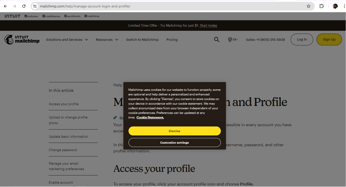
MailChimp offers clear and effective yellow CTAs to help users.
Effective UX design—including a strong grasp of design principles—is another foundational part to optimize a digital product like a website for the highest conversion rates. It calls for a careful approach to:
Visual design and the strategic placement of call-to-action (CTA) buttons, clear messaging and to make sure that navigation leads users naturally to the next step in their journey. A key part of this is to apply UI design patterns well and fine-tune the brand’s personality while leveraging tried-and-tested approaches to—for example—form fields and checkout processes.
Watch our video to learn more about UI design patterns:
ShowHide
video transcript
Transcript loading…
3. Speak to Users with Copy Geared for Conversion
Designers should show the value proposition and what benefits users can enjoy as subscribers, customers or whatever conversion looks like for the brand. It’s important to highlight benefits rather than list features of a product, for example. What’s more, a concise approach to microcopy and an accessible brand voice—and one which customers would expect from the brand—is a valuable way for brands to speak to users, earn their trust and keep them from becoming confused—especially important in markets with so many competitors.
Author, Speaker and UX Writer at Google, Torrey Podmajersky explains important points about UX writing and effective microcopy:
ShowHide
video transcript
00:00:00 --> 00:00:30
I'm working at the TAPP Transit System; this is a made-up transit system app. And it says, 'Oh, we need a notification for when someone's payment method has expired.' So, first I do the strategic work and I say, 'What's the *point* here?' What's the point for our user, and what's the point for the business or the organization? And what are our *voice concepts* that we want to make sure that we're landing so that it's in our brand?' So, I take it and then I start including *purpose*.
00:00:30 --> 00:01:03
And it gets longer and longer. And I just *iterate and iterate*, and I keep all these iterations. Thank heavens for tools like Sketch and Figma where I just make artboard after artboard after artboard or frame after frame and keep them all. I choose the best of those, and I work on making it *more concise* – more concise and more concise, and you see it's getting shorter and shorter. It gets so short here at the end, it's not particularly usable. So, I'm going to go with the second to the end and go forward.
00:01:03 --> 00:01:31
I'm going to make it more *conversational*: is this something a person would actually say? And I make more iterations. And I have my favorite among those. And then I look at all of them together, and I say, 'Here's my best ones,' and that's what I'm going to tell my team about. I'm going to say the original message doesn't follow the voice and really doesn't meet the purpose. I'm going to say which one I recommend and why and give them another couple of options.
00:01:31 --> 00:01:42
The secret here is: *I'm happy with all three of these*; I don't care which ones they choose; and, frankly, I'd prefer to A/B test them against each other and learn more about the language.
4. Make Accessibility and Inclusive Design Watchwords
Perhaps no user need is more vital for designers to tailor than through accessible and inclusive designs. It’s not just due to the potential legal repercussions that can come if a brand ignores users with disabilities. It’s also because the digital solutions that factor in the needs of all users—such as captions and good color contrast choices—are those that can make it easier for everyone on their user journey.
Watch our video on accessibility to understand more about this ultra-important aspect of design:
ShowHide
video transcript
00:00:00 --> 00:00:30
Accessibility ensures that digital products, websites, applications, services and other interactive interfaces are designed and developed to be easy to use and understand by people with disabilities. 1.85 billion folks around the world who live with a disability or might live with more than one and are navigating the world through assistive technology or other augmentations to kind of assist with that with your interactions with the world around you. Meaning folks who live with disability, but also their caretakers,
00:00:30 --> 00:01:01
their loved ones, their friends. All of this relates to the purchasing power of this community. Disability isn't a stagnant thing. We all have our life cycle. As you age, things change, your eyesight adjusts. All of these relate to disability. Designing accessibility is also designing for your future self. People with disabilities want beautiful designs as well. They want a slick interface. They want it to be smooth and an enjoyable experience. And so if you feel like
00:01:01 --> 00:01:30
your design has gotten worse after you've included accessibility, it's time to start actually iterating and think, How do I actually make this an enjoyable interface to interact with while also making sure it's sets expectations and it actually gives people the amount of information they need. And in a way that they can digest it just as everyone else wants to digest that information for screen reader users a lot of it boils down to making sure you're always labeling
00:01:30 --> 00:02:02
your interactive elements, whether it be buttons, links, slider components. Just making sure that you're giving enough information that people know how to interact with your website, with your design, with whatever that interaction looks like. Also, dark mode is something that came out of this community. So if you're someone who leverages that quite frequently. Font is a huge kind of aspect to think about in your design. A thin font that meets color contrast
00:02:02 --> 00:02:20
can still be a really poor readability experience because of that pixelation aspect or because of how your eye actually perceives the text. What are some tangible things you can start doing to help this user group? Create inclusive and user-friendly experiences for all individuals.
As designers consider how to make their digital solutions accessible for everyone, they can also expand their view with initiatives like card sorting and comprehensive site mapping. These are highly helpful for designers or design teams to work out the most effective ways to meet users’ expectations before moving on to prototyping. When designers can greatly streamline the user experience, they’ll make it much easier for users to find what they’re looking for—and so improve conversion rates.
Author, Speaker and Design Consultant, Donna Spencer explains vital points about card sorting:
ShowHide
video transcript
00:00:00 --> 00:00:26
If we were working with music content and we said, 'Here's a bunch of songs; arrange them,' we might see some people arrange them by band, we might see some people arrange them by genre, we might see some people say, 'Don't like any of those – toss them out.' So, we can learn about the *ways* that content can be organized, as well as the things that go together within those ways.
5. Conduct Thorough Usability Testing
Usability testing stands as the backbone of successful UX design. Usability testing with real users—and that includes A/B testing—sheds direct insights into what user interactions and preferences are like. For instance, simple changes like form simplification can raise conversion rates a great deal. When designers engage users in usability tests, they can find problematic areas and refine the UX to support user actions that much more effectively—for example, in websites that are more intuitive and user-friendly.
William Hudson explains important points about user testing in this video:
ShowHide
video transcript
Transcript loading…
6. Implement Feedback
Any design process—such as design thinking—benefits greatly when designers iteratively implement user feedback. Crucially, such continuous improvements can translate to far better conversion rates. Digital analytics and user feedback are the most vital ways for designers and their brands to understand how different elements of a website perform—particularly in terms of user engagement and conversion. Designers can take the insights from this data—digest and consider it carefully—and make user experiences that are far more tailored and effective. For example, if a particular CTA button is underperforming, designers can look at the user interaction patterns with that button to find how to make the modifications to enhance its effectiveness.
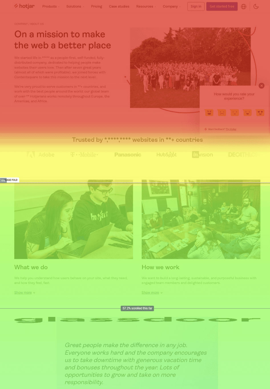
Designers can analyze scroll maps—such as with Hotjar—to find out whether users can find vital content such as Buy Now buttons.
Risks and Special Considerations with Conversion Rates
Here are some common ones for designers to watch out for:
1. Don’t Misinterpret Data
It takes insightful analysis for designers and designer teams to interpret user behavior data properly and see what conversion metrics indicate in reality. The best design decisions must line up with users’ needs and business goals. Another point that's crucial to understand is that just enhancing a site's user experience (UX) won’t directly guarantee a boost in conversion rates. Instead, what’s called for is a strategic approach to UX optimization—with rigorous data analysis through testing—for businesses to see what the direct impacts of UX interventions on conversion rates are.
2. Don’t Ignore User Feedback
It might sound like a truism that brands should always listen to their users. Nonetheless, brands must keep this top of mind—and focus on UX design—to improve customer experience and greatly boost key performance indicators (KPIs) and return on investment (ROI). When designers regularly weave the threads of user feedback into the fabric of their brands’ solutions, they can lower churn rates, raise brand equity and increase customer retention. Their brands can keep this optimal formula going long-term—because they can afford to do it, they’ve got the tech to support it, and they know what delights users into becoming customers, and what makes customers stay. Most importantly of all, users—and customers—can perceive brands that listen to them. Those are the businesses which they can sense truly value them—and they can reciprocate by becoming and remaining loyal customers.
Confusion and “work” are the two chief enemies of good design in this sense. Ill-executed and poorly optimized checkout forms—where a complex process leads to increased cart abandonment rates—can sink a brand’s reputation. Designers should try to pre-empt what users need to do as much as possible—with well-considered and ethically designed features and patterns. When users have a simple, clean design before them, effective information architecture and with checkout and CTA buttons easily visible—and no text-heavy pages—it can greatly improve user engagement and conversion rates. What’s more, engaging visuals can play a crucial role to carry information effectively and help boost conversions.
Watch our video to understand more about how important a well-designed information architecture is:
ShowHide
video transcript
00:00:00 --> 00:00:33
In a world overflowing with information, how do we find exactly what we're looking for, both online and offline? Enter Information Architecture, or IA: the discipline that helps us navigate through vast data landscapes. Information architecture is the framework of organization and labeling we use to structure and categorize content and data, primarily within digital products to make it easy to understand and navigate. Is like organizing a massive global library so you can find that one book without getting lost.
00:00:33 --> 00:01:03
Whether it's grouping Jurassic Period fossils in a museum, or arranging your favorite snacks in the supermarket, IA can guide us through physical and digital spaces alike. At its core, IA focuses on arranging the part of something to be understandable as a whole. In the context of UX design, IA is akin to the blueprint of a building: it lays out the foundation and structure upon which user experiences are built. It operates on the understanding that we perceive information as places
00:01:03 --> 00:01:30
made of language: labels, menus, visuals that can be organized for better navigation. Good IA is shaped by the content available, the context in which it's sought and the users seeking it, forming a complex information ecology. For UX designers, this means starting with understanding users needs, which leads to the creation of intuitive site maps, navigation and user flows that make digital experiences seamless.
00:01:30 --> 00:02:00
After a designer identifies user needs and content requirements, they will create a hierarchy that aligns with user behavior and psychology. This involves defining how information is grouped, how it flows from one section to another, and how users access it through navigation and search functionalities. Effective IA results in a coherent, intuitive user interface that allows users to find information quickly, accomplishes tasks efficiently, and understand the location within the digital space at any given time.
00:02:00 --> 00:02:13
Effective information architecture isn't just an initial step. It's the foundation upon which effective user experience is built, ensuring that every digital interaction is meaningful and easy to navigate.
Overall, conversion rates are barometer readings that tell brands what climate they create for their users—and customers—and can point the way to significant improvements. Because of this, designers have got to appreciate the intricacies of how to gauge what’s most effective—and attractive as a value proposition—in this atmosphere so they can convert passive users to become active participants. Within this calculus, designers have to think about their brand’s goals, too. For example, massive price reductions may cause conversions—but such sales won’t likely help maximize business objectives over the long term.
It takes a careful eye for detail and an incisive ability to analyze the data for designers to tailor the solutions that get—and retain—high conversion rates. When designers work with the best data and aim above just excellent visual appeal and superior navigability, they can prove to all users that the brands they encounter are worth staying with and returning to, time and time again.
Watch as CEO of Experience Dynamics, Frank Spillers explains important points about task analysis—offering key insights that can translate to higher conversion rates:
ShowHide
video transcript
00:00:00 --> 00:00:30
So, task analysis is an extremely important technique. And, to be clear, you can do your task analysis when you do your regular user research and interview observation; that's the observation side. That's where you ask a user, "Hey can you show me how you do it today?" Now, don't worry about the technology; don't worry about any tools they may be using
00:00:30 --> 00:01:00
– you know – existing applications or whatever. Just have them go through what they normally do. It's even great in task analysis to see things in the absence of some technology like your design or whatever. So, if they want to show you how they normally do it, then you'll get to see their kind of workarounds, their patterns, their shadow spreadsheets – you know – ways of coping, their hacks and their adjustments, things they've done to make it work.
00:01:00 --> 00:01:32
And that stuff is just beautiful. But having them step through their problem solving step by step, kind of 'teach me how you do it' – that's the basis of task analysis. If you're doing *ethnography*, which is similar to interview observation – you're essentially looking for a few more cultural cues with ethnography; you're looking for things of cultural significance, and it might just be user culture. It might be in that region of the country you're learning about the users.
00:01:32 --> 00:02:02
Or it might be at a national level or international level if you're doing localization or cross-cultural research. It might even be the culture of an underrepresented group if you're doing inclusive research and inclusive design, trying to understand the experience of that community, their history, their lived experience as it relates to the problem they're trying to solve or how they approach it. So, task analysis is definitely one of these things that you want to build into your tool set.
00:02:02 --> 00:02:32
And essentially what you're going to do is take those observations from your research and you're going to map them out and kind of flow chart them, flow diagram them and see how you can take that structure and map it to your design kind of like as the user goes from here to here to here, how can my screen support this thing that they do here with this tool or this feature? Kind of see how you can make it flow much more intuitively
00:02:32 --> 00:02:36
so it feels good and makes sense to your users.
How do SEO and conversion rates relate?
SEO and conversion rates connect closely. Good SEO brings more visitors to your site—by improving your ranking on search engines. When people find your site easily, your traffic increases. Still, traffic on its own doesn't guarantee conversions.
SEO does help attract the right audience—people who are already interested in what you have to offer them. And once they land on your site, a well-designed user experience—and clear calls-to-action—guide them towards converting. That might take the shape of them making a purchase, signing up for a newsletter or another goal.
So, while SEO gets people to your door, it’s your site’s design and usability that convince them to stay and take action.
Watch our Master Class Design KPIs: From Insights to Impact with Vitaly Friedman, Senior UX Consultant, European Parliament, and Creative Lead, Smashing Magazine for insights into key performance indicators (KPIs), how to measure design quality—and much more.
Watch as CEO of Experience Dynamics, Frank Spillers explains how accessibility—a vital consideration in design—impacts usability and SEO:
ShowHide
video transcript
Transcript loading…
How do page load times affect conversion rates?
Page load times directly impact conversion rates—and if your website loads quickly, users stay longer. Then, they’re more likely to convert. Fast load times create a positive user experience—and they make visitors feel valued and less frustrated, if they’d been less than happy when arriving.
Naturally, then, slow websites will drive users away—and people lose patience very quickly. They’ll leave within a matter of seconds if a page takes too long to load, likely never to return.
Watch our Master Class Design KPIs: From Insights to Impact with Vitaly Friedman, Senior UX Consultant, European Parliament, and Creative Lead, Smashing Magazine for insights into key performance indicators (KPIs), how to measure design quality—and much more.
What is a good conversion rate for a website?
A good one typically ranges from 2% to 5%—but it’s something that can vary depending on the industry and the goals of your site. E-commerce sites often see conversion rates of around 2-3%. Service-based websites, though, might expect to stretch for 5% or higher.
To determine if your conversion rate is good, compare it with industry benchmarks and the past performance of the site—and, remember, even small improvements in your conversion rate can lead to great increases in revenue or leads.
How can I increase conversion rates for a mobile app?
It’s vital to prioritize user experience—namely, make sure that your app loads quickly and works smoothly, without bugs. Simplify the user interface so you make its navigation easy and intuitive. What’s more, use clear and compelling calls-to-action to guide users toward actions like signing up or making a purchase.
Personalization can boost conversions, too. Use data to tailor content and offers to individual users, and make sure your payment process is easy and secure. You’ll help to build trust and reduce drop-offs during transactions that way.
Another must is to regularly update your app based on the user feedback you get—to fix issues and add valuable features. Test different design elements and functionalities so you can understand what works best for your audience. What’s more, offer timely and relevant push notifications to engage users and encourage them to come back to your app.
For invaluable insights into design for mobile—and the future of mobile—watch our Master Class How To Prepare For The Future Of Mobile UX with Steven Hoober, President - Design, 4ourth Mobile.
Watch our Master Class User Journey Mapping for Better UX with Kelly Jura, Vice-President, Brand & User Experience at ScreenPal for essential insights into how to empathize better with your brand’s users—including mobile users.
How do I set realistic conversion rate goals?
To set realistic conversion rate goals, try this:
To start, analyze your current conversion rates. What are your past performance and industry benchmarks like? When you know that, you can understand what’s achievable. Plus, research typical conversion rates for your industry. That will show you how you compare.
Next, find areas for improvement. Think about factors like website design, user experience and marketing strategies. Set incremental goals—and aim for small, consistent improvements, not drastic changes.
Use tools like A/B testing to experiment with different elements on your site or app—to help you understand what changes lead to better conversion rates. Then, track your results and tweak your strategies according to what data you find.
Last—but not least—make sure your goals are specific, measurable, achievable, relevant and time-bound (SMART): a framework that helps you stay focused and motivated.
What metrics should I monitor to understand conversion rates better?
To understand conversion rates better, monitor these key metrics:
Traffic sources: Track where your visitors come from—is it search engines, social media or direct visits? You’ll spot which channels drive the most conversions.
Bounce rate: Measure the percentage of visitors who leave your site after they’ve viewed only one page.
Average session duration: Check how long visitors stay on your site—and longer sessions often lead to higher chances of conversion.
Pages per session: Monitor how many pages a user visits during a single session—the more page views, possibly the better the chance of higher engagement.
Cart abandonment rate: For e-commerce sites, see how often users add items to their cart but don’t complete the purchase—you’ll likely find wrinkles to iron out in the checkout process.
Customer feedback: Collect and analyze user feedback to understand pain points and improve the UX—and so make the most of conversion rate design.
Watch as UX Strategist and Consultant, William Hudson explains vital points about web and mobile app analytics—an important area to access to get insights behind the UX of your product so you can find ways to hit higher conversion rates:
ShowHide
video transcript
00:00:00 --> 00:00:34
We're going to be looking at how analytics fits into the user experience profession. It's been around for a long time. Analytics have been around for as long as the web, obviously. And so has usability and user experience. They've been around since before – *long before*, in fact, if we're talking about usability. But the two have really not come very much into contact with each other until fairly recently – I'd say in the last five or seven years,
00:00:34 --> 00:01:02
we're starting to have much more interest in analytics from a user experience perspective. And bear in mind that analytics is really quite a big topic and that there are people who spend their entire lives looking at analytics. We're obviously going to be skimming the surface somewhat, but from a user experience perspective. So, the kinds of things that we're hoping to get out of analytics, whether we're talking about web or mobile app – I'm not going to differentiate
00:01:02 --> 00:01:32
between the two very much. In fact, Google Analytics treats them pretty much as equivalent. But the kinds of things we can get out are largely around the area of behavioral data – which is obviously of great interest to us from a user experience perspective. But we'll also be looking at some of the other kinds of data – typically demographic – which also can be useful for user experience. So, *bounce rates* is a number that is often quoted in analytics circles.
00:01:32 --> 00:02:01
It's how *often people appear* at a page on your website and then *immediately disappear*. So, they've bounced. Obviously, it's very disappointing for web designers to see that they've got high bounce rates on certain pages; and, of course, it can be a variety of issues that leads to that happening, and that's really one of the challenges facing us from a user experience perspective: Is it the content? Is it stuff that directed people to our site without our particularly being aware of it?
00:02:01 --> 00:02:33
Is it faulty information? What kinds of things go on? *Conversion rates* – really the queen of statistics from an analytics perspective: Are people doing what you want them to do? That's what a conversion is. Are people coming to your website and buying stuff? Or subscribing to your newsletter? Or voting for your candidate in whatever kind of organization this might be? Those are all examples of conversions. And, from a UX perspective, we tend to think of those as achievement of goals, and
00:02:33 --> 00:03:01
there is also the question, which we'll be talking a bit about later on, of our organizational goals versus users' individual goals; hopefully, those are aligned, but they may not be; and sometimes the analytics can help us with that. *Repeat usage* – how often people come back; obviously very important for most websites – we don't want people just dropping in and then disappearing forever. We really would like them to engage with our content in most cases.
00:03:01 --> 00:03:33
*User profiles*, *demographics*, *platforms* – these are all the kinds of things that the analytics tools can tell us. And some of this information has been available since year dot in the web arena – information that's passed back to a web server by the browser, for example. But it has become much more elaborate and much more sophisticated of late, especially with platforms like Google Analytics doing a lot of that work for us. *Search behavior* – this has become a little bit complicated in recent years,
00:03:33 --> 00:04:01
mostly because the search information used to be passed in with the request for a page. So, if you went to Google or Bing and you typed in a search string and then clicked on one of the resulting links, the search page would very kindly tell the server what the user was searching for at the time, but for various reasons that isn't happening so much now – some of it for information privacy reasons.
00:04:01 --> 00:04:33
So, search behavior is dealt with slightly differently these days. We're not going to go into great detail on that particular topic, but if you're working with Google Analytics, which is what we're going to be using as an example of an analytics platform, then rest assured that you can get to the search behavior, but it involves integrating Google's search analytics with the web analytics for your interactive solutions. *User journey* is obviously very interesting from a user experience perspective –
00:04:33 --> 00:05:00
Where are people going? What kind of people go where? How long are they spending at various locations? Does visiting one page or another improve or decrease the chances of them actually converting – buying something or signing up, what have you? Analytics is a really huge field, and we're going to be just kind of skimming in and looking at some of the highlights there and trying to understand how it all fits in. So, how this data is collected and reported
00:05:00 --> 00:05:27
– what's good about it? What's bad about it? There are inherent weaknesses in some of the data that we're going to be looking at, and you obviously need to know and understand that. And that is one of the things that I'm planning to do for you – is to point out some of the really important weaknesses and obviously some of the important strengths, too, but a lot of this data can be very helpful when it comes to locating and possibly even fixing user experience problems.
Video copyright info
Author: Stewart Cheifet. Appearance time: 0:22 - 0:24. Copyright license and terms: CC / Fair Use. Modified: Yes. Link: https://archive.org/details/CC1218greatestgames
Watch our Master Class Design KPIs: From Insights to Impact with Vitaly Friedman, Senior UX Consultant, European Parliament, and Creative Lead, Smashing Magazine for insights into key performance indicators (KPIs), how to measure design quality—and much more.
How can retargeting ads improve conversion rates?
It can do this by reminding users—who’ve previously visited your site but didn’t convert—to return and finish an action.
When users see retargeting ads, they’ll be more likely to reconsider—and revisit—your site. These ads tend to offer personalized content or discounts—or they can give reminders about abandoned carts, and encourage users to act.
Retargeting also helps build brand familiarity and trust—so making users more comfortable and likely to convert. From focusing on users who already know your brand, your retargeting efforts raise the chances of conversion—compared to targeting entirely new audiences.
What are some examples of successful conversion rate optimization (CRO) strategies?
Good CRO strategies often include the following:
A/B testing: Compare two versions of a webpage or app and see which one does better—you’ll find it helpful to find the most effective design and content elements.
Simplified navigation: Make it easy for users to find what they need—and clear, intuitive navigation lessens friction and guides users toward conversion.
Improved page load speed: Faster load times enhance user experience and reduce bounce rates—and so point to higher conversions.
Compelling calls-to-action (CTAs): Use clear and persuasive CTAs that shepherd users toward desired actions—such as “Buy Now” or “Sign Up.”
Mobile optimization: Make sure your site or app works seamlessly on mobile devices, so it can capture the ever-growing number of mobile users.
Trust signals: Include customer reviews, testimonials and secure payment badges to build trust and encourage conversions.
Watch our Master Class Design with Data: A Guide to A/B Testing with Zoltan Kollin, Design Principal at IBM for ultra-helpful actionable insights to help guide your design and improve the conversion rate for your brand.
Watch our Master Class User Journey Mapping for Better UX with Kelly Jura, Vice-President, Brand & User Experience at ScreenPal for essential insights into how to empathize better with your brand’s users—including mobile users.
What are some highly cited scientific articles about conversion rates?
This publication investigates the relationship between conversion rates and product sales on Amazon—utilizing the AISAS model—and highlights how various stages of conversion, including page clicks and buy box rates, have a great impact on sales performance. The findings are crucial for Amazon merchants who want to enhance their sales strategies in a competitive e-commerce environment. This makes it a valuable resource for both practitioners and researchers in digital marketing and e-commerce.
This publication is influential in the field of digital marketing and machine learning. That’s because it explores the relationship between text readability and conversion rates on landing pages. The authors conducted a comprehensive analysis using various readability indices and machine learning models so they could show how these factors can predict conversion rates effectively. Their findings indicate that certain readability features—such as sentence length and word complexity—greatly impact user engagement and purchasing behavior. This research sheds valuable insights for marketers who want to optimize their content for better performance—so making it a crucial reference for both academic and practical applications in marketing strategies.
What are some popular books on the subject of conversion rates?
This book is a comprehensive guide to conversion rate optimization (CRO)—one that combines practical strategies with theoretical insights. With industry leaders as authors, it covers essential topics such as user experience, web analytics and A/B testing. It emphasizes how important it is to understand user behavior, plus it provides actionable steps to improve website performance. The book's influence stems from its data-driven approach and extensive case studies—which make it a foundational text for marketers and web designers who want to improve their conversion rates.
Steve Krug’s influential book on web usability has become a classic in the field. It argues that websites should be intuitive and easy to navigate—and minimize the cognitive load on users. The book’s straightforward writing and practical advice have made it a go-to resource for designers and marketers alike. By emphasizing usability as a critical factor in conversion rates, Krug has helped shape the way in which professionals think about user experience—so making it essential reading for anyone involved in web design or digital marketing.
Earn a Gift, Answer a Short Quiz!
Question 1
Question 2
Question 3
Get Your Gift
Try Again! IxDF Cheers For You!
0 out of 3 questions answered correctly
Remember, the more you learn about design, the more you make yourself valuable.
As a user experience designer, you want to solve their challenges and problems. You research your target users, prototyp
568 shares
1 mth ago
Open Access—Link to us!
We believe in Open Access and the democratization of knowledge. Unfortunately, world-class educational materials such as this page are normally hidden behind paywalls or in expensive textbooks.