Illustration showing the visualisation of a case study, which includes the layout, color scheme, typography and high-quality images.

Design with Intent: Craft Your Portfolio with Visual Storytelling Tools

by Laia Tremosa | | 13 min read
516 shares

Does your UX/UI portfolio look like a dry textbook or a captivating story? Use typography, colors, layout and accessibility to create a memorable narrative that showcases your design skills and your personalitymake a great first impression on hiring managers and get that interview for your dream job.

In this video, Morgane Peng, Design Director at Societe Generale CIB, talks about the visual elements of a design portfolio.

Show Hide video transcript
  1. 00:00:00 --> 00:00:36

    Most people are really excited about this stage of making their portfolio and indeed it's time to work on the visual identity of your portfolio. I'll introduce here the main visual elements that you need to define and although those elements need to reflect you and your identity, I will also cover the good practices of making your portfolio easy to navigate for your visitors. Fonts and typographic scale are usually made of the following: a heading for your page titles, subheadings for your section titles,

  2. 00:00:36 --> 00:01:00

    lead text for bigger text sizes like in hero areas, your intros or quotes, body text to use for most of your content, and caption text to use as captions for your images or embedded elements. I'd like to mention that it's usually okay to choose one font that is different for your headings compared

  3. 00:01:00 --> 00:01:31

    to your body text, but I would recommend using a standard font for your body text. These fonts are standard for a reason: they are easy to read and you actually don't want to strain the eyes of your reader, especially if they've been looking at portfolios all day long. Colors I use for the following elements: text color, usually black or dark gray, don't go too light as it may make your text difficult to read and not accessible. The reverse applies if you want a portfolio in a dark

  4. 00:01:31 --> 00:02:00

    theme. A dominant color for your main call to actions like buttons and links, a supporting color for your secondary actions, usually less vibrant and less saturated than the dominant color. An accent color, if you're including illustrations or pictures, you can be intentional and choose an accent color and use touches of it for your portfolio. Some background colors, usually a combination of white and grays, to organize your content sections. Again, if you're doing a dark theme, they will

  5. 00:02:00 --> 00:02:30

    be a combination of black and dark grays. And unless you're an expert in visual design, don't go crazy with colors. Use online palette editors to help you choose and calibrate your colors. A grid system. If you're designing your portfolio for the web, you will also need to define your grid system, similar to when you do it for your digital projects. Things to consider are, for example, what's your maximum width? Do you want to center your content on one main column or use

  6. 00:02:30 --> 00:03:02

    layouts and organize content into two or three columns? You can also play with grid offsets to structure your content as long as it's consistent across your portfolio. Responsiveness, again, here for the web, you need to care about how your content is displayed on various screen sizes, usually desktop, tablet, and mobile. You can rely here on the web builder tools that you choose to use and their behaviors, or if you have code knowledge, you can do it with media queries and flex boxes.

  7. 00:03:02 --> 00:03:34

    Accessibility. Your website must be accessible. If your case studies showcase your work on accessibility but your portfolio is not, well, it may constitute a red flag for hiring managers. And finally, a logo. A well-crafted logo can be a big plus for your portfolio's visual identity. However, it is not mandatory at all. If you don't have a strong background in visual design, I would even recommend not to have any logo at all as it can be badly designed and play against you.

  8. 00:03:34 --> 00:03:57

    If you are a UX designer with no visual background at all or maybe a UX researcher with no visual background, then I would actually recommend you to use templates online. Choose one that you can customize, again using palette editors to make sure that your colors are consistent. But you can play around with that and also, as usual, get feedback on your work and iterate from there.

Visual Design: Form Follows Function

When you work on the visual aspect of your portfolio, think about how you can use the visual elements—typography, color scheme, etc.—to tell your professional story. Think about the content you’ve selected to represent yourself and how you can better showcase it.

Let’s explore how each visual element becomes a narrative tool to captivate potential employers:

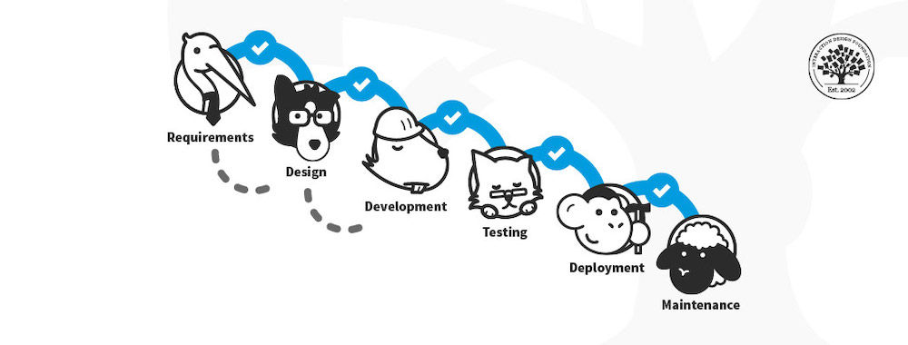
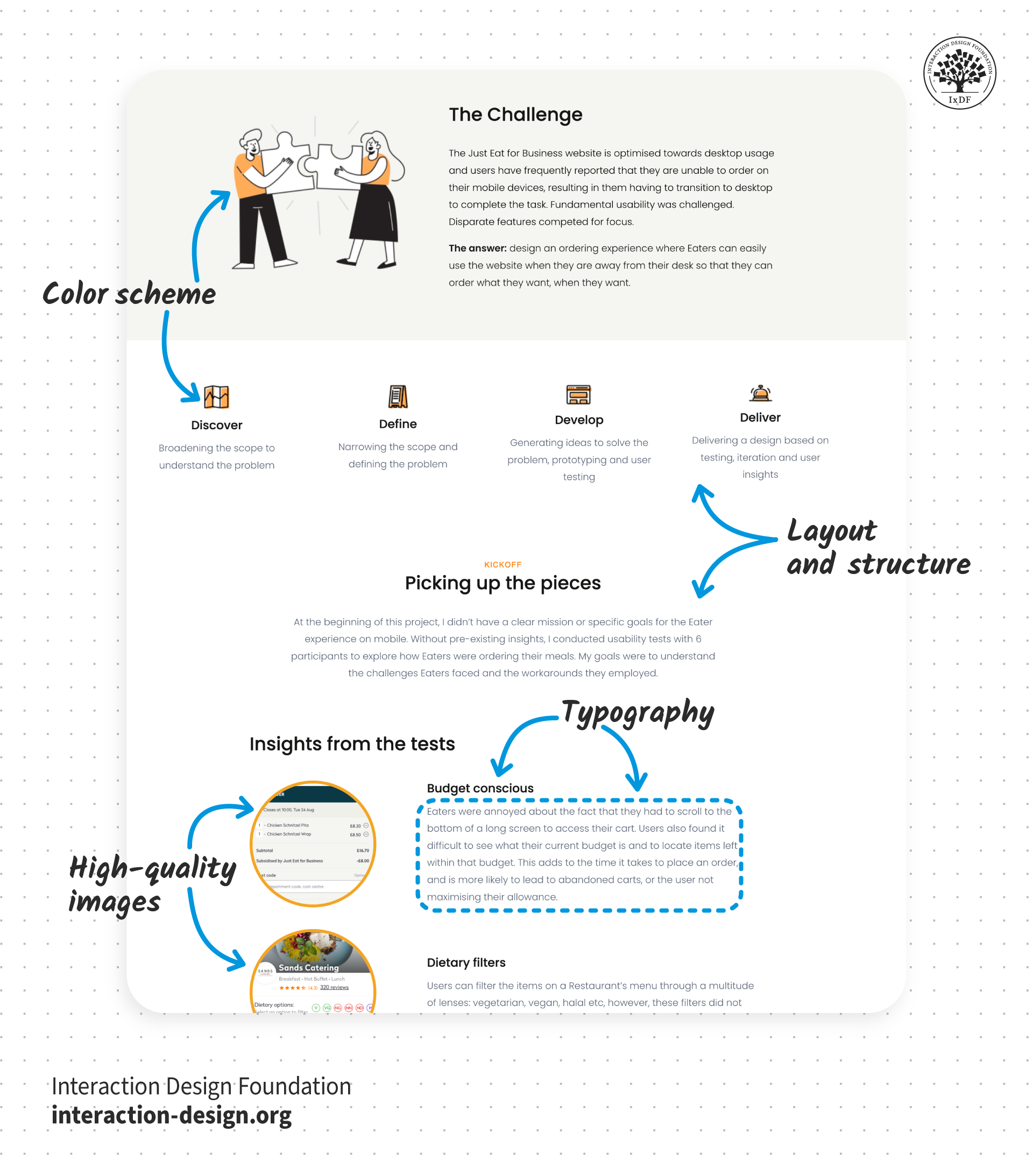
  1. Visual hierarchy and layout: Use visual hierarchy to guide recruiters through the story of your work. Take them on a journey—your design story—and help them find what they’re looking for. Also, use grids to keep your content organized and clean.

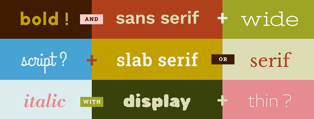
  1. Typography: Don't underestimate the power of fonts! Choose fonts that are not just aesthetically pleasing; they should speak to your design personality and professionalism. Clear, readable fonts act as your narrator; use them to communicate who you are as a designer to hiring managers. They are the voice that tells your design story. For body text, stick to user-friendly fonts, and be more creative (within reason) for titles.

  1. Color scheme: Keep in mind that colors evoke emotions and thus, have a significant impact on how your work is perceived. Think about the story you want to tell and choose your colors accordingly. Define the color palette and stick to it for the whole portfolio, this will ensure a cohesive and professional look.

  1. High-quality images: Be intentional about the images you choose. Think of them as snapshots of your design story. Each image should have a clear purpose and tell a story, whether it showcases your design process, the final product or a glimpse into your personality. Ensure all images are high-quality, well-lit and cropped to emphasize the key elements.

  1. Your logo and branding: Although logos are not mandatory for portfolios, if you’d like to design one, make sure that it represents you and your brand appropriately. Then feature it in your portfolio to build your identity as a designer.

  1. Responsiveness: Ensure your portfolio looks and functions flawlessly on any device, adapting to different screen sizes. Just like a great book can be enjoyed anywhere, your portfolio should provide a seamless user experience for recruiters, no matter how they choose to view it.

Remember, visual design isn’t just decoration; it’s the language that tells your professional design story. Use visual elements with the purpose to support your narrative, stand out from the crowd—for the right reasons—and captivate potential employers.

Illustration showing the visualisation of a case study, which includes the layout, color scheme, typography and high-quality images.

© Interaction Design Foundation, CC BY-SA 4.0

The Take Away

Don’t just make your portfolio aesthetically beautiful, use visual elements to tell your design story. Every visual element in your portfolio, from font choice to color palette, is a storytelling tool that can help you land your next interview.

Start by choosing fonts that support visual hierarchy, represent your personality and are easy to read. Next, select a color palette that reflects your design style and considers emotional impact. Add high-quality images that have a purpose and convey a specific message that supports your narrative. Also, make sure that hiring managers will have a seamless experience when reviewing your portfolio—no matter the device they use.

Overall, let your visuals be the voice of your design journey and use them strategically to support your professional narrative.

References and Where to Learn More

Want to create a portfolio that gets you hired? Take our course, Build a Standout UX/UI Portfolio: Land Your Dream Job, and learn how to showcase your skills, tell compelling project stories, and impress employers.

Take our course, Visual Design: The Ultimate Guide, to learn the basics of visual design and level up your portfolio’s appearance.

Read the article, The Key Elements & Principles of Visual Design.

Watch our Master Class, The Tone Of Typography: A Visual Communication Guide.

Build a network that supports your career growth—join an IxDF Local Group.

Hero image: © Interaction Design Foundation, CC BY-SA 4.0

Get Weekly Design Insights

Join 315,927 designers who get useful UX / UI Design tips from our newsletter.
A valid email address is required.
516 shares

Open Access—Link to us!

We believe in Open Access and the democratization of knowledge. Unfortunately, world-class educational materials such as this page are normally hidden behind paywalls or in expensive textbooks.

If you want this to change, , link to us, or join us to help us democratize design knowledge!

Privacy Settings
By using this site, you accept our Cookie Policy and Terms of Use.

Share Knowledge, Get Respect!

Share on:

or copy link

Cite according to academic standards

Simply copy and paste the text below into your bibliographic reference list, onto your blog, or anywhere else. You can also just hyperlink to this article.

Tremosa, L. (2025, March 12). Design with Intent: Craft Your Portfolio with Visual Storytelling Tools. Interaction Design Foundation - IxDF.

New to UX Design? We're Giving You a Free eBook!

The Basics of User Experience Design

Download our free ebook “The Basics of User Experience Design” to learn about core concepts of UX design.

In 9 chapters, we'll cover: conducting user interviews, design thinking, interaction design, mobile UX design, usability, UX research, and many more!

A valid email address is required.
315,927 designers enjoy our newsletter—sure you don't want to receive it?