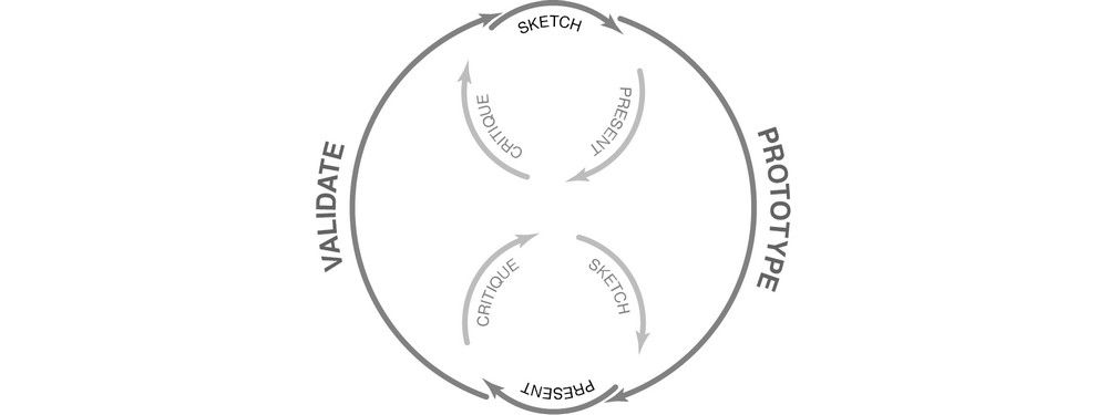
We conducted research with hundreds of people working on agile teams about their experiences in order to understand some of the biggest design problems they encounter. Designers who work in sprints of one or two weeks can be under pressure to deliver fast, skip research and cut corners, which can pretty quickly ruin a product’s user experience. One way to work in agile teams is to learn how to design small. We need to shift our mindset from "design everything at once" to "design the smallest possible thing."
One of the most challenging aspects of being a designer on an agile team is the fundamental idea of shipping code quickly and often. Designers working on a team doing one- or two-week sprints can feel tremendous pressure to cut corners, skip research and jump straight from idea to execution. Of course, we also realize that these are surefire ways to design the wrong thing, and badly.
In discussions about the difficulties of designing on agile teams, one of the most common complaints is that there is just no time! And that’s true in many cases. If designers want to work agilely and still design great, user-centered products, we need to stop designing faster and learn how to start designing less.
"We need to stop designing faster and learn how to start designing less." - Tweet This
We need to shift from a mindset where we design everything all at once and move toward a mindset of designing the smallest possible thing that can deliver value to our users. So, what does that look like?
Why We Design Small
Before we get into the how, let’s talk about why it’s so important to design, build and ship small things. It is not, as one might sometimes imagine, solely for the purpose of frustrating designers and researchers who sometimes like to have a holistic view of the things they are designing for often excellent reasons.
Finding the smallest thing we can to deliver value to a customer or user gives us quite a few benefits. For one, we get to deliver a potentially valuable thing to somebody who can start using it immediately instead of making them wait for dozens of other, unrelated features or changes. Frequently, very small changes or bug fixes can mean an enormous improvement in the user’s experience of a product.
Sometimes, of course, a change can have no impact whatsoever, or even a negative impact, and that’s a really good thing for us to find out as soon as possible too. By shipping smaller things more frequently, we have more chances to get feedback on our ideas and execution.
If something is going to be a massive failure, sometimes you can find out very early by shipping a small version of it. Imagine all the features you wouldn’t have created at all if you’d known how they would perform! Imagine all the value you could deliver to users if you weren’t busy building enormous versions of things that nobody wants. Delivering small features early gives you information that can help your team make a decision about whether the rest of the feature is worthwhile.
By breaking things down into shippable chunks, we can deliver value early and often and get feedback on our ideas before sinking tons of resources into them. That doesn’t sound so bad.
Unfortunately, it’s really hard to do well—and if you do it badly, it’s much worse than just designing everything up front.
Why It’s So Hard to Get Right
It doesn’t seem like it should be harder to design small things than it is to design large things, and yet many designers struggle with it for excellent reasons.
First, as designers, we’re often trained to think about products and experiences holistically. This is a good thing! We want to know the entire experience a user will have with a product. Indeed, we know that designing things in several pieces can provide a disjointed and inconsistent experience.
One designer we spoke with explained it perfectly. Her team was tasked with designing the information architecture for a very large site with many different categories of content. The engineers wanted to get started working on the code for searching the content, but she felt uncomfortable delivering the taxonomy for only one category, because she knew that—once they looked at other categories—they would find many more things that would require searching once she’d evaluated the other types of content in the system. After all, you don’t search for books using the same criteria that you would use to search for shoes or cars. She didn’t want an incomplete model that would just have to be changed later.
This leads to another reason it can be difficult to design on agile teams. Many of the people we spoke with reported that they very rarely got to iterate and improve a design once it was in the wild. When teams don’t return to incomplete or narrow versions of features, it can cause designers to shove as many details as possible into version 1.
And, of course, it can be very traumatic for designers to know that a feature is out in the world, imperfect and never to be improved. That is our work. We want it to be perfect. We want it to solve problems for people. We want to include it in our portfolios without blushing. These are all perfectly reasonable reactions, and they make it much harder to compromise and agree to design a small version of something when we are convinced that something bigger would be better.
What Designing Small Means
Just because something is difficult to get right doesn’t mean it necessarily has to produce a worse outcome. It may just take a bit more work to do well. Despite the well-founded complaints of many of the designers we spoke with, designing smaller things doesn’t have to mean designing worse things.
In fact, many of the people we spoke with found tremendous value in delivering value in smaller chunks, provided they remembered a few key things.
Small Isn’t Bad
© Daniel Skrok and Interaction Design Foundation, CC BY-SA 3.0
Often we refer to the first version of something that comes out as an MVP or Minimum Viable Product. Unfortunately, people often miss the very important “viable” part of that term. When you create the very first version of a new feature or product, it may be small, but it also has to be viable. It shouldn’t be buggy or impossible to use or otherwise bad.
Remember, we build something small and get it in front of users in order to learn something. That’s the whole point of producing something that people can start using. All we learn when we ship a bad or buggy or unusable product is that people don’t like things that are bad! Then, we have to figure out whether people aren’t using our new feature because it’s not the right thing or it’s the perfect thing but so poorly executed that nobody can stand using it.
Small Isn’t an Unrelated Mishmash of Features
Another difficult thing about designing, building and shipping in small increments is that we can lean toward shipping a lot of little features that get prioritized because they can be built quickly.
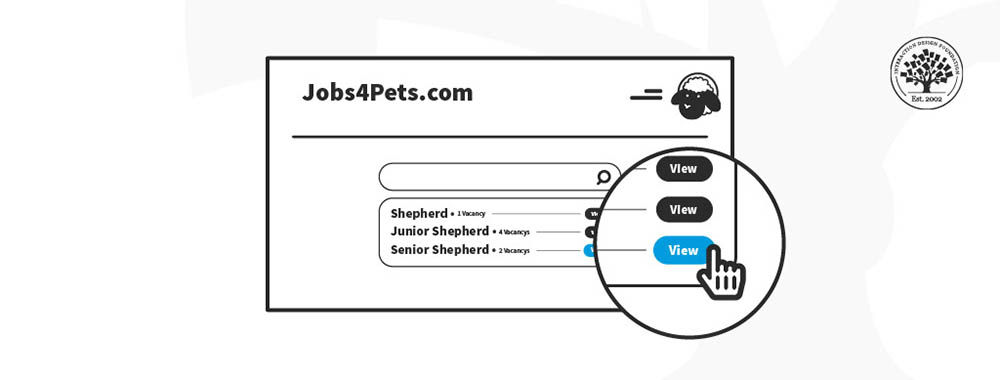
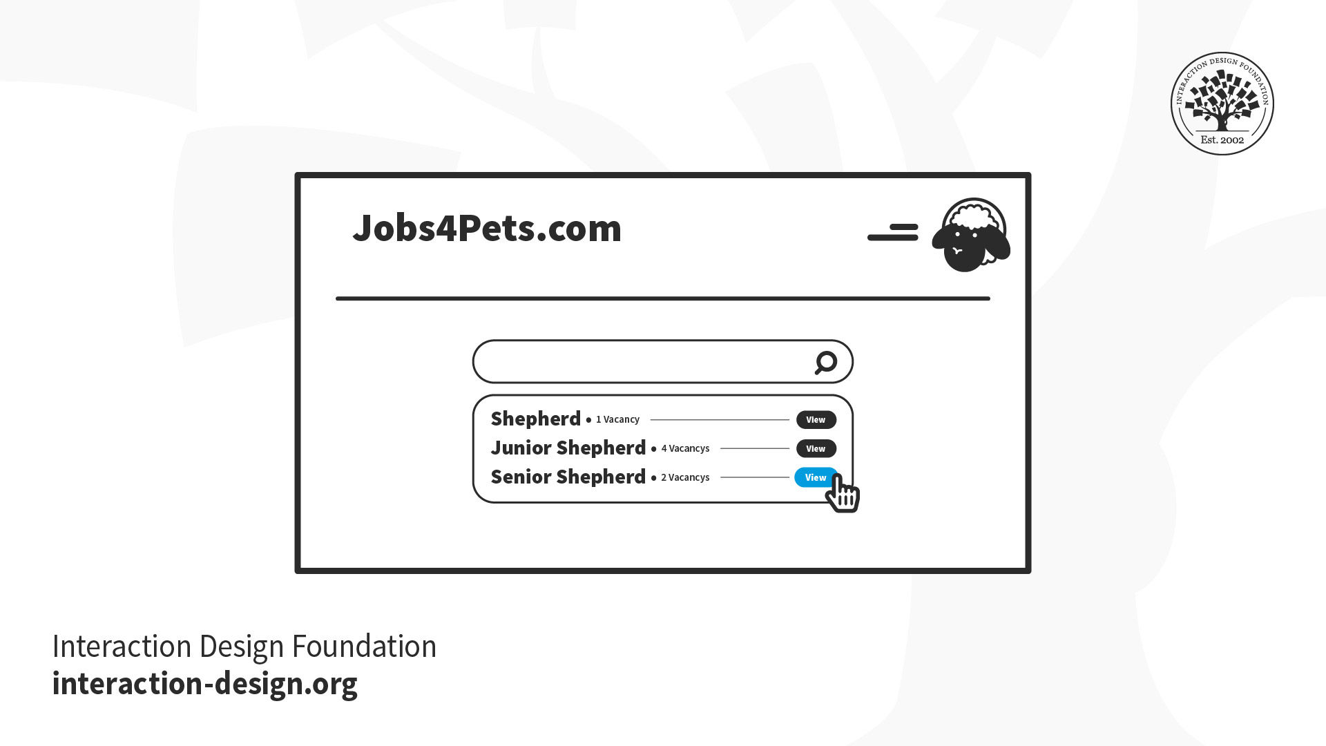
Imagine you’re building an interface that lets people search and apply for jobs. There are many things to include. For example, you need job postings with descriptions of the jobs that users get from potential employers. You need an interface that asks job seekers to submit their information. You need a system that lets potential employers review the applications. You’ll probably want some sort of profile or account pages that let both sides of the process store their information so that they don’t have to re-enter everything every time they post or apply for a job.
Each of these larger systems has multiple smaller features inside it. For example, the application process might have a feature that lets the job seeker pause an application and come back to finish it later. Or the posting feature might let employers repost a job description if they need to hire another person.
Now, as a designer, you might think you need to release all of those things to make the job board useful. But that’s really not true. What you do have to do, though, is make sure that you design and build things in the right order. You wouldn’t design the ability to repost a job before you designed the interface that let people post a job in the first place, right? And you wouldn’t want to design the interface that lets people apply for a job before you figured out a way to let them look at different jobs they might want.
Every time you design and release something, it should be something useful, and it should build on the existing interface in a rational way.
Small Is Useful
Most importantly, whatever you release should be useful to the expected user. If you have a very large user base, it might not immediately be useful to absolutely everybody, but it should be something that can be used by a specific segment of your customers, at least enough that you can get feedback on it and make it better in the next iteration.
Can you think of the smallest possible thing you could build for a job posting site that would make it useful? What is the least amount of design work you could do to deliver something that could be tested with users?
How Do You Design Small?
There are a multitude of techniques for designing small things that are still useful and usable and that can be improved and grown through iteration. For example, you can:
Understand the Goal
The most important part of designing small is understanding the core goal of the feature or product you’re creating. If your goal is too big or poorly understood, it’s very easy to just continue adding feature after feature because “somebody might want it.”
For example, imagine you’re designing the job board mentioned earlier. If it’s a general job board for any sort of job and any sort of user, you’re going to design it very differently than if it’s a job board for a highly specific industry in a particular location. Aiming too broadly will affect everything from your search options to the number of jobs you expect to show, to the requirements for the application form.
By zeroing in on the specific value you want to deliver to a well-defined set of users, you will already be on your way to designing a small, focused feature or product that will ultimately serve you much better than a large feature designed for “everybody” and useful for nobody.
Experiment with One
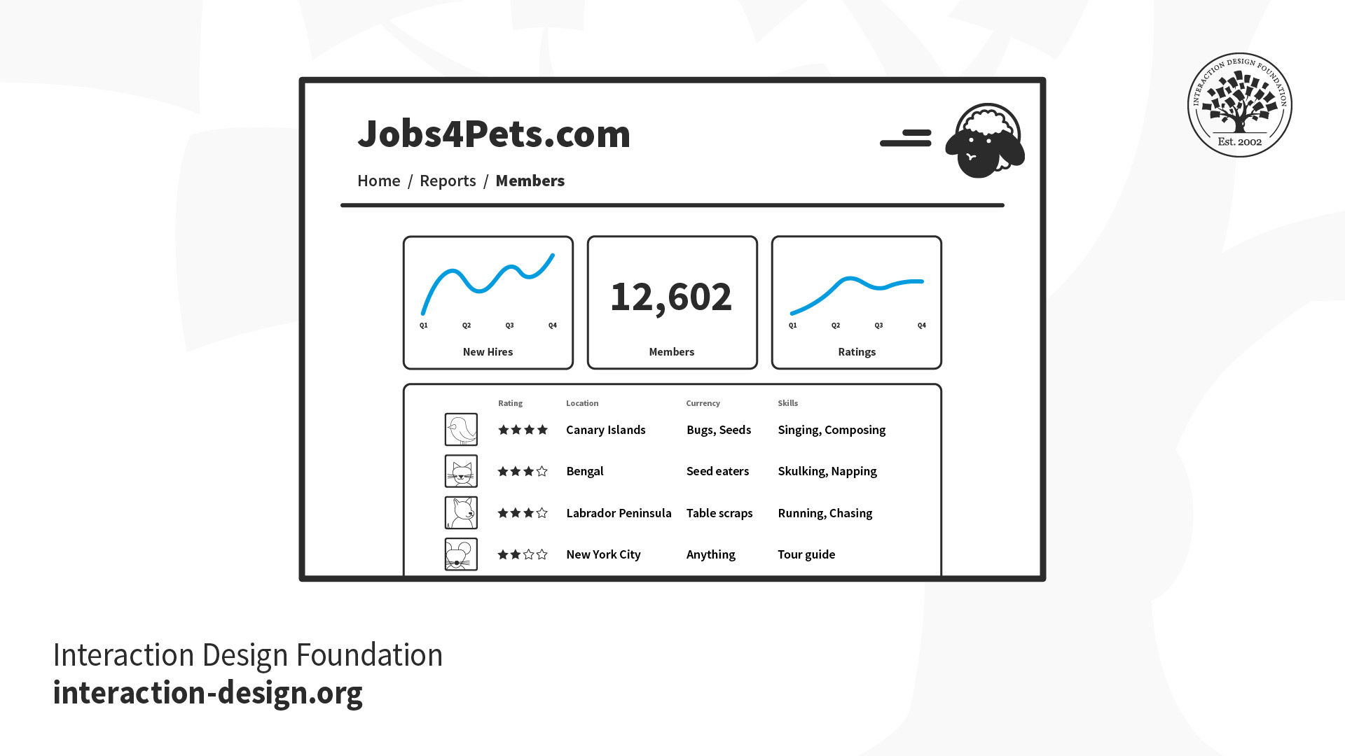
Let’s say you’re designing a reporting dashboard for your job searching site. It can be tempting to ideate broadly and try to understand all the possible different reports that employers and job seekers will want and then design them all.
© Daniel Skrok and Interaction Design Foundation, CC BY-SA 3.0
While it’s perfectly reasonable to spend a bit of time to understand which reports may be most useful, consider only fully designing and building one at a time, preferably prioritized by which you think will deliver the most value based on your research. Why would you make your users wait to see the most valuable report just because you haven’t finished designing the least valuable one? What if you’re wrong and people don’t need reports at all? By designing and releasing one report at a time, you’ll learn more quickly while hopefully delivering value to your users on a regular basis. 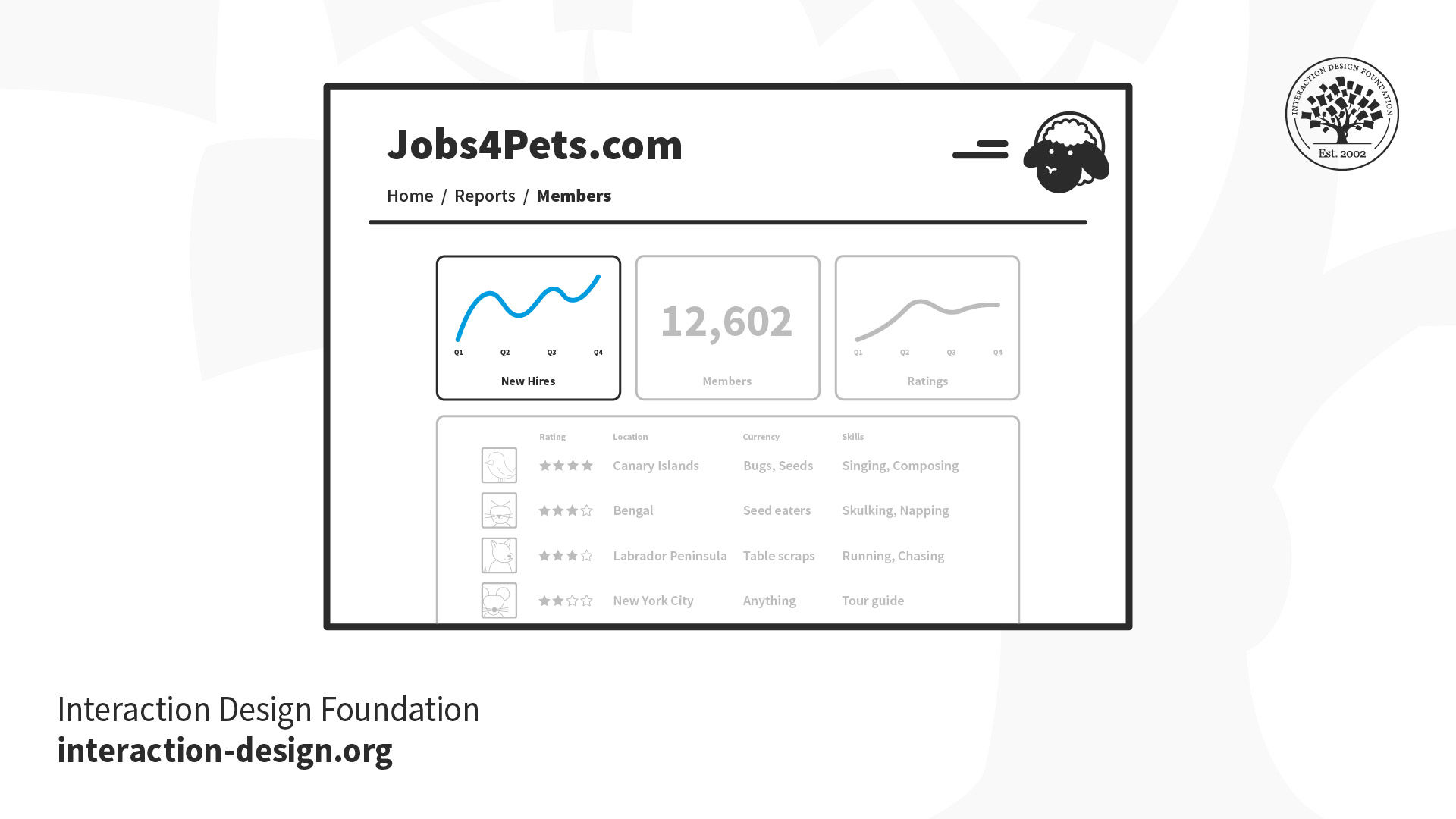
© Daniel Skrok and Interaction Design Foundation, CC BY-SA 3.0
This obviously doesn’t just apply to reports. If you have multiple similar things that you’re planning on releasing, look at whether it’s possible to start with one and then add more later.
Start without Code
Often when we are asked to design a new feature or product, there are many different ways we could design it. We can spend a ridiculous amount of time in meetings debating the best way to implement something.
Ideally, we’d get to build many different versions of something and just see which ones people like better, but this leads us to another problem: code is expensive. Prototypes and experiments, on the other hand, can be quite cheap.
Instead of jumping straight to designing fully realized features that will immediately be built by engineers, try designing experiments to learn the best way to build something. Try a concierge test or a Wizard of Oz experiment. Build a few interactive prototypes to test with users.
There is no rule that designers can only design pixel-perfect interfaces. We can also be experiment designers.
Don’t Deliver to Everybody at Once
One thing that makes designers hesitate about shipping an imperfect or unfinished design to people is not wanting to disappoint their users. After all, launching something that’s half-baked can end up reflecting very badly on the product and the company.
On the other hand, offering something that’s a work in progress to a small group of users who may have opted into early releases is an entirely different story. Testing out a new design on a few dozen or even a few hundred users can offer tremendous value to the team in the form of crucial insights and potential problems without risking disappointment for the whole user base.
Stop thinking that you have to launch every new feature with a press release and a marketing push. You’re still delivering value to users, even if you’re only delivering it to a few dozen beta testers or some internal folks who have volunteered to try things out. You’ll find that you’re a lot less concerned about failure if it’s done on a smaller stage, and you’re a lot less likely to fail if you’ve tested out your designs on smaller audiences first.
Accept Some Imperfection
With all that said, it’s important for teams to get over any fears of imperfection we may have. The truth is, none of our products will ever be perfect; moreover, in many cases, we don’t even know what perfect is. Obviously, we should not be shipping software that doesn’t work or is buggy or insecure to people. But we also don’t need to spend days or weeks obsessing over every pixel and every bit of polish if we’re not even sure that the feature is useful.
Think of all the hours spent grinding out gorgeous designs for products that nobody ever uses. Think of how much more useful it would have been to spend those hours testing ideas and finding a product that people actually want to use before putting the work into making everything perfect.
Commit to Iterating
Of course, if you’re going to accept imperfection, your team had better also be willing to commit to iteration. When we asked designers to tell us their biggest complaints about working on agile teams, many responded that they hated that their teams never iterated. They worked really hard to ship things fast and then never went back to refactor or improve the features. Sometimes they didn’t even measure the results of the features.
This is explicitly anti-Agile. Agility requires iteration. It requires improvement and refactoring. If you never go back to improve (or kill) your imperfect features, then nobody will feel safe releasing something they think might be imperfect. We have to commit to learning from our users and constantly improving features and products that are already in the wild, not just shipping endless features into the great abyss of user indifference.
The Take Away
One of the reasons agile teams can struggle with design and research is that it can be a challenge to design small, discrete things that still fit into a greater product vision and don’t sacrifice quality. If designers want to get more agile, they should learn how to make small things, get feedback and embrace experimentation, iteration and refactoring.
References and Where to Learn More
Here’s a primer on Concierge and Wizard of Oz tests from Kromatic:
Concierge vs. Wizard of Oz Prototyping
Read the Agile Manifesto.
Laura Klein explains why there’s nothing wrong with aiming for "good enough."
Image
© Interaction Design Foundation, CC BY-SA 3.0
