Google recently update their search algorithm to focus on user experience for mobile users. This is a significant step forward, though to date – there’s no equivalent focus on the user experience for desktop users (and perhaps there should be). With this change in mind, what are the key lessons for UX designers? Not just for now but also for the future? We’ve come up with five ideas that might help you stay ahead of the algorithm curve.
Break The UX vs. Content Divide
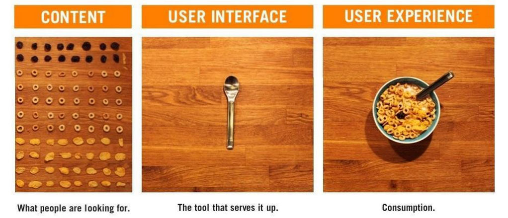
At a conference in Sydney, Google reassured website owners that content would always take priority over the User Experience. Thus, a poor UX on mobile can still be beaten out by high quality content. We’d argue that content needs to be seen as part of the user experience and not something that runs in parallel.
Content should be designed. It needs to be informative, emotional (in the sense of inspiring emotion in the reader), it needs to take the right tone, it should be in the language of the user, etc.
That means an investment not just in content development but an investment in user research to find out what content is most useful and produces business results. That sounds like user experience work to us.

Author/Copyright holder: Centerline Digital. Copyright terms and licence: All rights reserved Img source
Loading Time Counts
Responsive design may be ultra-convenient for dealing with multiple screen sizes but there’s a lot of potential slowdown when using a responsive site too. The experience of many responsive sites leads us to conclude that the desktop/laptop UX is suffering with responsive designs too.
That means a careful examination of load times and how they affect your users. How many people drop out of your site for every additional 0.X of a second of load time? There’s a good reason that most internet access from mobile is done via apps rather than the browser – load times suck.
You may also want to examine the possibilities of splitting your site and having a dedicated mobile experience. Yes, we know that there’s a lot of work to be done to manage multiple variants of a single website… we also think that it might be worth the investment. The alternative is increasingly going to mean that you need to invest in app to provide your content on mobile, and that can be expensive and risky – there are a lot of apps out there, how will you get yours noticed?

Author/Copyright holder: Vicki DeLoach. Copyright terms and licence: CC BY-NC-ND 2.0
SEO and UX Need The Same Outcomes
Alongside content, SEO work often falls outside of the UX remit. With a direct focus on the UX of mobile, this can’t be allowed to continue. We think that in the long run, Google is also going to end up examining the UX of desktop offerings. A failure to deliver the right user experience is going to offset a lot of the hard work done by SEO teams.
Why invest in keyword optimization, linking strategies, etc. if your content is only going to get buried in search engine rankings for a lousy overall user experience. Sure, you can offset some of that damage by having lots of great content but wouldn’t it be better to maximize your investment in SEO and content?
Even if you eventually decide to pursue the mobile app (rather than mobile website) strategy; Google has started to rank mobile apps in mobile search results too. You’re going to need to deliver the right UX and SEO results to get noticed.
UX for the Web is Going to Need Some Definition
Google, for very good reasons (e.g. to prevent gaming the system), does not publish its algorithms in detail. That means for a short period there’s going to be a lot of trial and error to try and produce the best results in search terms using UX. Eventually, this is going to become better understood.
There is going to have to be a set of vague standards for what defines UX from Google’s point of view rather than from the user’s or business’s point of view. UX just got more complicated, you now have to serve three sets of clients, if you develop for the web, rather than two.
We’d expect to see most of this analysis coming from the SEO community at the moment. That’s a community which has been working out the formula of Google rankings for a long time now. Reputable sites like Moz.com are worth keeping an eye on and as rules begin to emerge, you’ll need to start testing them with your users and monitoring the results.
Prepare for some heated debates as users, businesses and Google clash to some extent. We think that the UX part of the Google algorithm is likely to evolve over time too – so you’ll need to keep tracking developments in the future.

Author/Copyright holder: x6e38. Copyright terms and licence: CC BY 2.0
UX is Important and Investment in UX is Going to Rise
The biggest upside for UX folks from this development is that the biggest name on the internet, (well at least in most Western nations), has just drawn a great big line in the sand and told the world how important the user experience is.
That’s going to drive investment in the profession like never before. Expect to see more and more opportunities for UX designers and UX pros. There is a cloud to go with this silver lining, many of these first time advertisers are not going to really understand what UX is or means for their businesses… so there’s a process of education to be undertaken too.
Summary
Google’s decision to focus on user experience is a good thing. We’d like to see it evolve beyond the mobile experience in the long run though. While mobile is undeniably important the desktop is where much of the world’s business continues to take place.
There has to be a new focus on content, load times, and SEO. We expect to see some more concrete definitions of what Google considers to be good UX arriving soon. We also expect to see the demand for UX pros to rise on the back of this update.
Header Image: Author/Copyright holder: European Parliament. Copyright terms and licence: CC BY-NC-ND 2.0


