Let’s take a look at a subject that might appear tricky for designers to influence. However much control we have over our designs, we still have the power to reach beyond. Guiding our users toward a better UX isn’t only simpler than you might think; it will also pay dividends to both you and them and avert potential catastrophes.
Habitual Choice vs. Decision Making
Author/Copyright holder: Unknown. Copyright terms and licence: Unknown.
The American writer Edgar Rice Burroughs said that people are creatures of habit. And he was right. Forty to forty-five percent of our daily decisions are actually not decisions at all. They are habits.
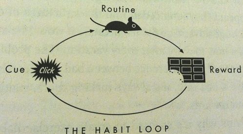
The author of The Power of Habit, Charles Duhigg (1), explains habit as a three-component process. First, we have a cue, a trigger for the behavior to start unfolding; then, we develop a routine, and, lastly, we expect a reward.
John Watson, an early behaviorist, described habits as patterns in behavior which form through the repeated association of stimulus and response pairs. A better-known term might be Classical Conditioning by B. F. Skinner (2). Watson proposed that this process could explain all aspects of human psychology. He said that everything from speech to emotional responses were patterns of stimulus and response. With that, he denied the existence of the mind and consciousness (3).
The Russian physiologist Ivan Pavlov showed examples of Classical Conditioning when conducting his famous research with dogs (4), but Watson wanted to know if the same applied to humans. He did an experiment, which is now known as the Little Albert experiment (3). With the experiment, he showed that little Albert, an infant, seemed to generalize his response and develop a phobia, which confirmed that humans can also be subject to classical conditioning (5).
Decades later, Duhigg (1) argued that the cue and reward are the areas we should be focusing upon when we are talking about habit formation. Habits, in contrast with decisions, are in their essence unconscious thoughts. When the behavior starts, the conscious decision originates from the prefrontal cortex, which is the area right behind our forehead. When this new behavior transforms into a habit, it shifts to a more middle region of our brain called the basal ganglia. It becomes an unconscious thought.
This explains why breaking habits is so hard. Once the conscious thought transforms into an unconscious one, we must identify the cue and reward to start changing the behavior. It must shift from one region in the brain to the other. This process of forming and changing a habit is specific to every individual. Researchers Lally et al. released a study report (6) on habits. They presented the results of their study, stating that it took 18 to 254 days for the participants to form an automatic reflex and that it took participants, on average, 66 days to get into a newly established habit.
The story of ever-changing Facebook design
Author/Copyright holder: Gustavo da Cunha Pimenta. Copyright terms and licence: CC BY-SA 2.0
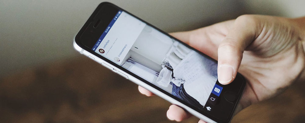
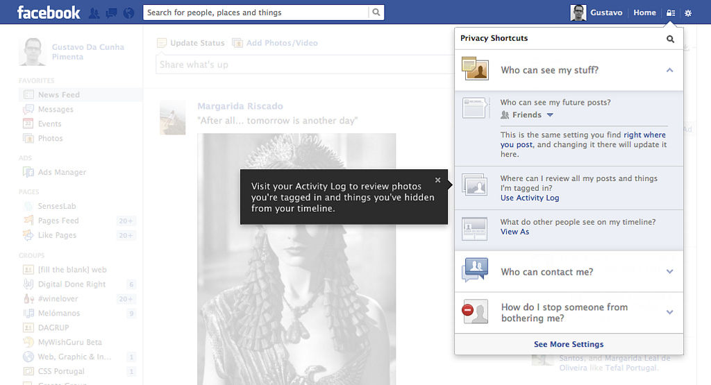
Do you remember a few years ago, when Facebook was in this never-ending design change phase? When you'd wake up and your Facebook had completely changed overnight? Do you remember the confusion and frustration? We all felt it — multiple times per year, in fact. No sooner had we learned and accepted a version, when another, completely different one, was forced on us. I remember people were saying things like, "well, it's free; they can do what they want," or, "if you don't like it, leave." Sure, both are true, but does that make it okay? I don't believe so. And by the looks of it, neither does Facebook. They've learned from their mistakes, and we now see fewer changes. Besides that, Facebook now makes a point of telling us what they want to publish and when they're going to test it.
The example of Facebook shows us the difference between good and bad user experience. Where there are ways to create a good experience, forcing your users to change, and change radically, is a big no-no.
But let's not focus on the bad. What we should be doing is focusing on the five things that can help change user habits. Making sure that we don't lose in the process is the other side of that golden equation.
The Five ways we can change users' habits without losing them

Author/Copyright holder: Dennis Skley. Copyright terms and licence: CC BY-ND 2.0
1. Communicate the change to users.
Don't surprise your users with big changes, especially if they cannot choose whether they want them or not. Notify them about future changes before you publish them.
Once you publish, you can use short, just-in-time tutorials, quests, or lead users by the hand, and explain new features.
Pinterest and Twitter had a great tactic when they undertook major redesigns. Both platforms clearly communicated the change to their users. Besides that, they gave them the choice of making a transition right away or later.
2. Test, test, test, and respond to the results.
Your users are not you. They might use your product in a different way than you intended. They might react to your product in unexpected ways. Be prepared and test. Then make changes. And test some more.
Many companies focus on shipping their products on time, because, as you know, time is money. What they don't realize is that testing can save them precious time in the end. They might use 10% more time in the beginning, but the end result will cost less in time and money because of it.
3. Make small steps when doing changes.
If you can, introduce changes in small chunks.
Skype just added a lot of emoticons to their chat. Even though this change was a soft one (who doesn't like new emoticons, after all?), they did it in stages — so much so that many users didn't even notice the change at first. Skype rolled out the change in three stages. First, they made the existing emoticons bigger. They did, however, leave the choice to use them in big form to the users. After that, they added a few more of the emoticons. Those weren't new, but they had been hidden before. In the end, they added the so-called Mojis.
4. New routines should have the same results as the old ones.
A new habit can be learned when the cue and reward stay the same. If you want to change users' habits, they first need to want the reward, believe that the habit can be changed, and then start changing their routine.
Many websites today use the registration and login process. It can be a cumbersome process, and redesign is sometimes welcoming. Place the login input fields in a prominent place, add a possibility to save credentials, and help people get into your website faster. That will help them form the habit of doing that more quickly.
5. Don't change just for the sake of change.
Do you have a product that works and users like it? Great! Do you want to change it? Great. Stop. Why? Before you make any changes, make sure that you're not changing something that doesn't need to be changed or something that users would hate to see be changed.
Around 1992, Microsoft introduced the Start button. They realized that Windows at that time was just too hard to use. After doing usability testing, they concluded that the system was faulty by design. The result of a change was one button that they called the “Start button”. People got used to it. With the label, the button was intuitive and easy to use. It held for years as an expected feature, to a point where, when Microsoft got rid of the button in Windows 8, user outcry resulted. The reaction of their users was so severe that Microsoft quickly reinstated the Start button in Windows 8.1.
Don't fix or change what isn't broken. Microsoft learned that the hard way.
The Take Away
Yes, people are creatures of habit, but that doesn't mean those habits can't be changed. It takes time, and, from the perspective of user experience design, some thought.
As designers, we need to identify users' cues and offer rewards that will make them want to form routines. This way, we can help users form habits, and help them use our systems or products without the constant need for them to make conscious decisions.
Users don’t like surprises. Remember the introduction of Facebook’s Timeline a few years ago? Facebook communicated the change well and left a long enough “runway” for users to make the most comfortable flight from the old format.
Testing your proposed changes on users is crucial, as is responding to the results. Users are all different; their idiosyncrasies are unique, even if we seem to share reality. As a designer, you can’t second-guess users’ reactions. Treat like a curving corridor and take little steps with your changes.
Always remember to keep the same results throughout the change plugged into the new routine. Users need to enjoy the rewards they had under “the old way”. Also, “the old way” may have got a lot of things right, especially if it offered such convenience and ease of use that features (like the ‘Start’ button) become expected standards, inseparable from a good UX. Lastly, change only when it is needed; that is, only when it will bring added value to your users. Don’t treat it like moving furniture around in a room just because you think it’s time for a change.
Steve Krug wrote a book entitled Don't make me think (7). I couldn't agree more with him. Let's not make people stop and think when they can effortlessly use our product.
Where to Learn More:
Fox, J. (2012). “Habits: Why We Do What We Do”. Harvard Business Review.
Learning and Teaching Foreign Languages (2014). “Habit Formation”.
McLeod, S. (2014). “Classical Conditioning”. Simply Psychology.
McLeod, S. ( 2013). “Pavlov’s Dogs.” Simply Psychology.
(Various contributors) (2015). “Little Albert experiement”. Wikipedia.
Lally, P., et. Al. (2009). “How are habits formed: Modelling habit formation in the real world”.European Journal of Social Psychology.
Krug, S. (2014). “Advanced Common Sense”. Advanced Common Sense Web Usability Consulting.
References
Hero Image: Author/Copyright holder: Glenn Brown. Copyright terms and licence: CC BY-NC 2.0

