Your constantly-updated definition of Emotional Response and
collection of videos and articles. Be a conversation starter: Share this page and inspire others!
193shares
What is Emotional Response?
Emotional response in user experience design refers to feelings, reactions and experiences users have when they interact with a product or service. Designers create interfaces and interactions that evoke specific emotions to make more engaging and meaningful user experiences that consider users’ emotional needs and desires.
Author and Human-Computer Interaction Expert, Professor Alan Dix explains why emotions matter in design:
ShowHide
video transcript
Transcript loading…
Why are Users Emotionally Responsive?
In the realm of user experience (UX) design and user interface (UI) design, emotional response plays a pivotal role. It contributes significantly to the overall user experience. Logic and action aren’t the only factors that drive human users and customers of products and services. The feelings that users respond with to a digital product—such as a website or mobile app—impact several key dimensions. Emotional reactions, and responses, can be profound in such areas as user satisfaction and customer loyalty, and extend to brand perception.
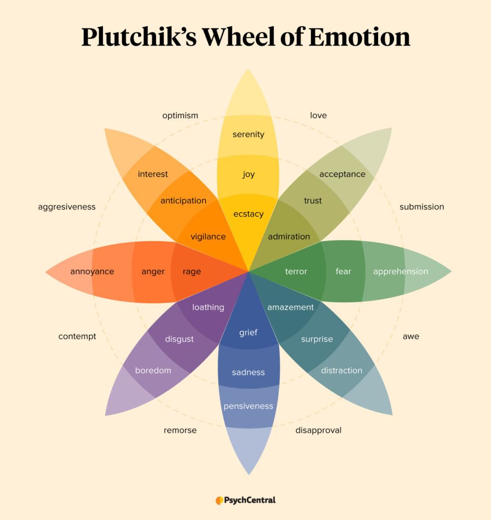
Plutchik’s Wheel of Emotion captures the range and complexity of human emotions.
There are many feelings on the wheel of emotions. A positive emotional response can lead to increased product stickiness, higher tolerance for minor usability issues, and improved product adoption. On the other hand, a negative emotional response can drive users away, and result in lost opportunities and lower revenue. If the negative emotions that users experience are bad enough—and enough users experience such negative responses—a brand that doesn’t take corrective action immediately can even suffer marketplace failure.
Feelings are extremely important, although they don’t account for everything. Functionality and usability are also essential in a final product. Accessibility is also a massive consideration for designers to account for in their design work. However, it’s equally critical to design for emotion to create positive and memorable experiences. Users’ emotions, intuition and memories greatly influence their decision-making process throughout the various touchpoints where they encounter brands. Product designers and service designers need to understand how the choices users make to engage with brands tend to hinge on their emotional responses to design solutions.
What are the Challenges of Designing for Emotions?
By nature, it’s challenging to know, and thus, design for how users will respond emotionally to a product. The main challenge is to understand and predict the wide range of emotional responses users may have. Feelings are complex. They can vary greatly from person to person. People can have many different feelings about designs, for instance. These notions can depend on idiosyncrasies and matters that these users might not be able to explain themselves—such as gut reactions. That makes it difficult to create a one-size-fits-all emotional design. Also, cultural, social and other personal factors can influence emotions, which further complicates the design process.
Professor Alan Dix explains the need to consider culture in design:
ShowHide
video transcript
Transcript loading…
Video copyright info
Copyright holder: Tommi Vainikainen _ Appearance time: 2:56 - 3:03 Copyright license and terms: Public domain, via Wikimedia Commons
Copyright holder: Maik Meid _ Appearance time: 2:56 - 3:03 Copyright license and terms: CC BY 2.0, via Wikimedia Commons _ Link: https://commons.wikimedia.org/wiki/File:Norge_93.jpg
Copyright holder: Paju _ Appearance time: 2:56 - 3:03 Copyright license and terms: CC BY-SA 3.0, via Wikimedia Commons _ Link: https://commons.wikimedia.org/wiki/File:Kaivokselan_kaivokset_kyltti.jpg
Copyright holder: Tiia Monto _ Appearance time: 2:56 - 3:03 Copyright license and terms: CC BY-SA 3.0, via Wikimedia Commons _ Link: https://commons.wikimedia.org/wiki/File:Turku_-_harbour_sign.jpg
Another challenge for designers is how to balance emotional appeal with functionality and usability. While a visually appealing design might evoke positive emotions, it will matter little if it compromises the functionality or usability of the product.
Yet another challenge is to identify the specific emotions that are most relevant to a product or service. Different products and industries may prompt different emotional responses. Some will be clearer than others. For example, a meditation app may aim to evoke feelings of calmness and relaxation. Meanwhile, a fitness app will be more likely to aim for feelings of motivation and empowerment for its users. It’s critical to understand the target audience and their emotional needs, to design for the desired emotional responses.
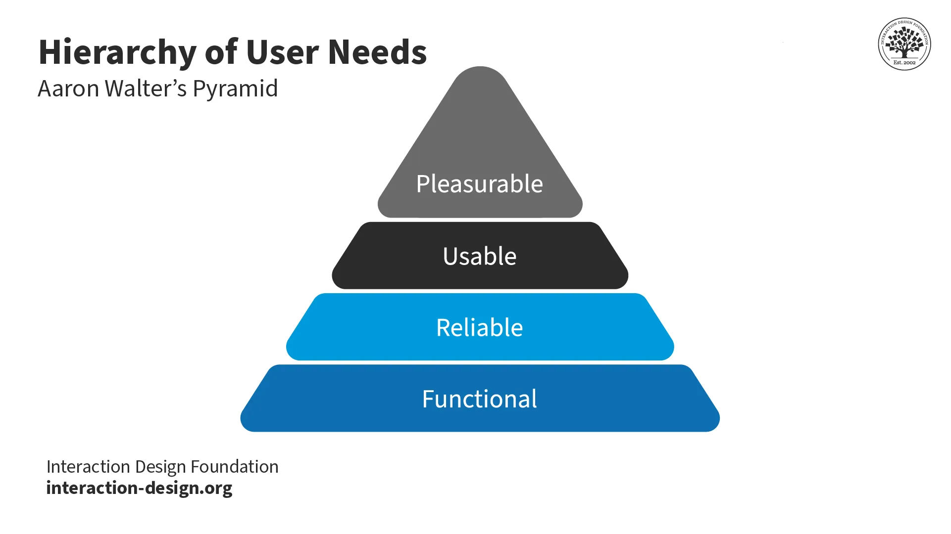
Aarron Walter, author of Designing for Emotion, represents the pyramid of needs users expect.
Hand in hand with emotional responses is the need to design for context. Consider the emotional situations users can find themselves in when they use—for example—a driving app or GPS. Driving, a potentially stressful and even hazardous activity, tends to call for features that keep users informed well in advance and calm. A digital application needs to prove its designers have empathy with drivers at the level that it accounts for their emotional responses. It also must stay at least a step ahead of the many uncertainties and frustrations that come with road use.
CEO of Experience Dynamics, Frank Spillers explains the value of when designers consider the context of use:
ShowHide
video transcript
Transcript loading…
Examples of Emotional Responses in UX Design
Beyond the personal quirks, preferences and peeves of individuals, the types of emotional responses users are likely to have can vary depending on the context and the specific product or service. They also show how emotional design can significantly impact perception and overall experience with a product or service.
These are typical emotional responses that users experience:
Joy and delight: A well-designed mobile game that brings joy and excitement through engaging gameplay, vibrant visuals and rewarding achievements.
Trust and confidence: A banking app that instills trust and confidence. It does this through secure login processes, clear and transparent communication of financial information, and reliable customer support.
Motivation and empowerment: A fitness app that motivates and empowers users to achieve their health and fitness goals. It does so through personalized workout plans, progress tracking and positive reinforcement.
Frustration and disappointment: A poorly designed e-commerce website that frustrates users with confusing navigation, slow loading times and unclear product descriptions. These lead to a disappointing shopping experience and abandoned carts.
Apple is a notable example of a brand that has incorporated emotional design into their products. From the sleek look and feel of their devices to the intuitive user interfaces, Apple creates an enjoyable experience. Also, they form a strong emotional connection with their customers, many of whom are loyal to the Apple brand. Apple’s products have become synonymous with innovation, quality and reliability. These are attributes that have helped Apple build a loyal and devoted following.
Apple has a strong brand presence to cater to how it appeals to users. Apple’s Mental Wellbeing feature lets users journal their emotions and moods, and facilitates mental health self-assessments.
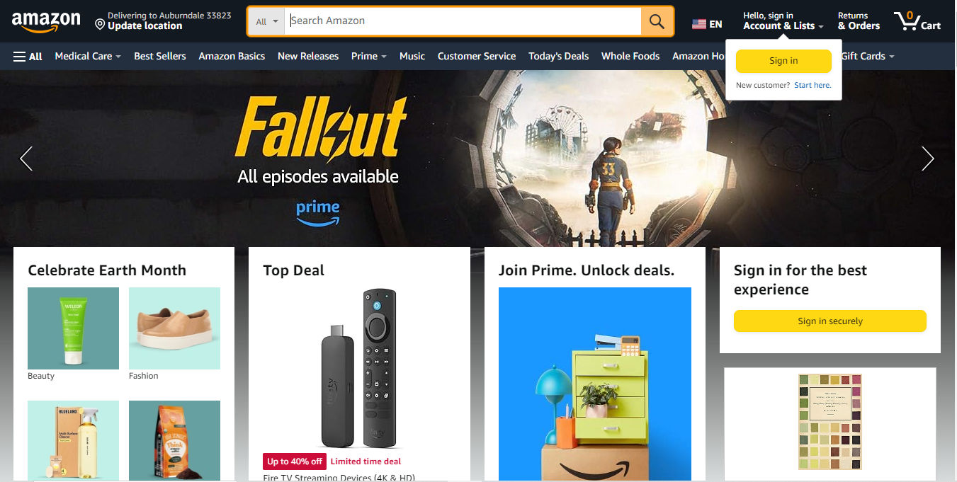
Amazon is another prominent example of a brand that understands the importance of emotional design. With features such as one-click checkout and personalized product recommendations, Amazon creates an effortless shopping experience. Meanwhile, Amazon also provides their customers with a sense of convenience and satisfaction. Additionally, they offer excellent customer support, which helps build trust and confidence in the brand.
Amazon appeals to a wide range of customers with its signature features such as one-click checkout and personalized sign-in experience.
There are various strategies and techniques to create designs that resonate with users on an emotional level.
Conduct User Research
UX research divides between quantitative research and qualitative research. UX research activities include interviews, surveys and usability testing. From solid research, designers can gain insights into users' emotional needs, preferences and pain points. Designers’ findings help them understand how users currently experience and respond emotionally to the product or service. From there, they can make informed design decisions to construct good user experiences in their UX design work.
UX Strategist and Consultant, William Hudson explains user research in this video:
ShowHide
video transcript
Transcript loading…
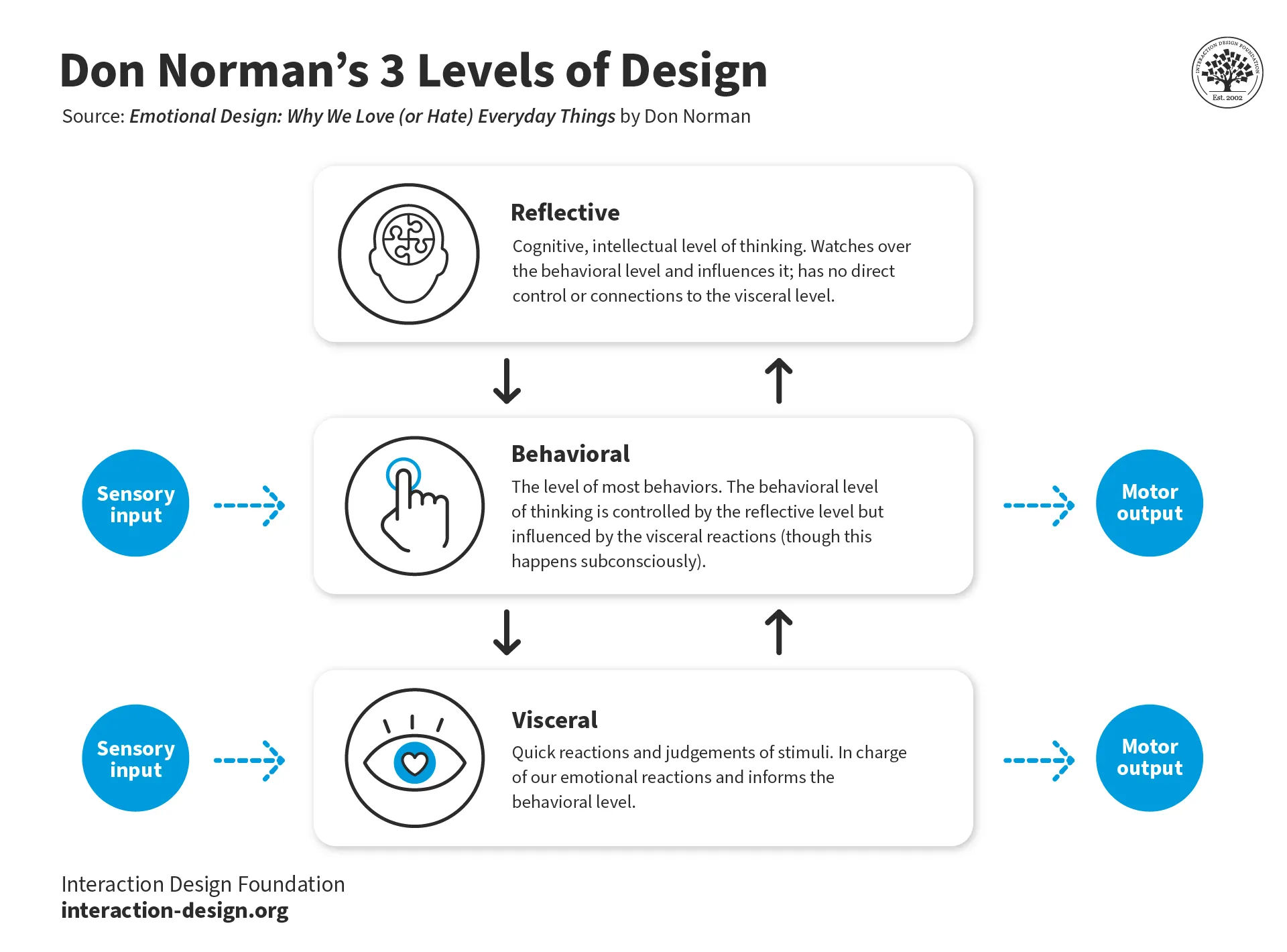
Apply the Principles of Emotional Design
Don Norman—the father of UX design—proposes these principles in his book Emotional Design: Why We Love (or Hate) Everyday Things. Norman suggests that emotional design can fit into three levels: visceral, behavioral and reflective.
Visceral level: This is about designing for immediate, instinctual emotional responses. It focuses on aesthetics, visual appeal and sensory elements that evoke emotional reactions in users. For example, product designers can use vibrant colors, engaging animations and pleasing visual layouts to create a positive visceral response.
Behavioral level: This is about designing for the emotional experience during interaction. When designers work at this level, they consider the users’ goals, motivations and the overall usability of the product. Designers aim to create seamless and enjoyable experiences that align with their users’ emotional needs and expectations.
Reflective level: This is about designing for the emotional impact and meaning that a product or service has on users after the interaction. It considers the users’ reflection, satisfaction and long-term emotional connection with the product. Designers aim to create a lasting positive impression and emotional attachment.
Designers fine-tine products or services to individual users' preferences and behaviors. They might customize the content, layout or functionality of a product based on the user’s past behavior, preferences or demographic information. Designers can also use storytelling to evoke emotional responses. As they weave a compelling narrative into the design, they can engage users on a deeper emotional level and create a more memorable user experience.
Frank Spillers explains the value of storytelling in this video:
ShowHide
video transcript
Transcript loading…
Tips for How to Design for Positive Emotional Responses
Here are tips to help designers create experiences that evoke the desired emotional responses and leave a lasting impression on users:
Understand the Users
Designers should conduct thorough user research to understand the target audience and their emotional needs. It’s also vital to understand the specific emotions that are most relevant to the product or service throughout the user flow or customer journey as individuals experience the brand.
Create a Positive First Impression
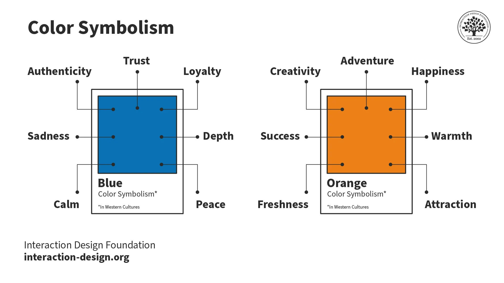
Designers should pay attention to the visual aesthetics and overall user interface. That way, they can create a positive visceral response from users. Use colors, contrast, typography and imagery that align with the desired emotional tone. For instance, colors can evoke a range of emotions, from calm and trust (blue) to excitement and urgency (red). Similarly, high-contrast designs can grab users' attention and evoke a sense of excitement or urgency.
Colors can symbolize a wide range of emotions, some of which will depend on the context and culture of the users.
Designers must ensure that their designs are not only visually appealing but also usable and functional—and accessible. A seamless and intuitive user experience can evoke positive emotional responses.
Professor Alan Dix explains the interplay between emotion and usability in this video:
ShowHide
video transcript
Transcript loading…
Personalize the Experience
Bring the experience home to individual users. Provide personalized recommendations, content and interactions. This helps create a sense of connection and emotional engagement. For example, well-crafted microcopy—the small bits of text that guide users through an interface—can inject personality into a design. It can make it feel more human and relatable to users. This can evoke positive emotions. Users will tend to feel valued and understood—vital objectives of a UX design process.
Use Microinteractions
Use small, delightful interactions throughout the user journey. These microinteractions can include animated buttons, subtle sounds and visual feedback that enhance the emotional experience.
Tell a Compelling Story
Use storytelling techniques to engage users emotionally and create a memorable experience. Craft a narrative that aligns with the user's emotional journey and connects with their values and hopes.
Evoke Empathy
Design with empathy: consider the user's emotions, needs and goals. It’s vital to show understanding and compassion through the design choices, content and interactions. Designers who weave empathy into their design work early on—through user personas, for example—can leverage empathy to great effect and have better results in user tests.
This video explains how valuable empathy is in design:
ShowHide
video transcript
Transcript loading…
Seek User Feedback
It’s important to continuously gather user feedback, to understand how the design resonates emotionally with users. Designers should use this feedback to iterate and improve the emotional experience.
Test and Iterate
Conduct usability testing and gather feedback throughout the design process. That’s the way to identify any emotional pain points or areas for improvement. It’s important to iterate and refine the design based on user insights.
Measure Emotional Impact
Designers should use qualitative and quantitative measures to assess their design’s emotional impact. It’s essential to conduct user interviews, surveys and emotional response assessments to gauge user satisfaction and emotional connection.
Remember, emotions are a powerful tool in UX design and a central part of user-centered design. They’re also a vital gauge to estimate user behaviors and reactions. UX and UI designers should harness emotional design with insight and energy to ensure their brands excel at producing the most delightful experiences.
When designers and other members of the design team, such as product managers, understand emotions, they can create user experiences that resonate and win in the marketplace. Also, when designers appreciate the nature and risk of negative emotions in various contexts, they can create products that wisely anticipate how users feel. User-friendly and delightful designs are the result of carefully informed decisions that come through in good visual design, specific features, information architecture and more.
Take our Masterclass Emotional Design: Evoke Emotional Responses Through Design with Susan Weinschenk, Chief Behavioral Scientist and CEO, The Team W, Inc., and Guthrie Weinschenk, Guthrie Weinschenk is a Behavioral Economist and the COO of The Team W, Inc.
Can designers measure emotional responses to their designs?
Designers can measure emotional responses to their designs. They use methods such as surveys, interviews, and physiological measures like heart rate or skin conductance to understand how people feel about a design. Eye tracking technology also offers insights into which elements capture attention and potentially evoke emotions. By combining these methods, designers gain valuable feedback that helps them create more engaging and effective designs. This approach ensures that designs not only look good but also connect with users on an emotional level, and enhance user experience and satisfaction.
How can color psychology influence emotional response in design?
Color psychology significantly influences emotional responses in design. Different colors can evoke specific emotions and behaviors. For example, blue often creates a sense of calm and trust, making it a favorite for healthcare and finance industries. Red, known for its intensity, can trigger excitement or urgency, which is why sale signs often use it.
When designers understand color psychology, they can craft designs that not only attract attention but also resonate emotionally with the audience. This strategic use of color enhances user engagement, improves brand perception, and can even influence decision-making processes. When designers apply color psychology thoughtfully, they ensure their work not only stands out visually but also connects with viewers on an emotional level, and makes the design more effective and memorable.
Take our Master Class How To Use Color Theory To Enhance Your Designs with Arielle Eckstut, Author and Co-Founder of The Book Doctors and LittleMissMatched, and Joann Eckstut, Color Consultant and Founder of The Roomworks.
In what ways can typography impact a user's emotional response?
Typography can deeply affect a user's emotional response in several ways. First, the choice of font can convey a specific mood or feeling. For example, serif fonts often appear more traditional or formal, and evoke a sense of reliability. Meanwhile, sans-serif fonts might feel modern and approachable, and create a more relaxed atmosphere. Second, the size, spacing, and layout of text can impact readability and influence how comfortable users feel while reading. Comfortable reading experiences tend to foster positive emotions, whereas difficult or strained reading can lead to frustration. Third, the color of typography not only affects readability but can also carry emotional weight, similar to the broader impacts of color psychology in design. When designers consider these aspects, they can use typography to subtly guide users' emotional reactions, enhancing the overall effectiveness and user engagement of a design.
How do A/B testing strategies incorporate emotional response analysis?
A/B testing strategies incorporate emotional response analysis by comparing two versions of a design to see which one elicits a more positive emotional reaction from users. Designers create two variants (A and B) with different emotional triggers, such as color schemes, imagery or messaging. They then measure users' reactions to each version using metrics like engagement rates, conversion rates and direct feedback through surveys or interviews. This process helps identify which elements contribute to a stronger emotional connection with the audience. By analyzing the emotional responses to each variant, designers gain insights into user preferences and behaviors. This allows them to refine their designs in a way that resonates more deeply with their target audience. This approach not only enhances user experience but also improves design effectiveness by aligning more closely with users' emotional needs and expectations.
What role does storytelling play in enhancing emotional response in design?
Storytelling plays a crucial role in enhancing emotional responses in design. It does so by creating a narrative that users can connect with on a personal level. When designers incorporate storytelling into their work, they invite users into a story, making the experience more memorable and engaging. This connection can evoke a wide range of emotions, from happiness and excitement to empathy and trust, depending on the story being told. Storytelling also helps in building a stronger relationship between the user and the brand, as it often conveys the brand's values and mission in a relatable way. By weaving storytelling into design, designers can transform a simple interaction into a compelling experience that resonates emotionally, and encourage deeper engagement and loyalty.
Take our Master Class The Power of Storytelling in UX with Fernando Marcelo Hereñu, Product and Design Manager at The Walt Disney Company.
What techniques can increase emotional resonance through UX design?
To increase emotional resonance through UX design, designers employ several techniques. First, they use personalized content to make the user feel seen and understood. This includes tailored recommendations or greetings that use the user’s name. Second, designers create interactive elements that delight users, such as animations or micro-interactions, which make the experience feel alive and engaging. Third, storytelling elements are woven into the design to build a narrative that users can connect with emotionally. This could be through the use of visuals, text, or the overall layout that tells a story. Fourth, incorporating feedback loops, such as reactions or comments, allows users to share their feelings, making the experience more interactive and personal. Lastly, empathy mapping is a tool designers use to understand and address the emotional needs of their users better. By focusing on these techniques, designers can create more emotionally resonant UX designs that foster a deeper connection with users.
Are there specific metrics to track emotional engagement in digital products?
Yes, there are specific metrics to track emotional engagement in digital products. One key metric is user satisfaction, often measured through surveys like Net Promoter Score (NPS), which asks users how likely they are to recommend the product to others. Another metric is engagement rate, which looks at how actively users interact with the product, including time spent, clicks, and completion of key actions. Emotional engagement is also measurable through user feedback, collected via reviews, comments or direct feedback tools. Additionally, conversion rates can reflect emotional engagement by showing how effectively the product meets users’ needs and motivates them to take action. Finally, drop-off rates during the onboarding process or at specific features can indicate areas where the product fails to emotionally connect with users, guiding designers on where to make improvements.
UX Strategist and Consultant, William Hudson explains why and when to use surveys, in this video:
How can virtual reality (VR) enhance emotional engagement in design?
Virtual Reality (VR) enhances emotional engagement in design by creating immersive experiences that can evoke strong emotions. As it places users inside a simulated environment, VR allows them to interact with the design in a more personal and direct way. This immersion leads to a heightened sense of presence, and makes the experience feel more real and impactful. For example, VR can simulate environments or situations that trigger empathy, excitement or curiosity, and so deepens the emotional connection to the content. Additionally, VR's interactive nature encourages active participation, which further strengthens this emotional bond. If designers leverage VR, they can craft experiences that not only capture users' attention but also resonate with them on an emotional level, and so significantly enhance the overall impact of the design.
Are there cultural differences in how design evokes emotional responses?
Cultural differences play a significant role in how design evokes emotional responses. What resonates emotionally in one culture might not have the same effect in another. For instance, colors carry different meanings across cultures; red signifies good luck in China, but it can represent danger or love in Western cultures. Similarly, symbolism and imagery that evoke positive emotions in one cultural context might be neutral or even negative in another. This extends to typography, where the aesthetic appeal and legibility of certain fonts can vary significantly based on cultural familiarity and associations. Designers need to understand these cultural nuances to create designs that elicit the intended emotional responses from a diverse audience. When designers consider cultural differences, they can craft more inclusive and resonant experiences for users worldwide.
Professor Alan Dix explains why it’s important to design with the users’ culture in mind:
ShowHide
video transcript
Transcript loading…
Video copyright info
Copyright holder: Tommi Vainikainen _ Appearance time: 2:56 - 3:03 Copyright license and terms: Public domain, via Wikimedia Commons
Copyright holder: Maik Meid _ Appearance time: 2:56 - 3:03 Copyright license and terms: CC BY 2.0, via Wikimedia Commons _ Link: https://commons.wikimedia.org/wiki/File:Norge_93.jpg
Copyright holder: Paju _ Appearance time: 2:56 - 3:03 Copyright license and terms: CC BY-SA 3.0, via Wikimedia Commons _ Link: https://commons.wikimedia.org/wiki/File:Kaivokselan_kaivokset_kyltti.jpg
Copyright holder: Tiia Monto _ Appearance time: 2:56 - 3:03 Copyright license and terms: CC BY-SA 3.0, via Wikimedia Commons _ Link: https://commons.wikimedia.org/wiki/File:Turku_-_harbour_sign.jpg
What are highly cited scientific articles on the subject of emotional response?
This seminal paper introduced the concept of user experience (UX) and its importance in human-computer interaction. It argued that UX goes beyond usability and encompasses the user's emotions, motivations, and overall experience with a product or system. The paper has been highly influential in shaping the UX research agenda and driving the field forward.
This paper presents a comprehensive model for understanding the emotional responses users have towards products. It identifies different layers of emotional experience, including aesthetic, instrumental and symbolic emotions. The model has been highly influential in guiding research on emotional design and user experience.
This paper investigates the antecedents of emotional experiences in interactive contexts, focusing on the role of system qualities and user characteristics. It has been influential in advancing human understanding of the factors that shape emotional responses to interactive products and services.
What are highly regarded books on the subject of emotional response?
1. Norman, D. A. (2003). Emotional Design: Why We Love (or Hate) Everyday Things. Basic Books. Donald Norman's book on emotional design has been a landmark publication in the field. It explores how the emotional responses evoked by a product's design can significantly impact the user's experience and perception of the product. Widely cited for its insights into the role of emotion in user experience, Emotional Design: Why We Love (or Hate) Everyday Things has influenced researchers and practitioners.
2. Csikszentmihalyi, M. (1990). Flow: The Psychology of Optimal Experience. Harper & Row. Csikszentmihalyi's book on the concept of "flow" has been highly influential in understanding the emotional and motivational aspects of user experience. It explores how the optimal balance between challenge and skill can lead to a state of deep engagement and enjoyment, which is a key consideration in designing engaging user experiences.
Earn a Gift, Answer a Short Quiz!
Question 1
Question 2
Question 3
Get Your Gift
Try Again! IxDF Cheers For You!
0 out of 3 questions answered correctly
Remember, the more you learn about design, the more you make yourself valuable.
It's Easy to Fast-Track Your Career with the World's Best Experts
Master complex skills effortlessly with proven best practices and toolkits directly from the world's top design experts. Meet your expert for this course:
Alan Dix: Author of the bestselling book “Human-Computer Interaction” and Director of the Computational Foundry at Swansea University.
People form emotional connections and associations with the things they use and come across throughout their lives. Thes
857 shares
2 mths ago
Open Access—Link to us!
We believe in Open Access and the democratization of knowledge. Unfortunately, world-class educational materials such as this page are normally hidden behind paywalls or in expensive textbooks.