Cognitive walkthroughs are used to examine the usability of a product. They are designed to see whether or not a new user can easily carry out tasks within a given system. It is a task-specific approach to usability (in contrast to heuristic evaluation which is a more holistic usability inspection). The idea is that if given a choice, most users prefer to do things to learn a product rather than to read a manual or follow a set of instructions.
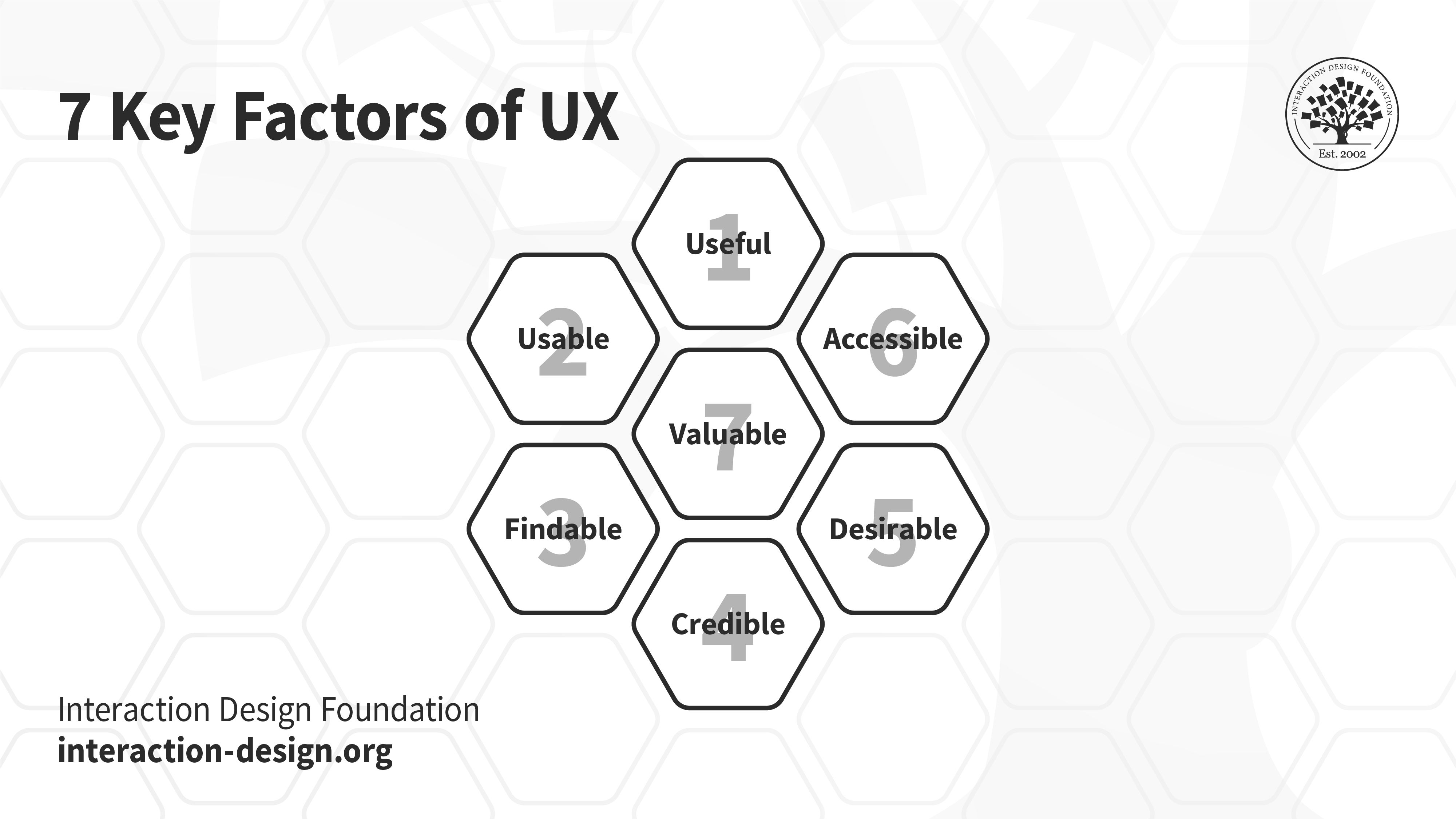
Peter Morville’s 7 Key Factors of UX (honeycomb): Useful, Usable, Findable, Credible, Desirable, Accessible and Valuable. Cognitive Walkthroughs will help you meet most, if not all of these qualitative markers of good user experience.
© Interaction Design Foundation, CC BY-SA 3.0
The biggest benefit of a cognitive walkthrough (or walkthroughs) is that it is extremely cost-effective and fast to carry out when compared to many other forms of usability testing. It can also be implemented before development during the design phase, giving rapid insight before the budget is spent developing an unusable product.
Table of contents
- How to Conduct a Cognitive Walkthrough
- Tasks Become Processes
- The Four Questions to be Asked during a Cognitive Walkthrough
- Will the user try and achieve the right outcome?
- Will the user notice that the correct action is available to them?
- Will the user associate the correct action with the outcome they expect to achieve?
- If the correct action is performed, will the user see that progress is being made towards their intended outcome?
- Who Should Conduct a Cognitive Walkthrough?
- What Do You Do with the Answers to the Questions?
- Cognitive Walkthroughs and Information Visualization
- The Take Away
- References and Where to Learn More
- Image
How to Conduct a Cognitive Walkthrough
A cognitive walkthrough begins by defining the task or tasks that the user would be expected to carry out. It is these tasks that the cognitive walkthrough will examine for usability—any tasks that can be performed in the product but are not subject to a cognitive walkthrough will not normally be assessed during the process.
Tasks Become Processes
Tasks are then divided up into a simple process to follow. So, for example, the login process on a website might look like this:
Open browser
Navigate to site
Click login button
Enter the user name in the user name field
Enter the password in the password field
Click the login button
If the task is too complex to write in a list format – a diagram can be used instead.
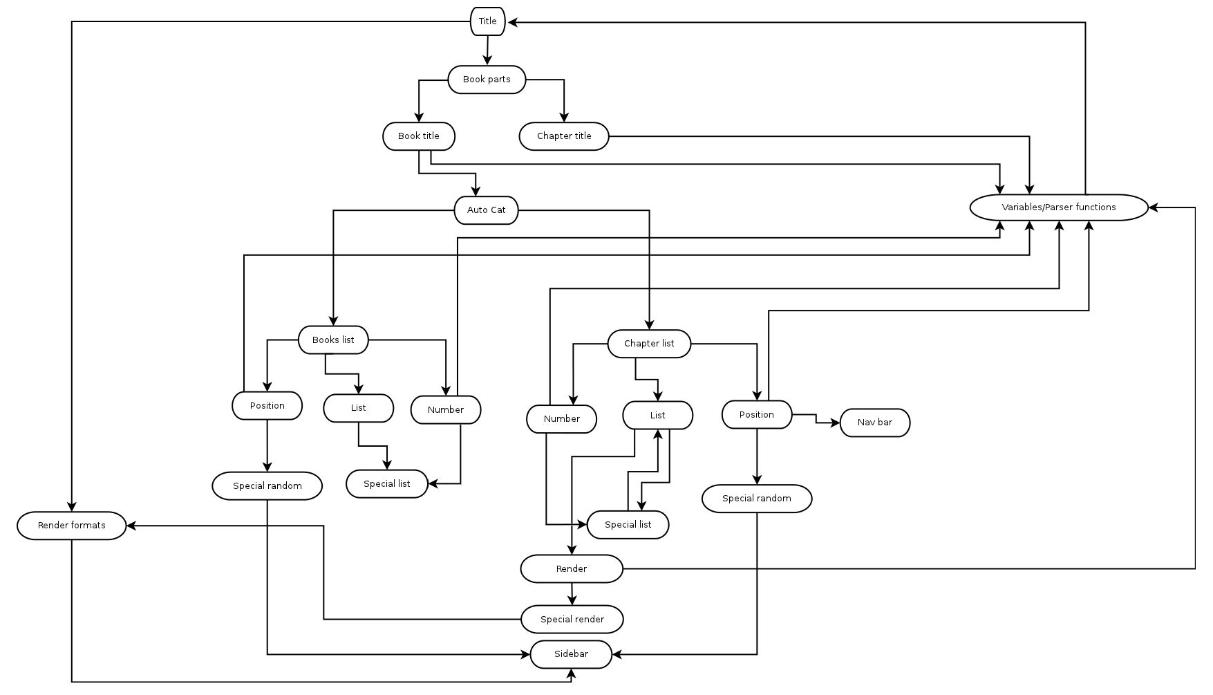
© Raylton P. Sousa, CC BY -SA 3.0
The Four Questions to be Asked during a Cognitive Walkthrough
In their 2002 paper, “Cognitive walkthrough for the Web” Blackmon, Polson, et al. offer four questions to be used by an assessor during a cognitive walkthrough:
Will the user try and achieve the right outcome?
Will the user notice that the correct action is available to them?
Will the user associate the correct action with the outcome they expect to achieve?
If the correct action is performed, will the user see that progress is being made towards their intended outcome?
The assessor performs each action in any given task process and asks the four questions above. Let’s take a look at each question more closely and see what they’re trying to achieve:
Will the user try and achieve the right outcome?
This question examines whether the interface is making assumptions about a user's level of experience or knowledge that aren't accurate. It can also help identify when a user's expectations of an action don't align with the actual action taken because they are using other reference points and becoming confused (for example, the use of language in your product is in common usage in other products and means something else).
For example, let's say you have designed a new smartphone. On your smartphone, the two buttons on the side act as navigation shortcuts to play the next or previous song, while the volume control is only available on the touchscreen. It is unlikely that your smartphone will succeed because, in all other smartphones, the side buttons control the volume of the audio. The user will likely press the buttons to change the audio volume and be disappointed by the outcome.

Imagine trying to change the song's volume, only to end up changing it altogether!
© Charlotte May, CC 0
Will the user notice that the correct action is available to them?
Hidden or obscured controls are a problem for users. The more data you present and the more choice you present, the less likely it is that a user will know what to do. If you bury a control in a menu system rather than having it present while the action takes place, the same is true; your users won’t know what to do.
One of the most common examples of this in real life is the TV or DVD remote control. These provide an overwhelming number of options to users and are often confusing to use. In many cases, manufacturers try to tackle this by placing rarely used functions underneath a sliding cover; reducing options makes the control easier to use.
Will the user associate the correct action with the outcome they expect to achieve?
If your use of language is poor, for example, you use overly complex words or industry jargon, it can be hard for a user to work out what is needed to achieve their outcome. This is also true when you use complex actions (think Ctrl+Alt+Del—it may be something you’re intimately familiar with now if you use Windows—but it’s not exactly intuitive, is it?) to carry out an action.
In his book “Don’t Make me Think”, Steve Krug says, “It doesn’t matter how many times I have to click, as long as each click is a mindless, unambiguous choice.”
If the correct action is performed, will the user see that progress is being made towards their intended outcome?
This will help you investigate when feedback in the system is missing, badly worded, easy to miss or plain old ambiguous. You need to let your users know about their progress in the task. It’s why computer games use loading screens to signify moving on to the next level and why it’s always a good idea to have a “thank you” note when a customer finishes making an order.
Who Should Conduct a Cognitive Walkthrough?
Anyone can conduct a cognitive walkthrough; however, there is a risk that someone who is already familiar with your jargon, language and system will miss things that someone who lacks that familiarity would find.
Given that conducting a cognitive walkthrough is not particularly challenging. If you’ve prepared the task lists and can copy the questions (plus a little explanation as to how to use them) onto a piece of paper – you should be able to find someone in your organization who can do it. You can also ask users to conduct these walkthroughs—that will add recruitment time and expense (you’ll need to compensate the user for their time).
If you have to use someone who is very familiar with the product, make sure they have user personas at hand – to try and guide them to “walk a mile in the user’s shoes”.

© Walton LaVonda, Public Domain.
What Do You Do with the Answers to the Questions?
Each assessor involved in a cognitive walkthrough should record the step in the process where they found an issue and what that issue was. This can be done in their own words.
When the process is complete, it’s a good idea to round up all the assessors’ reports into a single report and then prioritize issues for fixing.
Cognitive Walkthroughs and Information Visualization
Information visualization is a design field in which cognitive walkthroughs are being used. In this discipline, the questions you ask might need to be tweaked based on the type of visualization employed and the data's complexity. Unfortunately, there are no “ideal” questions formulated for cognitive walkthroughs of information visualizations, so if you intend to use the technique, you’ll need to experiment to find the right questions to bring results for your users.
The Take Away
Cognitive walkthroughs are cheap and easy to conduct. They allow the system or product to be examined for usability from a user’s perspective and provide quick feedback to enable decision-making in the design process. A product does not need to have been developed to conduct a cognitive walkthrough – the walkthrough can take place using sketches or other types of prototypes.
References and Where to Learn More
Blackmon, M. H. Polson, P.G. Muneo, K & Lewis, C. (2002) Cognitive Walkthrough for the Web CHI 2002 vol.4 No.1 pp463–470
Image
Hero Image: © Nicola Jones, CC BY-ND 2.0


