Your constantly-updated definition of Heuristic Evaluation (HE) and
collection of videos and articles. Be a conversation starter: Share this page and inspire others!
876shares
What is Heuristic Evaluation (HE)?
Heuristic evaluation is a process where experts use rules of thumb to measure the usability of user interfaces in independent walkthroughs and report issues. Evaluators use established heuristics (e.g., Nielsen-Molich’s) and reveal insights that can help design teams enhance product usability from early in development.
“By their very nature, heuristic shortcuts will produce biases.”
— Daniel Kahneman, Nobel Prize-winning economist
ShowHide
video transcript
Transcript loading…
Learn how to guide effective designs using heuristic evaluation.
Heuristic Evaluation: Ten Commandments for Helpful Expert Analysis
In 1990, web usability pioneers Jakob Nielsen and Rolf Molich published the landmark article “Improving a Human-Computer Dialogue”. It contained a set of principles—or heuristics—which industry specialists soon began to adopt to assess interfaces in human-computer interaction. A heuristic is a fast and practical way to solve problems or make decisions.
In user experience (UX) design, professional evaluators use heuristic evaluation to determine a design’s/product’s usability systematically. As experts, they go through a checklist of criteria to find flaws that design teams overlook. The Nielsen-Molich heuristics state that a system should:
Keep users informed about its statusappropriately and promptly.
Show informationin ways users understand from how the real world operates, and in the users’ language.
Offer users control and let them undo errors easily.
Be consistent so users aren’t confused over what different words, icons, etc. mean.
Prevent errors – a system should either avoid conditions where errors arise or warn usersbefore they take risky actions (e.g., “Are you sure you want to do this?” messages).
Have visible information, instructions, etc. to let users recognize options, actions, etc. instead of forcing them to rely on memory.
Be flexible so experienced users find faster ways to attain goals.
Have no clutter, containing only relevant information for current tasks.
Provide plain-language help regarding errors and solutions.
List concise steps in lean, searchable documentation for overcoming problems.
Heuristic Evaluation: Pros and Cons
When you apply the Nielsen-Molich heuristics as an expert, you have powerful tools to measure a design’s usability. However, like any method, there are pros and cons:
Pros of Heuristic Evaluation
Heuristics can help highlight potential usability issues early in the design process.
It is a fast and inexpensive tool compared with other methods involving real users.
Cons of Heuristic Evaluation
Heuristic evaluation depends on the knowledge and expertise of the evaluators. Training the evaluators or hiring external evaluators might increase the time and money required for conducting the evaluation.
Heuristic evaluation is based on assumptions about what “good” usability is. As heuristics are based on research, this is often true. However, the evaluations are no substitute for testing with real users. These are, as the name suggests, only guidelines, and not rules that are set in stone.
Heuristic evaluation can end up giving false alarms. In their article, “Usability testing vs. heuristic evaluation: A head-to-head comparison,” Robert Bailey, Robert Allan and P. Raiello found that 43% of 'problems' identified by experimental heuristic evaluations were not actually problems. Furthermore, evaluators could only identify 21% of genuine usability problems in comparison with usability testing.
A vital point is that heuristic evaluation, however helpful, is no substitute for usability testing.
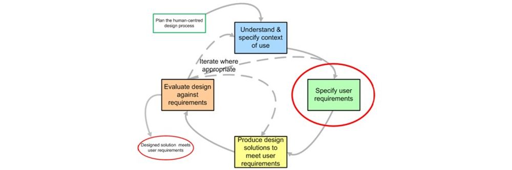
How to Conduct a Heuristic Evaluation
To conduct a heuristic evaluation, you can follow these steps:
Know what to test andhow – Whether it’s the entire product or one procedure, clearly define the parameters of what to test and the objective.
Know your usersand have clear definitions of the target audience’s goals, contexts, etc. User personas can help evaluators see things from the users’ perspectives.
Select 3–5 evaluators, ensuring their expertise in usability and the relevant industry.
Define the heuristics (around 5–10) – This will depend on the nature of the system/product/design. Consider adopting/adapting the Nielsen-Molich heuristics and/or using/defining others.
Brief evaluators on what to cover in a selection of tasks, suggesting a scale of severity codes (e.g., critical) to flag issues.
1st Walkthrough – Have evaluators use the product freely so they can identify elements to analyze.
2nd Walkthrough – Evaluators scrutinize individual elements according to the heuristics. They also examine how these fit into the overall design, clearly recording all issues encountered.
Debrief evaluators in a session so they can collate results for analysis and suggest fixes.
Start with a brief overview of the product or interface assessed and list the applied heuristics.
For each usability issue identified, explicitly state the violated heuristic, describe where it occurs in the interface, and explain its impact on user experience.
Provide specific recommendations to address each issue and prioritize them based on their severity to user experience.
Include visual aids like screenshots to help clarify the location and nature of the problems found.
For comprehensive insights and detailed instructions on conducting heuristic evaluations and writing practical reports, refer to How to Conduct a Heuristic Evaluation.
How is heuristic evaluation different from usability testing?
Heuristic evaluation differs from usability testing as it involves experts evaluating a product's user interface against established heuristics pinpointing usability issues, while usability testing involves real users completing tasks and identifying issues within the product. Heuristic evaluations are quicker and cost-effective, providing early insights, while usability testing offers an in-depth understanding of user interactions and experiences. For a comprehensive overview of usability testing, watch this video:
ShowHide
video transcript
Transcript loading…
Why is heuristic evaluation important?
Heuristic evaluation is vital as it efficiently identifies usability problems in the design phase of product development, saving time and resources. Employing experts to review products against usability principles helps enhance user satisfaction and interaction and ensures a product's design is intuitive and user-friendly. This method is cost-effective and quick, making it a fundamental step in achieving optimal user experience and interface design.
What is an example of heuristic evaluation?
An example of heuristic evaluation is when usability experts assess a website or application against established usability principles, or heuristics, to identify potential user experience issues. For instance, experts might evaluate the system's visibility of system status, user control, and freedom or match between the system and the real world. These evaluations help in uncovering usability problems early in the design process. For a detailed procedure for conducting a heuristic evaluation, refer to this article: How to Conduct a Heuristic Evaluation.
How effective is heuristic evaluation?
Compared to other methods, heuristic evaluation is a cost-effective and efficient way to determine design usability issues.
ShowHide
video transcript
Transcript loading…
However, as discussed in the video, it may not be as effective as testing with real users when it comes to understanding the user experience fully. Heuristic evaluations, performed by experts, assess whether solutions conform to established usability guidelines, providing critical insights, especially in the early stages of design. Nonetheless, optimal outcomes usually result from combining this method with user testing, allowing designers to address expert opinions and real user experiences effectively.
How do you conduct a heuristic evaluation in UI?
To conduct a heuristic evaluation in UI, select a set of heuristics or guidelines like Jakob Nielsen’s 10 usability heuristics. Next, assemble a group of usability experts and assign them to evaluate the interface independently, identifying issues that violate the chosen heuristics. Compile the found issues, prioritize them based on severity, and generate a report detailing the problems and suggested improvements. This article, How to Conduct a Heuristic Evaluation, provides a comprehensive guide on effectively performing heuristic evaluations in UI design.
Start conducting your own heuristic evaluations with the help of this template:
Get your free template for “How to Conduct Your Own Heuristic Evaluation”
What is a weakness of heuristic analysis?
A weakness of heuristic analysis is its reliance on experts’ judgments, which may not accurately reflect user experiences and can overlook user-centric issues. While cost-effective, this method might miss problems identified through user testing, leading to unresolved potential usability issues. The subjective nature of heuristic evaluation can result in varied findings among evaluators, necessitating thorough analysis to discern the most critical usability concerns. Despite these limitations, heuristic analysis remains a valuable tool in the early design stages to identify glaring usability issues efficiently.
What is a heuristic checklist?
A heuristic checklist is a structured tool used in heuristic evaluation to assess the user interface design against established usability principles or "heuristics." This checklist helps identify usability issues in a product, focusing on areas like user control, consistency, and error prevention. It's employed by experts to quickly spot potential problems in the early stages of design, aiding in the refinement of the user experience. For a more in-depth understanding and to explore the components of a heuristic checklist, refer to this article: How to Conduct a Heuristic Evaluation.
Start conducting your own heuristic evaluations with the help of any (or all!) of the different sets of heuristics:
Frank Spillers and Experience Dynamics’ USE Scorecard:
Get your free USE Scorecard to Evaluate Mobile UX
Jakob Nielsen and Rolf Molich’s universal usability heuristics:
Get your free template for “Heuristic Evaluation Sheet for General Use”
Enrico Bertini, Silvia Gabrielli and Stephen Kimani’s modified heuristics for mobile:
Get your free template for “Heuristic Evaluation Sheet for Mobile Designs”
What is the most common heuristic tool?
The most common heuristic tool is Jakob Nielsen’s “10 Usability Heuristics for User Interface Design.” It’s widely recognized and utilized for its effectiveness in identifying usability issues in user interface (UI) design.
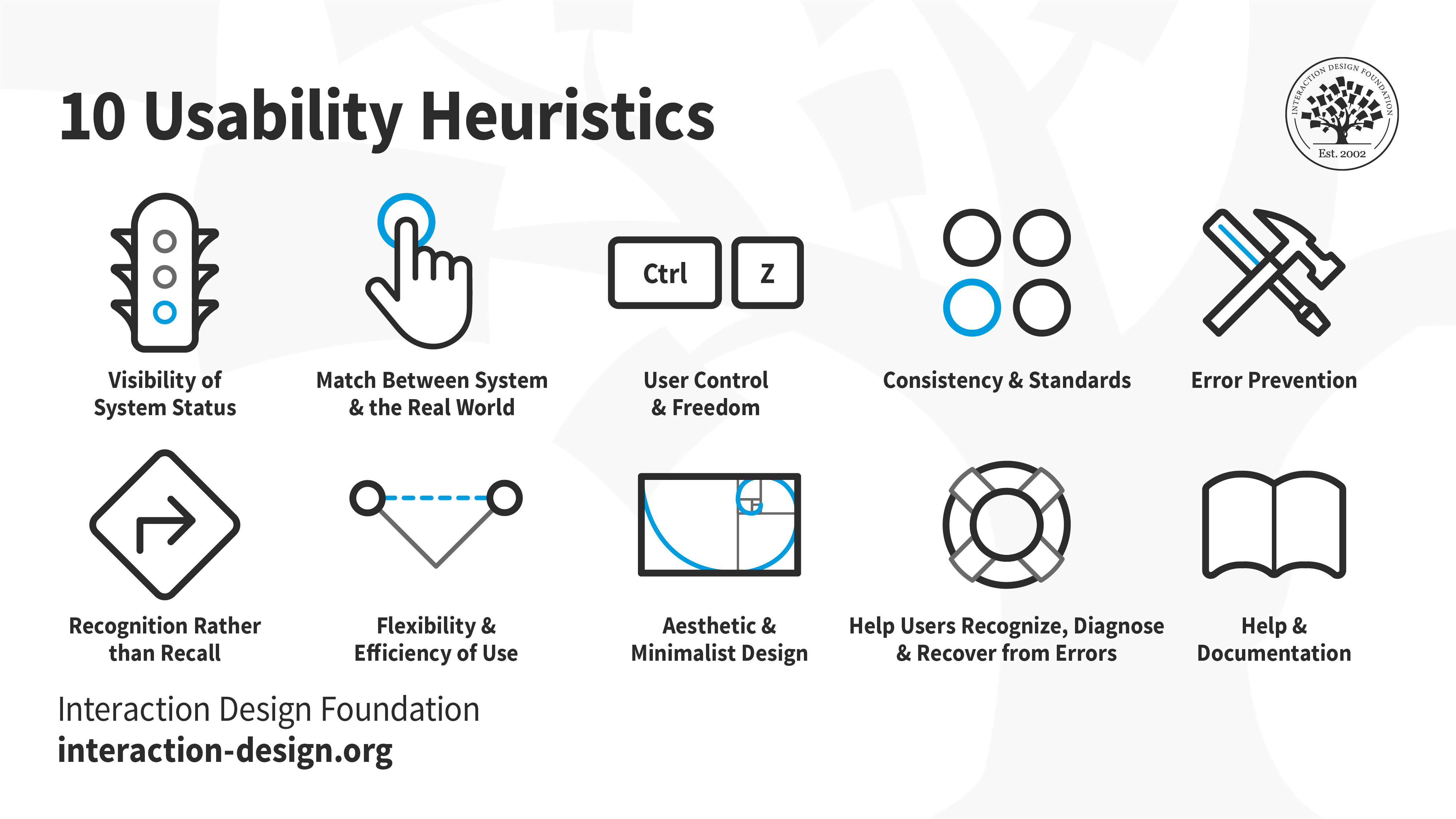
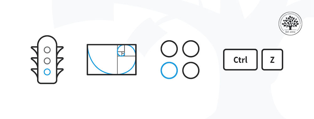
An illustration depicting Jakob Nielsen's 10 Usability Heuristics for User Interface Design. They’re called "heuristics" because they are broad rules of thumb and not specific usability guidelines.
Visibility of System Status: Keep users informed about what's going on through appropriate feedback within a reasonable time.
Match between System and the Real World: Use words and concepts familiar to the user, rather than system-oriented terms.
User Control and Freedom: Provide ways for users to easily reverse actions and exit from unintended states.
Consistency and Standards: Avoid user confusion by being consistent and following platform conventions.
Error Prevention: Eliminate error-prone conditions and confirm users' actions that have severe consequences.
Recognition Rather Than Recall: Minimize users' memory load by making objects, actions, and options visible and easily accessible.
Flexibility and Efficiency of Use: Allow users to tailor actions and provide shortcuts to accelerate experienced users’ interaction.
Aesthetic and Minimalist Design: Avoid unnecessary elements that can diminish the overall user experience.
Help Users Recognize, Diagnose, and Recover from Errors: Provide clear and plain-language error messages to help users understand, diagnose, and recover from errors.
Help and Documentation: Make help and documentation accessible, focused on the user's task, list concrete steps to be carried out, and not be overly large.
This set focuses on essential principles such as user control, error prevention, and consistency, offering a straightforward approach to improving user experience by addressing the most prevalent and impactful aspects of interface design.
Where to learn heuristic evaluation?
To learn heuristic evaluation, take with the User Experience: The Beginner’s Guide course. This course provides detailed insights and practical knowledge on heuristic evaluation, enabling learners to enhance user experience effectively. Additionally, explore comprehensive articles and literature on heuristic evaluation on the IxDF website to deepen your understanding and skills in this area. Both resources are invaluable for anyone looking to master heuristic evaluation techniques in user interface design.
Earn a Gift, Answer a Short Quiz!
Question 1
Question 2
Question 3
Get Your Gift
Try Again! IxDF Cheers For You!
0 out of 3 questions answered correctly
Remember, the more you learn about design, the more you make yourself valuable.
It's Easy to Fast-Track Your Career with the World's Best Experts
Master complex skills effortlessly with proven best practices and toolkits directly from the world's top design experts. Meet your experts for this course:
Marc Hassenzahl: Professor of Ubiquitous Design/Experience & Interaction in the Department of Business Computing at the University of Siegen.
William Hudson: User Experience Strategist and Founder of Syntagm.
All open-source articles on Heuristic Evaluation (HE)
8.0.1 The origin of heuristics
Heuristics, a form of cognitive strategy, have been studied in discplines such as cognit
Book chapter
Open Access—Link to us!
We believe in Open Access and the democratization of knowledge. Unfortunately, world-class educational materials such as this page are normally hidden behind paywalls or in expensive textbooks.